 Install FontSwap
Free Alternatives to Aeonik Supporting Cyrillic
Need a free alternative to Aeonik with Cyrillic script support? These 4 options include Cyrillic characters and share visual similarities with Aeonik. Each is licensed for free personal and commercial use.
Top Picks
Comparison Table
| Font | Relevance ⓘ
How well this alternative fits the specific context (use-case or trait) of this page. Score 0–100 based on matching keywords, industries, and font characteristics. Alternatives scoring 25+ are highlighted.
| Similarity ⓘ
How visually similar this free font is to the premium original. Score 0–100 based on x-height, width, stroke contrast, use-case overlap, and language coverage.
Learn more → | Weights | Variable | License | Source |
|---|---|---|---|---|---|---|
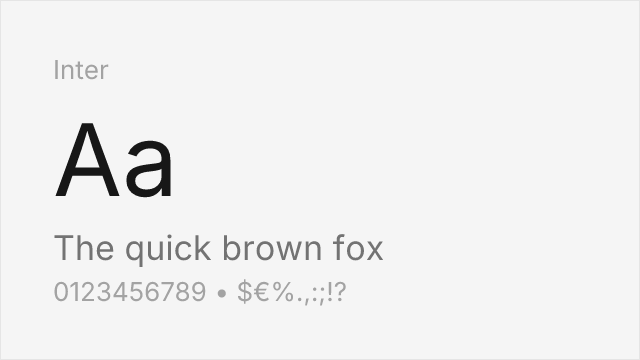
| Inter | 0 | 88% | Variable | Yes | OFL-1.1 | Google Fonts ↗ |
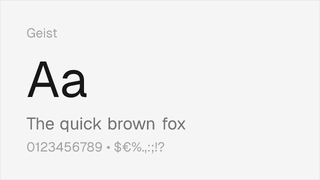
| Geist | 0 | 78% | Variable | Yes | OFL-1.1 | Google Fonts ↗ |
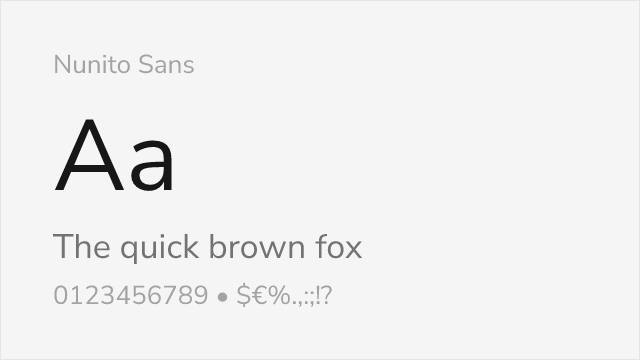
| Nunito Sans | 0 | 75% | Variable | Yes | OFL-1.1 | Google Fonts ↗ |
| Source Sans 3 | 0 | 72% | Variable | Yes | OFL-1.1 | Google Fonts ↗ |
All Alternatives (4)
[Google Fonts] · OFL-1.1 · Variable
Closest structural match with exceptional screen rendering and variable font support
Why it matches: Inter mirrors Aeonik's generous x-height and open apertures while sharing its commitment to digital-first legibility. Both typefaces sit in the space between geometric purity and grotesque pragmatism, producing letterforms that feel engineered rather than drawn. Inter's optical sizing axis adjusts stroke details across sizes, compensating for the optical grading that Aeonik achieves through careful manual spacing. The lowercase a, g, and s are structurally very close in both families.
fintech product interfacesSaaS dashboards and data displaysdesign system foundationscross-platform UI typography
[Google Fonts] · OFL-1.1 · Variable
Tech-focused neo-grotesque with similar market positioning
Why it matches: Geist was designed by Vercel in collaboration with Basement Studio for developer-facing interfaces, a context where Aeonik also thrives. Both share tight, rational letterforms with a focus on code-adjacent readability and digital-first proportions. Geist's slightly wider proportions give it marginally better legibility at very small sizes, while Aeonik maintains tighter overall typographic color. The two typefaces target overlapping audiences in the technology sector.
developer tools and platformstech startup brandingdocumentation sitesdark-mode interfaces
[Google Fonts] · OFL-1.1 · Variable
Softer grotesque with similar approachable character
Why it matches: Nunito Sans captures Aeonik's approachable professionalism through subtly rounded terminals and balanced proportions. Both typefaces project trustworthiness without formality, making them popular choices for consumer-facing financial products. Nunito Sans is softer and more humanist than Aeonik, which gives it greater warmth in body text but less of the geometric precision that defines Aeonik's character at display sizes.
consumer-facing fintech appsonboarding flows and formsfriendly enterprise softwarehealth and wellness platforms

[Google Fonts] · OFL-1.1 · Variable
Enterprise-grade alternative with strong hinting and proven cross-platform rendering
Why it matches: Source Sans 3 matches Aeonik's commitment to screen legibility through generous apertures and careful hinting optimized across rendering environments. While Aeonik leans more geometric, Source Sans 3 adds subtle humanist touches that improve readability in long-form content. Adobe's optimization, extensive hinting, and proven reliability across enterprise environments make it a dependable, freely licensed substitute when Aeonik's specific aesthetic is less critical than broad compatibility.
enterprise applicationsgovernment and institutional sitesmultilingual interfacesdocumentation and knowledge bases