Free Alternatives to Arial Supporting Latin Extended

8 alternatives | sans serif | Best match: Arimo (95%)

Need a free alternative to Arial with Latin Extended script support? These 8 options include Latin Extended characters and share visual similarities with Arial. Each is licensed for free personal and commercial use.

Top Picks

Comparison Table

Font Relevance Similarity Weights Variable License Source
Arimo 0 95% Variable Yes OFL-1.1 Google Fonts ↗
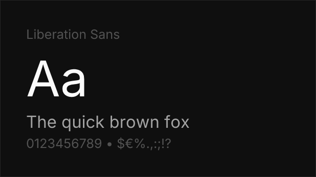
Liberation Sans 0 93% 2 No OFL-1.1 github ↗
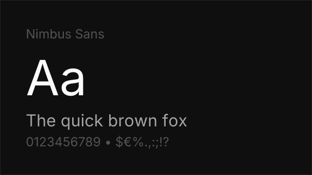
Nimbus Sans 0 90% 2 No GPL-2.0-with-font-exception fontsquirrel ↗
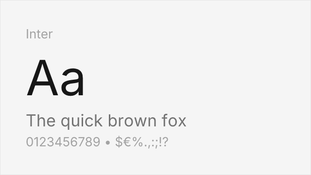
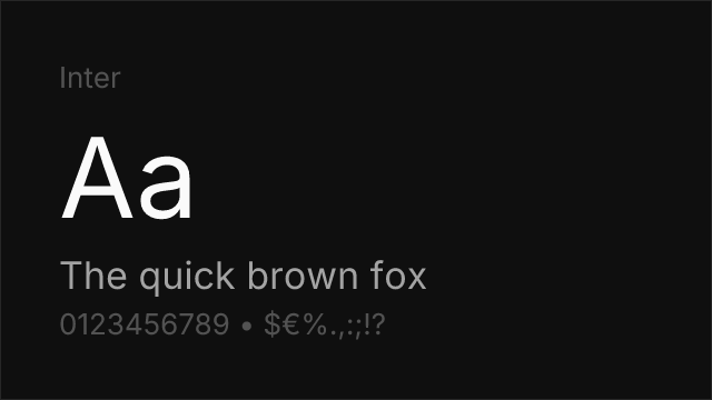
Inter 0 82% Variable Yes OFL-1.1 Google Fonts ↗
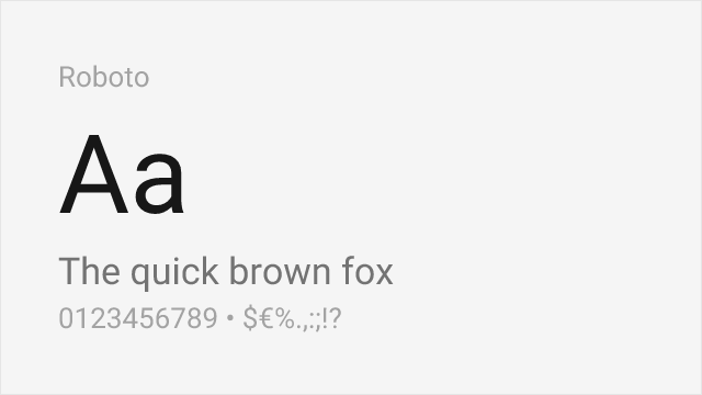
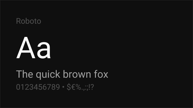
Roboto 0 78% Variable Yes Apache-2.0 Google Fonts ↗
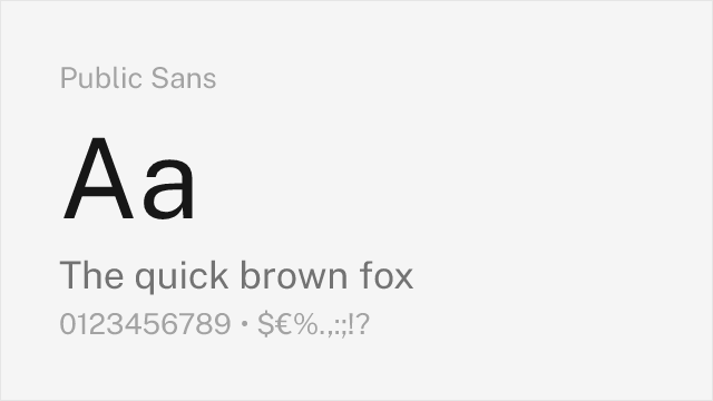
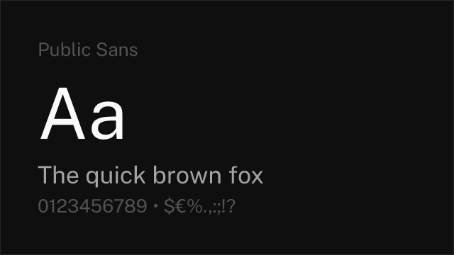
Public Sans 0 74% Variable Yes OFL-1.1 Google Fonts ↗
Source Sans 3 0 70% Variable Yes OFL-1.1 Google Fonts ↗
Work Sans 0 66% Variable Yes OFL-1.1 Google Fonts ↗

All Alternatives (8)

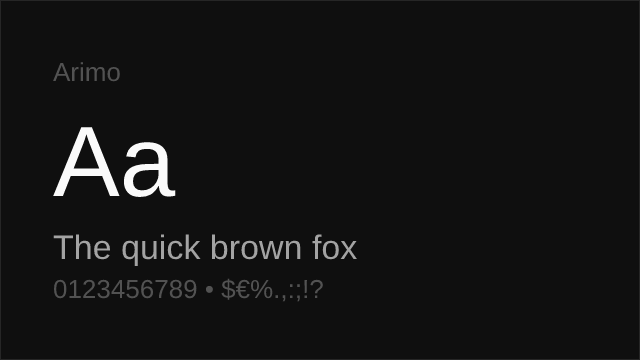
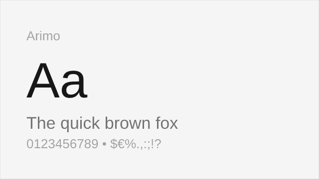
#1 Arimo 95%
[Google Fonts] · OFL-1.1 · Variable

Metrically compatible with Arial — identical advance widths, so layouts do not reflow.
Why it matches: Arimo is the only alternative here that guarantees your document will not reflow. Steve Matteson drew it to match Arial's advance widths character for character, so line breaks, page counts and column depths stay exactly where they were. The letterforms are redrawn rather than copied — apertures open slightly further and terminals cut a touch more squarely, both concessions to on-screen rendering — but in running text at reading sizes the substitution is invisible. If the brief is "replace Arial and change nothing else", this is the answer and the rest of the list is academic.
documentscorporatewebui
Get Font ↗
[github] · OFL-1.1 · 2 weights

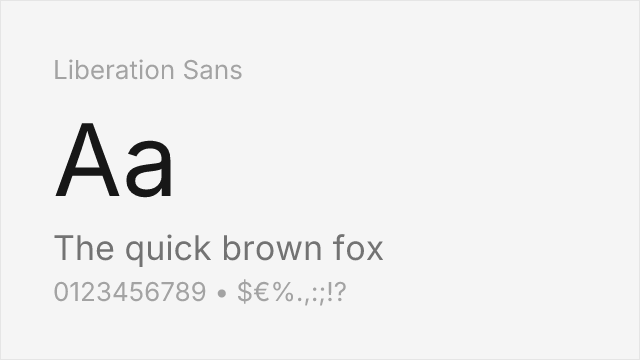
Also metrically compatible with Arial; ships on most Linux systems and with LibreOffice.
Why it matches: Liberation Sans solves the same problem Arimo does — matched advance widths, so an Arial layout does not reflow — but arrives from a different direction. It was commissioned so organisations could move off proprietary office software without their documents repaginating, and it ships as the default Arial stand-in across most Linux distributions and with LibreOffice. That makes it the better pick when your audience is on Linux, because it may already be installed and resolve locally with no download. The cost is range: two weights, no variable axis, and no Google Fonts CDN.
documentscorporateprintweb
Get Font ↗
#3 Nimbus Sans 90%
[fontsquirrel] · GPL-2.0-with-font-exception · 2 weights

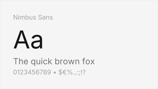
URW's Helvetica-metric clone; Arial shares Helvetica's widths, so it fits closely.
Why it matches: Arial was drawn to Helvetica's proportions and stroke widths, which means anything metrically matched to Helvetica also lands close to Arial. Nimbus Sans is URW's long-standing Helvetica clone and inherits that fit. What you get in exchange for the tight metrics is a more closed, more Swiss texture — the terminals are horizontal where Arial's are angled, and the `R` has Helvetica's curved leg rather than Arial's straight one. Choose it when you would rather the result leaned Helvetica than Arial.
printcorporatesignagedocuments
Get Font ↗
#4 Inter 82%
[Google Fonts] · OFL-1.1 · Variable

Screen-first neo-grotesque with a much wider weight range and true variable axes.
Why it matches: Inter shares Arial's neutral neo-grotesque skeleton but was designed for screens from the first sketch rather than adapted to them. The x-height is larger, apertures are more open, and spacing is tuned for UI density, so interface text reads more clearly at 13-15px than Arial ever has. The trade is that it will not preserve an Arial layout — expect text to reflow. Pick Inter when you are rebuilding rather than substituting, and want the extra eight weights and the variable axis that Arial cannot offer.
uisaaswebapps
Get Font ↗
#5 Roboto 78%
[Google Fonts] · Apache-2.0 · Variable

Android's system sans; neo-grotesque skeleton with slightly condensed proportions.
Why it matches: Roboto occupies similar territory — a neutral workhorse that disappears into the interface — and its ubiquity on Android gives it the same "already installed" quality Arial has on desktop. It runs marginally narrower than Arial, so a paragraph set in Roboto will occupy fewer lines, and the letterforms carry more humanist detail: note the curved leg on the `R` and the slightly angled terminals. Useful when you want a system-font feel across mobile rather than a document match.
mobile-appsuiwebdocuments
Get Font ↗
#6 Public Sans 74%
[Google Fonts] · OFL-1.1 · Variable

US government design system sans, drawn for accessibility and long-form legibility.
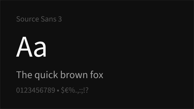
Why it matches: Public Sans comes from the US Web Design System and was drawn for exactly the institutional work Arial usually ends up doing: forms, notices, compliance documents, public-facing services. It is a shade more open and a shade less anonymous than Arial, with clearer differentiation between characters that commonly confuse — the `1`, `l` and `I` are genuinely distinguishable, which Arial's are not. Where an accessibility audit is in play, that difference is worth more than metric fidelity.
documentscorporatewebacademic
Get Font ↗
#7 Source Sans 3 70%
[Google Fonts] · OFL-1.1 · Variable

Adobe's open-source UI sans; humanist warmth over Arial's neutrality.
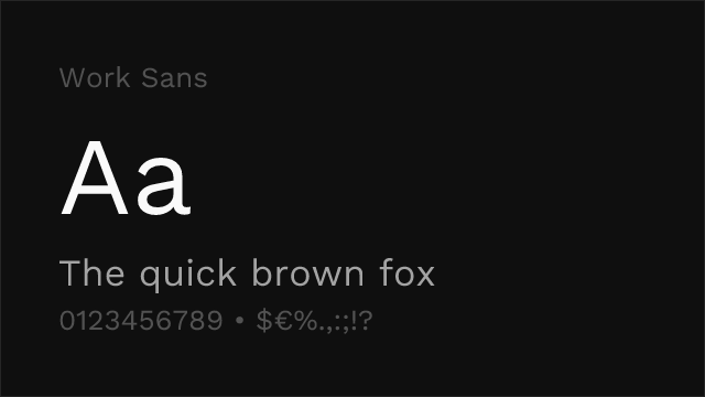
Why it matches: Source Sans 3 is the humanist end of what still reads as a sensible Arial replacement. Stroke endings are more calligraphic, the `a` and `g` carry more of a written origin, and the overall texture is warmer on the page. It will not pass as Arial and is not trying to. Reach for it when the Arial in your template was a default rather than a decision, and the document would be better for a typeface that has some warmth in it.
documentsuiacademicpublishing
Get Font ↗
#8 Work Sans 66%
[Google Fonts] · OFL-1.1 · Variable

Optimised for mid-size screen text; more character than Arial at display sizes.

Why it matches: Work Sans was drawn with the middle of the size range in mind — roughly 14-48px — which is where most web headings and subheads live. Against Arial it has noticeably more personality: slightly quirky curves, a less mechanical rhythm, and optical adjustments that keep it lively at larger settings. It is the furthest from a substitution on this list and the closest to a deliberate upgrade, appropriate when the Arial you are replacing was never doing brand work in the first place.
webheadlinesbrandingui
Get Font ↗

Related Pages