Free Alternatives to Arial

About Arial
- Foundry
- Monotype
- Classification
- sans-serif
- Style
- neo-grotesque
Brands Using Arial
Bundled as a core system font in every version of Windows since 3.1, and long the Office default
Shipped with macOS as a standard system typeface for cross-platform document fidelity
Included in PostScript 3 printers as one of the guaranteed resident font families
Widely mandated in public-sector document templates and accessibility guidance for its ubiquity
 See Arial live on these sites with FontSwap →
Arial is probably the most-installed typeface in history and one of the least-chosen. It arrived on Windows 3.1 in 1992, on macOS shortly after, and inside every PostScript 3 printer, which means that for most of the last three decades it has been the font you get when nobody picks a font. Monotype owns it, its licence forbids redistribution and derivative works, and it has never shipped as a variable font. If you are here, you almost certainly did not license Arial — you inherited it, in a template or a stylesheet or a document someone sent you, and now you need something you can actually deploy.
The good news is that Arial is one of the easiest premium typefaces to replace properly, because a font exists whose entire design brief was to replace it without moving anything.
Why Arial matters
Arial's significance is commercial rather than aesthetic. In 1982 Monotype needed a typeface it could offer to IBM that behaved like Helvetica without licensing Helvetica. Robin Nicholas and Patricia Saunders drew Arial to match Helvetica's proportions and stroke widths exactly, while detailing the letterforms differently enough to stand as its own design — the influence usually cited is Monotype's own Grotesque 215, with touches that recall Gill Sans in the R and G.
That decision — same metrics, different drawing — is the whole story. It let Arial substitute for Helvetica in existing layouts without reflowing them, which is precisely why Microsoft chose it a decade later. Every document that has ever specified Helvetica and rendered in Arial did so because of a width table decided in 1982.
The consequence for you is that Arial's identity is not really visual. It is infrastructural. People do not recognise Arial the way they recognise Futura; they recognise the absence of a decision. That is worth knowing before you replace it, because it changes what "a good match" means.
Design characteristics
Arial is a neo-grotesque: closed apertures, near-uniform stroke weight, a large x-height and tight, even spacing. Its proportions are Helvetica's, so the two set to identical widths.
Where it differs from Helvetica is in the details, and they are worth learning because they are how you tell a real Arial substitution from an approximate one:
- Terminals are cut at an angle. Helvetica shears its stroke endings horizontally; Arial cuts them on a slant. Look at the
t,S,Cande— the diagonal cut is the fastest way to identify Arial in the wild. - The
Rhas a straight, splayed leg, where Helvetica's curves before it kicks out. - The
Ghas no spur, the small downward projection Helvetica carries at the bottom right of its crossbar. - The
afinishes with a small tail rather than terminating flat. - Numerals are lining and tabular, sitting at cap height and occupying equal widths — a large part of why Arial has survived so long in spreadsheets and financial documents.
The x-height is generous relative to cap height, which is why Arial holds legibility at small sizes better than its reputation suggests. Its weakness is spacing: the letterfit is tight and fairly uniform, so at large display sizes Arial looks cramped and unrefined next to a typeface with optical sizing.
Where Arial excels
Documents and forms. Arial's tabular numerals, unremarkable letterforms and universal availability make it a genuinely sensible choice for anything whose purpose is to be read once and filed — invoices, government forms, compliance notices, spreadsheets, internal reports. It renders acceptably on every device anyone might open it on, which is a real quality and one that most beautiful typefaces do not have.
It also holds up in signage at moderate distances, which is why it appears across so much public wayfinding. The large x-height and closed apertures survive being read quickly and at an angle.
And it is honest about what it is. A document set in Arial does not pretend to be designed. In institutional contexts — public sector, legal, academic administration — that neutrality is sometimes the point.
Where Arial struggles
At display sizes it falls apart. The uniform spacing that works at 11pt becomes visibly awkward at 60pt, with gaps opening between some letter pairs and others colliding. Arial was never given optical size variants, so a headline gets the same drawing as body copy.
It has no meaningful weight range. The bundled desktop version ships Regular and Bold, and that is it — Arial Black is a separate family with a different design, not a continuation of the same axis. Building a typographic hierarchy from two weights forces you to lean on size and colour instead, which is why Arial-based documents so often look flat.
It carries baggage. Two decades of design criticism have positioned Arial as the compromise choice, the not-quite-Helvetica. Whether or not that is fair — and it is less fair than the internet suggests — it means using Arial in brand work signals either that you did not choose, or that you chose to save money. Neither is a message most brands want.
And the licensing is genuinely restrictive: no derivative works, no free redistribution, no webfont self-hosting without a licence. For a typeface whose value proposition is ubiquity, that is an awkward place to land.
How to choose a free substitute
Work through these in order. The first question that gets a clear answer determines your choice.
1. Does an existing layout have to survive unchanged? If you are replacing Arial inside documents, templates or a print workflow where reflow would be a problem, choose Arimo and stop reading. It matches Arial's advance widths character for character. Nothing else on this list does.
2. Would you rather the result leaned Helvetica?
Arial has always been the understudy. If you are free to reflow and you would prefer the Swiss original's texture — horizontal terminals, tighter apertures, the curved R leg — Nimbus Sans gets you there while staying metrically close.
3. Is this going on screen, in an interface? Inter is drawn for exactly that and will outperform Arial at 13-16px. You give up metric compatibility and gain eight weights, a variable axis and better UI spacing.
4. Does it need to pass an accessibility review?
Public Sans disambiguates 1/l/I in a way Arial does not, and comes from a design system built for public services. In regulated or government work this matters more than fidelity to the original.
5. Was the Arial a default rather than a decision? Then treat this as a chance to improve the document rather than clone it. Source Sans 3 brings warmth; Work Sans brings personality. Neither will be mistaken for Arial, which is the point.
One thing worth saying plainly: do not choose based on which alternative "looks most like Arial" in a specimen image. Arial's whole function is to be unremarkable, so almost any competent neutral sans looks like it at a glance. The differences that matter are metric compatibility, weight range and rendering quality at your actual target size.
Arial in practice: font stacks and fallbacks
One practical note that gets missed. Because Arial is installed almost everywhere, it is common to see it used as a fallback rather than a choice — font-family: "Brand Sans", Arial, sans-serif. That is a reasonable stack, but it has a hidden cost: Arial's metrics differ from most modern webfonts, so the moment your primary font fails to load, the layout shifts. If you are measuring Cumulative Layout Shift, this is often where it comes from.
Arimo helps here too. Because it is metrically matched to Arial, "Brand Sans", Arimo, Arial, sans-serif gives you a self-hosted fallback that renders identically on machines without Arial installed — Linux, most Android devices, locked-down corporate images — while keeping Arial for everyone who has it. You get consistent metrics across the whole visitor population rather than two different layouts.
If you are going the other way and want the fallback to shift as little as possible from your primary font, size-adjust and ascent-override in an @font-face block let you tune a fallback's metrics to match. That is more work than swapping in Arimo, but it is the right tool when your primary font is nothing like Arial to begin with.
Premium Font Neighbors
If Arial is standing in for Helvetica, look at the genuine article and its descendants: Helvetica itself, Neue Haas Grotesk — Christian Schwartz's restoration of Max Miedinger's original drawings — and Akzidenz-Grotesk, the 1896 face that Helvetica was itself responding to. Univers is the systematic alternative from the same Swiss moment, with a far more rigorous weight and width matrix than Arial ever attempted.
If you want the American grotesque lineage instead, Franklin Gothic, News Gothic and Trade Gothic offer the same workhorse neutrality with considerably more character, and all three have display cuts that behave properly at large sizes. Aktiv Grotesk is the modern take, marketed fairly openly as "the Helvetica alternative" and drawn without the awkwardnesses both Helvetica and Arial carry at display sizes.
FAQ
Is Arial free? No. Arial is proprietary and owned by Monotype. It ships bundled with Windows, macOS and PostScript printers, which means most people have it installed, but having it installed is not a licence to redistribute it, embed it in an application, or self-host it as a webfont. Bundled availability and licensing are different things, and this is the single most common misunderstanding about Arial.
What is the closest free alternative to Arial? Arimo, by a wide margin. It is metrically compatible — same advance widths for every character — so it substitutes into existing layouts without reflowing them. It is published under the SIL Open Font License and available through Google Fonts. No other free typeface offers that guarantee.
Is Arial the same as Helvetica?
No, but they share metrics deliberately. Arial was drawn in 1982 to match Helvetica's proportions and stroke widths so it could substitute in layouts without reflow, while the letterforms themselves were detailed differently to avoid being a copy. The quickest tells: Arial's terminals are cut on a diagonal, Helvetica's are horizontal; Arial's R has a straight splayed leg, Helvetica's is curved; Helvetica's G has a spur, Arial's does not.
Does Arial have a variable font version? Not in standard distributions. The bundled desktop family ships Regular, Bold and their italics. Monotype offers extended cuts — Arial Nova, Arial MT Pro — with additional weights and widths, but these are separate licensed products rather than a variable axis. If a variable axis matters to your workflow, every free alternative on this list except Nimbus Sans offers one.
Can I use Arial on a website? You can reference it in a CSS font stack and it will render for visitors who have it installed, which is most of them. You cannot self-host the font files as webfonts without a licence from Monotype. This is exactly the gap Arimo fills: specify Arimo as a self-hosted webfont and the layout is identical for every visitor, licensed or not.
Why do so many designers dislike Arial? Mostly because of how it came to exist. Arial was commissioned so that Helvetica's metrics could be used without Helvetica's licence, and the design community has never entirely forgiven the substitution. The practical criticisms are fairer: the spacing is poor at display sizes, there are effectively only two weights, and the letterforms lack the resolution of the faces it competes with. As a document typeface, though, it does its job perfectly adequately.
Does Arial render the same on Windows and macOS? Not quite. The outlines are identical, but the two platforms rasterise differently — Windows applies stronger hinting and snaps stems to the pixel grid more aggressively, while macOS favours preserving the original shapes and lets them blur slightly. On modern high-DPI displays the gap has narrowed to the point of irrelevance, but on standard-resolution screens Arial still looks noticeably tighter and darker on Windows. If a layout depends on text occupying an exact number of lines, test on both.
Will switching from Arial to Arimo change how my documents look? Layout, no — line breaks, page counts and column depths stay identical, because the advance widths match. The letterforms themselves are redrawn, so a side-by-side comparison at large sizes will show differences in the terminals and apertures. In running text at normal reading sizes, essentially nobody notices, which is precisely what Arimo was designed to achieve.
Is Arial on Google Fonts?
No, Arial is a premium font from Monotype and is not available on Google Fonts.
The closest Google Fonts alternative is Arimo with 95% similarity. Get it free on Google Fonts ↗
Free Alternatives (8)
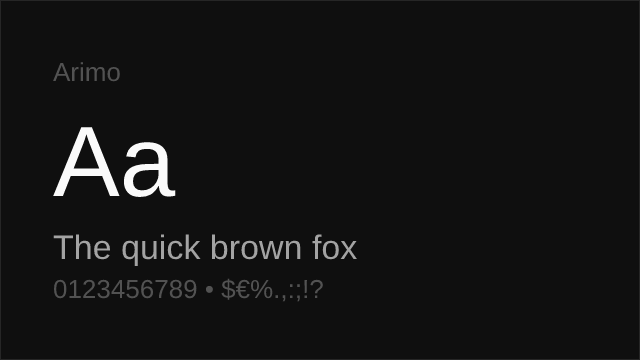
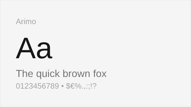
Metrically compatible with Arial — identical advance widths, so layouts do not reflow.
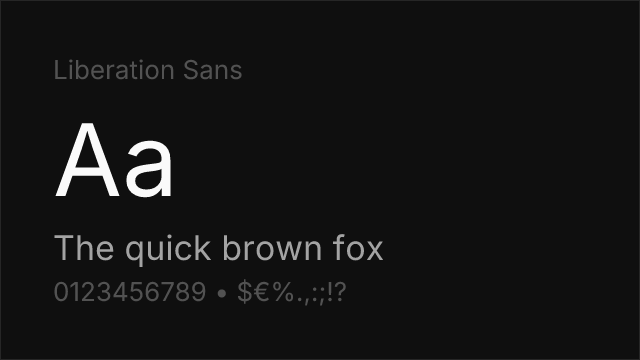
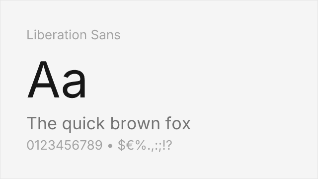
Also metrically compatible with Arial; ships on most Linux systems and with LibreOffice.
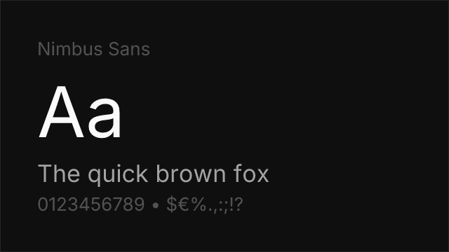
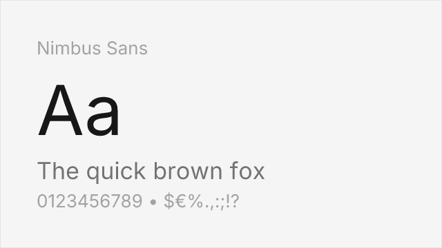
URW's Helvetica-metric clone; Arial shares Helvetica's widths, so it fits closely.
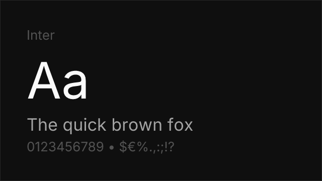
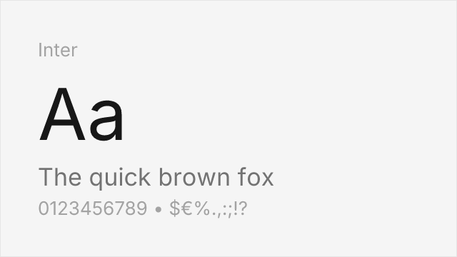
Screen-first neo-grotesque with a much wider weight range and true variable axes.
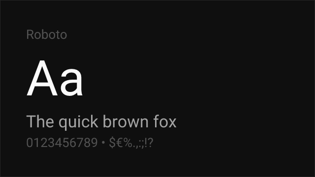
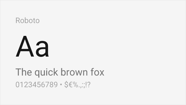
Android's system sans; neo-grotesque skeleton with slightly condensed proportions.
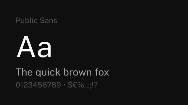
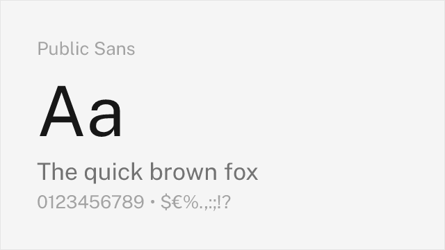
US government design system sans, drawn for accessibility and long-form legibility.
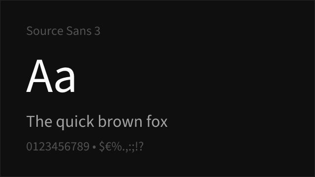

Adobe's open-source UI sans; humanist warmth over Arial's neutrality.
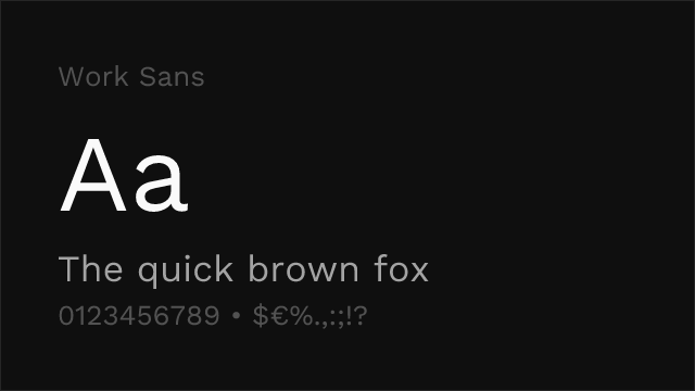

Optimised for mid-size screen text; more character than Arial at display sizes.
See where Arial is used in the wild and swap to free alternatives live.
Install FontSwap →Replacement Summary
Source: FontAlternatives.com
Premium font: Arial
Best free alternative: Arimo
FontAlternatives similarity score: 95%
Replacement difficulty: Low
Best for: documents, corporate, web, ui
Notable users: Microsoft, Apple, Adobe
Not recommended when: Full weight range is critical - some weights require approximation
What is the best free alternative to Arial?
Arimo is the best free alternative to Arial with a FontAlternatives similarity score of 95%.
Arimo shares similar proportions, stroke characteristics, and intended use with Arial. It is available under the OFL-1.1 license, which permits both personal and commercial use at no cost.
This alternative works particularly well for: documents, corporate, web, ui.
Can I safely replace Arial with Arimo?
Yes, Arimo is a high-confidence replacement for Arial. The FontAlternatives similarity score of 95% indicates strong structural compatibility.
Licensing: Arimo is licensed under OFL-1.1, which allows commercial use without licensing fees or royalties.
Weight coverage: Some weights require approximation. See the weight-matching guide below for details.
When should I NOT replace Arial?
While Arimo is a strong alternative, there are situations where replacing Arial may not be appropriate:
- Full weight range needed: Some Arial weights require approximation in Arimo.
- Strict compliance: Verify that OFL-1.1 terms meet your specific legal and compliance requirements.
Weight-Matching Guide
Map Arial weights to their closest free alternatives for accurate font substitution.
Arimo
| Arial | Arimo | Match |
|---|---|---|
| Light (300) | Regular (400) | substitute |
| Regular (400) | Regular (400) | exact |
| Bold (700) | Bold (700) | exact |
| Black (900) | Bold (700) | substitute |
Liberation Sans
| Arial | Liberation Sans | Match |
|---|---|---|
| Light (300) | Regular (400) | substitute |
| Regular (400) | Regular (400) | exact |
| Bold (700) | Bold (700) | exact |
| Black (900) | Bold (700) | substitute |
Nimbus Sans
| Arial | Nimbus Sans | Match |
|---|---|---|
| Light (300) | Regular (400) | substitute |
| Regular (400) | Regular (400) | exact |
| Bold (700) | Bold (700) | exact |
| Black (900) | Bold (700) | substitute |
Inter
| Arial | Inter | Match |
|---|---|---|
| Light (300) | Light (300) | exact |
| Regular (400) | Regular (400) | exact |
| Bold (700) | Bold (700) | exact |
| Black (900) | Black (900) | exact |
Roboto
| Arial | Roboto | Match |
|---|---|---|
| Light (300) | Light (300) | exact |
| Regular (400) | Regular (400) | exact |
| Bold (700) | Bold (700) | exact |
| Black (900) | Black (900) | exact |
Public Sans
| Arial | Public Sans | Match |
|---|---|---|
| Light (300) | Light (300) | exact |
| Regular (400) | Regular (400) | exact |
| Bold (700) | Bold (700) | exact |
| Black (900) | Black (900) | exact |
Source Sans 3
| Arial | Source Sans 3 | Match |
|---|---|---|
| Light (300) | Light (300) | exact |
| Regular (400) | Regular (400) | exact |
| Bold (700) | Bold (700) | exact |
| Black (900) | Black (900) | exact |
Work Sans
| Arial | Work Sans | Match |
|---|---|---|
| Light (300) | Light (300) | exact |
| Regular (400) | Regular (400) | exact |
| Bold (700) | Bold (700) | exact |
| Black (900) | Black (900) | exact |
Performance Guide
Production performance metrics for each alternative.
How to Use Arimo
Copy these code snippets to quickly add Arimo to your project.
CSS code for Arimo
@import url('https://fonts.googleapis.com/css2?family=Arimo:wght@100..900&display=swap');HTML code for Arimo
<link rel="preconnect" href="https://fonts.googleapis.com">
<link rel="preconnect" href="https://fonts.gstatic.com" crossorigin>
<link href="https://fonts.googleapis.com/css2?family=Arimo:wght@100..900&display=swap" rel="stylesheet">
Tailwind code for Arimo
// tailwind.config.js
module.exports = {
  theme: {
    extend: {
      fontFamily: {
        'arimo': ['Arimo', 'sans-serif'],
      },
    },
  },
}

// Usage in HTML:
// <p class="font-arimo">Your text here</p>
Next.js code for Arimo
// Using next/font (Next.js 13+)
import { Arimo } from 'next/font/google';

const arimo = Arimo({
  subsets: ['latin'],
  weight: ['100', '200', '300', '400', '500', '600', '700', '800', '900'],
});

export default function Component() {
  return (
    <p className={arimo.className}>
      Your text here
    </p>
  );
}

// Or using inline styles with Google Fonts link:
// <p style={{ fontFamily: "'Arimo'" }}>Your text</p>
Expo and React Native code for Arimo
// Install: npx expo install @expo-google-fonts/arimo expo-font
import { useFonts, Arimo_400Regular } from '@expo-google-fonts/arimo';

export default function App() {
  const [fontsLoaded] = useFonts({
    Arimo_400Regular,
  });

  if (!fontsLoaded) return null;

  return (
    <Text style={{ fontFamily: 'Arimo_400Regular' }}>
      Your text here
    </Text>
  );
}
Recommended Font Pairings
These free fonts pair well with Arimo Arial for headlines, body text, or accent use.
Lora's moderate contrast and calligraphic roots give headings warmth that Arial's neutrality cannot supply on its own
Merriweather's large x-height and sturdy serifs hold up in long-form body text where Arial becomes monotonous
Newsreader brings editorial texture to pull quotes and standfirsts while staying legible next to a neutral sans
Browse Alternatives by Context
Find Arial alternatives filtered by specific use case, style, or language support.
Frequently Asked Questions
What is the best free alternative to Arial?
Arimo is the best free alternative to Arial with a FontAlternatives similarity score of 95%. It shares similar proportions and characteristics while being available under the OFL-1.1 license for both personal and commercial use at no cost.
Is there a free version of Arial?
There is no official free version of Arial. However, Arimo is available under the OFL-1.1 open-source license and achieves a FontAlternatives similarity score of 95%. It includes variable weights and supports latin, latin-extended.
What Google Font looks like Arial?
The Google Fonts most similar to Arial are Arimo, Inter, Roboto. Among these alternatives, Arimo offers the closest match with a FontAlternatives similarity score of 95% and includes variable weights for flexible typography options.
Can I use Arimo commercially?
Yes, Arimo can be used commercially. It is licensed under OFL-1.1, which allows free use in websites, applications, print materials, and commercial projects without purchasing a license or paying royalties.
Is Arimo similar enough to Arial?
Arimo achieves a FontAlternatives similarity score of 95% compared to Arial. While not identical, it offers comparable letterforms, proportions, and visual style. Most designers find it works excellently as a substitute in web and print projects.
What are the main differences between Arial and its free alternatives?
Free alternatives to Arial may differ in subtle details like letter spacing, curve refinements, and available weights. Premium fonts typically include more OpenType features, extended language support, and optimized screen rendering. However, for most projects, these differences are negligible.
Where can I download free alternatives to Arial?
Download Arimo directly from Google Fonts. Click the "Get Font" button on any alternative listed above to visit the official download page. Google Fonts also provides convenient embed codes for seamless web integration.