Free Alternatives to Cambria

About Cambria
- Foundry
- Microsoft
- Classification
- serif
- Style
- transitional
Brands Using Cambria
Bundled with Windows Vista onward and Office 2007+, and the default heading face in Office's early ClearType themes
Widely adopted in thesis and dissertation templates for its screen legibility and Cambria Math companion
Common in contract and report templates where a serif is expected but print fidelity matters
Frequent choice in public-sector style guides that specify a serif for formal correspondence
 See Cambria live on these sites with FontSwap →
Cambria is the serif you have read most often without choosing it. Microsoft shipped it with Windows Vista and Office 2007, and for the better part of two decades it has been the default serif in an enormous share of the world's documents, dissertations and contracts. It is proprietary, licensed through Ascender for end users and Monotype for printer manufacturers, and it has never shipped as a variable font. Almost nobody who uses Cambria has licensed it directly.
Replacing it turns out to be easy, because the design problem Cambria solved has been solved several more times since, in the open.
Why Cambria matters
Cambria was drawn by Jelle Bosma, with contributions from Steve Matteson and Robin Nicholas, as part of Microsoft's ClearType Font Collection — the set commissioned in the early 2000s to exploit sub-pixel rendering on LCD screens. Calibri, Candara, Consolas, Constantia, Corbel and Cambria all came from that programme, and all six shipped together.
The brief was unusual for a serif. Serifs are the part of a letterform that suffers most at low resolution: they are small, they are often horizontal, and on a 96-DPI screen they either disappear or turn into blurred smudges. Most screen serifs of the era responded by getting heavier everywhere. Cambria responded more precisely — and that precision is its actual contribution.
There is a second reason it matters, which is Cambria Math. Developed with Tiro Typeworks, it was among the first fonts to implement OpenType's mathematical typesetting extensions, drawing on TeX's conventions. It is why so many science and engineering theses are set in Cambria: the equations and the body text finally came from the same family.
Design characteristics
Cambria is a transitional serif with a distinctly engineered feel. Its defining decisions are all legibility trades:
- Vertical and diagonal serifs are strong; horizontal serifs are small. This is the core idea. Vertical stems survive pixel-grid snapping well, so Cambria puts its weight there and keeps horizontals slight, where they would otherwise blur.
- Low stroke contrast. There are no true hairlines to lose at small sizes.
- Somewhat condensed proportions, which is why Cambria fits more words per line than most serifs of similar x-height — a quiet advantage in long documents.
- A large x-height relative to cap height, keeping lowercase legible when the whole page is set at 11pt.
- Square full stops and punctuation. An oddity worth knowing, and the fastest way to identify Cambria in a specimen.
- Both lining and text figures, which is more than most system serifs offer.
The overall effect is sturdy rather than elegant. Cambria is not trying to look like a book; it is trying to remain readable on a bad monitor, and it succeeds.
Where Cambria excels
Long documents read on screen. This is the case it was built for and it still holds up — reports, papers, theses, contracts, anything that runs to many pages and will be read in a window rather than on paper. The condensed proportions help here too, since more words fit per line without reducing size.
Mathematical and scientific typesetting, via Cambria Math. If a document mixes prose and equations, the case for Cambria is stronger than for any alternative on this page, because no free serif ships an equivalent OpenType math companion.
Mixed-script institutional work. The Cyrillic and Greek coverage is drawn to the same standard as the Latin, which is not true of every system serif.
And print, despite the screen brief. The features that make Cambria survive rasterisation — sturdy serifs, low contrast — cost it nothing on paper. It prints cleanly at small sizes.
Where Cambria struggles
Two weights. Regular and Bold, with italics, and that is the entire family. Building hierarchy in a long document from two weights forces you to lean on size, spacing and capitalisation, which is why Cambria-set reports so often look flat. Every alternative on this page except Merriweather offers a variable axis.
Display sizes. The engineering that makes Cambria robust at 11pt makes it dull at 40pt — the strong verticals and clipped horizontals read as stiff, and there is no optical display cut to switch to. It is a text face with no headline ambitions.
Character rather than the absence of it. Cambria is competent and anonymous, which is fine for a contract and limiting for anything with a voice. It also carries a specific association: to anyone who notices type, a document in Cambria reads as a document produced in Microsoft Office, which may or may not be the signal you want.
And the licensing is the usual system-font trap. Having Cambria installed via Office is not a licence to self-host it as a webfont or embed it in a product.
How to choose a free substitute
1. Is it long-form reading on a screen? Literata. Same brief, better execution, full variable axis. This is the default answer and it is right most of the time.
2. Does it need to survive genuinely small sizes or poor rendering? Merriweather. The largest x-height and sturdiest serifs of anything here. Accept that it runs wider and your line counts will change.
3. Is it going on the web, and should it look designed? Spectral. Seven weights, a real cursive italic, and a more refined drawing than Cambria ever had.
4. Do you need serious weight range for hierarchy? Source Serif Pro or Literata — both variable across 200-900.
5. Is the document multilingual? Noto Serif, for coverage consistency across scripts.
6. Was the Cambria just the template default? Then treat this as an upgrade. Crimson Pro will make the document look like a book rather than a memo.
One caveat that applies to all of them: none replaces Cambria Math. If your document contains equations set in the Cambria Math OpenType font, changing the body face will leave the maths mismatched. For LaTeX-adjacent work the usual answer is to move the whole document to a TeX serif rather than substitute piecemeal.
Cambria in practice: migrating a document set
Replacing Cambria across an organisation's templates is a different job from picking a font for one page, and it fails in predictable ways.
Page counts move. None of the alternatives here shares Cambria's metrics, and Cambria is comparatively condensed, so most substitutes will lengthen a document. Merriweather is the worst offender — expect a long report to gain pages. If contracts, tenders or submissions have page limits, test the longest real document you have before committing, not a sample paragraph.
Styles break before fonts do. Most Office templates specify Cambria for headings and Calibri for body, a pairing inherited from the Office 2007 default theme. Swapping only the serif leaves you with a mismatched pair. Decide the whole pairing at once — the pairsWith suggestions on this page assume Cambria is carrying body text, which is often not how it is actually used.
Two weights hid a problem you are about to inherit. Because Cambria only ships Regular and Bold, existing templates express hierarchy through size and spacing. Move to a variable face with nine weights and the old size jumps will look crude next to the new weight options. Budget time to redo the hierarchy rather than only swapping the family name.
Equations do not migrate. Worth repeating: if any document in the set uses Cambria Math, the equations are set in a separate OpenType math font with no free equivalent. Changing body text alone will leave a visible mismatch between prose and formulae. Documents with heavy mathematics should be considered separately from the rest of the migration.
Check where the font is actually resolved. A stylesheet or template that names Cambria will silently fall back on any machine without it — most Linux systems, many Macs. Users may already be reading something other than Cambria without knowing. Auditing what renders in practice often changes the urgency of the whole project.
The practical sequence that works: pick the replacement, rebuild one representative document end to end, compare page count and hierarchy against the original, and only then roll the change into the template library.
Premium Font Neighbors
If you want the rest of the ClearType family or its system-serif siblings, Georgia is the obvious neighbour — Matthew Carter's earlier screen serif, warmer and rounder than Cambria and still arguably the better read at small sizes. Calibri is the sans from the same commission, and Times New Roman and Verdana complete the set of serifs and sans that show up in the same template libraries. Palatino is the humanist alternative that Microsoft's own Book Antiqua descends from.
If you want a text serif with more craft, Minion Pro and Utopia are the Adobe workhorses drawn for exactly this kind of document, Baskerville is the transitional face Cambria's classification points back to, and Freight Text and Tiempos are the contemporary options — both drawn for reading, both with the weight range Cambria lacks.
FAQ
Is Cambria free? No. Cambria is proprietary, licensed by Ascender Corporation for end users and device manufacturers and by Monotype Imaging to printer manufacturers. It ships bundled with Windows Vista and later and with Office 2007 and later, so most people have it installed — but installed is not licensed. You cannot self-host it as a webfont or embed it in an application.
What is the closest free alternative to Cambria? Literata. It was drawn for the same problem — a serif that stays readable in long-form screen reading — and executes it with a variable 200-900 weight axis where Cambria offers only Regular and Bold. Merriweather is the alternative if small-size robustness matters more than range.
Can I use Cambria on a website? Only by naming it in a CSS font stack and hoping visitors have it locally, which many Windows users will. You cannot serve the font files yourself without a licence. Since Cambria is not on Google Fonts or any open webfont host, a reliable web deployment means picking one of the open alternatives here.
Is Cambria a good font for academic writing? Yes, and it is popular in thesis templates for two solid reasons: it holds legibility at the small sizes and tight leading that page limits force, and Cambria Math gives equations that match the body text. If your discipline involves heavy mathematics, that second reason is difficult to replace.
Does Cambria have a variable font version? No. The family is Regular, Bold, Italic and Bold Italic — four static styles. There is no weight axis and no optical size axis. Literata, Source Serif Pro, Noto Serif, Bitter and Crimson Pro all offer variable axes if that is a requirement.
What is the difference between Cambria and Georgia? Both are screen-first serifs, but Georgia came first (1993, Matthew Carter) and is the warmer, rounder design, with true text figures that sit below cap height by default. Cambria is more condensed and more overtly engineered — stronger vertical serifs, smaller horizontal ones, square punctuation. Georgia generally reads better at very small sizes; Cambria fits more words per line and has the maths companion.
Why do so many theses and dissertations specify Cambria? Three reasons compound. It holds legibility at the small sizes and tight leading that page limits force; Cambria Math means equations and prose finally came from one family, which no free serif matches; and it was simply present on every university-managed Windows machine from 2007 onward, so template authors could specify it knowing it would render. The third reason is probably the largest, and it is the one that no longer holds — students increasingly work on machines where Cambria is absent and the template silently falls back to something else.
Is Cambria the same as Constantia? No, though they are siblings from the same commission. Both shipped in Microsoft's ClearType Font Collection, and both are serifs drawn for screen reading. Constantia, by John Hudson, is the warmer and more calligraphic of the two, with old-style figures by default and a more traditional book feel. Cambria is more condensed and more overtly engineered. Constantia is the better read in print; Cambria fits more text per line and is the sturdier performer at small sizes.
Will switching from Cambria change my page count? Almost certainly, yes. None of these alternatives is metrically compatible with Cambria — that is a property only Arimo and Liberation Sans offer, and only against Arial. Merriweather in particular runs wider and will lengthen documents noticeably. If a fixed page count matters, test before committing, and consider adjusting the measure or size rather than expecting a drop-in.
Is Cambria on Google Fonts?
No, Cambria is a premium font from Microsoft and is not available on Google Fonts.
The closest Google Fonts alternative is Literata with 86% similarity. Get it free on Google Fonts ↗
Free Alternatives (7)
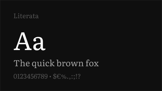
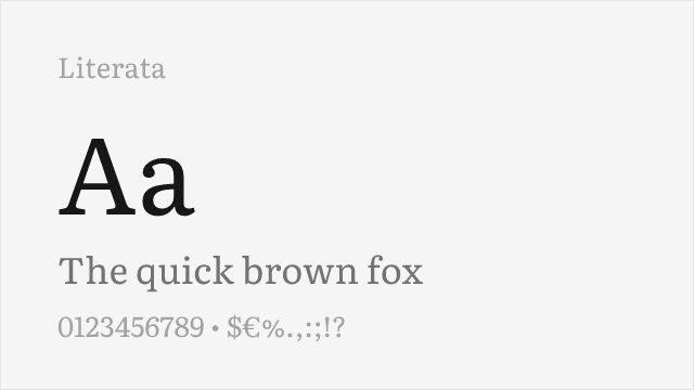
Screen-first reading serif with a variable 200-900 axis; the closest match in brief and build.
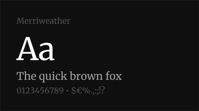
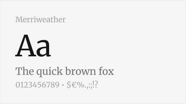
Large x-height and sturdy serifs; drawn explicitly for screen legibility.
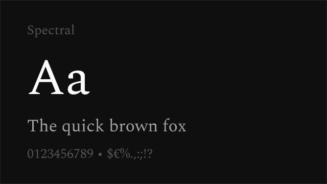
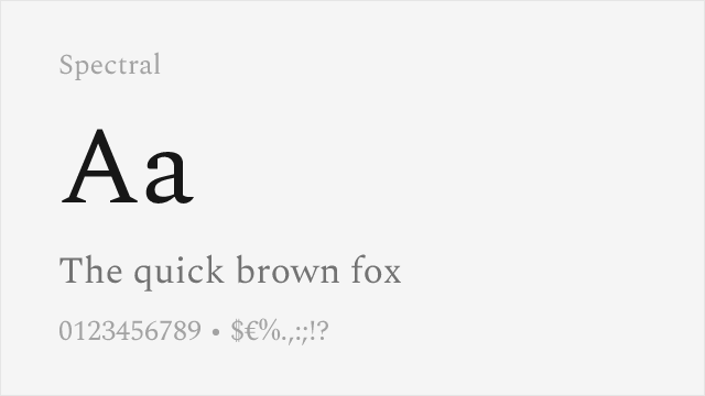
Production Type's screen-reading serif; seven weights each with a true cursive italic.
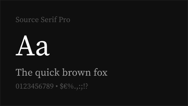
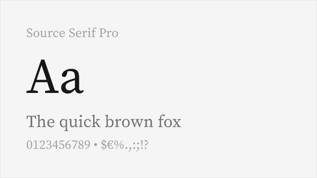
Adobe's open-source text serif, variable across 200-900.
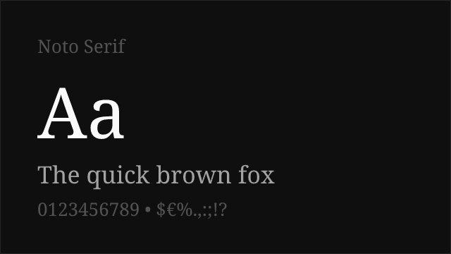
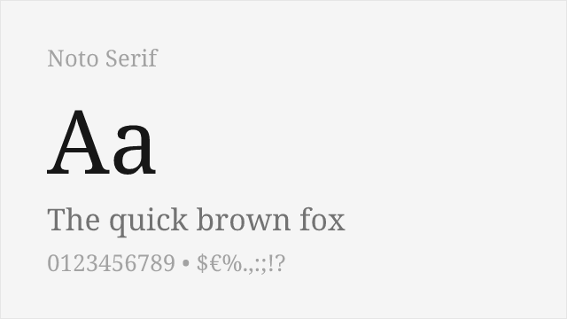
Google's workhorse serif with a variable 100-900 axis and enormous script coverage.
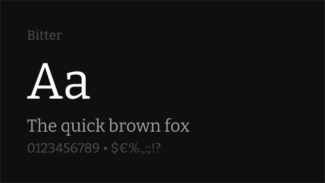
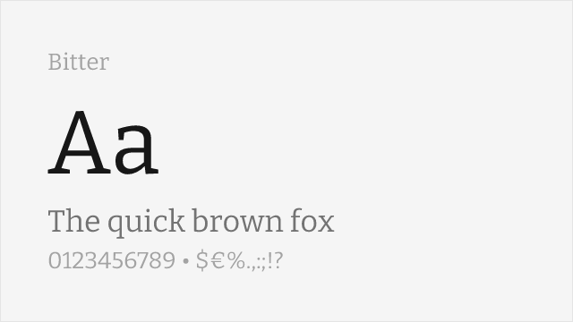
Contemporary slab with a variable 100-900 axis, drawn for screens.

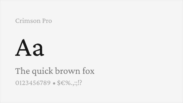
Old-style book serif; warmer and more traditional than Cambria.
See where Cambria is used in the wild and swap to free alternatives live.
Install FontSwap →Replacement Summary
Source: FontAlternatives.com
Premium font: Cambria
Best free alternative: Literata
FontAlternatives similarity score: 86%
Replacement difficulty: Low
Best for: documents, academic, publishing, web
Notable users: Microsoft, Academic publishers, Legal and professional services
Not recommended when: Brand consistency with Microsoft requires exact letterforms
What is the best free alternative to Cambria?
Literata is the best free alternative to Cambria with a FontAlternatives similarity score of 86%.
Literata shares similar proportions, stroke characteristics, and intended use with Cambria. It is available under the OFL-1.1 license, which permits both personal and commercial use at no cost.
This alternative works particularly well for: documents, academic, publishing, web.
Can I safely replace Cambria with Literata?
Yes, Literata is a high-confidence replacement for Cambria. The FontAlternatives similarity score of 86% indicates strong structural compatibility.
Licensing: Literata is licensed under OFL-1.1, which allows commercial use without licensing fees or royalties.
Weight coverage: All 2 weights have exact matches available.
When should I NOT replace Cambria?
While Literata is a strong alternative, there are situations where replacing Cambria may not be appropriate:
- Strict compliance: Verify that OFL-1.1 terms meet your specific legal and compliance requirements.
Weight-Matching Guide
Map Cambria weights to their closest free alternatives for accurate font substitution.
Literata
| Cambria | Literata | Match |
|---|---|---|
| Regular (400) | Regular (400) | exact |
| Bold (700) | Bold (700) | exact |
Merriweather
| Cambria | Merriweather | Match |
|---|---|---|
| Regular (400) | Regular (400) | exact |
| Bold (700) | Bold (700) | exact |
Spectral
| Cambria | Spectral | Match |
|---|---|---|
| Regular (400) | Regular (400) | exact |
| Bold (700) | Bold (700) | exact |
Source Serif Pro
| Cambria | Source Serif Pro | Match |
|---|---|---|
| Regular (400) | Regular (400) | exact |
| Bold (700) | Bold (700) | exact |
Noto Serif
| Cambria | Noto Serif | Match |
|---|---|---|
| Regular (400) | Regular (400) | exact |
| Bold (700) | Bold (700) | exact |
Bitter
| Cambria | Bitter | Match |
|---|---|---|
| Regular (400) | Regular (400) | exact |
| Bold (700) | Bold (700) | exact |
Crimson Pro
| Cambria | Crimson Pro | Match |
|---|---|---|
| Regular (400) | Regular (400) | exact |
| Bold (700) | Bold (700) | exact |
Performance Guide
Production performance metrics for each alternative.
How to Use Literata
Copy these code snippets to quickly add Literata to your project.
CSS code for Literata
@import url('https://fonts.googleapis.com/css2?family=Literata:wght@100..900&display=swap');HTML code for Literata
<link rel="preconnect" href="https://fonts.googleapis.com">
<link rel="preconnect" href="https://fonts.gstatic.com" crossorigin>
<link href="https://fonts.googleapis.com/css2?family=Literata:wght@100..900&display=swap" rel="stylesheet">
Tailwind code for Literata
// tailwind.config.js
module.exports = {
  theme: {
    extend: {
      fontFamily: {
        'literata': ['Literata', 'sans-serif'],
      },
    },
  },
}

// Usage in HTML:
// <p class="font-literata">Your text here</p>
Next.js code for Literata
// Using next/font (Next.js 13+)
import { Literata } from 'next/font/google';

const literata = Literata({
  subsets: ['latin'],
  weight: ['100', '200', '300', '400', '500', '600', '700', '800', '900'],
});

export default function Component() {
  return (
    <p className={literata.className}>
      Your text here
    </p>
  );
}

// Or using inline styles with Google Fonts link:
// <p style={{ fontFamily: "'Literata'" }}>Your text</p>
Expo and React Native code for Literata
// Install: npx expo install @expo-google-fonts/literata expo-font
import { useFonts, Literata_400Regular } from '@expo-google-fonts/literata';

export default function App() {
  const [fontsLoaded] = useFonts({
    Literata_400Regular,
  });

  if (!fontsLoaded) return null;

  return (
    <Text style={{ fontFamily: 'Literata_400Regular' }}>
      Your text here
    </Text>
  );
}
Recommended Font Pairings
These free fonts pair well with Literata Cambria for headlines, body text, or accent use.
Inter's neutral grotesque headings give Cambria's sturdy body text a clean structural counterpoint
Public Sans handles captions, tables and UI labels with the character disambiguation Cambria's numerals lack
Source Sans 3 shares Cambria's institutional register while adding a humanist warmth in supporting text
Browse Alternatives by Context
Find Cambria alternatives filtered by specific use case, style, or language support.
Frequently Asked Questions
What is the best free alternative to Cambria?
Literata is the best free alternative to Cambria with a FontAlternatives similarity score of 86%. It shares similar proportions and characteristics while being available under the OFL-1.1 license for both personal and commercial use at no cost.
Is there a free version of Cambria?
There is no official free version of Cambria. However, Literata is available under the OFL-1.1 open-source license and achieves a FontAlternatives similarity score of 86%. It includes variable weights and supports latin, latin-extended.
What Google Font looks like Cambria?
The Google Fonts most similar to Cambria are Literata, Merriweather, Spectral. Among these alternatives, Literata offers the closest match with a FontAlternatives similarity score of 86% and includes variable weights for flexible typography options.
Can I use Literata commercially?
Yes, Literata can be used commercially. It is licensed under OFL-1.1, which allows free use in websites, applications, print materials, and commercial projects without purchasing a license or paying royalties.
Is Literata similar enough to Cambria?
Literata achieves a FontAlternatives similarity score of 86% compared to Cambria. While not identical, it offers comparable letterforms, proportions, and visual style. Most designers find it works excellently as a substitute in web and print projects.
What are the main differences between Cambria and its free alternatives?
Free alternatives to Cambria may differ in subtle details like letter spacing, curve refinements, and available weights. Premium fonts typically include more OpenType features, extended language support, and optimized screen rendering. However, for most projects, these differences are negligible.
Where can I download free alternatives to Cambria?
Download Literata directly from Google Fonts. Click the "Get Font" button on any alternative listed above to visit the official download page. Google Fonts also provides convenient embed codes for seamless web integration.