Free Alternatives to Edgar

About Edgar
- Foundry
- Frere-Jones Type
- Classification
- serif
- Style
- oldstyle
Brands Using Edgar
Oldstyle text serif designed for extended reading, described as Mallory's serif sibling
Long-form book typography requiring sustained reading comfort and classical authority
Corporate communications and documents requiring authoritative, trustworthy serif typography
A sturdy text serif for books, journals, and considered editorial
 See Edgar live on these sites with FontSwap →
Edgar is an oldstyle text serif designed by Tobias Frere-Jones and Nina Stössinger, with contributions by Hrvoje Živčić and Fred Shallcrass, at Frere-Jones Type. Developed between 2014 and 2025, Edgar is described as the serif sibling of Mallory, Frere-Jones's humanist sans-serif. It is a book typeface designed specifically for extended reading, drawing on two foundational type models: the 18th-century work of English engraver William Caslon and the 19th-century designs of Scottish typographer Alexander Phemister.
Edgar requires a commercial license from Frere-Jones Type. It is available through frerejones.com. There is no free tier, no Google Fonts availability, and no trial version. If you need a similar old-style text serif for extended reading without the license cost, this page covers the best open-source alternatives.
Why Edgar Matters
The market for text serifs — typefaces designed primarily for comfortable reading at body sizes — has been dominated by a relatively small number of faces for decades. Minion, Sabon, Bembo, and Adobe Caslon set the standard for book and editorial typography. What these typefaces share is a lineage tracing back to the Renaissance and Enlightenment type traditions, filtered through 20th-century revivals and digital adaptations.
A text serif earns its keep in a way display type never has to. The reader is not meant to admire it. They are meant to forget it is there and keep moving down the page. That makes the category unusually demanding. The same shape has to work in the first line and the ten-thousandth, hold an even gray across a full column, and survive the ink spread of cheap paper or the coarse grid of a screen without drawing attention to any single letter. Small flaws that would pass unnoticed on a poster compound across a book, and the cost of getting it wrong is measured in reader fatigue rather than in one bad impression.
The best text serifs are the ones nobody remembers reading.
Edgar enters this lineage with a specific claim: it is designed by one of the most respected type designers working today, at a practice known for obsessive attention to legibility and letter-level refinement. Frere-Jones's track record — Interstate, Gotham, Whitney, Retina, Mallory — represents some of the most technically accomplished typefaces of the past 30 years. Edgar applies that same level of craft to the oldest challenge in type design: making a serif that is comfortable to read for hours.
The typeface was named after Frere-Jones's great-grandfather, Edgar Wallace, a prominent British journalist and prolific crime writer whose autobiography, "People," appeared in 1926. Tobias's full name — Tobias Edgar Mallory Jones — carries the Edgar name as well, making this a deeply personal project. The literary connection is fitting: Edgar was designed for the kind of sustained reading that novels, journalism, and long-form essay writing demand.
For anyone weighing a free substitute, that framing is the useful part. The question is not whether an open-source serif can look as refined as Edgar in a specimen. It is whether it holds the same composure across a long stretch of running text, and several free faces genuinely do. The alternatives below group around exactly that test: faithful old-style faces that share Edgar's Renaissance proportions, sturdier designs built to survive the screen, and warmer calligraphic serifs that trade a little neutrality for personality.
Design Characteristics
Edgar is built on old-style foundations with the technical precision of a 21st-century design practice:
- Caslon-Phemister hybrid: The underlying skeleton draws on William Caslon's 18th-century types (known for warmth and readability) and Alexander Phemister's 19th-century Old Style types (known for clarity and legibility). This produces a typeface that is warm without being soft.
- Text-first optimization: Every design decision in Edgar prioritizes performance at 9-14pt. Contrast is moderate enough to maintain evenness in long paragraphs. Serifs are sturdy enough to survive low-resolution rendering. Proportions are tuned for comfortable word recognition.
- Humanist warmth: Unlike the mechanical precision of transitional serifs, Edgar retains the organic character of hand-cut types. Curves are slightly asymmetric. Serifs have subtle bracketing. The overall texture has the lived-in quality of well-worn letterpress.
- Character differentiation: Following Frere-Jones's career-long emphasis on legibility, Edgar features clear differentiation between commonly confused characters. This is especially critical in text typography where misreading can disrupt comprehension.
- Mallory compatibility: As the serif complement to Mallory, Edgar shares proportional logic and design philosophy. The two families pair naturally for editorial projects needing both serif and sans-serif voices.
The overall aesthetic is classical with contemporary confidence. Edgar does not call attention to itself — it creates a comfortable reading environment and then stays out of the way.
These characteristics double as a checklist for judging a substitute. The old-style skeleton, with its diagonal stress, moderate contrast, and bracketed serifs, is what EB Garamond, Crimson Pro, and Cormorant Garamond reproduce most directly, since they descend from the same Renaissance models. The text-first tuning is where a screen-drawn face like Source Serif Pro or Merriweather pulls ahead, trading some historical character for sturdier rendering at small sizes. The humanist warmth, that slightly organic curve which keeps Edgar from feeling mechanical, is what Lora and Alegreya lean into hardest. No single free face carries all three qualities at once, so choosing well means deciding which of the three matters most for the page in front of you.
Where Edgar Excels
- Book typography: Edgar's primary purpose. Extended reading in fiction, non-fiction, essay collections, and literary journals.
- Long-form digital reading: Web articles, digital magazines, and reading applications where sustained reading comfort is critical.
- Academic and legal publishing: Scholarly journals, legal briefs, and institutional documents requiring authoritative serif typography.
- Editorial design: Magazine body text, feature articles, and long-form journalism where typography must support hours of reading.
- Cultural institution communications: Museums, libraries, and cultural organizations whose brand identity benefits from classical typographic authority.
The common thread across these is sustained reading at text sizes, where evenness matters more than flourish. That also makes each use case easy to map onto a free substitute. For printed books and journals, a faithful old-style face such as EB Garamond or Crimson Pro comes closest to Edgar's page color. For long-form reading that lives mostly on screens, a face drawn with rendering in mind, like Source Serif Pro or Merriweather, holds its shape better at small sizes. And for editorial work that wants a little more voice without giving up comfort, Lora and Alegreya sit comfortably between the two. The goal is not to hunt down a single best Edgar clone but to match the substitute to where the reading actually happens.
Where It Struggles
- Display and headline use: Edgar is designed for body text. At display sizes, its moderate contrast and text-optimized proportions lack the visual impact of high-contrast display serifs.
- Branding and logos: Edgar's strength is invisibility at text sizes. For brand identity work requiring a recognizable serif, a more distinctive family is needed.
- Screen-only projects with variable needs: Edgar is not a variable font. For web projects needing precise weight control through CSS, free variable serifs like Crimson Pro or Source Serif Pro offer more technical flexibility.
- Budget-constrained projects: For projects where the difference between Edgar and a good free text serif is not visible to the audience, EB Garamond or Crimson Pro deliver comparable reading quality at no cost.
Reading these limits in reverse is the fastest way to pick a substitute. If the job is display and headlines, skip the faithful text faces and reach for Cormorant Garamond, whose higher contrast was drawn for that scale. If the project needs programmatic weight control, the variable families such as Crimson Pro, Source Serif Pro, and EB Garamond solve what Edgar's static files cannot. And if the work lives entirely on screens at small sizes, Merriweather's sturdier construction will usually beat a more delicate old-style revival. Each of Edgar's weak spots points cleanly at the free face best equipped to cover it.
How to Choose a Free Substitute
When evaluating alternatives to Edgar, prioritize:
- Text color at 10-14pt: Set a full page of body text and evaluate the overall texture. Edgar's differentiation is in paragraph-level evenness, not glyph-level beauty.
- Reading comfort: Read a full article or chapter in the substitute font. Does it disappear? Can you focus on content rather than typography? This is Edgar's design goal.
- Old-style proportions: Edgar draws on pre-transitional models. Substitutes with transitional or modern construction (Source Serif Pro) will read differently. EB Garamond and Crimson Pro are closer in proportional logic.
- Italic quality: Edgar's italics are carefully designed companions, not afterthoughts. Verify your substitute's italics maintain the same warmth and readability.
- Weight coverage: Edgar offers a focused weight range for text use. Ensure your substitute covers at least Regular, Italic, Bold, and Bold Italic.
- Hinting for screen: If screen rendering is critical, Source Serif Pro's superior hinting may produce better results than more historically accurate alternatives like EB Garamond.
Once you have applied those tests, the choice usually resolves by destination rather than by which specimen looks prettiest:
- Faithful old-style page color → EB Garamond. The closest match to Edgar's Renaissance proportions and warm text color, and the right default when fidelity to the old-style tradition matters most.
- Old-style with a full variable range → Crimson Pro. Nearly as faithful, but with a continuous weight axis and extended features, so one family can carry both body text and semibold display.
- Reliable cross-platform rendering → Source Serif Pro. A transitional rather than old-style voice, but its optical sizing and hinting make it the safe pick when one file has to render cleanly on every device.
- Warm, contemporary reading on the web → Lora. Slightly calligraphic and comfortable at article length, with variable support that suits responsive layouts.
- Screen-first robustness → Merriweather. Built for displays, with a generous x-height and sturdy serifs that survive small sizes and low resolution better than delicate revivals.
- Editorial personality with book-grade features → Alegreya. Small caps, multiple figure styles, and calligraphic energy for text that wants character without sacrificing comfort.
- Display and headline contrast → Cormorant Garamond. The same old-style lineage pushed toward large sizes. Pair it with EB Garamond or Crimson Pro for body copy to cover Edgar's full range from one visual family.
A practical rule ties these together. Choose by proportion when you are matching Edgar's old-style character, which points to EB Garamond or Crimson Pro, and by medium when you are matching where the type will be read, which points to Source Serif Pro and Merriweather for screens or Lora and Alegreya for editorial warmth. A single project can legitimately use two, an old-style text face for the body and Cormorant Garamond for the headings, and land closer to Edgar's range than any one free family manages alone.
Premium Font Neighbors
If Edgar's approach appeals to you, these premium text serifs occupy adjacent territory:
Cluster A: Old-style text serifs for extended reading
- Adobe Caslon (Adobe) — Carol Twombly's revival of the Caslon originals that Edgar references
- Sabon (Linotype) — Jan Tschichold's Garamond interpretation, a 20th-century book typography standard
- Bembo (Monotype) — the Aldine model, one of the oldest and most influential text serif traditions
- Minion (Adobe) — Robert Slimbach's workhorse text serif with optical sizing
Cluster B: Contemporary text serifs with editorial focus
- Lyon Text (Commercial Type) — Kai Bernau's contemporary text serif with humanist warmth
- Freight Text (GarageFonts) — a text companion designed for extended reading
- Tiempos (Klim Type Foundry) — Kris Sowersby's elegant text serif with classical foundations
- Miller (Font Bureau) — Matthew Carter's Scotch Roman revival, a classic text serif from a tradition adjacent to Edgar's old-style roots
Exploring these neighbors helps clarify what you actually want from Edgar. If it is the specific old-style page color, the Caslon- and Garamond-derived faces in Cluster A are the reference points, and their free counterparts, EB Garamond and Crimson Pro, get remarkably close. If it is the contemporary editorial temperament, the Cluster B faces map more neatly onto Lora, Alegreya, and Source Serif Pro. Either way, the premium neighborhood is a map of the same trade-offs the free alternatives make, only at a different price.
All fonts listed above are premium/commercial typefaces requiring paid licenses.
FAQ
What is the best free alternative to Edgar?
EB Garamond is the closest free alternative at 82% similarity. It shares Edgar's old-style proportions, warm text color, and commitment to historical scholarship. For a more modern alternative with variable font support, Crimson Pro (79% similarity) is excellent.
Who designed Edgar?
Edgar was designed by Tobias Frere-Jones (full name: Tobias Edgar Mallory Jones) and Nina Stössinger, with contributions by Hrvoje Živčić and Fred Shallcrass, at Frere-Jones Type in New York; Stössinger led the italics. Development spanned from 2014 to 2025. Frere-Jones is known for typefaces including Interstate, Gotham, Whitney, and Mallory. Edgar supports over 70 Latin-script languages.
Why is it called Edgar?
Edgar is named after Tobias Frere-Jones's great-grandfather, Edgar Wallace, a prominent British journalist and crime writer. The literary connection is appropriate for a typeface designed for extended reading of exactly the kind of journalism and fiction that Wallace produced.
Is Edgar a variable font?
No. Edgar is available as static font files. For projects requiring variable font technology for text serifs, Crimson Pro, EB Garamond, and Source Serif Pro offer variable alternatives with comparable reading quality.
How does Edgar compare to Mallory?
Edgar is the serif sibling of Mallory, Frere-Jones's humanist sans-serif. Both share proportional logic and design philosophy. Edgar provides warm, classical text typography; Mallory provides clean, functional sans-serif. They are designed to pair naturally for editorial projects needing both serif and sans-serif voices within a coherent typographic system.
Is Edgar suitable for digital reading?
Yes. While Edgar was designed with book typography as its primary use case, it works well for digital long-form reading at appropriate sizes (14-18px on screen). For screen-heavy projects, Source Serif Pro's superior hinting may produce more consistent rendering across devices. For print and high-resolution screens, Edgar's refined details shine.
What is the difference between old-style and transitional serifs?
Old-style serifs (like Edgar, EB Garamond, Adobe Caslon) have diagonal stress, moderate contrast, and bracketed serifs inspired by Renaissance handwriting. Transitional serifs (like Source Serif Pro, Libre Baskerville) have vertical stress, higher contrast, and more refined serifs reflecting Enlightenment rationalism. Old-style serifs tend to feel warmer and more organic; transitional serifs feel crisper and more formal.
Should I match Edgar's style or its screen behavior?
It depends on where readers will meet the type. If the output is print or high-resolution, such as books, journals, and PDFs, match the style, and an old-style face like EB Garamond or Crimson Pro reproduces Edgar's proportions and page color most faithfully. If the output is everyday screens at small sizes, match the behavior instead: a face drawn for rendering, such as Source Serif Pro or Merriweather, holds its shape better than a delicate revival, even when it strays from Edgar's exact character. When a project spans both, it is reasonable to pick by the dominant medium and accept a small compromise on the other.
How many weights do I need to replace Edgar?
For most text work, four styles carry a design: Regular, Italic, Bold, and Bold Italic. That covers body copy, emphasis, and subheads without gaps. If the project also needs lighter display settings or fine typographic control, a variable family such as Crimson Pro, Source Serif Pro, or EB Garamond gives continuous weight adjustment from a single file, which is more flexible than Edgar's static set. Confirm that the substitute's italic is a genuine drawn italic rather than a slanted roman, because a weak italic is where cheaper families most often fall short in long-form reading.
Can one free font cover both Edgar's text and display needs?
Usually, but with a caveat. Text serifs and display serifs ask for opposite things: moderate contrast for evenness in paragraphs, higher contrast for drama in headlines. A variable family such as Crimson Pro can stretch across both roles reasonably well from a single design. If you want a sharper split, pair a faithful text face like EB Garamond or Crimson Pro for body copy with Cormorant Garamond for headings. Because they share the old-style lineage, the two read as one system while each does the job it was drawn for.
Is Edgar on Google Fonts?
No, Edgar is a premium font from Frere-Jones Type and is not available on Google Fonts.
The closest Google Fonts alternative is EB Garamond with 82% similarity. Get it free on Google Fonts ↗
Free Alternatives (7)
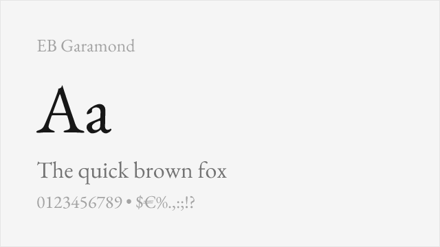
Scholarly revival of Claude Garamont's originals with meticulous historical accuracy
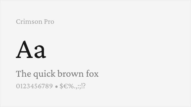
Renaissance-inspired text serif with variable weight and comprehensive features
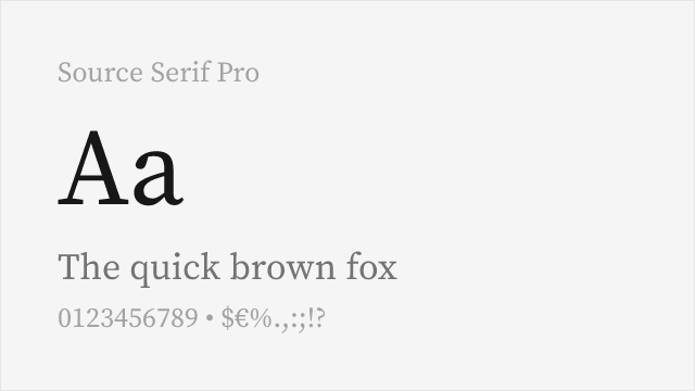
Adobe's transitional serif with optical sizing and reliable cross-platform rendering
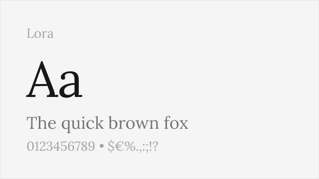
Calligraphy-influenced serif with variable support and warm reading character
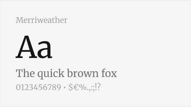
Screen-optimized serif with sturdy construction and excellent rendering
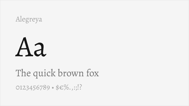
Calligraphic serif family with small caps, variable support, and dynamic character
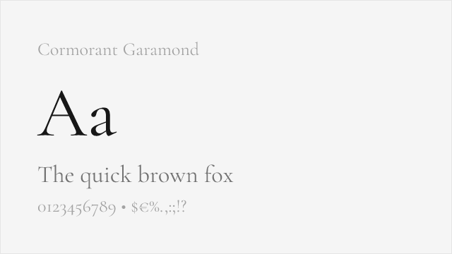
High-contrast display Garamond with dramatic presence and variable support
Compare the alternatives
See how Edgar compares to its top alternatives — and how those alternatives compare to each other — side by side.
See where Edgar is used in the wild and swap to free alternatives live.
Install FontSwap →Replacement Summary
Source: FontAlternatives.com
Premium font: Edgar
Best free alternative: EB Garamond
FontAlternatives similarity score: 82%
Replacement difficulty: Medium
Best for: scholarly and academic publishing, literary and cultural institutions, luxury print design, classical editorial aesthetics
Notable users: Frere-Jones Type, Book Publishers, Legal and Financial Institutions
Not recommended when: Full weight range is critical - some weights require approximation
What is the best free alternative to Edgar?
EB Garamond is the best free alternative to Edgar with a FontAlternatives similarity score of 82%.
EB Garamond shares similar proportions, stroke characteristics, and intended use with Edgar. It is available under the OFL-1.1 license, which permits both personal and commercial use at no cost.
This alternative works particularly well for: scholarly and academic publishing, literary and cultural institutions, luxury print design, classical editorial aesthetics.
Can I safely replace Edgar with EB Garamond?
Yes, with some considerations. EB Garamond achieves a FontAlternatives similarity score of 82%, indicating good structural compatibility for most use cases.
Licensing: EB Garamond is licensed under OFL-1.1, which allows commercial use without licensing fees or royalties.
Weight coverage: Some weights require approximation. See the weight-matching guide below for details.
When should I NOT replace Edgar?
While EB Garamond is a strong alternative, there are situations where replacing Edgar may not be appropriate:
- Optical precision requirements: EB Garamond has measurable structural differences from Edgar that may be visible in precise design work.
- Full weight range needed: Some Edgar weights require approximation in EB Garamond.
- Strict compliance: Verify that OFL-1.1 terms meet your specific legal and compliance requirements.
Weight-Matching Guide
Map Edgar weights to their closest free alternatives for accurate font substitution.
EB Garamond
| Edgar | EB Garamond | Match |
|---|---|---|
| Regular | Regular (400) | close |
| Medium | Medium (500) | close |
| Bold | Semi Bold (600) | substitute |
| Black | Extra Bold (800) | close |
Crimson Pro
| Edgar | Crimson Pro | Match |
|---|---|---|
| Light | Light (300) | close |
| Regular | Regular (400) | close |
| Medium | Medium (500) | close |
| Bold | Bold (700) | close |
Source Serif Pro
| Edgar | Source Serif Pro | Match |
|---|---|---|
| Light | Light (300) | close |
| Regular | Regular (400) | close |
| Medium | Semi Bold (600) | substitute |
| Bold | Bold (700) | close |
Lora
| Edgar | Lora | Match |
|---|---|---|
| Regular | Regular (400) | close |
| Medium | Medium (500) | close |
| Bold | Semi Bold (600) | substitute |
| Black | Bold (700) | substitute |
Merriweather
| Edgar | Merriweather | Match |
|---|---|---|
| Regular | Regular (400) | close |
| Bold | Bold (700) | close |
| Light | Light (300) | close |
| Black | Black (900) | close |
Alegreya
| Edgar | Alegreya | Match |
|---|---|---|
| Regular | Regular (400) | close |
| Medium | Medium (500) | close |
| Bold | Bold (700) | close |
| Black | Black (900) | close |
Cormorant Garamond
| Edgar | Cormorant Garamond | Match |
|---|---|---|
| Light | Light (300) | close |
| Regular | Regular (400) | close |
| Medium | Medium (500) | close |
| Bold | Bold (700) | close |
Performance Guide
Production performance metrics for each alternative.
How to Use EB Garamond
Copy these code snippets to quickly add EB Garamond to your project.
CSS code for EB Garamond
@import url('https://fonts.googleapis.com/css2?family=EB+Garamond:wght@100..900&display=swap');HTML code for EB Garamond
<link rel="preconnect" href="https://fonts.googleapis.com">
<link rel="preconnect" href="https://fonts.gstatic.com" crossorigin>
<link href="https://fonts.googleapis.com/css2?family=EB+Garamond:wght@100..900&display=swap" rel="stylesheet">
Tailwind code for EB Garamond
// tailwind.config.js
module.exports = {
  theme: {
    extend: {
      fontFamily: {
        'eb-garamond': ['"EB Garamond"', 'sans-serif'],
      },
    },
  },
}

// Usage in HTML:
// <p class="font-eb-garamond">Your text here</p>
Next.js code for EB Garamond
// Using next/font (Next.js 13+)
import { EB_Garamond } from 'next/font/google';

const eb_garamond = EB_Garamond({
  subsets: ['latin'],
  weight: ['100', '200', '300', '400', '500', '600', '700', '800', '900'],
});

export default function Component() {
  return (
    <p className={eb_garamond.className}>
      Your text here
    </p>
  );
}

// Or using inline styles with Google Fonts link:
// <p style={{ fontFamily: '"EB Garamond"' }}>Your text</p>
Expo and React Native code for EB Garamond
// Install: npx expo install @expo-google-fonts/eb-garamond expo-font
import { useFonts, EB_Garamond_400Regular } from '@expo-google-fonts/eb-garamond';

export default function App() {
  const [fontsLoaded] = useFonts({
    EB_Garamond_400Regular,
  });

  if (!fontsLoaded) return null;

  return (
    <Text style={{ fontFamily: 'EB_Garamond_400Regular' }}>
      Your text here
    </Text>
  );
}
Recommended Font Pairings
These free fonts pair well with EB Garamond Edgar for headlines, body text, or accent use.
Inter's clean neo-grotesk character provides excellent contrast with Edgar's warm old-style serif, creating a versatile pairing for editorial and brand systems that need both functional clarity and typographic warmth
Source Code Pro's monospace clarity pairs naturally with Edgar's editorial authority for technical publications, documentation, and academic content where body text and code coexist
IBM Plex Sans's rational corporate clarity creates structured contrast with Edgar's warm humanist forms, suitable for institutional communications and professional publications
Browse Alternatives by Context
Find Edgar alternatives filtered by specific use case, style, or language support.
By Use Case
By Script
Frequently Asked Questions
What is the best free alternative to Edgar?
EB Garamond is the best free alternative to Edgar with a FontAlternatives similarity score of 82%. It shares similar proportions and characteristics while being available under the OFL-1.1 license for both personal and commercial use at no cost.
Is there a free version of Edgar?
There is no official free version of Edgar. However, EB Garamond is available under the OFL-1.1 open-source license and achieves a FontAlternatives similarity score of 82%. It includes variable weights and supports latin, latin-extended.
What Google Font looks like Edgar?
The Google Fonts most similar to Edgar are EB Garamond, Crimson Pro, Source Serif Pro. Among these alternatives, EB Garamond offers the closest match with a FontAlternatives similarity score of 82% and includes variable weights for flexible typography options.
Can I use EB Garamond commercially?
Yes, EB Garamond can be used commercially. It is licensed under OFL-1.1, which allows free use in websites, applications, print materials, and commercial projects without purchasing a license or paying royalties.
Is EB Garamond similar enough to Edgar?
EB Garamond achieves a FontAlternatives similarity score of 82% compared to Edgar. While not identical, it offers comparable letterforms, proportions, and visual style. Most designers find it works excellently as a substitute in web and print projects.
What are the main differences between Edgar and its free alternatives?
Free alternatives to Edgar may differ in subtle details like letter spacing, curve refinements, and available weights. Premium fonts typically include more OpenType features, extended language support, and optimized screen rendering. However, for most projects, these differences are negligible.
Where can I download free alternatives to Edgar?
Download EB Garamond directly from Google Fonts. Click the "Get Font" button on any alternative listed above to visit the official download page. Google Fonts also provides convenient embed codes for seamless web integration.