Free Alternatives to Francesca

About Francesca
- Foundry
- 2D Typo
- Classification
- display
- Style
- decorative
Francesca is a decorative display typeface designed by Lukyan Turetskyy and published by 2D Typo, a type studio based in Lviv, Ukraine. What makes Francesca immediately recognizable is its ornamental treatment: small bead-like nodes appear at stroke junctions, terminals, and intersections throughout the letterforms, giving each character the quality of wrought ironwork or botanical illustration.
What Makes Francesca Distinctive
Most display serifs achieve elegance through contrast alone — the interplay of thick and thin strokes. Francesca goes further. Its defining feature is the tiny ornamental spheres that appear where strokes meet, branch, or terminate. These nodes transform what would otherwise be a conventional high-contrast serif into something closer to decorative metalwork or Art Nouveau lettering. The effect is subtle enough to read cleanly at headline sizes but distinctive enough to be instantly recognizable.
The underlying skeleton is a condensed, high-contrast serif with vertical stress. Thin strokes are extremely fine, almost hairline, while vertical stems carry moderate weight. Uppercase letters are tall and narrow, giving blocks of display text a stately, columnar rhythm. The condensed proportions make Francesca efficient in horizontal space — useful for packaging and narrow columns.
Design Details Worth Noting
- Ornamental nodes: Bead-like spheres at stroke junctions — the font's signature detail
- Extreme contrast: Very thin horizontals against weighted verticals
- Condensed proportions: Tall, narrow uppercase letters that stack efficiently
- Vertical stress: Classical axis that emphasizes formality
- Multilingual Cyrillic: Reflects the Ukrainian studio's commitment to non-Latin support
- Single weight: One carefully calibrated display weight
Where Francesca Excels
Francesca is purpose-built for contexts where typography carries the visual concept:
- Wine and spirits labels: The ornamental character suits premium beverage packaging, where a single word — the brand name — needs to communicate heritage, craft, and value
- Fashion editorials: Magazine covers and feature openers where the headline is the hero element
- Wedding and event stationery: Invitations, programs, and menus for occasions that demand decorative refinement
- Luxury branding: Boutique hotels, artisanal food brands, independent perfumeries — anywhere that handcraft signals quality
- Title sequences and poster design: Large-format applications where the ornamental nodes are fully visible
Pairing Strategy
Francesca's decorative intensity demands a quiet partner. Pair it with a low-contrast geometric or humanist sans-serif for body text — Inter, DM Sans, or Work Sans all recede enough to let Francesca command attention. Avoid pairing with other high-contrast or decorative typefaces; the resulting visual competition weakens both.
For a serif body companion, choose something with minimal personality: Source Serif Pro or Crimson Pro at regular weight. The goal is contrast in ornamentation level, not contrast in classification.
Limitations
Francesca is a single-weight display font. It has no bold, no italic, no text optical size. Below about 24px, the ornamental nodes become indistinct smudges rather than deliberate details. There is no variable font axis to adjust weight or ornamentation level. For projects requiring typographic hierarchy, you will need a separate typeface for subheadings and body text. The condensed proportions can also feel cramped in all-uppercase settings at narrow column widths — give the letters room to breathe.
About 2D Typo
2D Typo is a Ukrainian type studio that draws inspiration from history and Ukrainian visual culture. Their designers span generations and aesthetic preferences but share a commitment to typographic craft. Francesca exemplifies their approach: rooted in historical letterform traditions, but with a contemporary decorative vocabulary that feels fresh rather than revivalist.
Is Francesca on Google Fonts?
No, Francesca is a premium font from 2D Typo and is not available on Google Fonts.
The closest Google Fonts alternative is Playfair Display with 72% similarity. Get it free on Google Fonts ↗
Free Alternatives (4)


High-contrast display serif with similar editorial elegance and dramatic thick-thin transitions, though without Francesca's ornamental nodes
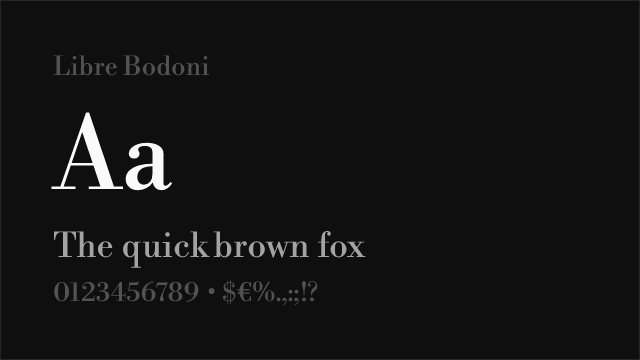
Classic Bodoni revival with comparable high contrast and vertical stress, offering a cleaner alternative for luxury contexts

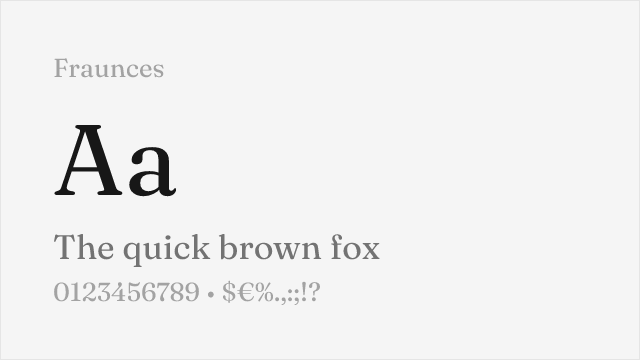
Expressive variable display serif with soft, organic character and optical size axis — the closest in personality if not in ornamental detail
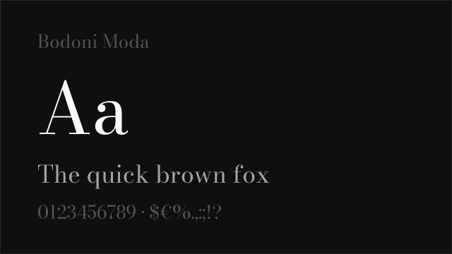
Google Fonts Bodoni revival with optical sizing and variable weight
See where Francesca is used in the wild and swap to free alternatives live.
Install FontSwap →Performance Guide
Production performance metrics for each alternative.
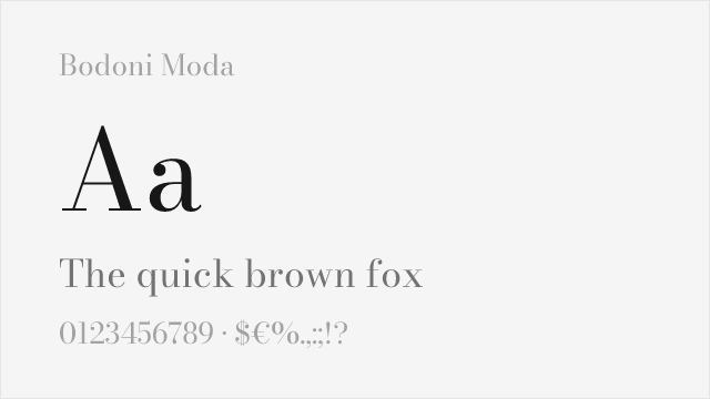
How to Use Playfair Display
Copy these code snippets to quickly add Playfair Display to your project.
CSS code for Playfair Display
@import url('https://fonts.googleapis.com/css2?family=Playfair+Display:wght@100..900&display=swap');HTML code for Playfair Display
<link rel="preconnect" href="https://fonts.googleapis.com">
<link rel="preconnect" href="https://fonts.gstatic.com" crossorigin>
<link href="https://fonts.googleapis.com/css2?family=Playfair+Display:wght@100..900&display=swap" rel="stylesheet">
Tailwind code for Playfair Display
// tailwind.config.js
module.exports = {
  theme: {
    extend: {
      fontFamily: {
        'playfair-display': ['"Playfair Display"', 'sans-serif'],
      },
    },
  },
}

// Usage in HTML:
// <p class="font-playfair-display">Your text here</p>
Next.js code for Playfair Display
// Using next/font (Next.js 13+)
import { Playfair_Display } from 'next/font/google';

const playfair_display = Playfair_Display({
  subsets: ['latin'],
  weight: ['100', '200', '300', '400', '500', '600', '700', '800', '900'],
});

export default function Component() {
  return (
    <p className={playfair_display.className}>
      Your text here
    </p>
  );
}

// Or using inline styles with Google Fonts link:
// <p style={{ fontFamily: '"Playfair Display"' }}>Your text</p>
Expo and React Native code for Playfair Display
// Install: npx expo install @expo-google-fonts/playfair-display expo-font
import { useFonts, Playfair_Display_400Regular } from '@expo-google-fonts/playfair-display';

export default function App() {
  const [fontsLoaded] = useFonts({
    Playfair_Display_400Regular,
  });

  if (!fontsLoaded) return null;

  return (
    <Text style={{ fontFamily: 'Playfair_Display_400Regular' }}>
      Your text here
    </Text>
  );
}
Recommended Font Pairings
These free fonts pair well with Playfair Display Francesca for headlines, body text, or accent use.
Browse Alternatives by Context
Find Francesca alternatives filtered by specific use case, style, or language support.
By Use Case
By Style
By Script
Frequently Asked Questions
What is the best free alternative to Francesca?
Playfair Display is the best free alternative to Francesca with a FontAlternatives similarity score of 72%. It shares similar proportions and characteristics while being available under the OFL-1.1 license for both personal and commercial use at no cost.
Is there a free version of Francesca?
There is no official free version of Francesca. However, Playfair Display is available under the OFL-1.1 open-source license and achieves a FontAlternatives similarity score of 72%. It includes variable weights and supports latin, latin-extended.
What Google Font looks like Francesca?
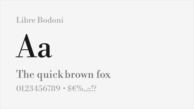
The Google Fonts most similar to Francesca are Playfair Display, Libre Bodoni, Fraunces. Among these alternatives, Playfair Display offers the closest match with a FontAlternatives similarity score of 72% and includes variable weights for flexible typography options.
Can I use Playfair Display commercially?
Yes, Playfair Display can be used commercially. It is licensed under OFL-1.1, which allows free use in websites, applications, print materials, and commercial projects without purchasing a license or paying royalties.
Is Playfair Display similar enough to Francesca?
Playfair Display achieves a FontAlternatives similarity score of 72% compared to Francesca. While not identical, it offers comparable letterforms, proportions, and visual style. Most designers find it works excellently as a substitute in web and print projects.
What are the main differences between Francesca and its free alternatives?
Free alternatives to Francesca may differ in subtle details like letter spacing, curve refinements, and available weights. Premium fonts typically include more OpenType features, extended language support, and optimized screen rendering. However, for most projects, these differences are negligible.
Where can I download free alternatives to Francesca?
Download Playfair Display directly from Google Fonts. Click the "Get Font" button on any alternative listed above to visit the official download page. Google Fonts also provides convenient embed codes for seamless web integration.