Free Alternatives to Monument Extended

About Monument Extended
- Foundry
- Pangram Pangram
- Classification
- display
- Style
- extended
Brands Using Monument Extended
Fashion and culture magazine headlines and editorial display
Editorial headlines and brand content across digital and print
Portfolio hero typography and project case study headers across the creative industry
Conference and event branding materials featuring extended display typography
Monument Extended is an ultra-wide geometric display typeface designed by Mathieu Desjardins and released by Pangram Pangram Foundry. It belongs to the broader Monument family — which includes Monument Grotesk (a standard-width neo-grotesque) — but Monument Extended is the face that made the family famous. Its dramatically widened proportions, geometric construction, and bold visual presence have made it one of the most recognizable display typefaces of the late 2010s and 2020s, appearing across creative studios, tech startups, fashion editorials, and social media with a frequency that reflects its cultural moment.
Monument Extended requires a paid license from Pangram Pangram. Licenses are available through pangram.co with desktop, web, and app options. There is no free trial or open-source version. If your budget cannot accommodate Pangram Pangram's licensing, this page covers the best open-source alternatives — though Monument Extended's ultra-wide proportions make it exceptionally hard to replace, as very few free fonts explore extended display territory.
Why Monument Extended Matters
Monument Extended emerged at a specific cultural inflection point in design. Around 2018-2020, the design world was experiencing a simultaneous reaction against several dominant trends: the minimal, thin-weight typography of mid-2010s tech companies, the ubiquitous neo-grotesques that made every startup look interchangeable, and the restraint of Swiss-influenced editorial design. Designers wanted something louder, bolder, and more visually aggressive — something that would stop thumbs mid-scroll and demand attention in an increasingly saturated visual landscape.
Monument Extended answered that need perfectly. Its ultra-wide letterforms take up physical space in a way that most typefaces cannot. Where a standard geometric sans like Futura or Montserrat occupies a modest horizontal footprint, Monument Extended's letters spread across the screen, forcing designers to use fewer words per line and creating the kind of sparse, impactful layouts that dominate contemporary creative portfolios and fashion editorials.
This spatial quality is central to understanding Monument Extended's appeal. When Atmos uses it for fashion editorial headlines, or when creative studios deploy it as hero typography on portfolio sites, the typeface's extended proportions transform headlines into visual events. A three-word headline in Monument Extended occupies the same space that an eight-word headline would in a standard sans-serif, creating implicit editorial hierarchy through width alone.
Pangram Pangram Foundry, based in Toronto, built its reputation on typefaces that serve the creative and tech design community with contemporary aesthetics at accessible price points. Monument Extended is their most successful release — a typeface that captures the visual language of contemporary design culture so precisely that it has become both a trend-defining face and, through its ubiquity, a target for designers seeking the next visual direction. That cycle of adoption, saturation, and renewal is itself a testament to Monument Extended's cultural impact.
Design Characteristics
Monument Extended's design is defined by its extreme horizontal proportions and geometric foundation:
- Ultra-wide proportions: The defining feature — letterforms are stretched dramatically wider than standard widths, creating a horizontal emphasis that dominates any layout and forces sparse, impactful headline composition
- Geometric construction: The underlying letterforms are built from geometric primitives — circular bowls, straight stems, uniform stroke width — creating a clean, precise aesthetic that aligns with contemporary design sensibilities
- Near-monoline stroke weight: Consistent stroke thickness across all letter elements eliminates contrast, producing a bold, graphic quality that reads as designed rather than calligraphic
- Squared terminals and junctions: Stroke endings and intersections are clean and squared, reinforcing the geometric precision and industrial character
- Compact vertical proportions: Despite the extreme horizontal extension, the vertical proportions are relatively compact, allowing Monument Extended headlines to occupy wide rectangles rather than tall blocks
- Simplified, reduced detail: Letterforms are stripped to essentials — no decorative elements, no calligraphic references, no historical ornamentation — creating a typeface that reads as pure visual signal
- Five weights from Light to Black: The weight range provides hierarchy within the extended framework, though most designers gravitate toward the Bold and Black weights for maximum display impact
Where Monument Extended Excels
Monument Extended is at its best in contexts that demand bold visual presence and contemporary credibility:
- Creative studio and portfolio hero typography: The primary use case — Monument Extended announces "creative professional" with its proportions alone, making it the default for portfolio sites and case study headers in the design industry
- Tech startup landing pages: The bold, geometric character aligns with the visual language of technology products, creating hero sections that project confidence and modernity
- Fashion and culture editorial: Magazine features and editorial content use Monument Extended for headlines that create visual impact and signal awareness of current design trends
- Social media and brand content: The extended proportions are optimized for the horizontal frames of Instagram posts, Twitter headers, and YouTube thumbnails, where wide type fills the frame effectively
- Event and conference branding: Design conferences, music festivals, and cultural events use Monument Extended for materials that need to project contemporary visual culture
Where Monument Extended Struggles
Monument Extended's extreme proportions create significant limitations:
- Body text of any kind: Monument Extended is a display-only typeface — the extreme width and geometric simplification make it illegible at text sizes and exhausting to read beyond a headline
- Narrow formats and layouts: The ultra-wide proportions require generous horizontal space. In narrow columns, mobile-first layouts, or any context with limited width, Monument Extended forces awkward breaks or requires uncomfortably small sizes
- Conservative or traditional brand contexts: The aggressively contemporary personality conflicts with the values of financial institutions, law firms, government agencies, and established luxury houses that prefer timeless over trendy
- Long headlines: Monument Extended works best with three to five words. Longer headlines become logistically difficult, requiring either tiny sizes or multiple line breaks that undermine the typeface's visual impact
- Projects with longevity requirements: Monument Extended is closely tied to a specific design moment (2018-2023). Projects requiring typography that will age gracefully may find its trendiness becomes dated
- Multilingual projects with complex scripts: Extended Latin coverage is adequate, but the font does not support Cyrillic, Greek, Arabic, or CJK scripts
How to Choose a Free Substitute
When evaluating Monument Extended alternatives, accept upfront that no free font matches its ultra-wide proportions. The extended display category is severely underserved in open-source type. Instead, focus on these criteria:
- Display impact at large sizes: Monument Extended's primary function is visual dominance. Test your alternative at 48-120px in a hero section or poster layout. If it does not command comparable attention, it is not serving the same purpose — even if the letterforms are similar
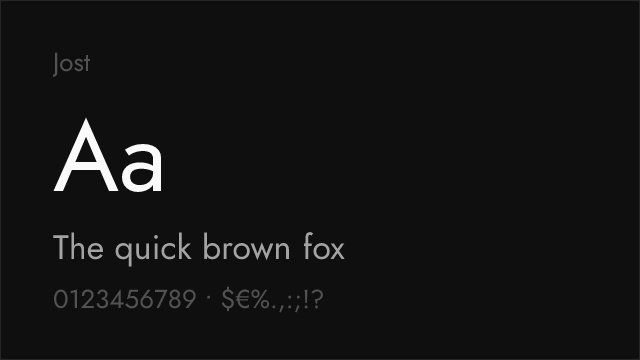
- Geometric construction: Monument Extended's appeal comes partly from its clean, geometric precision. Prioritize alternatives with geometric or neo-grotesque construction over humanist or calligraphic sans-serifs. Montserrat, Jost, and Raleway all share this geometric DNA
- Bold and Black weight quality: Most Monument Extended usage is in Bold or Black. Test your alternative's heaviest weights at display sizes — the letterforms should feel confident and impactful without becoming blobby or losing definition
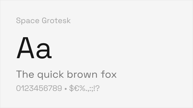
- Contemporary positioning: Monument Extended signals awareness of current design culture. Your alternative should convey "someone chose this deliberately for its contemporary character" rather than "this was the available option." Space Grotesk and Jost achieve this; generic sans-serifs do not
- Letterform simplification: Monument Extended reduces letters to their geometric essentials. Look for alternatives with similar reductiveness — clean, simplified forms without decorative or calligraphic elements
Premium Font Neighbors
If Monument Extended's extended display approach resonates but you want to explore adjacent options:
Cluster A: Ultra-wide and extended display faces
- Druk (Commercial Type) — Berton Hasebe's display family with Druk Wide providing extreme extended proportions; the most direct premium competitor to Monument Extended
- Neue Plak (Monotype) — includes extended widths in a comprehensive geometric system; more restrained than Monument Extended
- PP Neue Machina (Pangram Pangram) — from the same foundry; geometric display with a more technological, grid-based personality
Cluster B: Contemporary geometric display faces for creative contexts
- Monument Grotesk (Pangram Pangram) — the standard-width sibling; shares design DNA without the extended proportions
- Clash Display (Indian Type Foundry) — geometric display with aggressive personality; occupies similar creative studio territory
- Right Grotesk (Pangram Pangram) — another Pangram display face with contemporary creative positioning
- Soulcraft (Typotheque) — extended display with a more humanist, textured character than Monument Extended's geometric purity
- ITC Avant Garde (ITC) — the original geometric display face; historically significant precedent for Monument Extended's approach
FAQ
Is Monument Extended free?
No. Monument Extended is a premium typeface from Pangram Pangram Foundry, available through pangram.co. Desktop, web, and app licenses are priced separately. Some Pangram Pangram typefaces offer limited free trial versions, but the full Monument Extended family requires a paid license. For free alternatives, Montserrat (76% similarity) is the most practical replacement.
What is the best free alternative to Monument Extended?
Montserrat is the closest practical free alternative at 76% similarity. Both share geometric construction and confident display character, but Montserrat's proportions are significantly narrower than Monument Extended's ultra-wide letterforms. No free font replicates the extended proportions — the gap between standard-width geometric sans-serifs and Monument Extended's extreme width is the primary challenge in finding a substitute.
What makes Monument Extended's design unique?
The ultra-wide proportions are Monument Extended's signature. Where standard geometric sans-serifs like Futura or Montserrat maintain conventional letter widths, Monument Extended stretches its letterforms dramatically wider, creating a horizontal emphasis that transforms headlines into visual statements. This extreme extension, combined with geometric precision and monoline construction, produces a display typeface that occupies physical space in a way most fonts cannot.
Why is Monument Extended so popular with creative studios?
Monument Extended captures the visual language of contemporary creative culture: bold, confident, geometric, and unmistakably contemporary. Its extended proportions force sparse, impactful headlines that align with the minimalist-but-bold aesthetic dominant in creative portfolios. The typeface signals design awareness — using it communicates that the designer is engaged with current typographic trends. Pangram Pangram's accessible pricing and design-community marketing have also contributed to its widespread adoption.
Can I use Monument Extended on the web?
Yes, with a web font license from Pangram Pangram. Web licenses include WOFF2 files for self-hosting. Monument Extended is not available on Google Fonts or Adobe Fonts. Given the large file sizes of extended display fonts, consider subsetting to only the characters and weights you need for web performance.
Why is Monument Extended rated as "hard" to replace?
The extended display category is severely underserved in open-source type. While free geometric sans-serifs like Montserrat and Jost share Monument Extended's geometric construction, none match its ultra-wide proportions. This proportional gap is fundamental — it changes how headlines are composed, how much text fits per line, and how the typeface dominates a layout. Projects that specifically need extended proportions have no true free equivalent.
Is Monument Extended a variable font?
No. Monument Extended ships as static files in five weights (Light, Regular, Medium, Bold, Black) with matching italics. Most of its free alternatives (Montserrat, Raleway, Jost) are available as variable fonts, offering a web performance advantage.
What is the difference between Monument Extended and Monument Grotesk?
Monument Extended is the ultra-wide display variant with dramatically stretched proportions. Monument Grotesk is a standard-width neo-grotesque — a versatile, everyday sans-serif. They share the same geometric DNA and design philosophy but serve different functions: Monument Extended for display impact and Monument Grotesk for general-purpose typography.
Will Monument Extended look dated?
Monument Extended is closely associated with a specific design moment (approximately 2018-2023), when ultra-wide display type dominated creative portfolios, tech branding, and fashion editorials. Like any trend-defining typeface, it risks becoming visually associated with that period. For projects with a specific cultural window, this is an asset. For projects requiring timeless typography, it is a risk worth considering.
What fonts pair well with Monument Extended?
Monument Extended pairs best with clean, restrained sans-serifs that provide functional contrast without competing for attention. Inter, DM Sans, and Space Grotesk all complement Monument Extended's display drama with readable body text. Avoid pairing it with other display-forward typefaces — the combination creates visual competition. The contrast between Monument Extended's extreme display character and a quiet, functional body face is what makes the pairing work.
Is Monument Extended on Google Fonts?
No, Monument Extended is a premium font from Pangram Pangram and is not available on Google Fonts.
The closest Google Fonts alternative is Montserrat with 76% similarity. Get it free on Google Fonts ↗
Free Alternatives (8)


Closest geometric sans-serif with comparable weight range, though narrower proportions


Elegant geometric display sans with wide proportions and comprehensive weight range


Industrial grotesque with clean proportions and condensed/standard width variants

Futura-influenced geometric sans with clean display presence

Tech-forward geometric grotesque with distinctive character for digital display
Bold condensed display with maximum impact for headline-only applications
Condensed display sans with strong presence and variable weight support
See where Monument Extended is used in the wild and swap to free alternatives live.
Install FontSwap →Replacement Summary
Source: FontAlternatives.com
Premium font: Monument Extended
Best free alternative: Montserrat
FontAlternatives similarity score: 76%
Replacement difficulty: Medium
Best for: creative brand display typography, tech startup hero sections, editorial display with geometric character, versatile display hierarchies
Notable users: Atmos, Highsnobiety, Various creative studios
Not recommended when: Precise optical matching is needed - Montserrat has measurable structural differences
What is the best free alternative to Monument Extended?
Montserrat is the best free alternative to Monument Extended with a FontAlternatives similarity score of 76%.
Montserrat shares similar proportions, stroke characteristics, and intended use with Monument Extended. It is available under the OFL-1.1 license, which permits both personal and commercial use at no cost.
This alternative works particularly well for: creative brand display typography, tech startup hero sections, editorial display with geometric character, versatile display hierarchies.
Can I safely replace Monument Extended with Montserrat?
Yes, with some considerations. Montserrat achieves a FontAlternatives similarity score of 76%, indicating good structural compatibility for most use cases.
Licensing: Montserrat is licensed under OFL-1.1, which allows commercial use without licensing fees or royalties.
Weight coverage: Most weights have close or exact matches available.
When should I NOT replace Monument Extended?
While Montserrat is a strong alternative, there are situations where replacing Monument Extended may not be appropriate:
- Optical precision requirements: Montserrat has measurable structural differences from Monument Extended that may be visible in precise design work.
- Brand consistency: Monument Extended is commonly seen in Creative studio portfolio sites and case studies contexts where exact letterforms may be required.
- Strict compliance: Verify that OFL-1.1 terms meet your specific legal and compliance requirements.
Weight-Matching Guide
Map Monument Extended weights to their closest free alternatives for accurate font substitution.
Montserrat
| Monument Extended | Montserrat | Match |
|---|---|---|
| Light (300) | Light (300) | close |
| Regular (400) | Regular (400) | close |
| Bold (700) | Bold (700) | close |
| Black (900) | Black (900) | close |
Raleway
| Monument Extended | Raleway | Match |
|---|---|---|
| Thin (100) | Thin (100) | close |
| Regular (400) | Regular (400) | close |
| Bold (700) | Bold (700) | close |
| Black (900) | Black (900) | close |
Barlow
| Monument Extended | Barlow | Match |
|---|---|---|
| Light (300) | Light (300) | close |
| Regular (400) | Regular (400) | close |
| Semi Bold (600) | SemiBold (600) | close |
| Bold (700) | Bold (700) | close |
Jost
| Monument Extended | Jost | Match |
|---|---|---|
| Thin (100) | Thin (100) | close |
| Regular (400) | Regular (400) | close |
| Bold (700) | Bold (700) | close |
| Black (900) | Black (900) | close |
Space Grotesk
| Monument Extended | Space Grotesk | Match |
|---|---|---|
| Light (300) | Light (300) | close |
| Regular (400) | Regular (400) | close |
| Medium (500) | Medium (500) | close |
| Bold (700) | Bold (700) | close |
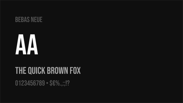
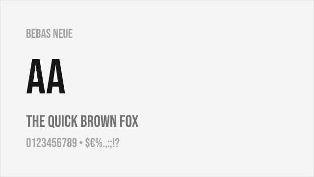
Bebas Neue
| Monument Extended | Bebas Neue | Match |
|---|---|---|
| Bold (700) | Regular (400) | substitute |
Oswald
| Monument Extended | Oswald | Match |
|---|---|---|
| Light (300) | Light (300) | substitute |
| Regular (400) | Regular (400) | substitute |
| Bold (700) | Bold (700) | substitute |
Performance Guide
Production performance metrics for each alternative.
How to Use Montserrat
Copy these code snippets to quickly add Montserrat to your project.
CSS code for Montserrat
@import url('https://fonts.googleapis.com/css2?family=Montserrat:wght@100..900&display=swap');HTML code for Montserrat
<link rel="preconnect" href="https://fonts.googleapis.com">
<link rel="preconnect" href="https://fonts.gstatic.com" crossorigin>
<link href="https://fonts.googleapis.com/css2?family=Montserrat:wght@100..900&display=swap" rel="stylesheet">
Tailwind code for Montserrat
// tailwind.config.js
module.exports = {
  theme: {
    extend: {
      fontFamily: {
        'montserrat': ['Montserrat', 'sans-serif'],
      },
    },
  },
}

// Usage in HTML:
// <p class="font-montserrat">Your text here</p>
Next.js code for Montserrat
// Using next/font (Next.js 13+)
import { Montserrat } from 'next/font/google';

const montserrat = Montserrat({
  subsets: ['latin'],
  weight: ['100', '200', '300', '400', '500', '600', '700', '800', '900'],
});

export default function Component() {
  return (
    <p className={montserrat.className}>
      Your text here
    </p>
  );
}

// Or using inline styles with Google Fonts link:
// <p style={{ fontFamily: "'Montserrat'" }}>Your text</p>
Expo and React Native code for Montserrat
// Install: npx expo install @expo-google-fonts/montserrat expo-font
import { useFonts, Montserrat_400Regular } from '@expo-google-fonts/montserrat';

export default function App() {
  const [fontsLoaded] = useFonts({
    Montserrat_400Regular,
  });

  if (!fontsLoaded) return null;

  return (
    <Text style={{ fontFamily: 'Montserrat_400Regular' }}>
      Your text here
    </Text>
  );
}
Recommended Font Pairings
These free fonts pair well with Montserrat Monument Extended for headlines, body text, or accent use.
Inter's rational neo-grotesque forms provide functional contrast beneath Monument Extended's dramatic extended headlines — a pairing that echoes the creative studio aesthetic of bold display type with clean, readable body text
Space Grotesk's tech-forward personality complements Monument Extended's contemporary display character, creating cohesive creative-tech layouts where both typefaces signal awareness of current design culture
DM Sans's clean geometric proportions provide an approachable counterpoint to Monument Extended's aggressive display character, balancing visual drama with interface usability in tech and creative contexts
Browse Alternatives by Context
Find Monument Extended alternatives filtered by specific use case, style, or language support.
By Use Case
By Script
Frequently Asked Questions
What is the best free alternative to Monument Extended?
Montserrat is the best free alternative to Monument Extended with a FontAlternatives similarity score of 76%. It shares similar proportions and characteristics while being available under the OFL-1.1 license for both personal and commercial use at no cost.
Is there a free version of Monument Extended?
There is no official free version of Monument Extended. However, Montserrat is available under the OFL-1.1 open-source license and achieves a FontAlternatives similarity score of 76%. It includes variable weights and supports latin, latin-extended.
What Google Font looks like Monument Extended?
The Google Fonts most similar to Monument Extended are Montserrat, Raleway, Barlow. Among these alternatives, Montserrat offers the closest match with a FontAlternatives similarity score of 76% and includes variable weights for flexible typography options.
Can I use Montserrat commercially?
Yes, Montserrat can be used commercially. It is licensed under OFL-1.1, which allows free use in websites, applications, print materials, and commercial projects without purchasing a license or paying royalties.
Is Montserrat similar enough to Monument Extended?
Montserrat achieves a FontAlternatives similarity score of 76% compared to Monument Extended. While not identical, it offers comparable letterforms, proportions, and visual style. Most designers find it works excellently as a substitute in web and print projects.
What are the main differences between Monument Extended and its free alternatives?
Free alternatives to Monument Extended may differ in subtle details like letter spacing, curve refinements, and available weights. Premium fonts typically include more OpenType features, extended language support, and optimized screen rendering. However, for most projects, these differences are negligible.
Where can I download free alternatives to Monument Extended?
Download Montserrat directly from Google Fonts. Click the "Get Font" button on any alternative listed above to visit the official download page. Google Fonts also provides convenient embed codes for seamless web integration.