 Install FontSwap
Web Optimized Fonts
Typefaces specifically engineered for screen rendering, with optimized hinting, clear pixel-grid alignment, and carefully tuned metrics for crisp display across devices and resolutions.
Web-optimized typefaces are engineered from the ground up for the demands of screen display. Unlike print-first designs adapted for digital use, these fonts treat the pixel grid, browser rendering engine, and variable display conditions as primary design constraints, producing letterforms that render crisply and consistently across the fragmented landscape of screens, operating systems, and browsers.
Technical Requirements
True web optimization involves multiple layers of engineering beyond letterform design. Hinting — instructions embedded in the font that guide how outlines snap to pixel boundaries — is the most critical. TrueType hinting (manual, per-glyph instructions) produces the crispest results on Windows ClearType rendering but is extraordinarily labor-intensive. PostScript-style hinting (stem width and alignment hints) is less precise but more portable. Modern approaches combine both, with additional adjustments for platform-specific rendering quirks. Metrics tuning ensures consistent line height, ascender/descender proportions, and sidebearings across browsers — a font that looks perfectly spaced in Chrome may show gaps in Safari without careful metric normalization. Character set completeness matters for global audiences: web-optimized fonts should include Latin Extended, Cyrillic, Greek, and ideally additional scripts to prevent fallback font substitution that breaks visual consistency.
Performance and File Optimization
Web font performance directly impacts page load time, Core Web Vitals scores, and user experience. The WOFF2 format (Web Open Font Format 2.0) achieves 30-50% better compression than WOFF1 and should be the primary delivery format, with WOFF1 as a fallback for legacy browsers. Subsetting — removing unused glyphs, languages, and OpenType features — can reduce file sizes dramatically: a full Unicode font might be 200KB, while a Latin-subset version could be 20KB. Variable fonts consolidate an entire weight family into a single file, often smaller than two or three static weight files combined. The font-display: swap CSS property prevents invisible text during font loading, and preload hints tell browsers to fetch fonts early. Responsible web typography balances visual quality against performance — every kilobyte of font data has a measurable cost in load time and energy consumption.
Design Principles for Screen
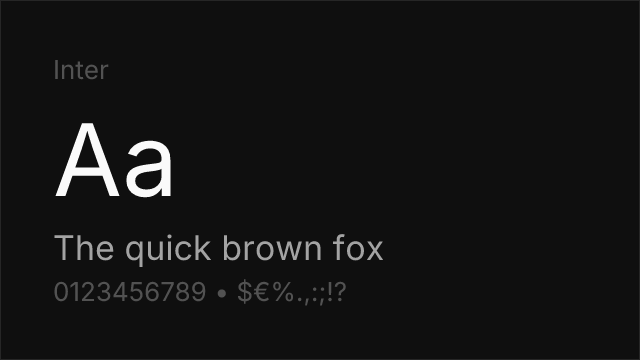
Web-optimized typefaces share several design characteristics that improve screen rendering. Generous x-heights ensure lowercase letters have enough pixel area to render clearly at common text sizes (14-18px). Open apertures prevent counters from closing under anti-aliasing. Consistent stroke weights avoid the rendering inconsistencies that high-contrast faces experience across different pixel densities. Slightly wider proportions than print equivalents compensate for the reduced resolution of screens compared to print. Some web-optimized designs include ink traps — small notches at stroke junctions that prevent dark spots when anti-aliasing blurs adjacent strokes together. Inter, Roboto, and Source Sans Pro exemplify these principles, each designed with screen rendering as the primary context rather than an afterthought.
When to Use
Web-optimized typefaces should be the default choice for any digital product, website, or application where text is rendered on screen. They are particularly important for body text at common reading sizes (14-20px), mobile interfaces where small text and variable display quality demand robust rendering, and design systems where consistent appearance across platforms is critical. For display sizes above 36px, the rendering advantages diminish and designers can choose from a broader range of typefaces, including those not specifically optimized for screen.
Premium Web Optimized Fonts


Free Web Optimized Fonts

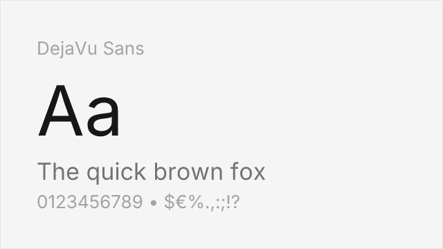
DejaVu Sans Free


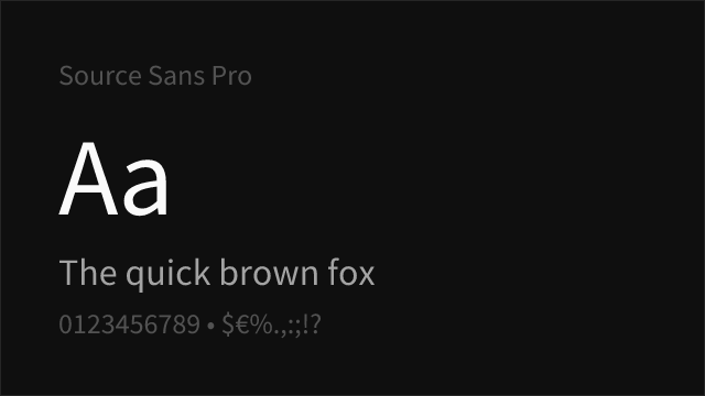
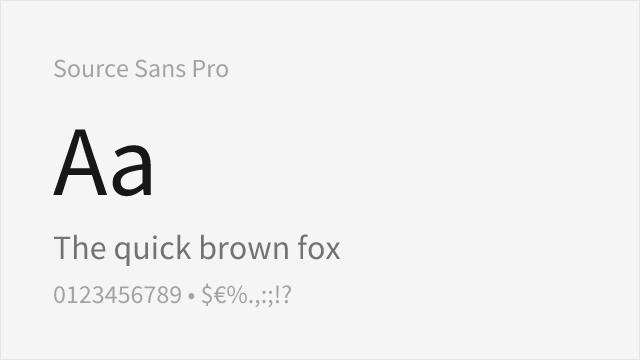
Source Sans Pro Free Variable
No fonts found with this filter.