Free Alternatives to Appeal

About Appeal
- Foundry
- WeType
- Classification
- serif
- Variable
- Yes
- Style
- revival
Brands Using Appeal
Text-weight revival serif drawn from the type of David Walker's 1830 abolitionist Appeal, for culturally-minded brands and institutions
Typography for museums, galleries, and cultural organizations seeking warmth with authority
Editorial and brand communications for lifestyle, hospitality, and premium consumer brands
Serif type for long-form reading and refined editorial layouts
 See Appeal live on these sites with FontSwap →
Appeal is a text-weight revival serif from WeType, designed by David Jon Walker and Mares Rayeshtyan and released around 2025. It revives the letterforms found in David Walker's Appeal in Four Articles to the Coloured Citizens of the World (1830), a landmark African American abolitionist manifesto, turning the small book type of that 87-page pamphlet into a warm, contemporary reading family. WeType — the foundry co-founded by John Kudos and David Jon Walker — publishes Appeal as a professional serif for editorial, branding, and publishing work.
Appeal requires a commercial license from WeType. It is available through wetype.co. There is no free tier, no Google Fonts availability, and no open-source distribution. If you need a similar warm, revival serif without the license cost, this page covers the best open-source alternatives.
This page is written for designers who love what Appeal does but need type they can ship without a per-seat license: an editor setting a literary quarterly, a studio building a museum's identity, a small hospitality brand that wants warmth on the page. The goal is not a pixel-perfect clone. Appeal has no exact free twin. The goal is to match what Appeal is for — warm, unhurried, culturally confident reading — with an open-source serif that gets you most of the way there.
Why Appeal Matters
The revival serif tradition — typefaces that draw on historical models from the Renaissance through the 19th century — is one of typography's richest territories. But most revival serifs are designed from a narrow cultural perspective, drawing primarily on European type traditions (Garamond, Caslon, Baskerville, Bodoni) and designed for Western Latin reading conventions.
Appeal enters this tradition from an unexpected direction. Designers David Jon Walker and Mares Rayeshtyan drew it from the letterforms of David Walker's Appeal in Four Articles to the Coloured Citizens of the World, an 87-page abolitionist manifesto first issued in 1830 and set in the small book type of its day. Rather than reproducing a famous punchcutter's specimen, they went back to a specific, historically charged printed artifact — a landmark of African American political writing — and rebuilt a working text family from the type on its pages.
The resonance runs deeper than the source material. Co-designer David Jon Walker, an art director and type designer who teaches at the Yale School of Art and whose practice centers on African American heritage, shares the abolitionist's surname. Reviving the type of David Walker's Appeal is, for him, both a typographic and a personal act of recovery. That is what makes Appeal matter: it is not a decorative nod to history but a considered attempt to carry a piece of nineteenth-century Black print culture into contemporary type, where designers can set it in books, exhibitions, and brand work today.
Revival, in type, is a loaded word. It does not mean photocopying an old face. It means going back to the source — the punchcut letters, the way ink spread on handmade paper, the rhythm a metal compositor built into a line — and asking which of those qualities are worth carrying into a world of screens and offset printing. A good revival keeps the warmth and drops the accidents. Appeal sits in that tradition, and its particular contribution is to revive a source most type histories overlook — the plain book type of an 1830 abolitionist pamphlet — while still reading as a comfortable, familiar text serif.
What that buys a client is durability. Trends in sans-serif branding move fast; a geometric sans that feels current one year can look dated three years on. A well-made revival serif ages differently, because it is already borrowing authority from centuries of reading. For a museum, a university press, or a heritage consumer brand, that quiet permanence is often the whole point of reaching for a serif in the first place.
Design Characteristics
Appeal is a warm humanist serif with revival influences:
- Humanist foundations: The underlying skeleton draws on humanist models with organic curves and natural proportions. The stress axis tilts toward the diagonal, echoing the pen-held angle of handwritten traditions.
- Warm text color: At body sizes, Appeal produces text blocks with inviting, comfortable rhythm. The spacing and proportion decisions prioritize reading warmth over typographic precision.
- Revival character: Appeal channels the warmth of pre-industrial type traditions without strict adherence to any single historical model. The effect is classical familiarity without pastiche.
- Moderate contrast: Stroke contrast is sufficient to create visual interest at display sizes while remaining stable at text sizes. The balance avoids both the monotone of low-contrast slab serifs and the fragility of high-contrast modern serifs.
- Revival provenance: The proportions, rhythm, and terminal shapes are drawn from a specific historical source — the small book type of David Walker's 1830 Appeal — rather than an abstract idea of a serif. That grounding in a real printed artifact gives the letterforms their period warmth.
The overall aesthetic is warm, authoritative, and inviting. Appeal reads as a serif that takes its heritage seriously without being academic about it.
When you set Appeal against a free candidate, the fastest tells are the stress and the terminals. Put the two side by side at reading size and study the round letters — the o, e, and c. If the thinnest part of the curve sits on a diagonal, tilted the way a broad-nib pen would hold it, you are looking at the humanist stress Appeal is built on. If it sits dead vertical, you have drifted into transitional territory (Baskerville, and by extension Libre Baskerville), which reads cooler and more formal. The second tell is the italic. A true old-style italic has its own cursive construction, not a mechanically slanted roman, and that is where a serif's warmth lives or dies. These two checks will tell you more about a substitute's kinship with Appeal than any similarity percentage.
Where Appeal Excels
- Cultural institutions: Museums, galleries, libraries, and universities whose brand identity benefits from typographic warmth and cultural authority
- Luxury and lifestyle branding: Premium brands that want serif warmth without the cold formality of transitional or modern serifs
- Editorial publishing: Literary journals, cultural magazines, and essay collections where reading comfort and warm tone are important
- Hospitality and premium consumer brands: Hotels, restaurants, and premium products seeking inviting, sophisticated typography
- Heritage and cultural-memory work: Museums, archives, publishers, and institutions telling stories about history and cultural heritage, where a typeface with a documented historical lineage adds meaning
The thread running through all of these is tone at reading size. Appeal is not trying to shout from a poster; it is trying to make a page of text feel considered and humane, the way a well-set book does. That is why it lands so naturally in contexts where the reader is meant to slow down: an exhibition catalog, a founder's letter, a tasting menu, a long-form feature. Where the job is to be absorbed rather than scanned, warmth stops being decoration and becomes the point.
Where It Struggles
- Technical and corporate documents: Appeal's warmth and cultural character may feel out of place in purely functional contexts. For legal briefs, technical manuals, or data-heavy reports, a more neutral serif (Source Serif Pro) is more appropriate.
- Non-Latin and complex-script needs: Appeal covers Latin and Latin-Extended. Projects that require Cyrillic, Greek, or non-Latin scripts will need a different or supplementary family to carry the same voice across languages.
- Display-heavy projects: Appeal is optimized for text sizes. For headline-dominant designs, high-contrast display serifs (Cormorant Garamond, Playfair Display) provide more visual impact.
Each of these limits is really a pointer toward the right substitute. If your project lives at text size and wants warmth, the revival alternatives below inherit Appeal's strengths cleanly. If it drifts toward the things Appeal struggles with — dense data tables, heavy display, or scripts Appeal doesn't cover — the honest move is usually to pick a different tool for that specific job rather than force a warm revival serif into a role it was never drawn for.
How to Choose a Free Substitute
When evaluating alternatives to Appeal, prioritize:
- Reading warmth: Set a full page of body text and evaluate how inviting the reading experience feels. Appeal's value is in its warm, comfortable text color.
- Revival character: The substitute should feel rooted in typographic tradition without being stiff or academic. EB Garamond and Crimson Pro achieve this balance.
- Humanist proportions: Appeal uses diagonal stress and organic curves. Substitutes with vertical stress (transitional) will feel less warm. Prioritize old-style or humanist serifs.
- Cultural tone: The substitute should feel authoritative without being exclusively European in its typographic vocabulary. Alegreya offers a particularly strong alternative with its own cultural depth.
- Italic quality: Verify the substitute's italics maintain warmth and readability. True cursive italics (EB Garamond, Alegreya) are preferable to mechanically slanted versions.
Those priorities narrow the field fast. Here is how the eight alternatives on this page sort out by the job you are actually trying to do.
For the closest overall match, start with EB Garamond. At 80% similarity it is the nearest free relative to Appeal's revival spirit: Renaissance proportions, diagonal stress, a genuinely cursive italic, and the same unhurried warmth in a block of body text. It is the safe default when you simply want Appeal, but open-source.
For free variable weights on the web, look at Crimson Pro or Lora. Both ship open-source variable families, so you get responsive weight control without a license — useful when you would rather not license and self-host Appeal's own variable files. Crimson Pro leans a touch more literary and higher in contrast; Lora wears its calligraphic warmth more openly and is the friendlier of the two for lifestyle and blog work. Either one trades a little of Appeal's restraint for a broad, freely available weight range.
For dependable cross-platform rendering, Source Serif Pro is the workhorse. It comes from the transitional rather than the revival side, so it reads cooler and more rational than Appeal, but its optical sizing and careful hinting make it reliable across operating systems and browsers. Choose it when consistency matters more than warmth: reports, documentation, and mixed corporate-and-editorial systems that have to hold together everywhere.
For screen body text on a tight weight budget, Libre Baskerville earns its place. It was drawn specifically to make a serif comfortable at paragraph sizes on screen. It is more formal than Appeal, closer to Baskerville's even keel, but it is dependable in exactly the situation where warmth is a nice-to-have rather than the brief.
For display rather than text, reach for Cormorant Garamond. Appeal is a text face first; Cormorant pushes the same humanist heritage toward high contrast and headline drama. Set it over EB Garamond or Lora and you reconstruct something close to Appeal's full text-to-display range using two free faces in place of one licensed family.
When cultural depth is the point, Alegreya rewards a closer look. It approaches serif design as cultural expression rather than pure function, which rhymes with the way WeType frames its own work. Its calligraphic energy is more visible than Appeal's, but the underlying ambition — a warm text serif with a point of view — is shared, and it composes gracefully across long, multilingual settings.
When you need a quiet, no-frills reading serif, Average does the job in a single weight. It synthesizes several serif traditions into one balanced regular. That limits your hierarchy, so treat it as a body-only tool and pair a stronger face for headings, but the reading color it produces is calm and comfortable.
A practical rule: match Appeal by feel at reading size, not by hunting for identical letterforms. Set a real paragraph — not a specimen alphabet — in each candidate, print it if the finished work will be printed, and read it properly. The face that still feels warm and comfortable after three paragraphs is the right one, whatever it scored on paper.
Premium Font Neighbors
If Appeal's approach appeals to you, these premium serifs occupy adjacent territory:
Cluster A: Warm revival serifs for editorial use
- Adobe Caslon (Adobe) — Carol Twombly's revival of English old-style types, warm and reliable
- Sabon (Linotype) — Jan Tschichold's Garamond interpretation, a book typography standard
- Freight Text (GarageFonts) — warm text serif with old-style character
- Lyon Text (Commercial Type) — contemporary text serif with humanist warmth
Cluster B: Culturally-grounded contemporary serifs
- Tiempos (Klim Type Foundry) — elegant text serif with classical foundations and contemporary finish
- Signifier (Klim Type Foundry) — contemporary serif with sharp detailing and cultural authority
All fonts listed above are premium/commercial typefaces requiring paid licenses.
Reading across these neighbors clarifies what you are really after. If it is Appeal's book-like warmth, Sabon and Freight Text are the closest in spirit. If it is contemporary editorial polish with a cultural edge, Tiempos and Signifier are the reference points. And if it is the wider serif conversation Appeal takes part in, the classic and contemporary editorial serifs around it — Garamond and its descendants, along with newer faces like Canela, Lyon, and Publico — map the territory it draws from. None of these are free, but knowing where Appeal sits among them makes it far easier to judge whether a given free substitute is close enough for your project.
FAQ
What is the best free alternative to Appeal?
EB Garamond is the closest free alternative at 80% similarity. It shares Appeal's revival spirit, warm text color, and commitment to historical typographic traditions. For a warmer alternative that is free and variable, Lora (77% similarity) or Crimson Pro (78%) are excellent choices.
Who founded WeType?
WeType was co-founded by John Kudos, an Indonesian-American creative director whose background includes seven years at Pentagram, and David Jon Walker, an art director and type designer at the Yale School of Art. Appeal itself was designed by David Jon Walker together with Mares Rayeshtyan.
Is Appeal a variable font?
Yes. WeType ships Appeal as a variable family — Appeal Variable Regular and Italic — alongside nine static weights from Thin to Black with matching italics. If you need variable serif type without a license, Crimson Pro, EB Garamond, and Lora all offer variable versions with comparably warm reading character.
What makes Appeal different from other revival serifs?
Appeal is distinguished by its source. While most revival serifs draw on famous European punchcutters (French Renaissance, English old-style), Appeal revives the small book type of a specific printed artifact: David Walker's Appeal in Four Articles to the Coloured Citizens of the World, an 1830 African American abolitionist manifesto. Designed by David Jon Walker and Mares Rayeshtyan, it carries a piece of nineteenth-century Black print culture into contemporary type — a heritage that purely European revivals do not touch.
Is Appeal suitable for web typography?
Yes, with licensed web font files, including Appeal's own variable version for efficient responsive loading. If you would rather not pay for web licensing, free alternatives like Crimson Pro or Lora provide comparable reading warmth as free variable families. EB Garamond is the closest free match for Appeal's revival character on the web.
What typefaces pair well with Appeal?
Appeal pairs naturally with clean sans-serifs that provide contrast without competing for attention. Inter, DM Sans, and Source Sans 3 all create effective serif/sans-serif pairings with Appeal. For monospace needs, Source Code Pro complements Appeal's editorial authority.
Which free alternative works best for display versus text?
For text — body copy and long-form reading — EB Garamond, Crimson Pro, and Lora hold Appeal's warmth at paragraph sizes. For display — headlines and large settings — Cormorant Garamond brings the same humanist heritage with far more contrast and drama. A common approach is to combine them: Cormorant for headings, EB Garamond or Lora for text, which reconstructs Appeal's full range from two free faces.
How many weights do I need to replace Appeal?
For most editorial and branding work, a regular, a medium or semibold, and a bold cover the hierarchy, plus a true italic for emphasis. EB Garamond and Crimson Pro both offer that range and more, and their variable versions let you fine-tune weight without shipping extra files. If you only need a single, calm reading weight, Average is enough on its own.
Is Appeal on Google Fonts?
No, Appeal is a premium font from WeType and is not available on Google Fonts.
The closest Google Fonts alternative is EB Garamond with 80% similarity. Get it free on Google Fonts ↗
Free Alternatives (8)
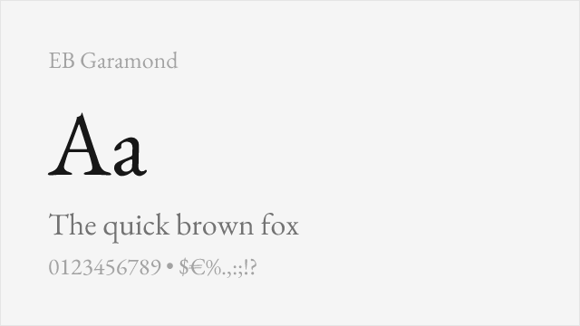
Scholarly revival of Claude Garamont's originals with meticulous historical accuracy
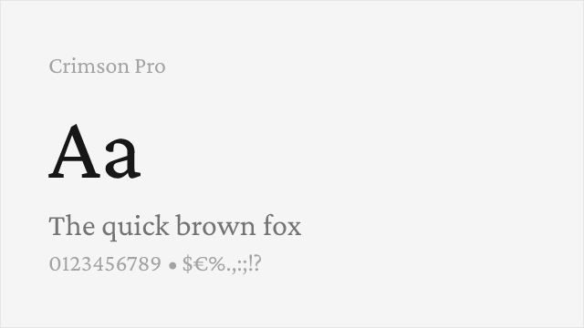
Renaissance-inspired text serif with variable weight and comprehensive features
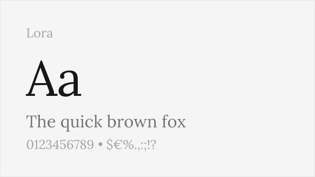
Calligraphy-influenced serif with variable support and warm reading character
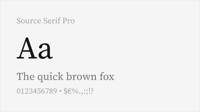
Adobe's transitional serif with optical sizing and reliable cross-platform rendering
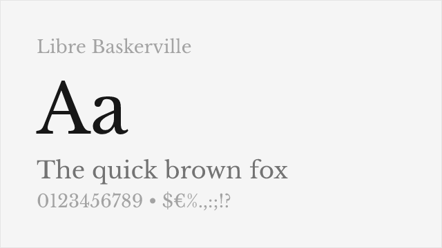
Optimized for body text on screen with traditional transitional proportions
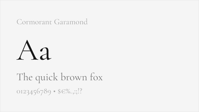
High-contrast display Garamond with dramatic presence and variable support
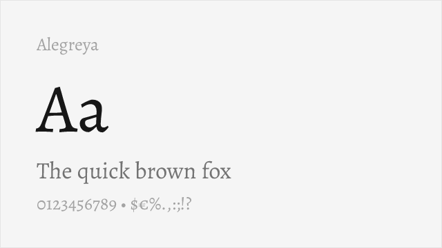
Calligraphic serif family with small caps, variable support, and dynamic character
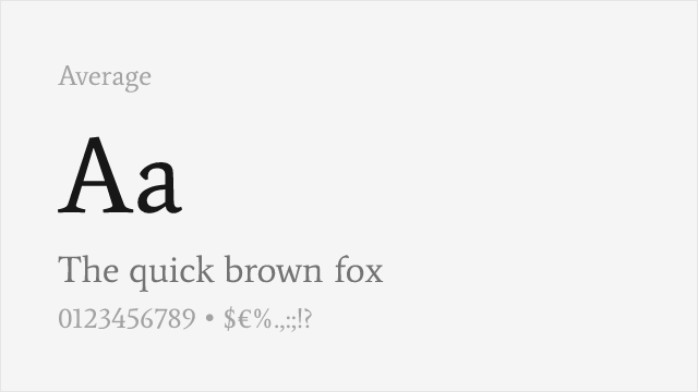
Measured text serif design synthesizing classical serif traditions
Compare the alternatives
See how Appeal compares to its top alternatives — and how those alternatives compare to each other — side by side.
See where Appeal is used in the wild and swap to free alternatives live.
Install FontSwap →Replacement Summary
Source: FontAlternatives.com
Premium font: Appeal
Best free alternative: EB Garamond
FontAlternatives similarity score: 80%
Replacement difficulty: Medium
Best for: scholarly and literary publishing, cultural institution communications, classical editorial design, luxury print materials
Notable users: WeType, Cultural Institutions, Lifestyle Brands
Not recommended when: Full weight range is critical - some weights require approximation
What is the best free alternative to Appeal?
EB Garamond is the best free alternative to Appeal with a FontAlternatives similarity score of 80%.
EB Garamond shares similar proportions, stroke characteristics, and intended use with Appeal. It is available under the OFL-1.1 license, which permits both personal and commercial use at no cost.
This alternative works particularly well for: scholarly and literary publishing, cultural institution communications, classical editorial design, luxury print materials.
Can I safely replace Appeal with EB Garamond?
Yes, with some considerations. EB Garamond achieves a FontAlternatives similarity score of 80%, indicating good structural compatibility for most use cases.
Licensing: EB Garamond is licensed under OFL-1.1, which allows commercial use without licensing fees or royalties.
Weight coverage: Some weights require approximation. See the weight-matching guide below for details.
When should I NOT replace Appeal?
While EB Garamond is a strong alternative, there are situations where replacing Appeal may not be appropriate:
- Optical precision requirements: EB Garamond has measurable structural differences from Appeal that may be visible in precise design work.
- Full weight range needed: Some Appeal weights require approximation in EB Garamond.
- Strict compliance: Verify that OFL-1.1 terms meet your specific legal and compliance requirements.
Weight-Matching Guide
Map Appeal weights to their closest free alternatives for accurate font substitution.
EB Garamond
| Appeal | EB Garamond | Match |
|---|---|---|
| Regular | Regular (400) | close |
| Medium | Medium (500) | close |
| Semi Bold | Semi Bold (600) | close |
| Bold | Extra Bold (800) | substitute |
Crimson Pro
| Appeal | Crimson Pro | Match |
|---|---|---|
| Light | Light (300) | close |
| Regular | Regular (400) | close |
| Semi Bold | Semi Bold (600) | close |
| Bold | Bold (700) | close |
Lora
| Appeal | Lora | Match |
|---|---|---|
| Regular | Regular (400) | close |
| Medium | Medium (500) | close |
| Semi Bold | Semi Bold (600) | close |
| Bold | Bold (700) | close |
Source Serif Pro
| Appeal | Source Serif Pro | Match |
|---|---|---|
| Light | Light (300) | close |
| Regular | Regular (400) | close |
| Medium | Semi Bold (600) | substitute |
| Bold | Bold (700) | close |
Libre Baskerville
| Appeal | Libre Baskerville | Match |
|---|---|---|
| Regular | Regular (400) | close |
| Bold | Bold (700) | close |
| Italic | Italic (400) | close |
| Bold Italic | Bold Italic (700) | close |
Cormorant Garamond
| Appeal | Cormorant Garamond | Match |
|---|---|---|
| Light | Light (300) | close |
| Regular | Regular (400) | close |
| Medium | Medium (500) | close |
| Bold | Bold (700) | close |
Alegreya
| Appeal | Alegreya | Match |
|---|---|---|
| Regular | Regular (400) | close |
| Medium | Medium (500) | close |
| Bold | Bold (700) | close |
| Black | Black (900) | close |
Average
| Appeal | Average | Match |
|---|---|---|
| Regular | Regular (400) | close |
Performance Guide
Production performance metrics for each alternative.
How to Use EB Garamond
Copy these code snippets to quickly add EB Garamond to your project.
CSS code for EB Garamond
@import url('https://fonts.googleapis.com/css2?family=EB+Garamond:wght@100..900&display=swap');HTML code for EB Garamond
<link rel="preconnect" href="https://fonts.googleapis.com">
<link rel="preconnect" href="https://fonts.gstatic.com" crossorigin>
<link href="https://fonts.googleapis.com/css2?family=EB+Garamond:wght@100..900&display=swap" rel="stylesheet">
Tailwind code for EB Garamond
// tailwind.config.js
module.exports = {
  theme: {
    extend: {
      fontFamily: {
        'eb-garamond': ['"EB Garamond"', 'sans-serif'],
      },
    },
  },
}

// Usage in HTML:
// <p class="font-eb-garamond">Your text here</p>
Next.js code for EB Garamond
// Using next/font (Next.js 13+)
import { EB_Garamond } from 'next/font/google';

const eb_garamond = EB_Garamond({
  subsets: ['latin'],
  weight: ['100', '200', '300', '400', '500', '600', '700', '800', '900'],
});

export default function Component() {
  return (
    <p className={eb_garamond.className}>
      Your text here
    </p>
  );
}

// Or using inline styles with Google Fonts link:
// <p style={{ fontFamily: '"EB Garamond"' }}>Your text</p>
Expo and React Native code for EB Garamond
// Install: npx expo install @expo-google-fonts/eb-garamond expo-font
import { useFonts, EB_Garamond_400Regular } from '@expo-google-fonts/eb-garamond';

export default function App() {
  const [fontsLoaded] = useFonts({
    EB_Garamond_400Regular,
  });

  if (!fontsLoaded) return null;

  return (
    <Text style={{ fontFamily: 'EB_Garamond_400Regular' }}>
      Your text here
    </Text>
  );
}
Recommended Font Pairings
These free fonts pair well with EB Garamond Appeal for headlines, body text, or accent use.
Inter's clean neo-grotesk character provides excellent contrast with Appeal's warm serif warmth, creating a versatile pairing for editorial and brand systems that balance functional clarity with cultural authority
DM Sans's clean geometric character creates contemporary contrast with Appeal's revival serif forms, suitable for lifestyle brands and cultural institutions bridging traditional and modern aesthetics
Source Code Pro's monospace clarity pairs naturally with Appeal's editorial authority for publications and documentation where body text and code or data must coexist
Browse Alternatives by Context
Find Appeal alternatives filtered by specific use case, style, or language support.
By Use Case
By Style
By Script
Frequently Asked Questions
What is the best free alternative to Appeal?
EB Garamond is the best free alternative to Appeal with a FontAlternatives similarity score of 80%. It shares similar proportions and characteristics while being available under the OFL-1.1 license for both personal and commercial use at no cost.
Is there a free version of Appeal?
There is no official free version of Appeal. However, EB Garamond is available under the OFL-1.1 open-source license and achieves a FontAlternatives similarity score of 80%. It includes variable weights and supports latin, latin-extended.
What Google Font looks like Appeal?
The Google Fonts most similar to Appeal are EB Garamond, Crimson Pro, Lora. Among these alternatives, EB Garamond offers the closest match with a FontAlternatives similarity score of 80% and includes variable weights for flexible typography options.
Can I use EB Garamond commercially?
Yes, EB Garamond can be used commercially. It is licensed under OFL-1.1, which allows free use in websites, applications, print materials, and commercial projects without purchasing a license or paying royalties.
Is EB Garamond similar enough to Appeal?
EB Garamond achieves a FontAlternatives similarity score of 80% compared to Appeal. While not identical, it offers comparable letterforms, proportions, and visual style. Most designers find it works excellently as a substitute in web and print projects.
What are the main differences between Appeal and its free alternatives?
Free alternatives to Appeal may differ in subtle details like letter spacing, curve refinements, and available weights. Premium fonts typically include more OpenType features, extended language support, and optimized screen rendering. However, for most projects, these differences are negligible.
Where can I download free alternatives to Appeal?
Download EB Garamond directly from Google Fonts. Click the "Get Font" button on any alternative listed above to visit the official download page. Google Fonts also provides convenient embed codes for seamless web integration.