Free Alternatives to Concourse

About Concourse
- Foundry
- MB Type
- Classification
- sans-serif
- Style
- humanist
Concourse is a sans-serif typeface designed by Matthew Butterick and sold exclusively through his foundry MB Type. Butterick is unusual in the type world: he is also a programmer and a practicing lawyer. That combination of perspectives produced a font with a specific mission — to replace the bad default fonts that professionals use in documents every day.
The Problem Concourse Solves
Most professional documents are set in Arial, Calibri, or Times New Roman. Not because anyone chose those fonts, but because nobody bothered to change them. Butterick's argument, laid out in his book Practical Typography, is that these defaults actively harm readability. They were designed for other purposes — Arial as a Helvetica substitute for licensing reasons, Calibri as a demonstration of ClearType rendering, Times New Roman for a newspaper that stopped printing in 1989.
Concourse was designed to be what these fonts pretend to be: a genuinely readable sans-serif for everyday professional text. It does not try to be exciting. It tries to make a legal brief, a business report, or a syllabus slightly easier to read — and slightly better-looking — than it would be in the default font.
Design Characteristics
Concourse is a humanist sans-serif, meaning its letterforms derive from handwriting rather than geometry. This gives it several advantages for text:
- Clear character differentiation: The capital I, lowercase l, and numeral 1 are all distinct — a critical detail in legal and technical documents
- Open apertures: Letters like 'c', 'e', and 's' have generous openings that prevent them from closing up at small sizes
- Moderate x-height: Tall enough for screen readability, short enough to look refined in print
- Low contrast: Minimal variation between thick and thin strokes, ensuring even color on the page
- Slightly condensed: Fits more words per line than typical humanist sans fonts, which matters in documents with page limits
The Concourse Family
Concourse comes in multiple optical sizes and weights:
- Concourse Text: Optimized for body copy at 9-14pt
- Concourse: The standard cut, suitable for most sizes
- Concourse Caps: Small caps with optical corrections
- Index variants: Extremely compact cuts for tight spaces
Each cut is available in multiple weights. The family is not as large as a corporate superfamily like Helvetica Now, but it covers the range that professional documents actually need.
Who Uses Concourse
Concourse is not a mainstream choice — you will not find it in any brand guideline from a Fortune 500 company. Its audience is individuals who care about typography in professional contexts: lawyers who want their briefs to read better, academics who care about their syllabi, authors who typeset their own books. Butterick uses Concourse throughout Practical Typography and his legal work, making it both a product and a demonstration.
Where Concourse Excels
- Legal documents: Briefs, contracts, memos, and correspondence where every page counts
- Academic materials: Syllabi, handouts, research papers, and dissertation text
- Business writing: Reports, proposals, and internal communications
- Long-form web content: Blog posts, documentation, and articles
- Self-published books: Interior text for non-fiction and reference works
Limitations
Concourse is sold only through mbtype.com. There is no trial version, no free tier, and no presence on major font marketplaces. Licensing starts at $119 for a single family. The font is not available as a variable font — each weight and style is a separate file. For teams that need to standardize on a typeface across many machines and platforms, the distribution model can be a practical barrier.
The design is also deliberately neutral. If your project needs typographic personality — for a brand identity, a poster, or an app with a distinctive visual voice — Concourse will not provide it. It is a background font, not a foreground one.
Is Concourse on Google Fonts?
No, Concourse is a premium font from MB Type and is not available on Google Fonts.
The closest Google Fonts alternative is Inter with 74% similarity. Get it free on Google Fonts ↗
Free Alternatives (3)

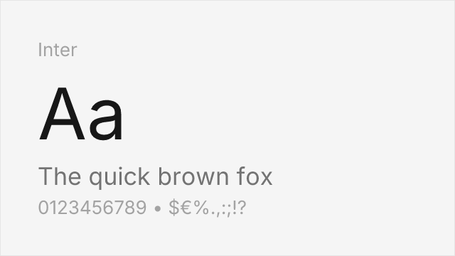
Modern humanist sans built for screens with an even larger weight range (100-900 variable). Inter matches Concourse's readability-first philosophy but was designed for UI, not documents — slightly tighter spacing


American gothic-influenced sans with similar neutral professionalism and a generous x-height. Wider proportions than Concourse, which makes it less space-efficient but equally readable


Google's geometric-humanist hybrid with low contrast and open apertures. Shares Concourse's restraint but leans geometric where Concourse leans humanist — a different flavor of the same quiet competence
See where Concourse is used in the wild and swap to free alternatives live.
Install FontSwap →Performance Guide
Production performance metrics for each alternative.
How to Use Inter
Copy these code snippets to quickly add Inter to your project.
CSS code for Inter
@import url('https://fonts.googleapis.com/css2?family=Inter:wght@100..900&display=swap');HTML code for Inter
<link rel="preconnect" href="https://fonts.googleapis.com">
<link rel="preconnect" href="https://fonts.gstatic.com" crossorigin>
<link href="https://fonts.googleapis.com/css2?family=Inter:wght@100..900&display=swap" rel="stylesheet">
Tailwind code for Inter
// tailwind.config.js
module.exports = {
  theme: {
    extend: {
      fontFamily: {
        'inter': ['Inter', 'sans-serif'],
      },
    },
  },
}

// Usage in HTML:
// <p class="font-inter">Your text here</p>
Next.js code for Inter
// Using next/font (Next.js 13+)
import { Inter } from 'next/font/google';

const inter = Inter({
  subsets: ['latin'],
  weight: ['100', '200', '300', '400', '500', '600', '700', '800', '900'],
});

export default function Component() {
  return (
    <p className={inter.className}>
      Your text here
    </p>
  );
}

// Or using inline styles with Google Fonts link:
// <p style={{ fontFamily: "'Inter'" }}>Your text</p>
Expo and React Native code for Inter
// Install: npx expo install @expo-google-fonts/inter expo-font
import { useFonts, Inter_400Regular } from '@expo-google-fonts/inter';

export default function App() {
  const [fontsLoaded] = useFonts({
    Inter_400Regular,
  });

  if (!fontsLoaded) return null;

  return (
    <Text style={{ fontFamily: 'Inter_400Regular' }}>
      Your text here
    </Text>
  );
}
Recommended Font Pairings
These free fonts pair well with Inter Concourse for headlines, body text, or accent use.
Browse Alternatives by Context
Find Concourse alternatives filtered by specific use case, style, or language support.
By Use Case
By Script
Frequently Asked Questions
What is the best free alternative to Concourse?
Inter is the best free alternative to Concourse with a FontAlternatives similarity score of 74%. It shares similar proportions and characteristics while being available under the OFL-1.1 license for both personal and commercial use at no cost.
Is there a free version of Concourse?
There is no official free version of Concourse. However, Inter is available under the OFL-1.1 open-source license and achieves a FontAlternatives similarity score of 74%. It includes variable weights and supports latin, latin-extended.
What Google Font looks like Concourse?
The Google Fonts most similar to Concourse are Inter, Work Sans, DM Sans. Among these alternatives, Inter offers the closest match with a FontAlternatives similarity score of 74% and includes variable weights for flexible typography options.
Can I use Inter commercially?
Yes, Inter can be used commercially. It is licensed under OFL-1.1, which allows free use in websites, applications, print materials, and commercial projects without purchasing a license or paying royalties.
Is Inter similar enough to Concourse?
Inter achieves a FontAlternatives similarity score of 74% compared to Concourse. While not identical, it offers comparable letterforms, proportions, and visual style. Most designers find it works excellently as a substitute in web and print projects.
What are the main differences between Concourse and its free alternatives?
Free alternatives to Concourse may differ in subtle details like letter spacing, curve refinements, and available weights. Premium fonts typically include more OpenType features, extended language support, and optimized screen rendering. However, for most projects, these differences are negligible.
Where can I download free alternatives to Concourse?
Download Inter directly from Google Fonts. Click the "Get Font" button on any alternative listed above to visit the official download page. Google Fonts also provides convenient embed codes for seamless web integration.