Free Alternatives to Diverda

About Diverda
- Foundry
- Linotype
- Classification
- sans-serif
- Style
- geometric
Diverda is a geometric sans-serif typeface designed by Daniel Lanz and published by Linotype (now part of Monotype). The design distinguishes itself from conventional geometric sans-serifs through its subtle calligraphic stroke contrast and carefully refined Roman proportions, producing a typeface that feels both constructed and organic.
History and Design
Daniel Lanz created Diverda to bridge the gap between strict geometric sans-serifs and the warmth of calligraphic letterforms. While the overall skeleton follows geometric principles — circular bowls, even proportions, and consistent stroke rhythm — the details reveal a hand-informed sensibility. Stroke endings carry subtle modulation rather than mechanical uniformity, and the proportions reference classical Roman inscriptional letters rather than pure geometry.
This dual nature gives Diverda a distinctive position: it reads as clean and modern at a glance, but rewards closer inspection with warmth and refinement that pure geometric designs lack. The family offers multiple weights suited to both text and display applications.
Technical Characteristics
- Calligraphic stroke contrast: Subtle thick-thin variation within a geometric framework
- Roman proportions: Classical width relationships rather than monolinear construction
- Clean terminals: Precise stroke endings that maintain clarity at all sizes
- Balanced geometry: Circular forms tempered by humanist influences
- Multiple weights: Range of weights for hierarchical typesetting
Use Cases
Diverda works effectively for:
- Corporate identity: Professional branding that avoids generic geometric uniformity
- Editorial design: Magazine and publication typography requiring quiet sophistication
- Packaging and print: Premium product presentation with refined detail
- Digital interfaces: Clean screen rendering with distinctive character
- Cultural institutions: Museums, galleries, and arts organizations seeking modern elegance
Is Diverda on Google Fonts?
No, Diverda is a premium font from Linotype and is not available on Google Fonts.
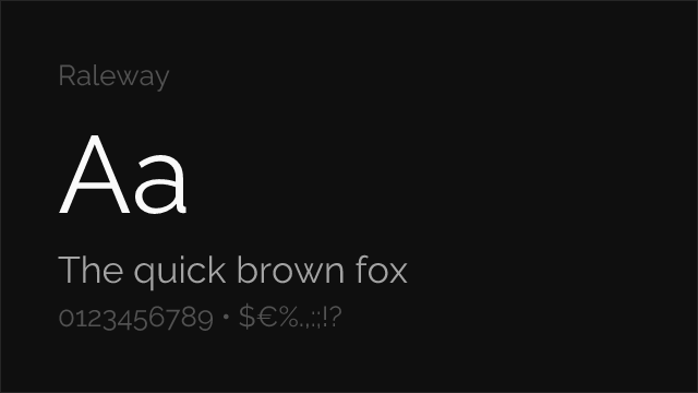
The closest Google Fonts alternative is Raleway with 72% similarity. Get it free on Google Fonts ↗
Free Alternatives (3)

Shares geometric elegance with distinctive calligraphic stroke contrast

Similar geometric sans-serif proportions rooted in 1920s design tradition
Elegant geometric construction with comparable display character
Performance Guide
Production performance metrics for each alternative.
How to Use Raleway
Copy these code snippets to quickly add Raleway to your project.
CSS code for Raleway
@import url('https://fonts.googleapis.com/css2?family=Raleway:wght@100..900&display=swap');HTML code for Raleway
<link rel="preconnect" href="https://fonts.googleapis.com">
<link rel="preconnect" href="https://fonts.gstatic.com" crossorigin>
<link href="https://fonts.googleapis.com/css2?family=Raleway:wght@100..900&display=swap" rel="stylesheet">
Tailwind code for Raleway
// tailwind.config.js
module.exports = {
  theme: {
    extend: {
      fontFamily: {
        'raleway': ['Raleway', 'sans-serif'],
      },
    },
  },
}

// Usage in HTML:
// <p class="font-raleway">Your text here</p>
Next.js code for Raleway
// Using next/font (Next.js 13+)
import { Raleway } from 'next/font/google';

const raleway = Raleway({
  subsets: ['latin'],
  weight: ['100', '200', '300', '400', '500', '600', '700', '800', '900'],
});

export default function Component() {
  return (
    <p className={raleway.className}>
      Your text here
    </p>
  );
}

// Or using inline styles with Google Fonts link:
// <p style={{ fontFamily: "'Raleway'" }}>Your text</p>
Expo and React Native code for Raleway
// Install: npx expo install @expo-google-fonts/raleway expo-font
import { useFonts, Raleway_400Regular } from '@expo-google-fonts/raleway';

export default function App() {
  const [fontsLoaded] = useFonts({
    Raleway_400Regular,
  });

  if (!fontsLoaded) return null;

  return (
    <Text style={{ fontFamily: 'Raleway_400Regular' }}>
      Your text here
    </Text>
  );
}
Recommended Font Pairings
These free fonts pair well with Raleway Diverda for headlines, body text, or accent use.
Browse Alternatives by Context
Find Diverda alternatives filtered by specific use case, style, or language support.
By Use Case
By Style
By Script
Frequently Asked Questions
What is the best free alternative to Diverda?
Raleway is the best free alternative to Diverda with a FontAlternatives similarity score of 72%. It shares similar proportions and characteristics while being available under the OFL-1.1 license for both personal and commercial use at no cost.
Is there a free version of Diverda?
There is no official free version of Diverda. However, Raleway is available under the OFL-1.1 open-source license and achieves a FontAlternatives similarity score of 72%. It includes variable weights and supports latin, latin-extended.
What Google Font looks like Diverda?
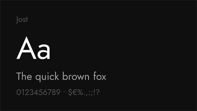
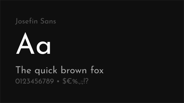
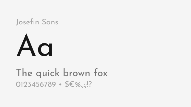
The Google Fonts most similar to Diverda are Raleway, Jost, Josefin Sans. Among these alternatives, Raleway offers the closest match with a FontAlternatives similarity score of 72% and includes variable weights for flexible typography options.
Can I use Raleway commercially?
Yes, Raleway can be used commercially. It is licensed under OFL-1.1, which allows free use in websites, applications, print materials, and commercial projects without purchasing a license or paying royalties.
Is Raleway similar enough to Diverda?
Raleway achieves a FontAlternatives similarity score of 72% compared to Diverda. While not identical, it offers comparable letterforms, proportions, and visual style. Most designers find it works excellently as a substitute in web and print projects.
What are the main differences between Diverda and its free alternatives?
Free alternatives to Diverda may differ in subtle details like letter spacing, curve refinements, and available weights. Premium fonts typically include more OpenType features, extended language support, and optimized screen rendering. However, for most projects, these differences are negligible.
Where can I download free alternatives to Diverda?
Download Raleway directly from Google Fonts. Click the "Get Font" button on any alternative listed above to visit the official download page. Google Fonts also provides convenient embed codes for seamless web integration.