Handwritten Fonts
Typefaces that mimic natural handwriting with irregular baselines, varied letterforms, and an informal character. Used to add personality, warmth, and authenticity to designs.
Handwritten typefaces simulate the appearance of natural handwriting, capturing the irregularities, personal touches, and organic energy that distinguish human marks from mechanical reproduction. Unlike formal calligraphic scripts, handwritten fonts embrace imperfection — uneven baselines, inconsistent letter sizes, and spontaneous stroke variation are features, not flaws.
Sub-categories
Handwritten fonts span a broad spectrum of tools and styles. Brush scripts (Pacifico, Yellowtail) mimic the thick-thin dynamics of a loaded brush, producing expressive, flowing letterforms with dramatic weight variation. Marker and felt-tip styles (Permanent Marker, Indie Flower) simulate the consistent-width, slightly ragged strokes of dry-erase markers and fiber-tip pens. Ballpoint and pencil styles (Architects Daughter, Gloria Hallelujah) reproduce the thin, scratchy lines of everyday writing tools. Chalk and crayon styles (Amatic SC, Fredericka the Great) capture the rough, textured strokes of writing on coarse surfaces. Each sub-category carries different emotional associations: brush scripts suggest energy and creativity, marker styles feel casual and immediate, ballpoint styles evoke personal notes, and chalk styles suggest education or artisanal craftsmanship.
Digital vs Print
Handwritten fonts face a fundamental tension in digital reproduction. The irregularity that makes handwriting appealing relies on each letter instance being slightly different — something a standard font, which uses the same glyph for every occurrence of a letter, cannot achieve. Repeated identical "handwritten" letters quickly expose the typeface as mechanical, especially in words with double letters. OpenType features like contextual alternates (calt) and stylistic sets address this by providing multiple versions of each letter that the software rotates automatically. Print production is more forgiving, as ink absorption on textured paper adds authentic randomness. For digital use, choose handwritten fonts with extensive alternate glyph sets and consider supplementing with OpenType-aware layout engines that enable automatic variation.
Common Mistakes
The most frequent error is using handwritten fonts for extended body text. These fonts are designed for personality and emphasis — headlines, quotes, labels, packaging accents — not for sustained reading. Even well-designed handwritten faces become fatiguing and hard to read after a few lines. Another common mistake is using handwritten fonts at very small sizes, where the irregular forms become illegible rather than charming. Designers also often choose handwritten fonts that are too trendy, dating a design to a specific era (the "chalk on blackboard" trend of 2012-2015, for instance). Finally, avoid combining multiple handwritten fonts in a single design — competing handwriting styles create visual chaos rather than personality.
When to Use
Handwritten typefaces are ideal for food and beverage branding, greeting cards, social media graphics, children's products, craft brands, personal blogs, and any context where warmth, personality, and approachability outweigh formality. They work best as accent type — headlines, callouts, hand-lettered logos — paired with clean, readable sans-serif or serif body text. Always test readability with real users before committing to a handwritten font for any text beyond a few words.
Premium Handwritten Fonts


Free Handwritten Fonts
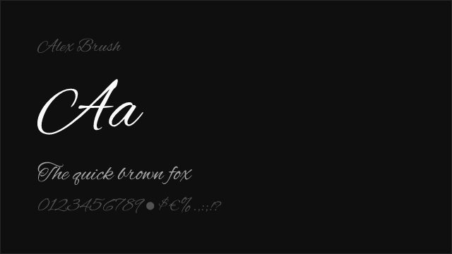
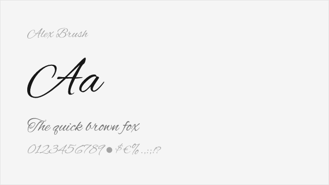
Alex Brush Free

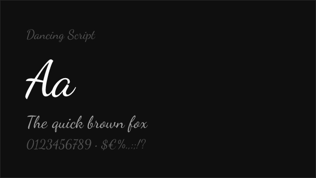
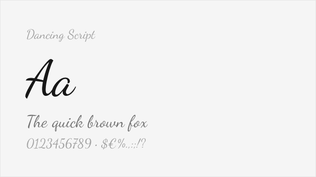
Dancing Script Free Variable
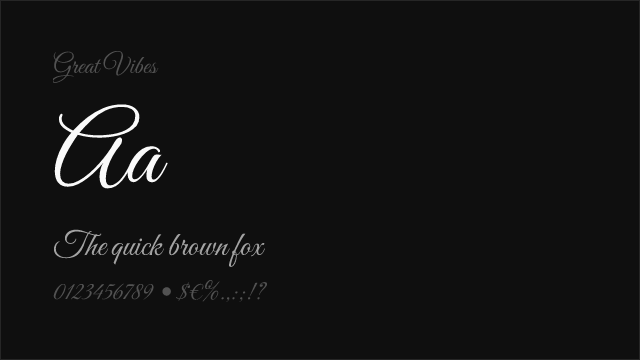
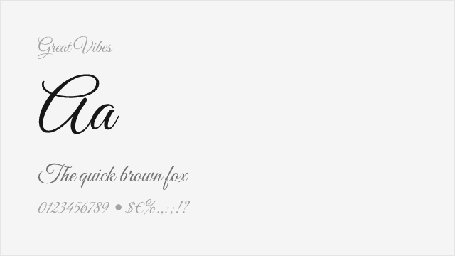
Great Vibes Free

Merriweather Free

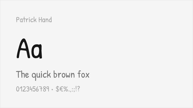
Patrick Hand Free
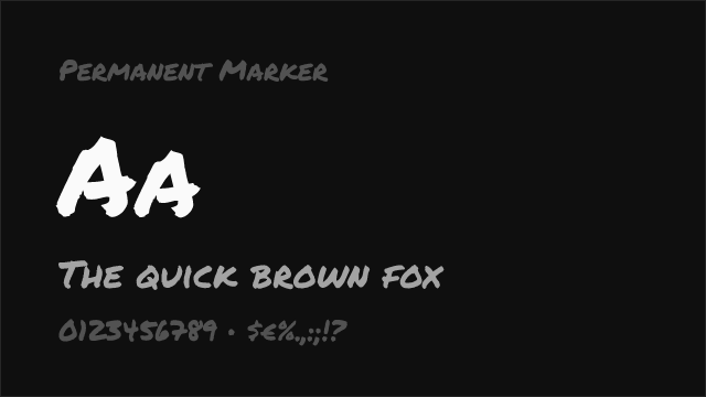
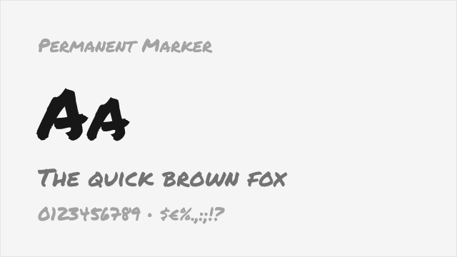
Permanent Marker Free
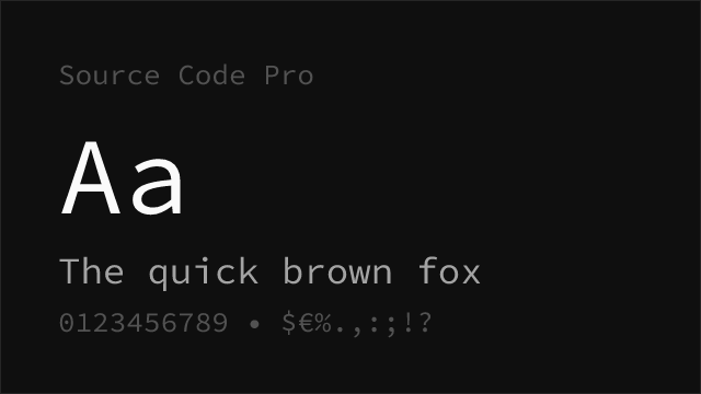
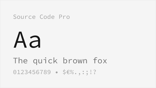
Source Code Pro Free Variable


Source Serif Pro Free Variable
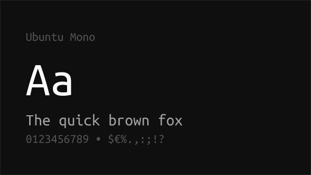
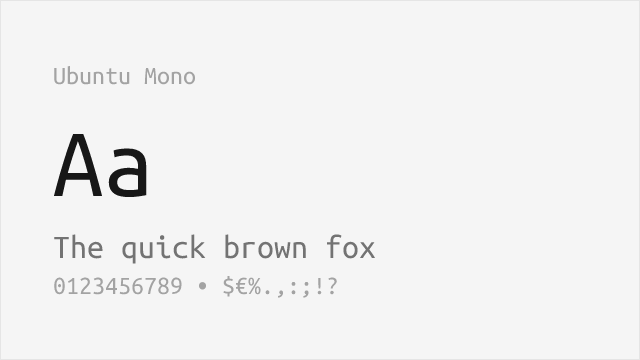
Ubuntu Mono Free
No fonts found with this filter.