Free Alternatives to Brown

About Brown
- Foundry
- Lineto
- Classification
- sans-serif
- Style
- geometric
Brands Using Brown
Logo wordmark in the 2014 rebrand (the broader identity system used LL Circular); predates Airbnb's custom Cereal typeface (2018)
Studio branding and client presentation materials
Official brand typeface (2019 identity by Uniform)
Product branding and website
 See Brown live on these sites with FontSwap →
Brown is a geometric sans-serif typeface with warm, humanist details, designed by Aurele Sack and released by Lineto in 2011. Conceived as a warmer counterpart to the austere Swiss sans-serifs that dominate the Lineto catalog — most notably Akkurat and Circular — Brown introduces rounded terminals and softened forms that give it a distinctly friendly, approachable personality. The typeface occupies a rare position: trustworthy enough for corporate communications, warm enough for consumer brands, and refined enough for editorial use. This versatility has made Brown one of the most quietly influential typefaces of the 2010s, adopted by technology companies, lifestyle brands, and advertising agencies who need their typography to feel human without sacrificing sophistication.
Brown requires a paid license from Lineto. Lineto operates a per-project licensing model with separate pricing for desktop, web, and app use. Web licenses are tiered by monthly page views. There is no free tier or trial. If your project cannot support Lineto's pricing, this page covers the strongest open-source alternatives and what to prioritize when choosing one.
Why Brown Matters
Brown's significance lies in its resolution of a tension that pervades modern brand typography: the need to feel simultaneously corporate and human. Before Brown, the choice was largely binary. Traditional grotesques like Helvetica and Univers communicated institutional authority but felt cold and impersonal. Rounded and geometric alternatives like VAG Rounded or Gotham Rounded communicated friendliness but could undermine professional credibility. Brown bridges this gap with a clean geometric skeleton that carries warmth in its terminals rather than its structure — the bones are professional, the skin is approachable.
This design strategy proved prescient. As technology and lifestyle companies in the 2010s shifted from disruption narratives to trust-building, they needed typefaces that could humanize digital experiences without feeling childish. Norway's national rail operator, Norske tog, adopted Brown as its official brand typeface in its 2019 identity, where the typeface's refined warmth lent approachability to a public-service institution. Best Made Co. used Brown across its product branding and website, where the typeface's friendly sophistication matched the retailer's craft-focused, design-conscious positioning.
Airbnb set its logo wordmark in Brown for the 2014 rebrand — though the broader identity system of that era actually ran on LL Circular — before commissioning its own custom Cereal typeface, drawn by Dalton Maag, in 2018. That progression from a licensed wordmark to a bespoke family is a common one for fast-growing brands, even though Cereal's geometric design is independent rather than derived from Brown.
Aurele Sack, working within Lineto's intellectually rigorous Swiss framework, achieved something unusual: a typeface that signals both design literacy and emotional intelligence. Brown does not try to be invisible like Helvetica or distinctive like Circular. It occupies a middle ground — present enough to convey personality, restrained enough to avoid dominating the content it carries.
Lineto, based in Zurich, is one of the most influential independent type foundries in the world, home to Akkurat, Circular, and Brown — three typefaces that collectively shaped how the technology industry approaches typography. Brown is the warmest voice in this trio.
Design Characteristics
Brown's letterforms reveal the careful negotiations between geometric structure and humanist warmth that define its character:
- Rounded terminals throughout: The most distinctive feature — stroke endings are consistently rounded rather than squared or angled, creating the signature warmth that separates Brown from traditional grotesques like Helvetica or Akkurat
- Moderate x-height with balanced proportions: Neither exaggerated for screen optimization nor classically short, Brown's x-height sits in a middle ground that performs equally well in print editorial and digital interfaces
- Open apertures with controlled counters: The
c,e,s, andahave generous openings that improve readability while maintaining the compact efficiency of a well-drawn workhorse sans - Near-monoline stroke weight: Minimal stroke contrast creates even typographic color across paragraphs, reinforcing the calm, controlled reading experience
- Geometric bowls, humanist softening: Brown's bowls carry a clear geometric circularity — particularly visible in the
o,b, andd— tempered by warm, rounded terminals that soften the geometry into something friendly - Carefully calibrated letter-spacing: Default tracking is generous enough for comfortable screen reading without the looseness that would undermine Brown's professional pedigree in print contexts
- Full weight range with matching italics: Available from Thin through Black, providing comprehensive typographic hierarchy support for complex brand systems
Where Brown Excels
Brown performs at its best in contexts that need warmth without sacrificing authority:
- Consumer technology brands: Apps, platforms, and SaaS products that need to feel human and trustworthy use Brown to soften digital interactions
- Lifestyle and wellness branding: Health, food, beauty, and wellness brands leverage Brown's approachable character to create inviting visual identities
- Advertising and campaign work: Brown's warmth translates well to advertising contexts where headlines need to connect emotionally while maintaining brand sophistication
- Editorial features and magazines: Longform content benefits from Brown's comfortable reading texture and personality without the distraction of a more distinctive typeface
- Corporate communications with a human touch: Companies moving away from cold corporate identities use Brown to signal cultural evolution
- Packaging and retail environments: Brown's friendly clarity reproduces well on packaging, retail signage, and point-of-sale materials
Where Brown Struggles
Brown's warmth becomes a limitation in certain contexts:
- Institutional and governmental communications: Brown's friendly personality can undermine the authority and gravitas expected in legal, governmental, and institutional typography
- Data-heavy interfaces and dashboards: The rounded terminals consume slightly more horizontal space than squared alternatives, reducing efficiency in dense information displays
- Multilingual projects: Brown supports Latin and Latin Extended only — projects requiring Cyrillic, Greek, Arabic, or CJK scripts need fallback strategies that compromise visual consistency
- Ultra-minimal or brutalist design: Brown's inherent warmth conflicts with design approaches that intentionally seek coldness, austerity, or confrontational typography
- High-density small text: While well-crafted, Brown's rounded terminals can blur at very small sizes on low-resolution screens where sharper terminals maintain better definition
- Projects requiring variable font optimization: Brown ships as static files only, lacking the performance advantages and design flexibility of variable font alternatives
- Academic and scientific publishing: The friendly personality can feel insufficiently serious for research papers, technical documentation, and academic journals
How to Choose a Free Substitute
When evaluating Brown replacements, focus on these criteria:
Terminal treatment and warmth: Brown's rounded terminals are its most distinctive feature. Test alternatives by examining the stroke endings on
c,s,r, andt— softer terminals will better approximate Brown's warmth. DM Sans achieves this through overall construction rather than terminal shape; Nunito Sans gets closer through explicitly rounded endings.Warmth over pure geometry: Brown is a geometric sans, but its rounded terminals and humanist details keep it from reading as coldly mechanical. Strictly geometric alternatives (like Poppins or Montserrat) can feel more rigid and impersonal at body sizes. Look for typefaces that soften their geometry with warm terminals and slightly irregular, humanist detailing rather than chasing pure geometric precision.
Typographic color and reading rhythm: Set a full paragraph at 14-16px in both Brown and your candidate. Brown produces exceptionally even, warm typographic color. If your alternative feels cold, sparse, or mechanical in comparison, it will not serve the same emotional purpose in your design.
Weight range for brand hierarchy: Brown's full Thin-to-Black range supports complex brand systems. Your alternative needs at minimum Light, Regular, Medium, SemiBold, and Bold to cover common use cases. Check that the medium and semibold weights feel proportionally correct — Brown's weight distribution is carefully calibrated.
Personality at display sizes: Brown's character becomes more apparent in headlines and display text. Test your alternative at 36px and above to verify it carries enough personality to feel intentional rather than generic. The best substitutes will feel friendly and warm at display sizes while remaining professional at body sizes.
Premium Font Neighbors
If Brown's warm, geometric approach resonates, explore these adjacent premium options:
Cluster A: Warm geometrics and rounded sans-serifs
- GT Walsheim (Grilli Type) — similarly warm geometric with more pronounced roundness; the closest premium competitor to Brown's personality
- Circular (Lineto) — Brown's sibling from the same foundry; more strictly geometric and uniform, but sharing the same warmth
- Cereal (Airbnb / Dalton Maag) — Airbnb's custom geometric sans (2018); the 2014 Airbnb logotype had used LL Brown, though Cereal's design is its own
Cluster B: Approachable corporate sans-serifs
- Proxima Soft (Mark Simonson) — rounded version of Proxima Nova with comparable warmth for consumer branding
- Mark Pro (FontFont) — friendly, versatile sans with similar corporate-meets-consumer positioning
- Newson (Newlyn) — warm, rounded grotesque with a slightly more British character than Brown's Swiss origins
Comparing these clarifies the choice: Brown's exact warmth in a premium face (GT Walsheim, Circular), or a friendlier corporate-meets-consumer sans (Mark Pro, Proxima Soft). Either way, the free sans-serifs listed above capture most of Brown's approachable, even-tempered character at no cost, which is usually the more sensible starting point.
FAQ
Is Brown free?
No. Brown is a premium typeface from Lineto with per-project licensing. Desktop, web, and app licenses are priced separately, with web licenses tiered by monthly page views. Lineto does not offer free tiers, trial versions, or educational discounts. The best free alternative is DM Sans at 84% similarity.
What is the best free alternative to Brown?
DM Sans is the closest free alternative at 84% similarity. Both share a warm, geometric-humanist character that bridges corporate professionalism and consumer approachability. DM Sans adds variable font support and broader language coverage, making it a practical replacement for most contexts where Brown would be used.
What makes Brown different from other sans-serifs?
Brown's rounded terminals distinguish it from traditional grotesques like Helvetica, Akkurat, or Univers, which use squared or angled terminals. This rounding creates warmth and approachability that most sans-serifs of its era lacked. Brown is essentially a geometric sans carrying the emotional register of a warm, humanist face — a combination that was rare when it launched in 2011 and remains distinctive today.
Is Brown a variable font?
No. Brown ships as static font files across its weight range. Brown's warm character depends heavily on the smooth transitions between Regular and Bold — the Medium and Semibold weights that give brand systems their nuanced hierarchy — and this is exactly where variable font interpolation would help most, allowing designers to dial in the precise weight that maintains Brown's warmth at any size. Most of its free alternatives — including DM Sans, Nunito Sans, Plus Jakarta Sans, and Work Sans — are available as variable fonts, offering both this design flexibility and web performance advantages.
Who designed Brown?
Aurele Sack, a Swiss type designer working with Lineto. Sack designed Brown to fill a gap in the sans-serif landscape — a typeface that could feel warm and human while maintaining the structural discipline expected of Swiss typography. Brown has become one of Lineto's most commercially successful releases alongside Circular and Akkurat.
Does Brown support Cyrillic?
No. Brown supports Latin and Latin Extended scripts only. For projects requiring Cyrillic with a similar warm character, DM Sans, Nunito Sans, and Mulish offer Cyrillic coverage alongside their Latin character sets. These alternatives maintain a comparable level of warmth and approachability.
How does Brown compare to Circular?
Both are Lineto typefaces, but they occupy different positions. Circular is a pure geometric sans-serif — clean, round, and uniform — favored by tech companies for its precision. Brown is geometric at heart too, but softer and less uniform — its rounded terminals and subtle irregularities give it more personality and warmth. Circular reads as "modern and efficient," Brown reads as "modern and human." Choose Circular for tech products and data interfaces; choose Brown for brand communications and editorial contexts.
Why do brands switch from Brown to custom typefaces?
Companies like Airbnb licensed Brown during growth phases — in Airbnb's case for the 2014 logo wordmark — then commissioned custom typefaces as they matured. Custom type eliminates ongoing licensing costs at scale, provides unique brand differentiation, and can be optimized for specific technical requirements. The custom successors are usually their own designs, though: Airbnb's Cereal, for instance, is an independent geometric sans by Dalton Maag rather than a derivative of Brown.
Is Brown good for body text?
Yes. Brown's moderate x-height, even stroke weights, and open counters make it comfortable for extended reading at body sizes (12-16px on screen, 9-11pt in print). Its rounded terminals add warmth to paragraphs without disrupting the reading flow. Brown is particularly effective for editorial body text where the content benefits from a friendly, conversational tone.
What industries use Brown most?
Technology, lifestyle, fashion, hospitality, and creative services are Brown's core industries. Companies in these sectors value typography that feels human and trustworthy — qualities that Brown delivers through its warm, geometric-humanist construction. Brown is less common in finance, law, government, and academia, where its friendliness can conflict with expectations of institutional authority.
Is Brown on Google Fonts?
No, Brown is a premium font from Lineto and is not available on Google Fonts.
The closest Google Fonts alternative is DM Sans with 84% similarity. Get it free on Google Fonts ↗
Free Alternatives (7)
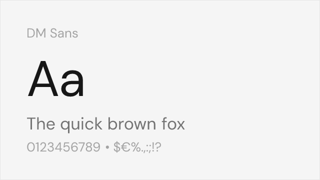
Closest match for Brown's warm, geometric-humanist character with clean, modern proportions
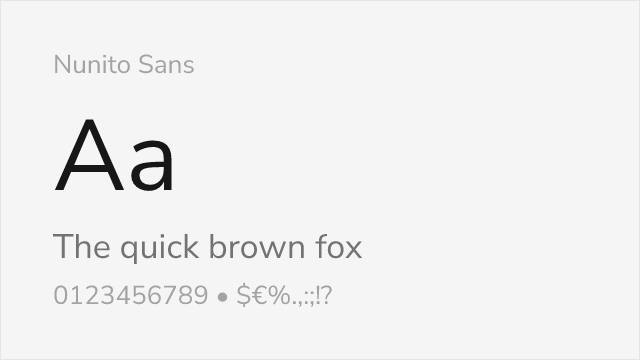
Friendly sans with clean proportions and comparable warmth
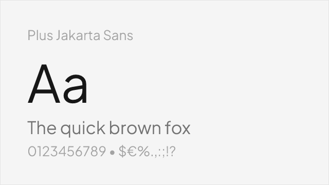
Modern geometric-grotesque with warm character and excellent screen optimization
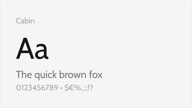
Humanist sans with warm, friendly proportions and robust construction

Versatile editorial sans with restrained warmth and full weight coverage
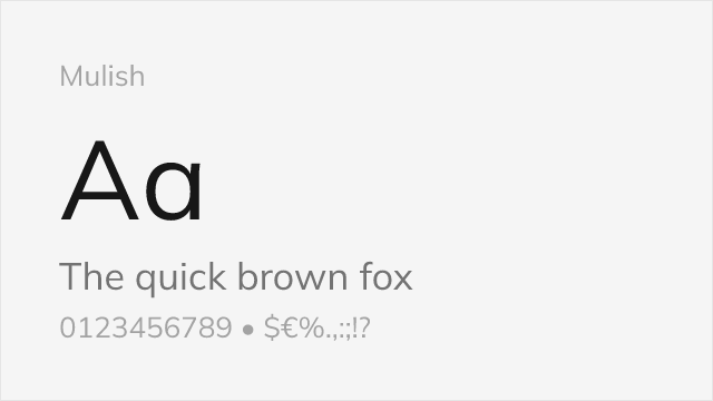
Clean, modern sans with subtle rounded character and balanced proportions
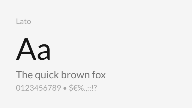
Mature humanist sans with warm details and proven reliability at scale
Compare the alternatives
See how Brown compares to its top alternatives — and how those alternatives compare to each other — side by side.
See where Brown is used in the wild and swap to free alternatives live.
Install FontSwap →Replacement Summary
Source: FontAlternatives.com
Premium font: Brown
Best free alternative: DM Sans
FontAlternatives similarity score: 84%
Replacement difficulty: Medium
Best for: tech company branding, consumer app interfaces, marketing websites, product design systems
Notable users: Airbnb, Various Swiss design studios, Norske tog
Not recommended when: Brand consistency with Airbnb requires exact letterforms
What is the best free alternative to Brown?
DM Sans is the best free alternative to Brown with a FontAlternatives similarity score of 84%.
DM Sans shares similar proportions, stroke characteristics, and intended use with Brown. It is available under the OFL-1.1 license, which permits both personal and commercial use at no cost.
This alternative works particularly well for: tech company branding, consumer app interfaces, marketing websites, product design systems.
Can I safely replace Brown with DM Sans?
Yes, with some considerations. DM Sans achieves a FontAlternatives similarity score of 84%, indicating good structural compatibility for most use cases.
Licensing: DM Sans is licensed under OFL-1.1, which allows commercial use without licensing fees or royalties.
Weight coverage: Most weights have close or exact matches available.
When should I NOT replace Brown?
While DM Sans is a strong alternative, there are situations where replacing Brown may not be appropriate:
- Optical precision requirements: DM Sans has measurable structural differences from Brown that may be visible in precise design work.
- Strict compliance: Verify that OFL-1.1 terms meet your specific legal and compliance requirements.
Weight-Matching Guide
Map Brown weights to their closest free alternatives for accurate font substitution.
DM Sans
| Brown | DM Sans | Match |
|---|---|---|
| Light (300) | Light (300) | close |
| Regular (400) | Regular (400) | close |
| Medium (500) | Medium (500) | close |
| Bold (700) | Bold (700) | close |
Nunito Sans
| Brown | Nunito Sans | Match |
|---|---|---|
| Light (300) | Light (300) | close |
| Regular (400) | Regular (400) | close |
| Medium (500) | Medium (500) | close |
| Bold (700) | Bold (700) | close |
Plus Jakarta Sans
| Brown | Plus Jakarta Sans | Match |
|---|---|---|
| Light (300) | Light (300) | close |
| Regular (400) | Regular (400) | close |
| Medium (500) | Medium (500) | close |
| Bold (700) | Bold (700) | close |
Cabin
| Brown | Cabin | Match |
|---|---|---|
| Regular (400) | Regular (400) | close |
| Medium (500) | Medium (500) | close |
| SemiBold (600) | SemiBold (600) | close |
| Bold (700) | Bold (700) | close |
Work Sans
| Brown | Work Sans | Match |
|---|---|---|
| Thin (100) | Thin (100) | close |
| Regular (400) | Regular (400) | close |
| Medium (500) | Medium (500) | close |
| Bold (700) | Bold (700) | close |
Mulish
| Brown | Mulish | Match |
|---|---|---|
| Light (300) | Light (300) | close |
| Regular (400) | Regular (400) | close |
| Medium (500) | Medium (500) | close |
| Bold (700) | Bold (700) | close |
Lato
| Brown | Lato | Match |
|---|---|---|
| Light (300) | Light (300) | close |
| Regular (400) | Regular (400) | close |
| Bold (700) | Bold (700) | close |
| Black (900) | Black (900) | close |
Performance Guide
Production performance metrics for each alternative.
How to Use DM Sans
Copy these code snippets to quickly add DM Sans to your project.
CSS code for DM Sans
@import url('https://fonts.googleapis.com/css2?family=DM+Sans:wght@100..900&display=swap');HTML code for DM Sans
<link rel="preconnect" href="https://fonts.googleapis.com">
<link rel="preconnect" href="https://fonts.gstatic.com" crossorigin>
<link href="https://fonts.googleapis.com/css2?family=DM+Sans:wght@100..900&display=swap" rel="stylesheet">
Tailwind code for DM Sans
// tailwind.config.js
module.exports = {
  theme: {
    extend: {
      fontFamily: {
        'dm-sans': ['"DM Sans"', 'sans-serif'],
      },
    },
  },
}

// Usage in HTML:
// <p class="font-dm-sans">Your text here</p>
Next.js code for DM Sans
// Using next/font (Next.js 13+)
import { DM_Sans } from 'next/font/google';

const dm_sans = DM_Sans({
  subsets: ['latin'],
  weight: ['100', '200', '300', '400', '500', '600', '700', '800', '900'],
});

export default function Component() {
  return (
    <p className={dm_sans.className}>
      Your text here
    </p>
  );
}

// Or using inline styles with Google Fonts link:
// <p style={{ fontFamily: '"DM Sans"' }}>Your text</p>
Expo and React Native code for DM Sans
// Install: npx expo install @expo-google-fonts/dm-sans expo-font
import { useFonts, DM_Sans_400Regular } from '@expo-google-fonts/dm-sans';

export default function App() {
  const [fontsLoaded] = useFonts({
    DM_Sans_400Regular,
  });

  if (!fontsLoaded) return null;

  return (
    <Text style={{ fontFamily: 'DM_Sans_400Regular' }}>
      Your text here
    </Text>
  );
}
Recommended Font Pairings
These free fonts pair well with DM Sans Brown for headlines, body text, or accent use.
Literata's contemporary serifs complement Brown's warm, geometric forms for editorial layouts that balance modern readability with traditional typographic contrast — both share an emphasis on screen optimization and reading comfort
Fraunces's expressive, wonky serifs create a playful contrast against Brown's controlled warmth, a pairing that works beautifully for lifestyle, food, and wellness brands seeking personality with polish
Source Serif Pro's steady transitional serifs provide authoritative body text contrast to Brown's friendly sans-serif headlines, creating a professional editorial hierarchy with warmth at every level
Browse Alternatives by Context
Find Brown alternatives filtered by specific use case, style, or language support.
By Use Case
By Style
By Script
Frequently Asked Questions
What is the best free alternative to Brown?
DM Sans is the best free alternative to Brown with a FontAlternatives similarity score of 84%. It shares similar proportions and characteristics while being available under the OFL-1.1 license for both personal and commercial use at no cost.
Is there a free version of Brown?
There is no official free version of Brown. However, DM Sans is available under the OFL-1.1 open-source license and achieves a FontAlternatives similarity score of 84%. It includes variable weights and supports latin, latin-extended.
What Google Font looks like Brown?
The Google Fonts most similar to Brown are DM Sans, Nunito Sans, Plus Jakarta Sans. Among these alternatives, DM Sans offers the closest match with a FontAlternatives similarity score of 84% and includes variable weights for flexible typography options.
Can I use DM Sans commercially?
Yes, DM Sans can be used commercially. It is licensed under OFL-1.1, which allows free use in websites, applications, print materials, and commercial projects without purchasing a license or paying royalties.
Is DM Sans similar enough to Brown?
DM Sans achieves a FontAlternatives similarity score of 84% compared to Brown. While not identical, it offers comparable letterforms, proportions, and visual style. Most designers find it works excellently as a substitute in web and print projects.
What are the main differences between Brown and its free alternatives?
Free alternatives to Brown may differ in subtle details like letter spacing, curve refinements, and available weights. Premium fonts typically include more OpenType features, extended language support, and optimized screen rendering. However, for most projects, these differences are negligible.
Where can I download free alternatives to Brown?
Download DM Sans directly from Google Fonts. Click the "Get Font" button on any alternative listed above to visit the official download page. Google Fonts also provides convenient embed codes for seamless web integration.