Free Alternatives to Aptos

About Aptos
- Foundry
- Microsoft
- Classification
- sans-serif
- Variable
- Yes
- Style
- neo-grotesque
Brands Using Aptos
Default typeface across Word, Outlook, PowerPoint and Excel since 2023, replacing Calibri
Inherited as the default in corporate document and template systems standardised on Microsoft 365
Default across Microsoft 365 Education deployments for coursework and administration
Default in government Microsoft 365 tenants, where document typography follows the platform
 See Aptos live on these sites with FontSwap →
In 2023 Microsoft changed the default font in Word, Outlook, PowerPoint and Excel for the first time in fifteen years. Calibri went; Aptos arrived. If you have opened a new document since, you have read Aptos — which makes it one of the most-seen typefaces in the world and, like Arial and Calibri before it, one that almost nobody consciously chose.
Aptos is proprietary. It is available to Microsoft 365 subscribers through the platform, with a locally installed version distributed by Microsoft, and it is not licensed for you to redistribute, self-host as a webfont, or build into a product. That is the gap this page exists to fill.
Why Aptos matters
The interesting thing about Aptos is not that it is good — it is that Microsoft went looking for something specific and took four years to find it.
In 2019 Microsoft commissioned five typefaces as candidates to succeed Calibri. Steve Matteson, then heading Monotype's design studio, submitted one under the working name Bierstadt, after a mountain in the Colorado Rockies. It won. Microsoft renamed it Aptos — after an unincorporated town in Santa Cruz County, California, that Matteson favoured — reportedly because people did not take the original name seriously.
Matteson is a consequential choice for this job. He drew the Windows TrueType core fonts, the Segoe family that has defined Microsoft's interface typography since Windows Vista, and Droid, which did the same for early Android. He also drew Arimo, the metric-compatible Arial substitute. Few people have shaped more of what ordinary computing looks like.
His stated brief for Aptos was to escape the coldness of a pure grotesque. "You gotta try to sneak in a little bit of humanity," he told Microsoft Design. "You can't just use rulers and straight edges." That sentence explains most of the design decisions below.
Design characteristics
Aptos is a neo-grotesque built on mid-century Swiss proportions — Helvetica and Arial are the acknowledged reference points — with humanist detail deliberately introduced at small scale.
The specifics are worth knowing, because they are what you are trying to preserve when you substitute:
- The lowercase
lhas a tail. This is the most-discussed decision in the typeface and the most practically useful. In Helvetica, Arial and Calibri, lowercaseland capitalIare near-identical vertical strokes; Aptos breaks the ambiguity outright. Any replacement that reverts to a bare stem loses a genuine legibility feature. - The
gis double-storeyed. Calibri's was single-storey and rounded. The change moves Aptos toward a more literary, less software-ish register. - The
Rhas "a little swing" to its leg — Matteson's phrase — rather than the straight splay of Arial or the mechanical curve of Helvetica. - The dots on
iandjare circular, not the squared-off dots typical of grotesques. Small, but it sets the tone. - Subtle circular geometry inside the contours — Microsoft describes "subtle circular squares within the letters' contours" — is credited with improving legibility at small sizes.
Stroke weight is near-uniform, the x-height is large, and spacing is looser than Arial's, which is a large part of why Aptos reads more comfortably in dense documents. Microsoft ships it in six weights — Light, Regular, Semibold, Bold, Extrabold and Black — each with an italic, plus a variable version, and the family extends to Aptos Serif, Aptos Mono, Aptos Display and Aptos Narrow.
Where Aptos excels
Business documents, which is exactly what it was commissioned for. At 11pt in a Word document Aptos is measurably easier to scan than Calibri was: the larger x-height, looser spacing and disambiguated l all pull in the same direction. Reports, memos, proposals and correspondence are its home ground and it is very good there.
Presentations benefit too. The six weights give real hierarchy — something Arial never offered — and the Semibold in particular sits usefully between Regular and Bold for deck subheads, a gap most system fonts leave open.
It also handles mixed-script documents better than its predecessors, with Cyrillic and Greek coverage drawn to the same standard as the Latin.
Where Aptos struggles
It is not a brand typeface and does not pretend to be. Aptos's design goal was universal acceptability, and the cost of universal acceptability is that it says nothing in particular. Using it as a brand face means adopting the visual identity of a Word document — which, given how many billions of Word documents exist, is a real risk of anonymity rather than a theoretical one.
The licensing is genuinely restrictive in practice. Availability through Microsoft 365 is not a webfont licence, and it is not a licence to embed Aptos in an application or product. Designers regularly discover this at the point of handoff, having built a comp in the font their word processor supplied.
Its display performance is fine rather than remarkable. Aptos Display exists for larger settings, but the core family at 60pt and up looks capable rather than distinguished — the humanist details that reward attention at 11pt do not add up to much at poster scale.
And it carries a specific institutional association that Arial, for all its ubiquity, never quite acquired. Arial reads as "no decision made". Aptos, for anyone who has noticed the change, reads as "Microsoft 365", which is a narrower and sometimes less welcome signal.
How to choose a free substitute
1. Is this an interface, or a document? For interfaces, Inter is the strongest option and arguably better than Aptos at the job: more weights, wider tooling support, and spacing tuned for UI density. For documents meant to be read at length, Source Sans 3 is warmer on the page.
2. Do you specifically want the character disambiguation?
If Aptos appealed because it is clearer than Calibri — the l with a tail, the unambiguous numerals — go to Public Sans, which treats that as a first-order design requirement rather than a refinement.
3. Do you want the same designer's hand? Arimo is also Matteson's, and the construction logic carries over more than the different briefs would suggest. Accept that you lose the Light weight and the humanist liberties.
4. Is this a presentation or a marketing site? Figtree keeps Aptos's friendly detailing while running a little more geometric, which reads better at deck-headline sizes. Manrope goes further toward contemporary product UI.
5. Was Aptos simply what the template gave you? Then this is an opportunity, not a substitution. Work Sans has the personality that a default deliberately lacks.
A caution worth stating: because Aptos is so new, some font-comparison sources describe it inaccurately or confuse it with Bierstadt, its working name, or with unrelated typefaces that share the name. Check what you are downloading. Aptos itself is not available under any open licence, and anything presenting itself as a free Aptos is either mislabelled or unlicensed.
Aptos in practice: what you can and cannot do with it
The licensing question comes up at the same point in almost every project, so it is worth being concrete.
You can type in Aptos in Word, Outlook, PowerPoint and Excel; send documents in it; print it; export a PDF with it embedded for viewing and printing, which is what Office does by default. That covers essentially all ordinary document work.
You cannot self-host it as a webfont, bundle it into an application, embed it in a mobile app, or hand the font files to a client or contractor. A Microsoft 365 subscription licenses you to use Microsoft's software, not to redistribute a typeface that ships with it.
The trap is comps. A designer mocks up a landing page in a tool that picked up Aptos from the system font list, the client approves it, and the front-end developer discovers at build time that there is no legal way to serve it. If a design is going anywhere near the web, decide the webfont before the comp is signed off — which in practice means starting from Inter, Figtree or Public Sans rather than retrofitting them later.
If you need the document and the website to match, the cleanest answer is to standardise on one of the open alternatives in both places. Set it as the Office theme font and serve the same family on the web, and the mismatch disappears entirely.
Premium Font Neighbors
If you want the lineage Aptos replaced or extends, start with Calibri — the fifteen-year incumbent, softer and rounder — and Segoe UI, Matteson's own earlier Microsoft interface family, which shares more of his construction thinking than Aptos's brief would suggest. Tahoma and Verdana round out the Microsoft screen-font tradition Aptos grew out of, both drawn for legibility under conditions far harsher than anything current displays impose.
If you want the Swiss ancestry Aptos is drawing on, Helvetica, Neue Haas Grotesk and Univers are the source material, and Aktiv Grotesk is the contemporary interpretation working the same seam — a neutral grotesque with the display-size awkwardness engineered out. Arial sits alongside as the other great default, and comparing the two is instructive: they are separated by forty years of thinking about how type behaves on screens.
FAQ
Is Aptos free? No. Aptos is proprietary to Microsoft. It is available to Microsoft 365 subscribers through the platform, with a locally installed version supplied by Microsoft, but that is a right to use it in Microsoft applications — not a licence to redistribute it, self-host it as a webfont, or embed it in a product you ship.
What font did Aptos replace? Calibri, which had been the default across Word, Outlook, PowerPoint and Excel since 2007. Calibri itself replaced Times New Roman as the Office default, so Aptos is the third typeface to hold that position in the modern era.
Why was Aptos originally called Bierstadt? Steve Matteson named his submission after Mount Bierstadt in the Colorado Rockies, following a convention he used across the candidate designs. Microsoft renamed it before launch — Matteson has said people did not take the original name seriously — choosing Aptos, an unincorporated town in Santa Cruz County, California, whose varied landscape was felt to suit the typeface's versatility.
Is Aptos a variable font? Yes. Microsoft distributes a variable version alongside the six static weights (Light through Black) and their italics. The wider family also includes Aptos Serif, Aptos Mono, Aptos Display and Aptos Narrow.
What is the closest free alternative to Aptos? Inter, for most purposes. It shares the large x-height, open apertures and screen-first spacing, and offers a wider weight range. If what you specifically valued was Aptos's warmth, Figtree is closer; if it was the character disambiguation, Public Sans is closer; if it was the underlying construction, Arimo is by the same designer.
Can I use Aptos on my website? Not by self-hosting it. Your Microsoft 365 licence does not extend to webfont serving, and Aptos is not available through Google Fonts or any open webfont host. Specifying it in a CSS font stack will render for visitors who happen to have it installed locally, which is unpredictable. For a reliable web deployment, pick one of the open-licensed alternatives on this page.
Is Aptos better than Calibri?
For documents, most of the evidence points that way — the larger x-height, looser spacing and disambiguated l and I all favour Aptos at reading sizes, and the six-weight range gives hierarchy Calibri's four could not. Calibri retains an advantage in softness; its rounded stem terminals give it a gentler texture that some readers prefer for informal correspondence. The change was an improvement in legibility rather than a wholesale upgrade.
Are there free alternatives to Aptos Serif and Aptos Mono? Yes, and they are strong ones. For Aptos Serif, Source Serif 4 and Literata both cover the same ground — a screen-first serif that holds up in body text without reading as traditional. For Aptos Mono, JetBrains Mono and IBM Plex Mono are the usual answers, both open-licensed and both better documented for code use than Aptos Mono is. If you are replacing the whole Aptos family rather than just the sans, pairing Inter with Literata gets you close to the same tonal range.
Why does Aptos look so much like Helvetica and Arial?
Because it is deliberately built on the same mid-century Swiss proportions — Microsoft's own description cites that lineage. The differences are concentrated in details Matteson introduced to soften it: the tailed l, the double-storey g, the swing in the R leg, circular dots on the i and j. At a glance it reads as a grotesque; up close it is noticeably warmer than either.
Is Aptos on Google Fonts?
No, Aptos is a premium font from Microsoft and is not available on Google Fonts.
The closest Google Fonts alternative is Inter with 86% similarity. Get it free on Google Fonts ↗
Free Alternatives (7)
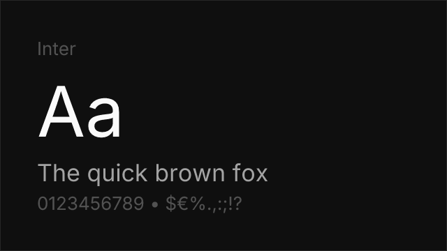
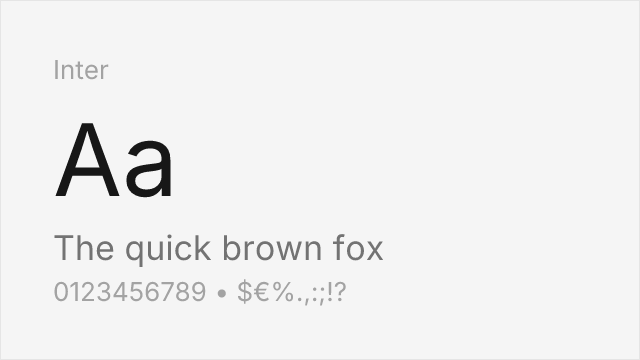
Screen-first neo-grotesque with the same large x-height and open apertures.
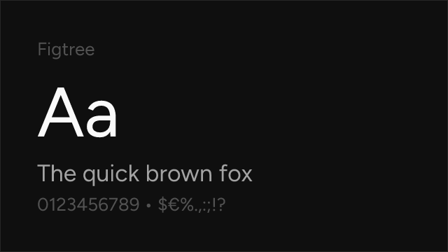
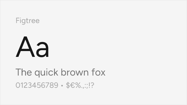
Geometric-leaning sans with rounded, friendly detailing close to Aptos's humanist touches.
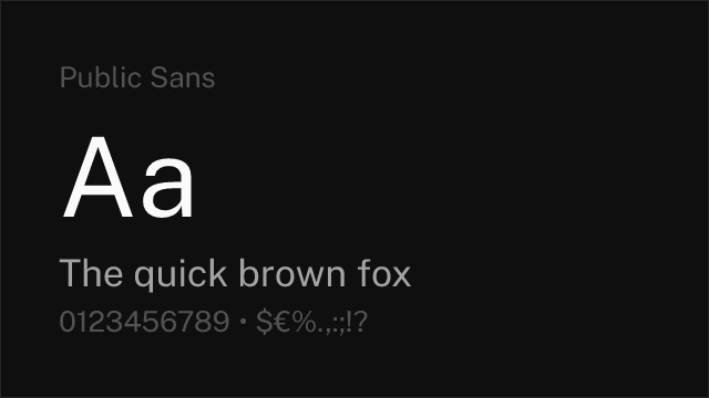
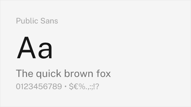
Accessibility-first grotesque from the US Web Design System.
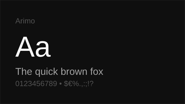
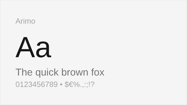
Also drawn by Steve Matteson; shares his neo-grotesque construction logic.
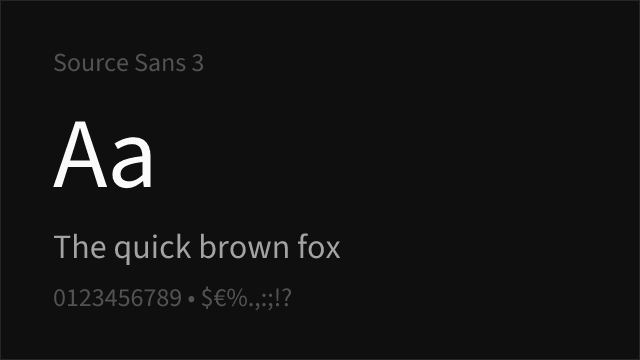

Adobe's open-source UI sans, humanist where Aptos is grotesque-with-warmth.
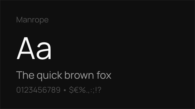
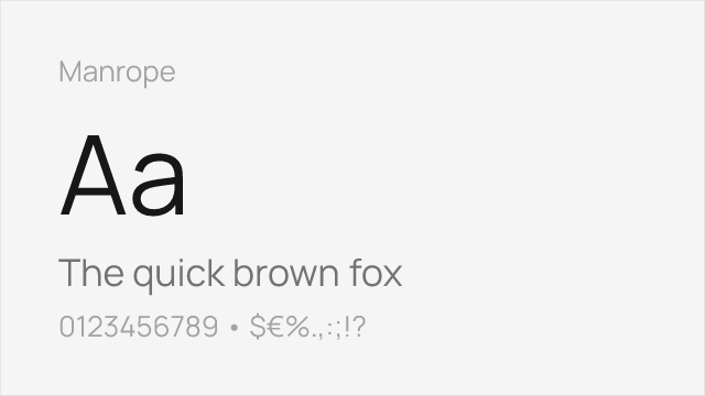
Semi-geometric sans with tight, modern spacing.
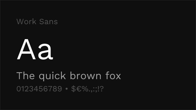

Optimised for mid-size screen text with more character than a default needs.
See where Aptos is used in the wild and swap to free alternatives live.
Install FontSwap →Replacement Summary
Source: FontAlternatives.com
Premium font: Aptos
Best free alternative: Inter
FontAlternatives similarity score: 86%
Replacement difficulty: Low
Best for: ui, documents, saas, web
Notable users: Microsoft, Enterprise Microsoft 365 tenants, Educational institutions
Not recommended when: Brand consistency with Microsoft requires exact letterforms
What is the best free alternative to Aptos?
Inter is the best free alternative to Aptos with a FontAlternatives similarity score of 86%.
Inter shares similar proportions, stroke characteristics, and intended use with Aptos. It is available under the OFL-1.1 license, which permits both personal and commercial use at no cost.
This alternative works particularly well for: ui, documents, saas, web.
Can I safely replace Aptos with Inter?
Yes, Inter is a high-confidence replacement for Aptos. The FontAlternatives similarity score of 86% indicates strong structural compatibility.
Licensing: Inter is licensed under OFL-1.1, which allows commercial use without licensing fees or royalties.
Weight coverage: All 4 weights have exact matches available.
When should I NOT replace Aptos?
While Inter is a strong alternative, there are situations where replacing Aptos may not be appropriate:
- Strict compliance: Verify that OFL-1.1 terms meet your specific legal and compliance requirements.
Weight-Matching Guide
Map Aptos weights to their closest free alternatives for accurate font substitution.
Inter
| Aptos | Inter | Match |
|---|---|---|
| Light (300) | Light (300) | exact |
| Regular (400) | Regular (400) | exact |
| Semibold (600) | Semibold (600) | exact |
| Bold (700) | Bold (700) | exact |
Figtree
| Aptos | Figtree | Match |
|---|---|---|
| Light (300) | Light (300) | exact |
| Regular (400) | Regular (400) | exact |
| Semibold (600) | Semibold (600) | exact |
| Bold (700) | Bold (700) | exact |
Public Sans
| Aptos | Public Sans | Match |
|---|---|---|
| Light (300) | Light (300) | exact |
| Regular (400) | Regular (400) | exact |
| Semibold (600) | Semibold (600) | exact |
| Bold (700) | Bold (700) | exact |
Arimo
| Aptos | Arimo | Match |
|---|---|---|
| Light (300) | Regular (400) | substitute |
| Regular (400) | Regular (400) | exact |
| Semibold (600) | SemiBold (600) | exact |
| Bold (700) | Bold (700) | exact |
Source Sans 3
| Aptos | Source Sans 3 | Match |
|---|---|---|
| Light (300) | Light (300) | exact |
| Regular (400) | Regular (400) | exact |
| Semibold (600) | Semibold (600) | exact |
| Bold (700) | Bold (700) | exact |
Manrope
| Aptos | Manrope | Match |
|---|---|---|
| Light (300) | Light (300) | exact |
| Regular (400) | Regular (400) | exact |
| Semibold (600) | Semibold (600) | exact |
| Bold (700) | Bold (700) | exact |
Work Sans
| Aptos | Work Sans | Match |
|---|---|---|
| Light (300) | Light (300) | exact |
| Regular (400) | Regular (400) | exact |
| Semibold (600) | Semibold (600) | exact |
| Bold (700) | Bold (700) | exact |
Performance Guide
Production performance metrics for each alternative.
How to Use Inter
Copy these code snippets to quickly add Inter to your project.
CSS code for Inter
@import url('https://fonts.googleapis.com/css2?family=Inter:wght@100..900&display=swap');HTML code for Inter
<link rel="preconnect" href="https://fonts.googleapis.com">
<link rel="preconnect" href="https://fonts.gstatic.com" crossorigin>
<link href="https://fonts.googleapis.com/css2?family=Inter:wght@100..900&display=swap" rel="stylesheet">
Tailwind code for Inter
// tailwind.config.js
module.exports = {
  theme: {
    extend: {
      fontFamily: {
        'inter': ['Inter', 'sans-serif'],
      },
    },
  },
}

// Usage in HTML:
// <p class="font-inter">Your text here</p>
Next.js code for Inter
// Using next/font (Next.js 13+)
import { Inter } from 'next/font/google';

const inter = Inter({
  subsets: ['latin'],
  weight: ['100', '200', '300', '400', '500', '600', '700', '800', '900'],
});

export default function Component() {
  return (
    <p className={inter.className}>
      Your text here
    </p>
  );
}

// Or using inline styles with Google Fonts link:
// <p style={{ fontFamily: "'Inter'" }}>Your text</p>
Expo and React Native code for Inter
// Install: npx expo install @expo-google-fonts/inter expo-font
import { useFonts, Inter_400Regular } from '@expo-google-fonts/inter';

export default function App() {
  const [fontsLoaded] = useFonts({
    Inter_400Regular,
  });

  if (!fontsLoaded) return null;

  return (
    <Text style={{ fontFamily: 'Inter_400Regular' }}>
      Your text here
    </Text>
  );
}
Recommended Font Pairings
These free fonts pair well with Inter Aptos for headlines, body text, or accent use.
Newsreader's editorial contrast gives headings the authority Aptos deliberately withholds
Literata was drawn for extended screen reading, complementing Aptos in reports and long documents
Zilla Slab's squared serifs mark out callouts and data labels without clashing with Aptos's soft detailing
Browse Alternatives by Context
Find Aptos alternatives filtered by specific use case, style, or language support.
Frequently Asked Questions
What is the best free alternative to Aptos?
Inter is the best free alternative to Aptos with a FontAlternatives similarity score of 86%. It shares similar proportions and characteristics while being available under the OFL-1.1 license for both personal and commercial use at no cost.
Is there a free version of Aptos?
There is no official free version of Aptos. However, Inter is available under the OFL-1.1 open-source license and achieves a FontAlternatives similarity score of 86%. It includes variable weights and supports latin, latin-extended.
What Google Font looks like Aptos?
The Google Fonts most similar to Aptos are Inter, Figtree, Public Sans. Among these alternatives, Inter offers the closest match with a FontAlternatives similarity score of 86% and includes variable weights for flexible typography options.
Can I use Inter commercially?
Yes, Inter can be used commercially. It is licensed under OFL-1.1, which allows free use in websites, applications, print materials, and commercial projects without purchasing a license or paying royalties.
Is Inter similar enough to Aptos?
Inter achieves a FontAlternatives similarity score of 86% compared to Aptos. While not identical, it offers comparable letterforms, proportions, and visual style. Most designers find it works excellently as a substitute in web and print projects.
What are the main differences between Aptos and its free alternatives?
Free alternatives to Aptos may differ in subtle details like letter spacing, curve refinements, and available weights. Premium fonts typically include more OpenType features, extended language support, and optimized screen rendering. However, for most projects, these differences are negligible.
Where can I download free alternatives to Aptos?
Download Inter directly from Google Fonts. Click the "Get Font" button on any alternative listed above to visit the official download page. Google Fonts also provides convenient embed codes for seamless web integration.