Low Contrast Fonts
Typefaces with minimal variation between thick and thin strokes, producing even color on the page and excellent readability. Ideal for body text, interfaces, and extended reading.
Low-contrast typefaces minimize the difference between their thickest and thinnest strokes, creating an even visual texture that the eye can follow comfortably over long passages. This consistency of weight — the typographic equivalent of even illumination — reduces visual fatigue and makes low-contrast designs among the most readable typefaces available.
Accessibility and Legibility Research
Low-contrast typefaces consistently perform well in readability studies across diverse populations. Research on readers with low vision shows that even stroke weight is easier to perceive than the alternating thick-thin patterns of high-contrast faces, where hairline strokes can disappear below the visibility threshold. For readers with dyslexia, the consistent visual rhythm of low-contrast type reduces the letter-confusion that more variable designs can trigger. Age-related contrast sensitivity loss also favors low-contrast faces — as the eye's ability to distinguish subtle weight differences declines, typefaces that maintain visible strokes throughout every letter become more legible. These findings have led accessibility guidelines to recommend low-contrast sans-serif typefaces for interfaces, signage, and public information where the widest possible audience must be served.
Digital Optimization
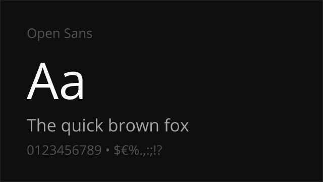
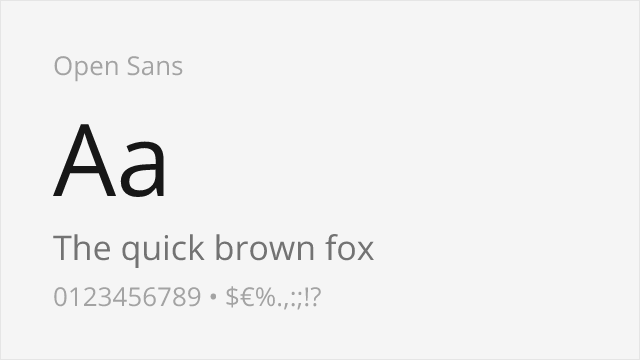
Low-contrast typefaces are inherently well-suited to screen rendering. Unlike high-contrast faces, where hairline strokes may vanish or render inconsistently at different pixel densities, low-contrast designs maintain their essential character across display technologies. Their uniform strokes fit predictably onto pixel grids, and the absence of extreme thin elements means anti-aliasing has less work to do. This makes low-contrast faces particularly effective for mobile interfaces, where small text sizes and varying screen qualities demand forgiving, robust letterforms. Many of the most successful screen-first typefaces — Inter, Roboto, San Francisco — are low-contrast designs precisely because this characteristic translates reliably to digital contexts without extensive per-size optical adjustments.
Design Principles
Low contrast in type design is not merely the absence of stroke variation — it is a positive design choice with specific aesthetic and functional implications. The even weight creates a calm, democratic visual texture where no single stroke dominates. This works against dramatic hierarchy within individual letters but creates excellent paragraph color: long passages of low-contrast text appear as an even gray block, which experienced typographers consider a hallmark of good text composition. The design challenge is maintaining visual interest and character differentiation without the thick-thin contrast that naturally distinguishes similar letterforms. Low-contrast type designers achieve this through variations in proportion, aperture size, terminal shape, and the subtle geometry of curves — the personality must come from structure rather than weight modulation.
When to Use
Low-contrast typefaces are ideal for body text, user interfaces, mobile applications, wayfinding signage, educational materials, and any context where sustained readability takes priority over visual drama. They are the safest choice for accessibility-sensitive projects, public-facing information, and designs that must perform across a wide range of display conditions. Pair with higher-contrast display faces for headlines when visual hierarchy requires more dramatic impact.
Premium Low Contrast Fonts


Free Low Contrast Fonts
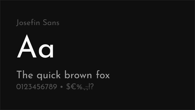
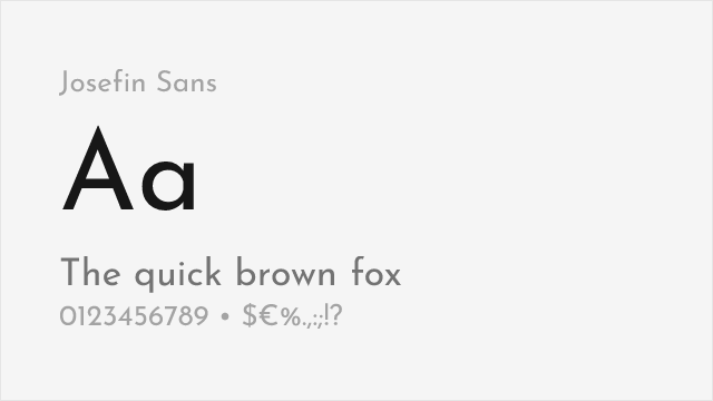
Josefin Sans Free Variable


Montserrat Free Variable
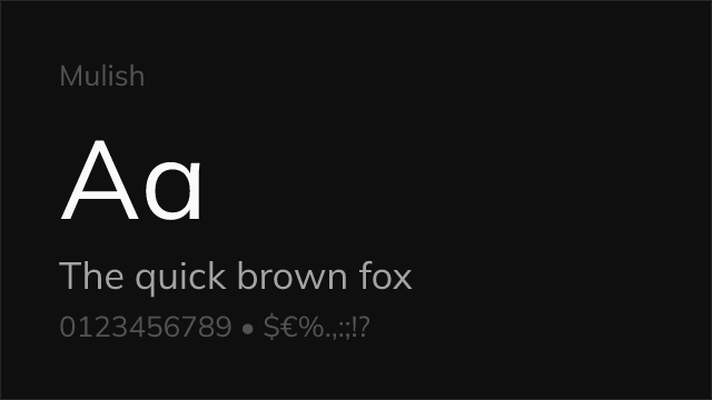


Nunito Sans Free Variable


No fonts found with this filter.