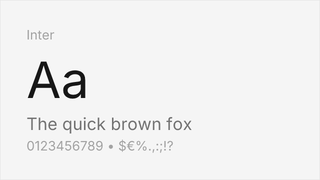
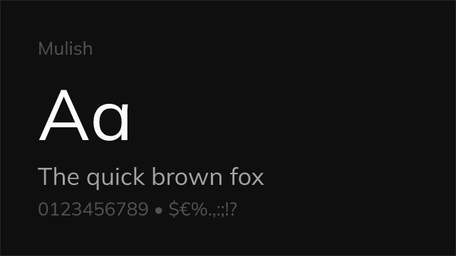
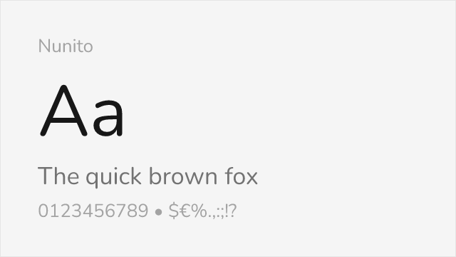
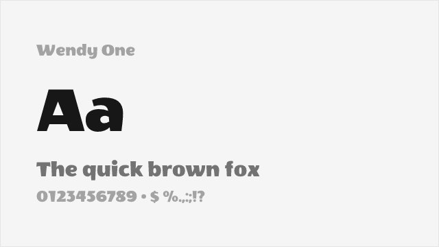
Monoline Fonts
Typefaces with a consistent, uniform stroke width throughout every letterform. Their even weight creates a clean, mechanical aesthetic suited to logos, signage, and minimalist design.
Monoline typefaces maintain the same stroke thickness from start to finish in every letter, eliminating the thick-thin contrast found in most type categories. This uniform weight produces an evenness of texture that reads as clean, mechanical, and unadorned — the typographic equivalent of a line drawn with a marker rather than a brush.
Design Principles
True monoline construction requires deliberate optical corrections that contradict the apparent simplicity of the concept. Where curved strokes meet straight ones (as in the letters 'b', 'd', 'p'), a designer must slightly thin the curve to prevent the junction from appearing too heavy — an uncorrected join creates a dark spot that disrupts the even texture. Similarly, horizontal strokes appear optically thicker than verticals of the same measured width, so monoline fonts typically thin horizontals by a few percent. Round letters like 'o' must overshoot the baseline and cap height slightly, as circles geometrically equal to a square appear smaller to the human eye. The discipline of monoline design lies in making these corrections invisible — the result should look perfectly uniform even though it is not.
Modern Trends
Monoline typefaces have experienced a resurgence driven by several contemporary design movements. The craft branding trend — artisanal coffee, small-batch spirits, handmade goods — frequently uses monoline script and sans-serif lettering to suggest human craftsmanship and authenticity. Logo design has embraced monoline construction for its clean scalability, as uniform strokes reproduce predictably across screen sizes, embroidery, engraving, and single-color printing. In UI design, monoline icon systems have become standard (Phosphor, Feather Icons), and monoline typefaces complement these icon styles by sharing the same visual weight and construction logic. Variable font technology allows monoline designs to offer continuous weight adjustment while maintaining their uniform-stroke character.
Pairing Strategies
Monoline typefaces pair effectively with high-contrast serif faces, where the juxtaposition of uniform and variable strokes creates rich visual texture. A monoline sans headline over a transitional serif body provides a modern-meets-classical hierarchy. For more cohesive pairings, combine monoline sans-serifs with monoline scripts or geometric sans-serifs that share the uniform-stroke philosophy. Avoid pairing monoline faces with other low-contrast designs of similar weight — the lack of contrast between the two creates a flat, monotonous hierarchy. Monoline type also works well alongside illustration and photography, where its even stroke acts as a quiet frame that does not compete with visual content.
When to Use
Monoline typefaces excel in logo design, brand wordmarks, packaging, signage, and any context where clean scalability and consistent reproduction are priorities. They work well for minimalist interfaces, craft and artisanal branding, and designs that need to translate across physical media (engraving, embossing, screen printing). Use at display sizes for maximum impact; at text sizes, the uniform weight can make monoline fonts feel less lively than designs with more natural stroke variation.
Premium Monoline Fonts


Free Monoline Fonts


No fonts found with this filter.