Rounded Fonts
Typefaces with softened terminals and curved stroke endings that create a friendly, approachable personality. Rounded fonts convey warmth and accessibility.
Rounded typefaces replace the sharp terminals and corners of standard sans-serifs with smooth, circular endings. This seemingly small modification profoundly changes a font's personality — rounded forms are perceived as softer, friendlier, and more approachable than their sharp-cornered counterparts, making them popular for brands and interfaces that prioritize warmth over formality.
Friendliness and Accessibility
Research in psychology and design consistently shows that people perceive rounded shapes as friendlier, safer, and more approachable than angular ones — a phenomenon called the "contour bias." This makes rounded typefaces particularly effective for healthcare applications, children's educational materials, and consumer products targeting broad audiences. However, the friendliness perception has a ceiling: excessively rounded fonts can appear juvenile or unserious, undermining credibility for professional or financial contexts. The best rounded designs (Nunito, Varela Round) strike a balance, offering warmth without sacrificing competence. For accessibility, rounded terminals improve letter differentiation at small sizes, as the circular endings create more distinctive glyph silhouettes than squared-off terminals.
Cultural Associations
Rounded typefaces carry distinct cultural connotations across industries. In technology, rounded fonts signal user-friendly, consumer-facing products — note the prevalence of rounded fonts in app icons and mobile interfaces. Food and beverage brands use rounded type to suggest approachability and pleasure. Healthcare organizations choose rounded fonts to reduce the clinical feel of medical communications. In Japan, rounded Gothic typefaces (Maru Gothic) are a deeply established tradition with broader cultural acceptance than in Western design, where rounded fonts remain primarily associated with informal or child-oriented contexts. The startup ecosystem has embraced rounded geometric sans-serifs (Poppins, Nunito) as a way to project approachability and innovation simultaneously.
Pairing Strategies
Rounded fonts pair best with typefaces that provide structural contrast. A rounded sans-serif headline over a traditional serif body (Nunito over Source Serif Pro) creates a warm-but-credible combination suited to editorial and brand content. For all-sans pairings, combine a rounded display font with a standard (non-rounded) sans for body text to maintain readability over longer passages. Avoid pairing rounded fonts with other rounded fonts — the uniformity of soft endings becomes monotonous. Rounded fonts also work as accent faces for callouts, badges, and UI labels within systems that use sharper type elsewhere, adding friendly emphasis without disrupting the overall hierarchy.
When to Use
Rounded typefaces are ideal for brands targeting families, children, or health-conscious consumers. They work well for mobile app interfaces, educational platforms, onboarding flows, and any context where the design should feel inviting. Use them for headlines and UI elements rather than long body text, where the rounded terminals can slow reading speed slightly compared to standard sans-serif designs.
Premium Rounded Fonts


Cooper Black


Object Sans


Free Rounded Fonts


Merriweather Free


Montserrat Free Variable

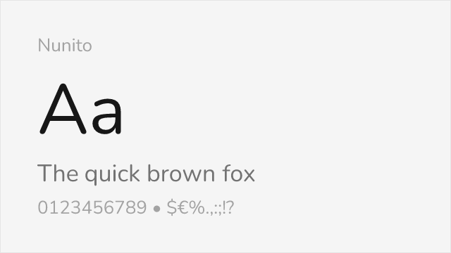


Nunito Sans Free Variable


Roboto Slab Free Variable


Zilla Slab Free
No fonts found with this filter.