Free Alternatives to Akzidenz-Grotesk

About Akzidenz-Grotesk
- Foundry
- Berthold
- Classification
- sans-serif
- Style
- neo-grotesque
Brands Using Akzidenz-Grotesk
Wordmark and core corporate typeface
Original 1970s Unimark wayfinding identity (marketed in the US as Standard Medium)
Institutional corporate typeface
The foundational grotesque of 1950s Swiss design (Müller-Brockmann, Gerstner)
 See Akzidenz-Grotesk live on these sites with FontSwap →
See Akzidenz-Grotesk in the Wild
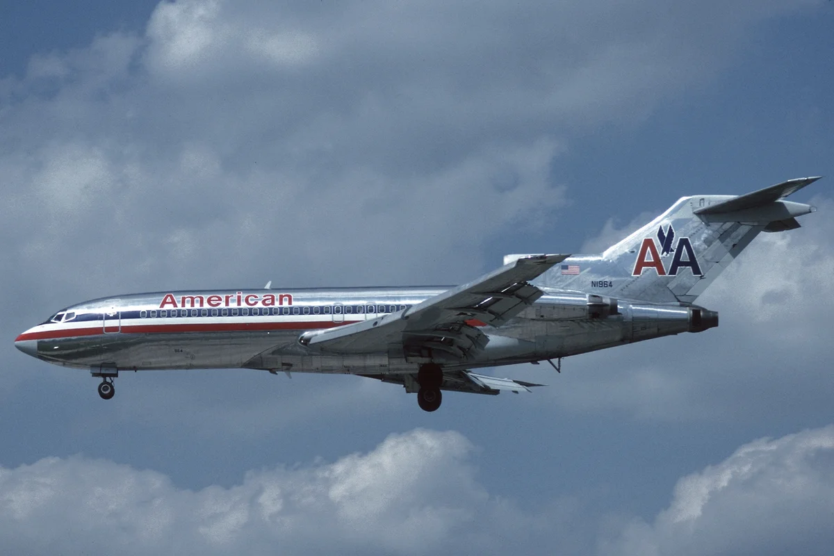
Akzidenz-Grotesk is a foundational sans-serif typeface originally released by the Berthold Type Foundry in Germany around 1898. Often considered the grandfather of neo-grotesque typography, it directly influenced the creation of Helvetica and remains prized for its authentic industrial character. For designers seeking typography with genuine historical provenance, Akzidenz-Grotesk offers something no modern typeface can replicate: over a century of typographic heritage.
History and Design
The name "Akzidenz" refers to "jobbing" or commercial printing in German, reflecting the typeface's original purpose for everyday printing needs—business cards, letterheads, and general commercial work. The design evolved from multiple sources within Berthold's extensive type library, with contributions attributed to various punch cutters including Ferdinand Theinhardt, whose earlier work formed the foundation.
The typeface emerged during the transition from ornate Victorian typography to the cleaner, more functional designs that would define 20th-century modernism. Unlike the decorative display faces common in the late 1890s, Akzidenz-Grotesk represented a radical embrace of simplicity and functionality. Its success demonstrated that sans-serif typography could serve serious professional purposes.
Unlike later neo-grotesques designed with mathematical precision, Akzidenz-Grotesk retains subtle quirks and irregularities from its pre-digital origins. The letter 'g' has a distinctive single-storey form. Stroke widths vary slightly between characters. These "imperfections" give Akzidenz-Grotesk a warmth and authenticity that many designers prefer over the clinical precision of Helvetica.
The move to digital preserved this character, for better and worse. The Berthold digital cuts (and later the AG family issued under the Berthold name) carried the quirks forward faithfully, but the typeface's licensing has been complicated by the dissolution and reorganization of the original Berthold foundry, which left the genuine article less consistently and cheaply available than the omnipresent Helvetica. That practical friction — the authentic version being harder to license than its more famous imitator — is a large part of why designers who love the look so often end up reaching for one of the free neo-grotesques instead.
Berthold expanded the family significantly over the decades, adding weights and widths to create a comprehensive system. The current family includes Extended and Condensed variants alongside the standard widths, though the core Regular and Bold weights remain the most widely used.
Two chapters of that history matter for anyone using it today. First, the name: for much of the twentieth century Akzidenz-Grotesk was sold in the English-speaking world simply as "Standard," which is why American design of the 1950s and 60s that appears to use it is often credited to Standard Medium — including the original Unimark wayfinding system for the New York City Subway. Second, the revival: in the postwar decades Berthold's artistic director Günter Gerhard Lange became the typeface's great champion, carefully reworking and extending the family to give its historically uneven weights a more coherent range while preserving the quirks that gave it character. It is largely thanks to Lange that Akzidenz-Grotesk survived the Helvetica era as a living, usable family rather than a museum piece.
Why Akzidenz-Grotesk Matters
Akzidenz-Grotesk's influence on 20th-century typography cannot be overstated. When the Haas Type Foundry sought to create a competitor in 1957, they tasked Max Miedinger with designing what would become Helvetica—explicitly modeled on Akzidenz-Grotesk but with more refined, consistent letterforms. The "International Typographic Style" (Swiss Style) employed both typefaces frequently, sometimes interchangeably.
What distinguishes Akzidenz-Grotesk from its more famous successor is precisely what some designers find appealing: its imperfections. Where Helvetica can feel cold and clinical, Akzidenz-Grotesk projects warmth and authenticity. The subtle irregularities remind viewers they're looking at something with history, something crafted by human hands rather than computed by algorithms.
That distinction became a badge of taste. The Swiss designers who defined the International Typographic Style — figures like Josef Müller-Brockmann — built rigorous grid-based work on Akzidenz-Grotesk before Helvetica even existed, and a later generation of designers came to treat choosing the older face over Helvetica as a quiet signal of connoisseurship: proof that you knew where the neo-grotesque style actually came from. In that sense Akzidenz-Grotesk matters twice over — once as the origin of the most important typographic style of the twentieth century, and again as the insider's alternative to the very typeface it inspired.
Fashion, luxury, and cultural brands particularly favor Akzidenz-Grotesk for this sophisticated, understated elegance, precisely because it carries the neo-grotesque look without the ubiquity of Helvetica. High-end publications and art galleries recognize that Akzidenz-Grotesk communicates taste and cultural awareness—a knowing choice that signals design literacy to the audiences most likely to notice it.
Design Characteristics
Akzidenz-Grotesk's appeal is bound up in what it is not: it is not mathematically perfect, and that is exactly the point. As a nineteenth-century design predating the systematic neo-grotesques, it carries small irregularities that its successors sanded away, and those irregularities are what give it life:
- Historical quirks: Subtle inconsistencies from pre-digital craftsmanship that read as warmth rather than error.
- Single-storey
g: A distinctive lowercase form that immediately distinguishes it from many later grotesques. - Moderate x-height and classical proportions: Balanced, unexaggerated forms suited to both text and display.
- Slightly varied stroke widths: Organic rather than mathematically uniform, which softens the overall color.
- Industrial, workmanlike character: An honest, functional aesthetic born from commercial "jobbing" printing.
- A comprehensive family: Weights and widths accreted over decades, from condensed to extended, though the Regular and Bold remain the workhorses.
Where Akzidenz-Grotesk Excels
Akzidenz-Grotesk thrives where a designer wants neo-grotesque neutrality with a whisper of history — the knowing choice rather than the default one:
- Fashion and luxury: Sophisticated without being pretentious or trendy; a favorite of design-literate brands.
- Editorial and art publishing: Classic character for magazines, catalogs, and culture titles.
- Branding with heritage: A timeless quality that signals taste rather than novelty.
- Museums and cultural institutions: Its authentic modernist aesthetic suits galleries and exhibitions.
- High-end retail and signage: Understated elegance that reads as considered, the kind of quiet confidence that expensive brands spend a great deal of effort trying to manufacture and that Akzidenz-Grotesk supplies almost by default.
Where Akzidenz-Grotesk Struggles
For all its heritage, Akzidenz-Grotesk is a specialist, and the same qualities that make it a connoisseur's choice limit it elsewhere. Its value is largely contextual — it depends on an audience that can read the reference — and outside that context there are usually more practical tools:
- Screen and UI work: A print-era design, it is less optimized for interface text than screen-first families like Inter; on the web its digital cuts can feel dated at small sizes.
- Distinctiveness in a crowded field: To most viewers it reads as "a Helvetica," so it rarely sets a brand apart from the wider neo-grotesque crowd.
- Availability and cost: The authentic Berthold cuts are commercial and, historically, less consistently available than Helvetica or its free cousins.
- Warmth or personality briefs: Its neutrality means it brings little to projects that want overt friendliness, character, or contemporary edge.
How to Choose a Free Substitute
The honest truth is that no free font reproduces Akzidenz-Grotesk's specific historical quirks — that century of provenance is not something an open license can supply. So decide first whether you actually need the heritage or just the neo-grotesque neutrality, because the answer changes the recommendation.
If you need clean, functional neutrality for modern work, Inter is the closest and most capable free match, with Roboto the pragmatic cross-platform option and Source Sans 3 the choice for coordinated document systems. If you want a little more grotesque character and a full systematic range, Work Sans and Familjen Grotesk are strong picks, and Libre Franklin brings a warmer, American-gothic flavor.
What none of them can give you is the specific knowingness of Akzidenz-Grotesk — the signal to other designers that you reached past Helvetica for the original. If that association is the real reason you wanted it, be honest that a free substitute will not carry it, and either license the genuine article or choose a free face with its own distinct voice rather than a near-miss that reads as generic.
One practical test helps here: set the same paragraph in Akzidenz-Grotesk and in your candidate, then ask a colleague which feels older. If they cannot tell — or if they cannot say why the original looks different — then the heritage you were paying for is not actually surviving in your layout, and a clean free grotesque like Inter or Work Sans will serve you just as well for far less friction. Reserve the licensed original for the cases where the difference genuinely reads, which are rarer than most briefs assume.
Premium Font Neighbors
Akzidenz-Grotesk sits at the root of the neo-grotesque family tree, so its neighbors are its own descendants. Helvetica is the most famous — Max Miedinger drew it in 1957 explicitly to refine Akzidenz-Grotesk — and Neue Haas Grotesk restores Helvetica to its original, more characterful drawing. Univers, released the same year, is the systematic alternative built from scratch. For contemporary takes on the same neutrality, Aktiv Grotesk and Neuzeit update the idea, while Graphik and GT America are the modern design-world grotesques that now dominate branding. Franklin Gothic offers the parallel American-gothic tradition for a slightly warmer, sturdier voice.
FAQ
What is the best free alternative to Akzidenz-Grotesk?
Inter is the best all-round free alternative, matching Akzidenz-Grotesk's neutral, professional utility with excellent clarity and a full weight range — though it lacks the original's historical character. For more grotesque personality, Work Sans and Familjen Grotesk are strong; Roboto is the pragmatic cross-platform pick. All are free under the SIL Open Font License.
What's the difference between Akzidenz-Grotesk and Helvetica?
Akzidenz-Grotesk predates Helvetica by six decades and carries subtle pre-digital irregularities that give it warmth and authenticity. Helvetica (1957) was drawn explicitly to refine Akzidenz-Grotesk into a more uniform, mathematically consistent face. Akzidenz-Grotesk has a single-storey g and slightly varied stroke widths; Helvetica is more even. Many designers prefer Akzidenz-Grotesk precisely for its historical character.
Why do fashion brands use Akzidenz-Grotesk?
It communicates sophisticated taste and cultural awareness without looking trendy. Its historical provenance signals design literacy, and its subtle imperfections lend a warmth that clinical alternatives lack. Reaching for the original rather than the ubiquitous Helvetica is itself a knowing choice that design-literate audiences recognize.
Can I use these free alternatives commercially?
Yes. Inter, Roboto, Source Sans 3, Work Sans, Familjen Grotesk, and Libre Franklin are all released under the SIL Open Font License, permitting unlimited commercial use without fees across web, app, branding, and print. Attribution is only required if you redistribute the font files themselves.
Who designed Akzidenz-Grotesk?
It was not the work of a single designer. Akzidenz-Grotesk was released by the Berthold Type Foundry around 1898 and assembled and expanded from several sources within Berthold's library over the following decades; earlier grotesque work by the punchcutter Ferdinand Theinhardt is often cited as part of its foundation, though the exact attribution is debated among type historians.
Is Akzidenz-Grotesk good for websites?
It can be, but as a print-era design its digital cuts are less screen-optimized than modern web-first families. For interface and body text online, Inter or Work Sans usually render more cleanly at small sizes while preserving the neutral grotesque feel — and they come with variable-font and hinting advantages the older design lacks.
What fonts pair well with Akzidenz-Grotesk?
The most reliable pairing is a classical serif for contrast — a Garamond or a transitional serif under Akzidenz-Grotesk headings gives editorial work a timeless, considered feel that plays to the grotesque's heritage. For an all-sans look, lean on the family itself, setting a heavier or condensed width against the roman rather than mixing in a second sans, since two competing grotesques tend to muddy each other. When the project calls for warmth, a humanist serif for body text balances the grotesque's cool neutrality nicely.
Is Akzidenz-Grotesk on Google Fonts?
No, Akzidenz-Grotesk is a premium font from Berthold and is not available on Google Fonts.
The closest Google Fonts alternative is Inter with 82% similarity. Get it free on Google Fonts ↗
Free Alternatives (6)
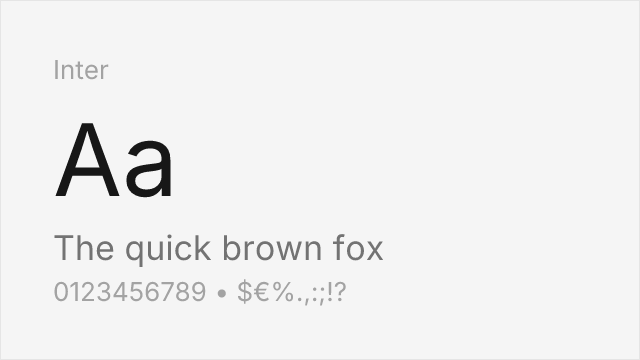
Modern interpretation capturing the neutral essence with digital optimization
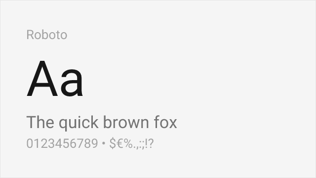
Similar industrial character with contemporary refinements

Clean neo-grotesque with comparable professional utility
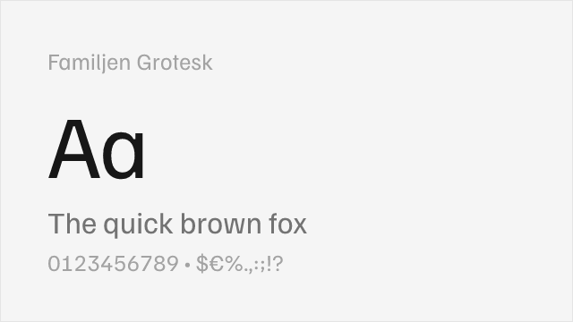
Variable neo-grotesque with contemporary refinements and Swedish design sensibility

Variable neo-grotesque with a full weight range and screen tuning
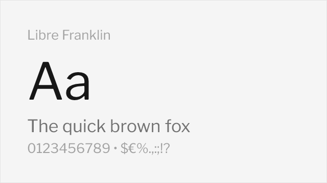
American-gothic grotesque with a systematic, wide weight range
Compare the alternatives
See how Akzidenz-Grotesk compares to its top alternatives — and how those alternatives compare to each other — side by side.
See where Akzidenz-Grotesk is used in the wild and swap to free alternatives live.
Install FontSwap →Replacement Summary
Source: FontAlternatives.com
Premium font: Akzidenz-Grotesk
Best free alternative: Inter
FontAlternatives similarity score: 82%
Replacement difficulty: Medium
Best for: corporate identity, editorial design, web applications, UI design
Notable users: American Red Cross, New York City Subway, Arizona State University
Not recommended when: Brand consistency with American Red Cross requires exact letterforms
What is the best free alternative to Akzidenz-Grotesk?
Inter is the best free alternative to Akzidenz-Grotesk with a FontAlternatives similarity score of 82%.
Inter shares similar proportions, stroke characteristics, and intended use with Akzidenz-Grotesk. It is available under the OFL-1.1 license, which permits both personal and commercial use at no cost.
This alternative works particularly well for: corporate identity, editorial design, web applications, UI design.
Can I safely replace Akzidenz-Grotesk with Inter?
Yes, with some considerations. Inter achieves a FontAlternatives similarity score of 82%, indicating good structural compatibility for most use cases.
Licensing: Inter is licensed under OFL-1.1, which allows commercial use without licensing fees or royalties.
Weight coverage: Most weights have close or exact matches available.
When should I NOT replace Akzidenz-Grotesk?
While Inter is a strong alternative, there are situations where replacing Akzidenz-Grotesk may not be appropriate:
- Optical precision requirements: Inter has measurable structural differences from Akzidenz-Grotesk that may be visible in precise design work.
- Strict compliance: Verify that OFL-1.1 terms meet your specific legal and compliance requirements.
Weight-Matching Guide
Map Akzidenz-Grotesk weights to their closest free alternatives for accurate font substitution.
Inter
| Akzidenz-Grotesk | Inter | Match |
|---|---|---|
| Light | Light (300) | close |
| Regular | Regular (400) | close |
| Medium | Medium (500) | close |
| Bold | Bold (700) | close |
Roboto
| Akzidenz-Grotesk | Roboto | Match |
|---|---|---|
| Light | Light (300) | close |
| Regular | Regular (400) | exact |
| Medium | Medium (500) | exact |
| Bold | Bold (700) | exact |
Source Sans 3
| Akzidenz-Grotesk | Source Sans 3 | Match |
|---|---|---|
| Light | Light (300) | close |
| Regular | Regular (400) | exact |
| Medium | Medium (500) | exact |
| Bold | Bold (700) | exact |
Familjen Grotesk
| Akzidenz-Grotesk | Familjen Grotesk | Match |
|---|---|---|
| Regular | Regular (400) | exact |
| Medium | Medium (500) | exact |
| Bold | Bold (700) | exact |
Work Sans
| Akzidenz-Grotesk | Work Sans | Match |
|---|---|---|
| Light | Light (300) | close |
| Regular | Regular (400) | exact |
| Medium | Medium (500) | exact |
| Bold | Bold (700) | exact |
Libre Franklin
| Akzidenz-Grotesk | Libre Franklin | Match |
|---|---|---|
| Light | Light (300) | close |
| Regular | Regular (400) | exact |
| Medium | Medium (500) | exact |
| Bold | Bold (700) | exact |
Performance Guide
Production performance metrics for each alternative.
How to Use Inter
Copy these code snippets to quickly add Inter to your project.
CSS code for Inter
@import url('https://fonts.googleapis.com/css2?family=Inter:wght@100..900&display=swap');HTML code for Inter
<link rel="preconnect" href="https://fonts.googleapis.com">
<link rel="preconnect" href="https://fonts.gstatic.com" crossorigin>
<link href="https://fonts.googleapis.com/css2?family=Inter:wght@100..900&display=swap" rel="stylesheet">
Tailwind code for Inter
// tailwind.config.js
module.exports = {
  theme: {
    extend: {
      fontFamily: {
        'inter': ['Inter', 'sans-serif'],
      },
    },
  },
}

// Usage in HTML:
// <p class="font-inter">Your text here</p>
Next.js code for Inter
// Using next/font (Next.js 13+)
import { Inter } from 'next/font/google';

const inter = Inter({
  subsets: ['latin'],
  weight: ['100', '200', '300', '400', '500', '600', '700', '800', '900'],
});

export default function Component() {
  return (
    <p className={inter.className}>
      Your text here
    </p>
  );
}

// Or using inline styles with Google Fonts link:
// <p style={{ fontFamily: "'Inter'" }}>Your text</p>
Expo and React Native code for Inter
// Install: npx expo install @expo-google-fonts/inter expo-font
import { useFonts, Inter_400Regular } from '@expo-google-fonts/inter';

export default function App() {
  const [fontsLoaded] = useFonts({
    Inter_400Regular,
  });

  if (!fontsLoaded) return null;

  return (
    <Text style={{ fontFamily: 'Inter_400Regular' }}>
      Your text here
    </Text>
  );
}
Browse Alternatives by Context
Find Akzidenz-Grotesk alternatives filtered by specific use case, style, or language support.
By Use Case
By Style
By Script
Frequently Asked Questions
What is the best free alternative to Akzidenz-Grotesk?
Inter is the best free alternative to Akzidenz-Grotesk with a FontAlternatives similarity score of 82%. It shares similar proportions and characteristics while being available under the OFL-1.1 license for both personal and commercial use at no cost.
Is there a free version of Akzidenz-Grotesk?
There is no official free version of Akzidenz-Grotesk. However, Inter is available under the OFL-1.1 open-source license and achieves a FontAlternatives similarity score of 82%. It includes variable weights and supports latin, latin-extended.
What Google Font looks like Akzidenz-Grotesk?
The Google Fonts most similar to Akzidenz-Grotesk are Inter, Roboto, Source Sans 3. Among these alternatives, Inter offers the closest match with a FontAlternatives similarity score of 82% and includes variable weights for flexible typography options.
Can I use Inter commercially?
Yes, Inter can be used commercially. It is licensed under OFL-1.1, which allows free use in websites, applications, print materials, and commercial projects without purchasing a license or paying royalties.
Is Inter similar enough to Akzidenz-Grotesk?
Inter achieves a FontAlternatives similarity score of 82% compared to Akzidenz-Grotesk. While not identical, it offers comparable letterforms, proportions, and visual style. Most designers find it works excellently as a substitute in web and print projects.
What are the main differences between Akzidenz-Grotesk and its free alternatives?
Free alternatives to Akzidenz-Grotesk may differ in subtle details like letter spacing, curve refinements, and available weights. Premium fonts typically include more OpenType features, extended language support, and optimized screen rendering. However, for most projects, these differences are negligible.
Where can I download free alternatives to Akzidenz-Grotesk?
Download Inter directly from Google Fonts. Click the "Get Font" button on any alternative listed above to visit the official download page. Google Fonts also provides convenient embed codes for seamless web integration.