Free Alternatives to Century Gothic

About Century Gothic
- Foundry
- Monotype
- Classification
- sans-serif
- Style
- geometric
Brands Using Century Gothic
Bundled application font since Office 4.3 (1994), which drove its ubiquity
A default "clean, modern" choice for business slide decks and reports
Widely used via bundled Office for logos and marketing by non-designers
Popular for calm, open geometric identities at display sizes
 See Century Gothic live on these sites with FontSwap →
Century Gothic is a geometric sans-serif released by Monotype in 1991, drawn as a digital family in the lineage of Monotype's own Twentieth Century (a 1930s Futura-style face). Bundled for years with Microsoft Office, it became one of the most familiar geometric sans-serifs in the world — the clean, wide, circular typeface of a thousand corporate slide decks.
Why Century Gothic Matters
Century Gothic's significance is less about design innovation than about ubiquity. It was never a bold artistic statement; it was Monotype's practical, readable entry in the geometric-sans category, made enormously influential by the fact that it shipped on the computers of nearly every office worker for two decades. For a generation of people who never thought about typefaces, Century Gothic was the "modern, clean" font — the one you picked when Arial felt too plain and Times too stuffy.
That ubiquity is exactly why the page you are reading exists. Because Century Gothic came bundled rather than licensed, plenty of designers used it without ever buying it, and now — building websites, or working outside the Microsoft ecosystem — they need a font they can legally embed and self-host. The good news is that its geometric style is one of the best-served in free type, so the wide, circular look is easy to reproduce.
Who is it for? Projects that want a clean, friendly, geometric voice with a generous, open feel — corporate communications, education, wellness and lifestyle branding, and anything that benefits from looking calm and approachable at large sizes. It is less suited to dense text or to brands wanting a sharp, distinctive, or fashion-forward identity, where its very familiarity works against it. Think of it as a safe, pleasant default rather than a statement: if a brief calls for typography that reassures rather than surprises, Century Gothic and its free relatives do that job reliably, and if it calls for something memorable, this is the wrong shelf to be shopping on.
Design Characteristics
If you want to understand Century Gothic in one word, it is round. Where Futura is geometric and precise and Avant Garde is geometric and tight, Century Gothic is geometric and roomy — the same constructed logic, opened up and given air. That openness is what makes it feel friendly and premium at large sizes, and it is also what limits it everywhere else. The specifics that define it:
- Near-circular bowls: The
O,o,e, and related letters are built on near-perfect circles, the defining move of the geometric-sans style. - Single-storey
aandg: Simple, constructed forms rather than the two-storey shapes of humanist sans-serifs, reinforcing the clean, modern look. - Wide proportions and generous spacing: Century Gothic is noticeably wider and more loosely spaced than most geometric sans-serifs, which gives it an airy, elegant feel — and makes it hungry for horizontal space.
- Large x-height: The lowercase is tall relative to the capitals, aiding legibility at the display sizes where the face is happiest.
- Light, even strokes: Thin, consistent stroke weights contribute to its clean appearance and, famously, to its reputation as an economical font to print.
- A small core family: Century Gothic's standard offering is limited — Regular and Bold with italics — which is one of the main practical reasons designers reach for a more flexible free alternative.
History and Design
The geometric-sans style Century Gothic belongs to was defined by Paul Renner's Futura in the late 1920s and popularized in the United States by faces like Monotype's Twentieth Century. When ITC Avant Garde Gothic became fashionable in the 1970s and 80s with its wide proportions and tight, distinctive forms, Monotype had a template for a similar geometric sans. Century Gothic, released in 1991, drew on that wide, circular tradition while aiming for comfortable readability.
Its real distribution engine, though, was Microsoft. Bundled with Office and Windows for many years, Century Gothic reached an audience that no foundry marketing could match, becoming the default "geometric" choice in business documents and presentations through the 1990s and 2000s. That bundling is a double-edged legacy: it made the face ubiquitous, but it also means its licensing is tied to Microsoft software rather than freely available for web embedding — the gap the free alternatives fill.
It is worth being clear about what Century Gothic is and is not within the geometric-sans family. It is not a designer's darling in the way Futura or Avenir are; type critics have often treated it as the competent, slightly generic bundled option rather than a landmark design. But that is also unfair to how well it does its actual job. As a clean, readable, wide geometric sans that a non-designer could pick from a dropdown and not embarrass themselves with, it succeeded completely — and the sheer volume of documents set in it over thirty years makes it a genuine part of the visual vocabulary of modern office life, whatever the critics think of its pedigree.
Century Gothic also earned a curious footnote in the "font ecology" debates around 2010, when studies pointing out that its thin strokes used relatively little ink led some organizations to recommend it as an economical print choice. The catch, often noted in response, is that its wide proportions consume more paper and horizontal space, so any ink savings can be offset — a neat illustration that typographic economy is never as simple as one variable.
Where Century Gothic Excels
Century Gothic's sweet spot is anywhere large, clean, and calm — display sizes where its wide, circular elegance can breathe and its light strokes stay crisp. It is a headline and identity face far more than a text one, and inside that lane its familiarity is an asset: it reads instantly as "modern and professional" without asking the viewer to work for it. The strongest fits:
- Presentations and slides: Clean and legible at large sizes, which is exactly the scale slide decks live at — its most natural home.
- Logos and geometric branding: The circular, elegant forms suit wordmarks and identities that want a modern, approachable feel.
- Education and children's materials: The simple single-storey letterforms are clear and unintimidating.
- Wellness, beauty, and lifestyle branding: The airy, open proportions read as calm and premium at display sizes.
- Headlines and short display text: Where its width and spacing are an asset rather than a liability.
Where Century Gothic Struggles
The traits that make Century Gothic elegant at 40 points make it awkward at 10, and the ubiquity that made it safe also made it invisible. Most of its weaknesses come down to using it outside the display role it was really built for:
- Body text and dense layouts: The wide proportions and loose spacing eat horizontal space and slow reading; it is a display face at heart, not a text one.
- Small sizes and screens: The thin, light strokes can weaken and shimmer at small sizes on lower-resolution displays.
- Distinctive or fashion-forward brands: Its very familiarity — the "default modern font" association — works against projects that need to stand out.
- Limited weights: The core Regular/Bold family offers little room for nuanced hierarchy compared with the wide variable ranges of the free alternatives, which can span anywhere from Thin to Black in a single family.
- Print economy myths: Choosing it purely to "save ink" is shaky reasoning once paper and space are factored in, and it should never be the deciding factor in a type choice that will shape how a brand looks for years.
How to Choose a Free Substitute
Because Century Gothic sits squarely in the well-populated geometric-sans category, a close free match is easy to find — the trick is matching its specific wide, open proportions rather than just its geometric style.
For the closest proportional match, Questrial is purpose-built to echo Century Gothic's wide geometry and clean circular forms, though it offers only a single weight. When you need weights and flexibility, Mulish delivers the same clean aesthetic with a full variable range, and Poppins brings circular geometric forms with excellent screen optimization. For a more Futura-classical feel, Jost is the pick; for warmer, screen-first readability at smaller sizes, Nunito Sans softens the geometry without losing the circular character; and Montserrat is the ubiquitous, ultra-flexible option for branding and headlines.
The one thing to watch is width. Several of these alternatives are narrower than Century Gothic, so if its airy, spacious feel is central to your design, add a little letter-spacing to the substitute and test a full line of text — the spacing is as much a part of Century Gothic's character as the letterforms themselves. It is also worth checking the single-storey a and g: some geometric alternatives quietly switch to two-storey forms, which changes the character more than any proportional difference, so confirm those letters match the look you are after before you commit.
Premium Font Neighbors
If Century Gothic's geometric style appeals but you want to explore commercial options, its neighborhood is one of the richest in type. Futura is the archetype the whole style descends from, and ITC Avant Garde Gothic is its closest relative — the wide, circular geometric sans Century Gothic most resembles. Avenir offers a warmer, more humanist take on geometric forms, while Gotham is the modern American geometric that defined 2000s branding. For distinctive alternatives, Brandon Grotesque adds warmth and rounded corners, Kabel brings a quirkier Art Deco geometry, and Proxima Nova and Sofia Pro provide contemporary, versatile geometric families built for screen and print alike.
FAQ
What is the best free alternative to Century Gothic?
Questrial is the closest free match, purpose-built to echo Century Gothic's wide geometric proportions and clean circular forms, though it comes in a single weight. If you need multiple weights, Mulish offers the same clean aesthetic as a variable font, and Poppins is an excellent geometric option optimized for screens. All are free on Google Fonts under the SIL Open Font License.
Can I use Questrial commercially?
Yes. Questrial is licensed under the SIL Open Font License (OFL-1.1), permitting unlimited commercial use without fees — websites, apps, print, presentations, and products. Attribution is only required if you redistribute the font files. Mulish, Poppins, Jost, Nunito Sans, and Montserrat are all OFL as well.
How similar is Questrial to Century Gothic?
Questrial reaches roughly 85% similarity, matching Century Gothic's wide letterforms, circular construction, and generous spacing very closely. The main difference is range: Questrial ships a single regular weight, where Century Gothic has Regular and Bold. For weighted hierarchy, Mulish or Poppins are the better free picks.
Is Century Gothic free?
Century Gothic is a commercial Monotype typeface that has been bundled with Microsoft Office and Windows, so many people have access to it through that software rather than a standalone license. It is not free to embed on websites or redistribute, which is why designers working outside the Microsoft ecosystem turn to open-source alternatives like Questrial, Mulish, and Poppins.
Does Century Gothic really use less ink?
Its thin, light strokes do use relatively little ink, which is why it was suggested as an economical print font in ink-saving discussions around 2010. But its wide proportions use more paper and horizontal space, so the savings are easily offset. It is a reasonable consideration for high-volume printing, not a guaranteed economy.
Is Century Gothic good for body text?
Not especially. Its wide proportions, loose spacing, and light strokes are built for display sizes — headlines, logos, and slides — and become inefficient and tiring across long passages of body text. For running text, a narrower, screen-optimized alternative like Nunito Sans or Poppins is more comfortable.
What fonts pair well with Century Gothic?
A warm serif makes a strong counterpart — a transitional or slab serif underneath Century Gothic headlines balances its cool geometry with some texture. When Century Gothic is used for display, pair it with a more neutral, readable sans or serif for body copy so its wide, airy character stays reserved for the parts of the layout that benefit from it.
Is Century Gothic on Google Fonts?
No, Century Gothic is a premium font from Monotype and is not available on Google Fonts.
The closest Google Fonts alternative is Questrial with 85% similarity. Get it free on Google Fonts ↗
Free Alternatives (6)
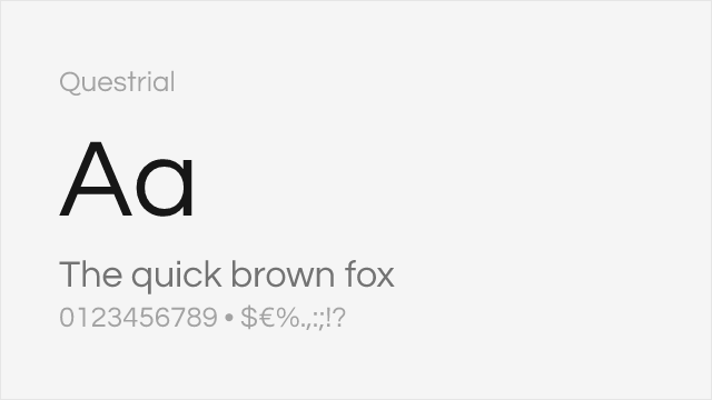
Very similar geometric structure and wide proportions
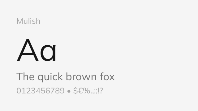
Comparable clean aesthetic with modern refinements
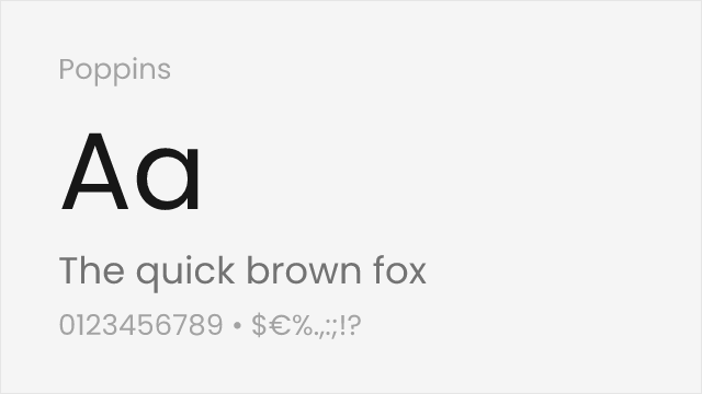
Similar geometric DNA with slightly tighter spacing
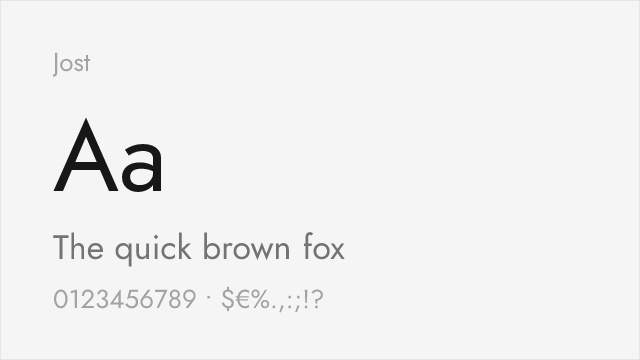
Futura-lineage geometric with a full variable weight axis
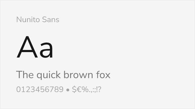
Rounded geometric sans with a large x-height and broad weights
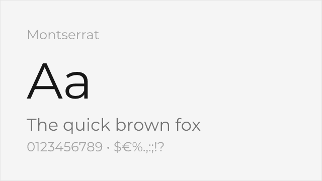
Popular geometric sans with an urban, slightly wider build
Compare the alternatives
See how Century Gothic compares to its top alternatives — and how those alternatives compare to each other — side by side.
See where Century Gothic is used in the wild and swap to free alternatives live.
Install FontSwap →Replacement Summary
Source: FontAlternatives.com
Premium font: Century Gothic
Best free alternative: Questrial
FontAlternatives similarity score: 85%
Replacement difficulty: Low
Best for: presentations, logos and wordmarks, print headlines, minimalist design
Notable users: Microsoft Office, Corporate presentations, Small-business branding
Not recommended when: Brand consistency with Microsoft Office requires exact letterforms
What is the best free alternative to Century Gothic?
Questrial is the best free alternative to Century Gothic with a FontAlternatives similarity score of 85%.
Questrial shares similar proportions, stroke characteristics, and intended use with Century Gothic. It is available under the OFL-1.1 license, which permits both personal and commercial use at no cost.
This alternative works particularly well for: presentations, logos and wordmarks, print headlines, minimalist design.
Can I safely replace Century Gothic with Questrial?
Yes, Questrial is a high-confidence replacement for Century Gothic. The FontAlternatives similarity score of 85% indicates strong structural compatibility.
Licensing: Questrial is licensed under OFL-1.1, which allows commercial use without licensing fees or royalties.
Weight coverage: All 1 weights have exact matches available.
When should I NOT replace Century Gothic?
While Questrial is a strong alternative, there are situations where replacing Century Gothic may not be appropriate:
- Extended language support: Questrial has limited cyrillic support compared to Century Gothic.
- Strict compliance: Verify that OFL-1.1 terms meet your specific legal and compliance requirements.
Weight-Matching Guide
Map Century Gothic weights to their closest free alternatives for accurate font substitution.
Questrial
| Century Gothic | Questrial | Match |
|---|---|---|
| Regular | Regular (400) | exact |
Mulish
| Century Gothic | Mulish | Match |
|---|---|---|
| Regular | Regular (400) | close |
| Bold | Bold (700) | close |
Poppins
| Century Gothic | Poppins | Match |
|---|---|---|
| Regular | Regular (400) | close |
| Bold | Bold (700) | close |
Jost
| Century Gothic | Jost | Match |
|---|---|---|
| Regular | Regular (400) | close |
| Bold | Bold (700) | close |
Nunito Sans
| Century Gothic | Nunito Sans | Match |
|---|---|---|
| Regular | Regular (400) | close |
| Bold | Bold (700) | close |
Montserrat
| Century Gothic | Montserrat | Match |
|---|---|---|
| Regular | Regular (400) | close |
| Bold | Bold (700) | close |
Performance Guide
Production performance metrics for each alternative.
How to Use Questrial
Copy these code snippets to quickly add Questrial to your project.
CSS code for Questrial
@import url('https://fonts.googleapis.com/css2?family=Questrial:wght@400&display=swap');HTML code for Questrial
<link rel="preconnect" href="https://fonts.googleapis.com">
<link rel="preconnect" href="https://fonts.gstatic.com" crossorigin>
<link href="https://fonts.googleapis.com/css2?family=Questrial:wght@400&display=swap" rel="stylesheet">
Tailwind code for Questrial
// tailwind.config.js
module.exports = {
  theme: {
    extend: {
      fontFamily: {
        'questrial': ['Questrial', 'sans-serif'],
      },
    },
  },
}

// Usage in HTML:
// <p class="font-questrial">Your text here</p>
Next.js code for Questrial
// Using next/font (Next.js 13+)
import { Questrial } from 'next/font/google';

const questrial = Questrial({
  subsets: ['latin'],
  weight: ['400'],
});

export default function Component() {
  return (
    <p className={questrial.className}>
      Your text here
    </p>
  );
}

// Or using inline styles with Google Fonts link:
// <p style={{ fontFamily: "'Questrial'" }}>Your text</p>
Expo and React Native code for Questrial
// Install: npx expo install @expo-google-fonts/questrial expo-font
import { useFonts, Questrial_400Regular } from '@expo-google-fonts/questrial';

export default function App() {
  const [fontsLoaded] = useFonts({
    Questrial_400Regular,
  });

  if (!fontsLoaded) return null;

  return (
    <Text style={{ fontFamily: 'Questrial_400Regular' }}>
      Your text here
    </Text>
  );
}
Recommended Font Pairings
These free fonts pair well with Questrial Century Gothic for headlines, body text, or accent use.
Libre Baskerville's refined serifs create elegant hierarchy when paired with Century Gothic's clean circular geometry
Merriweather's sturdy, screen-optimized serifs complement Century Gothic's wide proportions for readable digital layouts
Browse Alternatives by Context
Find Century Gothic alternatives filtered by specific use case, style, or language support.
Frequently Asked Questions
What is the best free alternative to Century Gothic?
Questrial is the best free alternative to Century Gothic with a FontAlternatives similarity score of 85%. It shares similar proportions and characteristics while being available under the OFL-1.1 license for both personal and commercial use at no cost.
Is there a free version of Century Gothic?
There is no official free version of Century Gothic. However, Questrial is available under the OFL-1.1 open-source license and achieves a FontAlternatives similarity score of 85%. It includes 1 weights and supports latin, latin-extended.
What Google Font looks like Century Gothic?
The Google Fonts most similar to Century Gothic are Questrial, Mulish, Poppins. Among these alternatives, Questrial offers the closest match with a FontAlternatives similarity score of 85% and includes 1 weights for design flexibility.
Can I use Questrial commercially?
Yes, Questrial can be used commercially. It is licensed under OFL-1.1, which allows free use in websites, applications, print materials, and commercial projects without purchasing a license or paying royalties.
Is Questrial similar enough to Century Gothic?
Questrial achieves a FontAlternatives similarity score of 85% compared to Century Gothic. While not identical, it offers comparable letterforms, proportions, and visual style. Most designers find it works excellently as a substitute in web and print projects.
What are the main differences between Century Gothic and its free alternatives?
Free alternatives to Century Gothic may differ in subtle details like letter spacing, curve refinements, and available weights. Premium fonts typically include more OpenType features, extended language support, and optimized screen rendering. However, for most projects, these differences are negligible.
Where can I download free alternatives to Century Gothic?
Download Questrial directly from Google Fonts. Click the "Get Font" button on any alternative listed above to visit the official download page. Google Fonts also provides convenient embed codes for seamless web integration.