Delicate Fonts
Fonts with fine, intricate details and light presence. Delicate typography features thin strokes, subtle ornamentation, and a gentle touch suited for beauty, skincare, stationery, and contexts requiring subtle refinement.
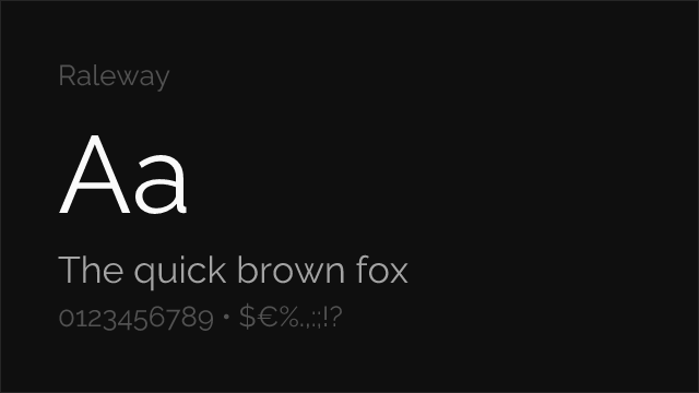
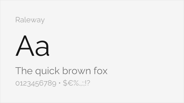
Free Delicate Fonts
Open-source fonts that genuinely feel delicate.
Premium Delicate Fonts with Free Alternatives
Popular premium delicate fonts you can replace with open-source options.
No premium fonts tagged as delicate yet.
We're carefully tagging fonts with honest personality assessments. Explore our premium font alternatives.
Frequently Asked Questions
What makes a font delicate?
Delicate fonts have fine strokes, hairline details, and proportions that feel light and refined. They require careful rendering and work best at larger sizes where their subtlety can be appreciated. Delicacy is about precision and restraint.
Are delicate fonts hard to read?
Delicate fonts can be challenging at small sizes or poor rendering conditions. Use them for headlines, logos, and display where their fine details are visible. For body text, choose fonts with more weight or pair delicate display fonts with readable text fonts.
What free fonts have genuine delicacy?
Cormorant Light offers delicate classical beauty. Josefin Sans Thin provides geometric delicacy. Lato Light delivers subtle sans-serif refinement. Playfair Display's hairlines add delicate contrast. These fonts are genuinely fine, not just thin.