Best Fonts for Book Design
Typography optimized for extended reading, book publishing, and literary content. Book fonts prioritize reading comfort over hours, elegant page composition, and timeless design that doesn't distract from content.
Free Fonts for Book Design
Open-source fonts perfect for book design projects.
Premium Book Design Fonts You Can Replace
Popular premium fonts for book design with free open-source alternatives.
Frequently Asked Questions
What makes a font good for book design?
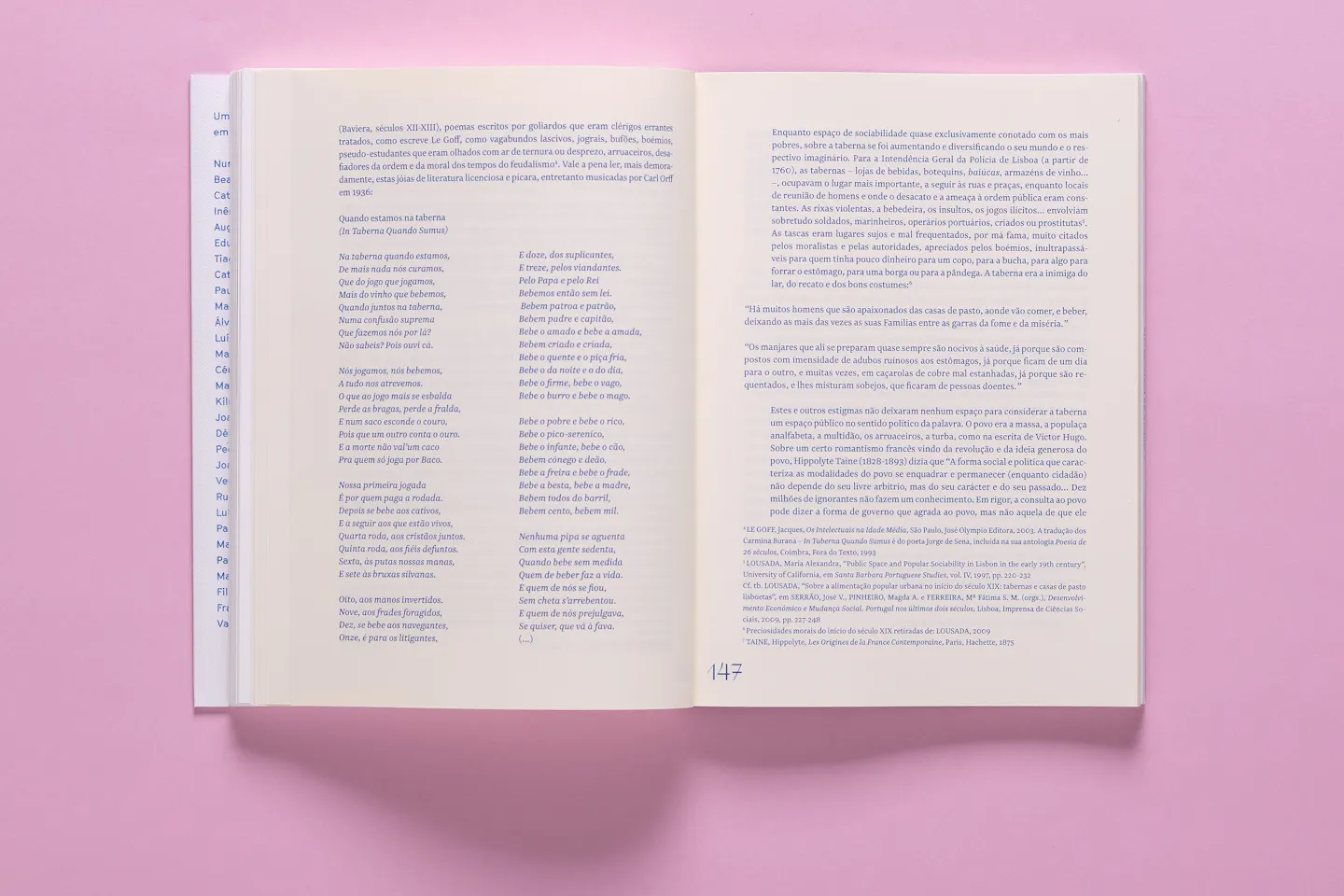
Book fonts must sustain comfortable reading over hours without eye fatigue. They need moderate x-heights, open counters, and well-balanced spacing. Serifs traditionally dominate because they guide the eye along lines, though sans-serifs work for specific genres. Character consistency across pages is essential.
What font size works best for books?
Most books use 10-12pt text with 120-145% line height, depending on the font's x-height and the book's trim size. Larger formats can use bigger type; pocket editions need efficient fonts. Test with actual page layouts—what looks right on screen may not work in print at reading distance.
What free fonts work well for book publishing?
EB Garamond offers classical book typography with excellent spacing. Crimson Pro provides warm, readable serif text. Libre Baskerville delivers traditional elegance. For contemporary books, Source Serif Pro or Merriweather work well. Consider fonts with true small caps and old-style figures for professional typesetting.
Book Design Alternatives by Font
Browse book design alternatives for specific premium fonts.
