Free Alternatives to Calluna

About Calluna
- Foundry
- Exljbris Font Foundry
- Classification
- serif
- Style
- slab-serif
Brands Using Calluna
Long-form editorial and book interiors, where its flow and OpenType figure sets suit extended reading
Editorial web typography, helped by exljbris offering the Regular weight free
Programme notes, catalogues and annual reports needing a warmer register than a system serif
Body text setting, where the free Regular lowers the barrier to trialling a commercial family
 See Calluna live on these sites with FontSwap →
Calluna is a text serif by Jos Buivenga, released through his exljbris foundry in 2009 after roughly eighteen months of work. Buivenga described it as his "first attempt to make a (serious) text typeface", and the essay that introduced it gave the family the tagline it has carried since: a text typeface with flow.
It is a commercial family — eight styles across five weights, sold through Fontspring, MyFonts and FontShop. But there is a detail that changes the calculus for a lot of projects: the Regular is free. exljbris built its reputation on that model, and it means you can legitimately set body copy in Calluna Regular at no cost, and only need an alternative when you want the other seven styles.
Why Calluna matters
Calluna started as an experiment. Buivenga had already released Museo, a slab-influenced display family that became one of the best-known free-plus-premium typefaces of the era. Calluna began as a test of whether serifs could be grafted onto Museo's skeleton to produce a proper slab — and turned into something more interesting than that.
The characteristic that emerged is directional. Calluna's serifs are angled rather than set square, and they join the stem through a bend Buivenga likened to a pipe fitting. The effect is that every glyph has a slight lean toward its upper right, and a line of text acquires a forward pull. He has described repeatedly flipping the preview vertically during design to check that this direction stayed consistent.
That is an unusual thing to engineer into a text face, and it is why Calluna reads as moving in a way most serifs do not. It is also why the obvious free substitutes are slabs rather than book faces: the serif construction is the signature.
The second reason it matters is commercial. Calluna and Museo are among the clearest demonstrations that giving away a weight can build a business — a model since adopted across independent type design.
Design characteristics
- Angled, slab-like serifs with a curved join to the stem. Most visible on the descenders of the
pandq, where the serif reads almost as a hook. - Low to moderate stroke contrast, keeping colour even across a page.
- A flowing, genuinely calligraphic italic rather than a mechanically sloped roman — the italic is a separate drawing and it shows.
- Comprehensive OpenType: small caps, old-style and lining figures, ligatures, and around 723 glyphs per style.
- Spacing and kerning refined with iKern, the specialist metrics service, which is part of why it sets so evenly straight out of the box.
- Five weights — Light, Regular, Semibold, Bold, Black — with true italics on several.
The overall texture is warm and slightly informal without tipping into friendliness. It reads as crafted rather than systematic, which is the point.
Where Calluna excels
Long-form editorial. Calluna was built for extended reading and the forward pull of the serifs genuinely helps carry the eye along a line. Articles, essays, book interiors and long reports are where it earns its keep.
Brand work needing a serif with a voice. Because it is distinctive without being decorative, Calluna solves a common problem: you want a serif that signals craft, but a Garamond or Caslon would read as historical and a Didone as fashion. Calluna sits in between.
Small-press and self-published books, helped enormously by the free Regular. A designer can typeset an entire book interior legally at no cost and buy the additional weights only if the design needs them.
Mixed figure work. The old-style and lining figure sets, plus small caps, mean tables, dates and running heads can be set properly rather than approximated.
Where Calluna struggles
No variable font. Calluna predates variable font technology and has never been reworked, so you are loading five separate weights if you want the full range — a real payload consideration on the web, and a limitation next to Bitter, Newsreader or Crimson Pro, which all offer axes.
Latin only. Language support is broad within Latin and Latin Extended, but there is no Cyrillic or Greek. For multilingual institutional work this rules it out where Noto Serif or Source Serif would cope.
Display sizes are adequate rather than special. The directional serifs that make body text move become slightly fussy when blown up, and there is no display optical cut. Calluna will set a headline, but it will not sing the way a face drawn for large sizes does.
And the licensing is easy to get wrong precisely because the Regular is free. The free weight is genuinely free; the other seven are not, and web use of any of them requires the appropriate licence. Designers regularly comp a layout using the free Regular and then discover the Semibold they used for headings needs buying.
How to choose a free substitute
1. Was it the serifs you wanted? Bitter. It is the closest free face to Calluna's wedge-slab construction, and it brings a variable 100-900 axis. Zilla Slab is the alternative if you specifically want the angled cuts and the forward lean.
2. Was it the flow? Lora. Brushed terminals, calligraphic italic, moderate contrast — it captures the reading feel while leaving the slabs behind. Alegreya goes further in the literary direction.
3. Was it the warmth and the character? Vollkorn. Blunter and more rustic, but firmly in the same register and unafraid of having a personality.
4. Is this going on the web, and do you want capabilities Calluna lacks? Newsreader, for the optical size axis, or Bitter for the weight axis. Both do things Calluna cannot.
5. Was Calluna doing book work? Crimson Pro is the more classical answer and reads superbly in print.
One genuine option worth stating plainly: use Calluna Regular. If your project needs one weight of body copy and nothing else, the free Regular is a legitimate, licensed choice, and no free alternative will match Calluna better than Calluna does. Come back to this list when the design needs the Semibold.
Calluna in practice: the free Regular, and where it stops
Calluna's free-plus-premium model is genuinely useful and routinely misunderstood, so it is worth being precise about what it does and does not cover.
What the free Regular gets you. One weight — Calluna Regular — legitimately licensed, including for web use. For a great many projects that is sufficient: a book interior, a long-form article template, a documentation site where body text is the whole typographic problem. There is no trial period and no attribution requirement.
Where it stops. Everything else. Light, Semibold, Bold and Black, and the italics beyond the Regular, are commercial. This matters more than it sounds, because those are exactly the styles a design reaches for once it grows past body copy: a Semibold for subheads, a Bold for emphasis, an italic for citations. Calluna Sans is a separate purchase entirely.
The failure mode. A designer comps a layout with the full family installed from a trial or from Adobe Fonts, the client approves it, and the build discovers that three of the four weights in the comp need buying. This is the same trap as designing in Aptos and shipping to the web, and it has the same fix: decide the licensed weight set before the comp is signed off, not after.
A sensible strategy. If the budget is uncertain, design within the free Regular deliberately — build hierarchy from size, spacing, colour and caps rather than weight. Calluna's small caps and old-style figures are available in the Regular and do a lot of work here. If the design then genuinely needs a Semibold, you have a specific, costed request rather than a vague one.
Where a free alternative wins outright. If you need three or more weights, the calculus flips. Bitter gives you a continuous 100-900 axis at no cost, and one variable file will load faster than Calluna's separate weights would even if you bought them. Buying into a non-variable 2009 family for a modern web build is a decision worth making consciously rather than by default.
Premium Font Neighbors
If you want more from the same maker or the same slab-serif territory, Museo Slab is the obvious neighbour — the exljbris family Calluna grew out of, and the direct ancestor of its serif construction. Freight Text and Utopia are the contemporary text serifs working nearby, both with the range Calluna lacks, and Tiempos covers the same editorial ground with a newspaper economy Calluna does not attempt.
If you want the classical text faces Calluna is quietly in conversation with, Minion Pro is the workhorse it most often gets compared to in book work, while Sabon, Caslon and Baskerville are the historical faces a designer reaches for when Calluna reads as too contemporary. Palatino and Georgia are the humanist and screen-serif options respectively, both more neutral and both far more widely installed.
FAQ
Is Calluna free? Partly, and this is the most useful thing to know about it. exljbris makes Calluna Regular free — that specific weight, genuinely, for real projects. The remaining seven styles across Light, Semibold, Bold and Black are commercial, sold via Fontspring, MyFonts and FontShop. So a single-weight body setting costs nothing, while any design needing weight contrast requires a licence.
Who designed Calluna? Jos Buivenga, the Dutch designer behind the exljbris foundry, released in 2009 after about eighteen months of development. He is better known for Museo and Museo Sans, and Calluna began as an experiment in adding serifs to the Museo skeleton.
What is the closest free alternative to Calluna? Bitter, if what you want is the serif construction — it is the nearest free face to Calluna's angled slab serifs and adds a variable weight axis. Lora, if what you want is the flow and warmth rather than the slabs.
Is Calluna a slab serif? Not strictly, though it is usually filed near one. The serifs are slab-like — squared off and substantial — but they are angled and joined to the stem with a curve, rather than the flat, bracketless rectangles of a true slab like Rockwell. It sits between transitional serif and slab, which is much of why it looks distinctive.
Does Calluna have a variable font version? No. It was released in 2009, well before variable fonts existed, and has not been reworked since. If a variable axis matters, Bitter, Newsreader, Crimson Pro, Alegreya and Vollkorn all offer one.
What is the difference between Calluna and Calluna Sans? They are separate families from the same designer, drawn to work together. Calluna Sans takes the same underlying skeleton and proportions and removes the serifs, so pairing them gives a matched serif/sans system. Calluna Sans is sold separately and is not covered by the free Regular offer.
Can I use Calluna on a website? Calluna Regular, yes — the free weight covers web use, and exljbris distributes it for that purpose. Any other weight requires a webfont licence. Note also that there is no variable version, so serving several weights means several files, which is a genuine performance consideration for a text face used at length.
Is Calluna good for body text on the web? Yes, with one caveat. It was drawn for extended reading and the even spacing — refined with the iKern metrics service — means it sets well without much intervention. The caveat is loading: with no variable version, each weight is a separate file, so a design using Regular, Semibold and Bold ships three. If the site is performance-sensitive, either restrict yourself to the free Regular or use a variable alternative like Bitter or Newsreader.
What pairs well with Calluna? Its intended partner is Calluna Sans, drawn on the same skeleton, which gives a properly matched serif/sans system — but that is a separate purchase. Among free faces, a geometric sans works best because it echoes Museo, the exljbris family Calluna grew out of: Figtree is the closest in feeling. Avoid pairing it with another characterful serif; Calluna's directional serifs need a quiet partner to read clearly.
Does Calluna support Cyrillic or Greek? No. Coverage is Latin and Latin Extended, which is broad for Western and Central European languages but stops there. For work that runs through Cyrillic or Greek, Source Serif Pro or Noto Serif are the practical substitutes.
Is Calluna on Google Fonts?
No, Calluna is a premium font from Exljbris Font Foundry and is not available on Google Fonts.
The closest Google Fonts alternative is Bitter with 84% similarity. Get it free on Google Fonts ↗
Free Alternatives (7)
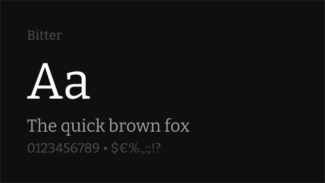
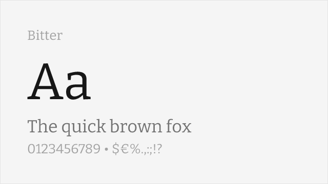
Contemporary slab with a variable 100-900 axis; closest to Calluna's wedge-slab serifs.
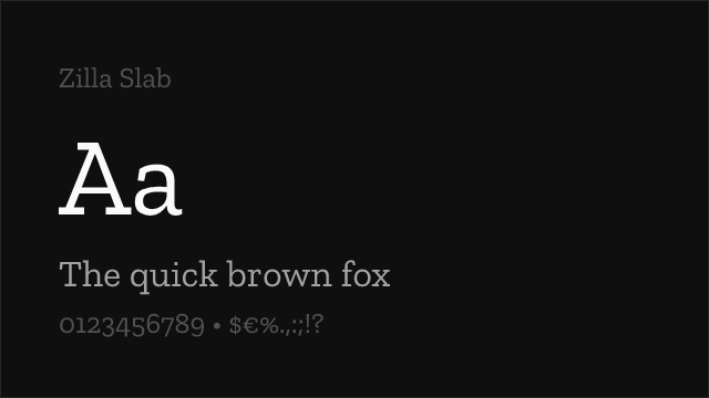
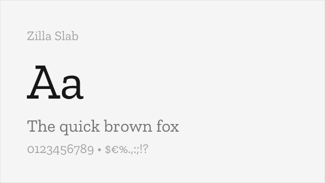
Mozilla's slab; angled cuts and a similar sense of forward motion.
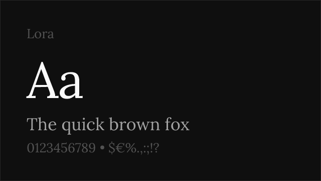
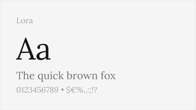
Calligraphic roots and brushed terminals; matches Calluna's warmth if not its slabs.
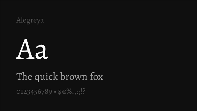
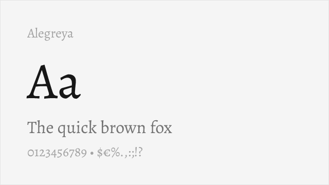
Literary serif with calligraphic origins, drawn for extended reading.
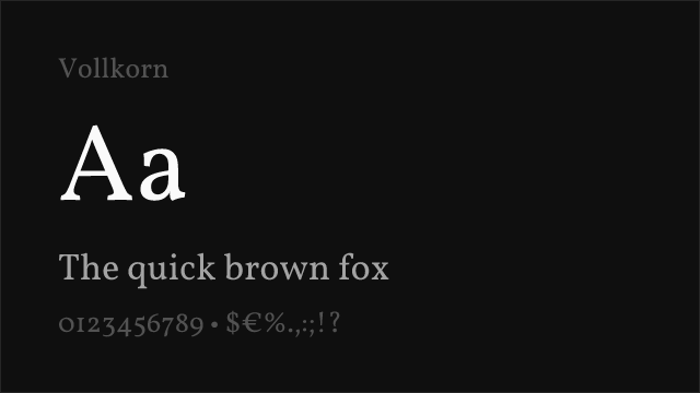
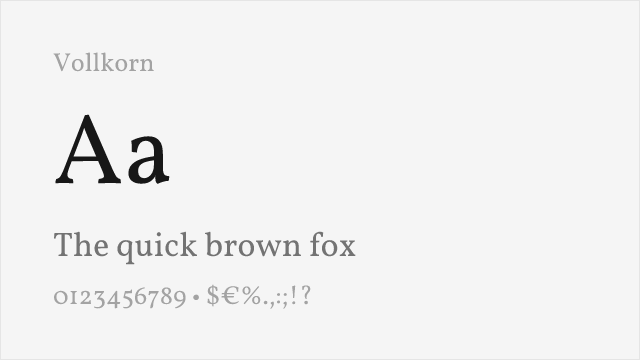
Sturdy, warm text serif with a slightly rustic quality.

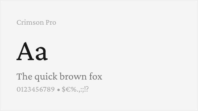
Old-style book serif; more traditional and higher contrast than Calluna.
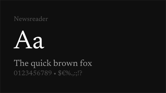
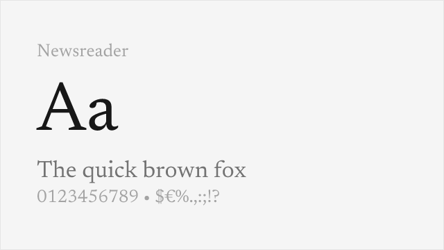
Screen-first editorial serif with an optical size axis.
See where Calluna is used in the wild and swap to free alternatives live.
Install FontSwap →Replacement Summary
Source: FontAlternatives.com
Premium font: Calluna
Best free alternative: Bitter
FontAlternatives similarity score: 84%
Replacement difficulty: Medium
Best for: editorial, web, documentation, publishing
Notable users: Independent publishers, Design-led agency sites, Academic and cultural institutions
Not recommended when: Brand consistency with Independent publishers requires exact letterforms
What is the best free alternative to Calluna?
Bitter is the best free alternative to Calluna with a FontAlternatives similarity score of 84%.
Bitter shares similar proportions, stroke characteristics, and intended use with Calluna. It is available under the OFL-1.1 license, which permits both personal and commercial use at no cost.
This alternative works particularly well for: editorial, web, documentation, publishing.
Can I safely replace Calluna with Bitter?
Yes, with some considerations. Bitter achieves a FontAlternatives similarity score of 84%, indicating good structural compatibility for most use cases.
Licensing: Bitter is licensed under OFL-1.1, which allows commercial use without licensing fees or royalties.
Weight coverage: All 4 weights have exact matches available.
When should I NOT replace Calluna?
While Bitter is a strong alternative, there are situations where replacing Calluna may not be appropriate:
- Optical precision requirements: Bitter has measurable structural differences from Calluna that may be visible in precise design work.
- Strict compliance: Verify that OFL-1.1 terms meet your specific legal and compliance requirements.
Weight-Matching Guide
Map Calluna weights to their closest free alternatives for accurate font substitution.
Bitter
| Calluna | Bitter | Match |
|---|---|---|
| Light (300) | Light (300) | exact |
| Regular (400) | Regular (400) | exact |
| Semibold (600) | Semibold (600) | exact |
| Bold (700) | Bold (700) | exact |
Zilla Slab
| Calluna | Zilla Slab | Match |
|---|---|---|
| Light (300) | Light (300) | exact |
| Regular (400) | Regular (400) | exact |
| Semibold (600) | Semibold (600) | exact |
| Bold (700) | Bold (700) | exact |
Lora
| Calluna | Lora | Match |
|---|---|---|
| Light (300) | Regular (400) | substitute |
| Regular (400) | Regular (400) | exact |
| Semibold (600) | Semibold (600) | exact |
| Bold (700) | Bold (700) | exact |
Alegreya
| Calluna | Alegreya | Match |
|---|---|---|
| Light (300) | Regular (400) | substitute |
| Regular (400) | Regular (400) | exact |
| Semibold (600) | Semibold (600) | exact |
| Bold (700) | Bold (700) | exact |
Vollkorn
| Calluna | Vollkorn | Match |
|---|---|---|
| Light (300) | Regular (400) | substitute |
| Regular (400) | Regular (400) | exact |
| Semibold (600) | Semibold (600) | exact |
| Bold (700) | Bold (700) | exact |
Crimson Pro
| Calluna | Crimson Pro | Match |
|---|---|---|
| Light (300) | Light (300) | exact |
| Regular (400) | Regular (400) | exact |
| Semibold (600) | Semibold (600) | exact |
| Bold (700) | Bold (700) | exact |
Newsreader
| Calluna | Newsreader | Match |
|---|---|---|
| Light (300) | Light (300) | exact |
| Regular (400) | Regular (400) | exact |
| Semibold (600) | Semibold (600) | exact |
| Bold (700) | Bold (700) | exact |
Performance Guide
Production performance metrics for each alternative.
How to Use Bitter
Copy these code snippets to quickly add Bitter to your project.
CSS code for Bitter
@import url('https://fonts.googleapis.com/css2?family=Bitter:wght@100..900&display=swap');HTML code for Bitter
<link rel="preconnect" href="https://fonts.googleapis.com">
<link rel="preconnect" href="https://fonts.gstatic.com" crossorigin>
<link href="https://fonts.googleapis.com/css2?family=Bitter:wght@100..900&display=swap" rel="stylesheet">
Tailwind code for Bitter
// tailwind.config.js
module.exports = {
  theme: {
    extend: {
      fontFamily: {
        'bitter': ['Bitter', 'sans-serif'],
      },
    },
  },
}

// Usage in HTML:
// <p class="font-bitter">Your text here</p>
Next.js code for Bitter
// Using next/font (Next.js 13+)
import { Bitter } from 'next/font/google';

const bitter = Bitter({
  subsets: ['latin'],
  weight: ['100', '200', '300', '400', '500', '600', '700', '800', '900'],
});

export default function Component() {
  return (
    <p className={bitter.className}>
      Your text here
    </p>
  );
}

// Or using inline styles with Google Fonts link:
// <p style={{ fontFamily: "'Bitter'" }}>Your text</p>
Expo and React Native code for Bitter
// Install: npx expo install @expo-google-fonts/bitter expo-font
import { useFonts, Bitter_400Regular } from '@expo-google-fonts/bitter';

export default function App() {
  const [fontsLoaded] = useFonts({
    Bitter_400Regular,
  });

  if (!fontsLoaded) return null;

  return (
    <Text style={{ fontFamily: 'Bitter_400Regular' }}>
      Your text here
    </Text>
  );
}
Recommended Font Pairings
These free fonts pair well with Bitter Calluna for headlines, body text, or accent use.
Figtree's geometric warmth echoes Museo, the exljbris family Calluna grew out of, without competing with its serifs
Public Sans keeps captions and UI labels neutral so Calluna's character carries the body text alone
Work Sans has enough personality to sit beside Calluna in headings without flattening the page
Browse Alternatives by Context
Find Calluna alternatives filtered by specific use case, style, or language support.
By Script
Frequently Asked Questions
What is the best free alternative to Calluna?
Bitter is the best free alternative to Calluna with a FontAlternatives similarity score of 84%. It shares similar proportions and characteristics while being available under the OFL-1.1 license for both personal and commercial use at no cost.
Is there a free version of Calluna?
There is no official free version of Calluna. However, Bitter is available under the OFL-1.1 open-source license and achieves a FontAlternatives similarity score of 84%. It includes variable weights and supports latin, latin-extended.
What Google Font looks like Calluna?
The Google Fonts most similar to Calluna are Bitter, Zilla Slab, Lora. Among these alternatives, Bitter offers the closest match with a FontAlternatives similarity score of 84% and includes variable weights for flexible typography options.
Can I use Bitter commercially?
Yes, Bitter can be used commercially. It is licensed under OFL-1.1, which allows free use in websites, applications, print materials, and commercial projects without purchasing a license or paying royalties.
Is Bitter similar enough to Calluna?
Bitter achieves a FontAlternatives similarity score of 84% compared to Calluna. While not identical, it offers comparable letterforms, proportions, and visual style. Most designers find it works excellently as a substitute in web and print projects.
What are the main differences between Calluna and its free alternatives?
Free alternatives to Calluna may differ in subtle details like letter spacing, curve refinements, and available weights. Premium fonts typically include more OpenType features, extended language support, and optimized screen rendering. However, for most projects, these differences are negligible.
Where can I download free alternatives to Calluna?
Download Bitter directly from Google Fonts. Click the "Get Font" button on any alternative listed above to visit the official download page. Google Fonts also provides convenient embed codes for seamless web integration.