Free Alternatives to Centra No.1

About Centra No.1
- Foundry
- Sharp Type
- Classification
- sans-serif
- Style
- geometric
Brands Using Centra No.1
Product interface typography and marketing materials
Referenced in design community as a recommended UI typeface
Presentation software brand identity and product typography
Product interface and developer-focused marketing
Centra No.1 is a geometric sans-serif typeface designed by Josh Finklea and released by Sharp Type, the New York-based foundry co-founded by Lucas Sharp and Chantra Malee. Part of the broader Centra family that includes Centra No.2 (a more grotesque variant), Centra No.1 occupies the geometric end of the spectrum — clean, precise, and contemporary, with just enough humanist warmth to prevent the cold perfection that makes many geometric typefaces feel sterile. Since its release, Centra No.1 has become a defining typeface of the design-tool era, adopted by SaaS companies, design studios, and technology brands who value typography that signals both competence and taste.
Centra No.1 requires a paid license from Sharp Type. Desktop, web, and app licenses are priced separately. Sharp Type does not offer a free tier, though they occasionally provide educational access. If your project cannot accommodate the licensing cost, this page covers the best open-source alternatives and the criteria for selecting one.
Why Centra No.1 Matters
Centra No.1 matters because it became the typographic signature of a specific generation of SaaS products — the ones that understood design as a competitive advantage rather than an afterthought. Sharp Type, the New York-based foundry, positioned itself squarely inside the design-tool ecosystem, and Centra No.1 was built with that community's requirements in mind: a typeface that needed to work at 13px in a dense Figma sidebar and at 48px on a marketing hero, that needed to feel designed without feeling decorative, and that needed to signal craft without signaling preciousness. This is a narrower brief than "be a good geometric sans-serif," and the specificity shows.
The Notion adoption story illustrates why Centra No.1 resonated where Circular and Proxima Nova had grown stale. Notion needed a typeface for an interface where users spend hours daily — dense text, nested blocks, database views, kanban boards — that also worked on marketing pages selling the product's design sophistication. Centra No.1 solved both requirements because its geometric-humanist hybrid construction delivers clarity in cramped UI contexts while carrying enough personality to feel intentional at display sizes. Figma's design community began recommending it as a go-to UI typeface, Pitch adopted it for brand identity, and Linear used it across product and marketing — creating a network effect where designers encountered Centra No.1 in the tools they used to design, normalizing it as a choice for the products they were building.
Sharp Type, as a foundry, has earned a reputation for typefaces that serve the design community specifically. Josh Finklea's design of Centra No.1 demonstrates a deep understanding of what designers want from their tools — precision, flexibility, and a sense of cultural positioning. Centra No.1 is not trying to be everything to everyone. It is trying to be the typeface that design-literate technology companies reach for when they want geometric clarity with craft, and it has largely succeeded in that mission.
The typeface's influence extends through the design-tool ecosystem. Figma's design community recommends Centra No.1 as a go-to UI typeface. Pitch, the presentation software, adopted it for its brand identity. Linear, the developer-focused project management tool, uses it in product and marketing contexts. These adoptions create a network effect — designers encounter Centra No.1 in the tools they use to design, which normalizes it as a choice for the products they are designing.
Centra No.1 also represents a broader shift in how technology companies think about type. The 2010s trend of every startup using the same three typefaces (Circular, Proxima Nova, Avenir) gave way to a more considered approach where companies select typefaces that reflect their specific positioning. Centra No.1 became a marker of this more thoughtful era.
Design Characteristics
Centra No.1's letterforms reveal a careful negotiation between geometric precision and humanist approachability:
- Moderate x-height with clean proportions: Slightly taller than classical geometric sans-serifs but shorter than aggressively screen-optimized fonts, creating proportions that feel contemporary without dating themselves to any specific technology era
- Geometric bowls with humanist softening: The
o,b,d,p, andqfeature circular foundations that subtly deviate from mathematical perfection, introducing organic warmth that prevents the mechanical feel of strict geometric types - Open apertures for legibility: The
c,e,s, andahave generous counter openings that improve readability in UI contexts and dense text layouts without the extreme openness of screen-first fonts like Inter - Controlled stroke contrast: Near-monoline construction with minimal variation produces even typographic color, essential for the dense information layouts typical of SaaS product interfaces
- Horizontal stress with subtle diagonal hints: The overall stress pattern is horizontal and rationalist, but faint diagonal tendencies in certain letterforms add the humanist warmth that distinguishes Centra from pure geometric types
- Clean, horizontal terminals: Stroke endings are precise and controlled, giving Centra No.1 its polished, professional character without the warmth of rounded terminals or the sharpness of diagonal cuts
- Comprehensive weight range: Available from Thin through Black with matching italics, supporting the full typographic hierarchy required by complex product and brand systems
Where Centra No.1 Excels
Centra No.1 is at its best in contexts that demand modern, design-conscious typography:
- SaaS product interfaces: The clean proportions and optimized x-height handle dense product layouts, navigation elements, and form inputs with precision
- Technology brand identities: Centra communicates both technical competence and design sophistication, positioning brands as thoughtful and modern
- Design tool documentation: Technical documentation and help content benefit from Centra's legibility and professional clarity
- Startup marketing pages: Landing pages and feature announcements use Centra effectively at both headline and body sizes
- Corporate presentations: Pitch decks and internal communications leverage Centra's polished geometric character
- Editorial layouts for design audiences: Content aimed at designers and creative professionals reads naturally in Centra
Where Centra No.1 Struggles
Centra No.1's refined positioning becomes limiting in certain contexts:
- Mass-market consumer brands: Centra's design-world refinement can read as exclusionary or overly polished for brands targeting broad consumer audiences
- Warm or playful brand personalities: The geometric precision and restrained character make Centra uncomfortable for brands that need warmth, playfulness, or emotional expressiveness
- Projects requiring broad script support: Centra No.1 covers Latin and Latin Extended only, requiring fallback strategies for Cyrillic, Greek, Arabic, or CJK content
- Budget-constrained teams: Sharp Type's licensing is priced at a premium level that reflects its positioning in the design market
- Legacy system integration: Centra's contemporary proportions may clash with existing type choices in older corporate identity systems
- Traditional print editorial: Centra reads as digital-native; traditional book and newspaper contexts may find its proportions too contemporary
- Variable font requirements: Centra ships as static files, lacking the performance and flexibility advantages of variable fonts for web deployment
How to Choose a Free Substitute
When evaluating Centra No.1 replacements, prioritize these criteria:
Geometric-humanist balance: Centra No.1's defining quality is its position between pure geometry and humanist warmth. Test alternatives by examining the
oandnside by side — if theois perfectly circular and thenis purely mechanical, the typeface is too geometric. If the curves feel organic and irregular, it is too humanist. DM Sans and Jost strike the closest balance.Proportions in UI context: Set your alternative in a realistic interface layout — navigation, body text, form labels, buttons — at 13-16px. Centra No.1 excels because its proportions are calibrated for this exact context. Alternatives that feel too wide, too narrow, or too tall will reveal themselves immediately in UI mockups.
Typographic color consistency: Set a dense paragraph at 14px. Centra No.1 produces extremely even color without hotspots or gaps. This evenness is what makes it comfortable in information-dense product interfaces. Alternatives with uneven stroke distribution or inconsistent letter-spacing will feel rougher.
Weight range for hierarchy: Centra No.1's weight range from Thin to Black supports complex typographic hierarchies. Your alternative should cover at least five weights to handle headings, subheadings, body text, captions, and emphasis within a single product or brand system.
Cultural positioning: Centra No.1 carries a "design-literate technology company" connotation. When choosing a substitute, consider whether the free alternative conveys a similar sense of intentionality and craft. Some alternatives are technically capable but carry associations with early Google Fonts adoption that may conflict with the positioning you need.
Premium Font Neighbors
If Centra No.1's geometric-humanist approach resonates, explore these premium alternatives:
Cluster A: Geometric-grotesque hybrids for technology brands
- Circular (Lineto) — the dominant geometric of the 2010s tech scene; rounder and more uniform than Centra
- Proxima Nova (Mark Simonson) — the original tech-startup sans-serif; more humanist and less refined than Centra
- Avenir (Linotype) — Frutiger's geometric masterwork; more classical and reserved than Centra's contemporary positioning
- Graphik (Commercial Type) — versatile grotesque with similar tech-world adoption; less geometric than Centra
Cluster B: Design-conscious sans-serifs
- Sohne (Klim Type Foundry) — Sowersby's "memory of Helvetica" with comparable design-community cachet
- GT Walsheim (Grilli Type) — warmer and friendlier than Centra, popular in the same design ecosystem
- Brown (Lineto) — warm grotesque with rounded terminals; more personality than Centra's precision
- Neue Haas Grotesk (Commercial Type) — Helvetica's refined ancestor; more traditional than Centra but equally precise
FAQ
Is Centra No.1 free?
No. Centra No.1 is a premium typeface from Sharp Type with per-project licensing. Desktop, web, and app licenses are sold separately. There is no free tier or trial version publicly available. The best free alternative is DM Sans at 85% similarity.
What is the best free alternative to Centra No.1?
DM Sans is the closest free alternative at 85% similarity. Both share a geometric-grotesque balance that reads as modern and intentional. DM Sans adds variable font support, broader language coverage, and an extensive weight range, making it a practical replacement for most product and branding contexts where Centra would be used.
What is the difference between Centra No.1 and Centra No.2?
Centra No.1 is the geometric member of the family — cleaner, more precise, and more strictly constructed. Centra No.2 is the grotesque counterpart — slightly more irregular, warmer, and with more humanist influence. No.1 is better for UI and product design; No.2 is better for editorial and branding where personality matters more than precision.
Who designed Centra No.1?
Josh Finklea designed Centra No.1 for Sharp Type, the New York-based foundry co-founded by Lucas Sharp and Chantra Malee. Sharp Type has built a reputation for typefaces that serve the design and technology community, including Centra, Sharp Grotesk, and Ogg.
Is Centra No.1 a variable font?
No. Centra No.1 ships as static font files across its weight range. This is increasingly notable because competing geometric sans-serifs in the same design-tool ecosystem — DM Sans, Jost, and even Google's own fonts — all offer variable versions. For the SaaS product interfaces where Centra No.1 is most commonly deployed, variable font support has become a baseline expectation rather than a bonus feature. Most of Centra's free alternatives provide this advantage out of the box.
Does Centra No.1 support Cyrillic?
No. Centra No.1 supports Latin and Latin Extended scripts only. For projects requiring Cyrillic with a similar aesthetic, DM Sans and Nunito Sans offer Cyrillic coverage. Montserrat provides the broadest language support among the listed alternatives.
Why is Centra No.1 popular with SaaS companies?
Centra No.1 signals design literacy and intentionality — qualities that SaaS companies targeting design-savvy audiences want to project. Its geometric clarity works well in product interfaces, while its refined character elevates marketing materials beyond the generic look of overused alternatives. The typeface also performs well at the range of sizes typical in SaaS products: small UI labels, medium body text, and large feature headlines.
How does Centra No.1 compare to Circular?
Both are geometric sans-serifs popular in the technology sector, but they occupy different positions. Circular is more purely geometric — rounder, more uniform, and more minimal. Centra No.1 incorporates humanist touches that add warmth and personality. Circular became ubiquitous after Spotify, Airbnb, and countless startups adopted it; Centra No.1 emerged partly as a response to that ubiquity, offering geometric clarity with more design-world distinction.
Is Centra No.1 good for body text?
Yes. Centra No.1's moderate x-height, open apertures, and even stroke distribution make it comfortable for extended reading at 14-18px on screen and 9-11pt in print. It was designed with product interface text in mind, where legibility at small sizes is critical. Its geometric character remains visible but does not interfere with reading flow.
What weight should I use for UI text?
Regular (400) or Medium (500) are the standard choices for UI body text. Medium provides slightly better legibility on lower-resolution screens and in contexts where text competes with interface elements. Use Regular for longer passages where the text needs to feel comfortable for extended reading, and Medium for labels, navigation, and shorter functional text.
Is Centra No.1 on Google Fonts?
No, Centra No.1 is a premium font from Sharp Type and is not available on Google Fonts.
The closest Google Fonts alternative is DM Sans with 85% similarity. Get it free on Google Fonts ↗
Free Alternatives (8)


Closest match for Centra No.1's geometric-grotesque balance with modern proportions

Refined geometric sans with comparable design-world pedigree and clean proportions


Widely adopted geometric sans with clean construction and full weight coverage

Modern geometric-grotesque with design-forward character and screen optimization


Elegant geometric with refined thin weights and contemporary character


Friendly geometric sans with clean proportions and Cyrillic support


Geometric sans with strong urban heritage and maximum weight flexibility
Montserrat's sister family with softer, curved alternate letterforms
See where Centra No.1 is used in the wild and swap to free alternatives live.
Install FontSwap →Replacement Summary
Source: FontAlternatives.com
Premium font: Centra No.1
Best free alternative: DM Sans
FontAlternatives similarity score: 85%
Replacement difficulty: Low
Best for: SaaS product interfaces, design system foundations, startup marketing sites, tech company branding
Notable users: Notion, Figma, Pitch
Not recommended when: Brand consistency with Notion requires exact letterforms
What is the best free alternative to Centra No.1?
DM Sans is the best free alternative to Centra No.1 with a FontAlternatives similarity score of 85%.
DM Sans shares similar proportions, stroke characteristics, and intended use with Centra No.1. It is available under the OFL-1.1 license, which permits both personal and commercial use at no cost.
This alternative works particularly well for: SaaS product interfaces, design system foundations, startup marketing sites, tech company branding.
Can I safely replace Centra No.1 with DM Sans?
Yes, DM Sans is a high-confidence replacement for Centra No.1. The FontAlternatives similarity score of 85% indicates strong structural compatibility.
Licensing: DM Sans is licensed under OFL-1.1, which allows commercial use without licensing fees or royalties.
Weight coverage: Most weights have close or exact matches available.
When should I NOT replace Centra No.1?
While DM Sans is a strong alternative, there are situations where replacing Centra No.1 may not be appropriate:
- Brand consistency: Centra No.1 is commonly seen in SaaS product interfaces contexts where exact letterforms may be required.
- Strict compliance: Verify that OFL-1.1 terms meet your specific legal and compliance requirements.
Weight-Matching Guide
Map Centra No.1 weights to their closest free alternatives for accurate font substitution.
DM Sans
| Centra No.1 | DM Sans | Match |
|---|---|---|
| Light (300) | Light (300) | close |
| Regular (400) | Regular (400) | close |
| Medium (500) | Medium (500) | close |
| Bold (700) | Bold (700) | close |
Jost
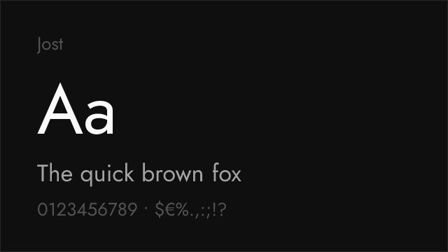
| Centra No.1 | Jost | Match |
|---|---|---|
| Thin (100) | Thin (100) | close |
| Regular (400) | Regular (400) | close |
| Medium (500) | Medium (500) | close |
| Bold (700) | Bold (700) | close |
Poppins
| Centra No.1 | Poppins | Match |
|---|---|---|
| Light (300) | Light (300) | close |
| Regular (400) | Regular (400) | close |
| Medium (500) | Medium (500) | close |
| Bold (700) | Bold (700) | close |
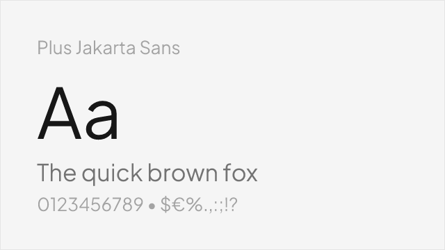
Plus Jakarta Sans
| Centra No.1 | Plus Jakarta Sans | Match |
|---|---|---|
| Light (300) | Light (300) | close |
| Regular (400) | Regular (400) | close |
| Medium (500) | Medium (500) | close |
| Bold (700) | Bold (700) | close |
Raleway
| Centra No.1 | Raleway | Match |
|---|---|---|
| Thin (100) | Thin (100) | close |
| Regular (400) | Regular (400) | close |
| Medium (500) | Medium (500) | close |
| Bold (700) | Bold (700) | close |
Nunito Sans
| Centra No.1 | Nunito Sans | Match |
|---|---|---|
| Light (300) | Light (300) | close |
| Regular (400) | Regular (400) | close |
| Medium (500) | Medium (500) | close |
| Bold (700) | Bold (700) | close |
Montserrat
| Centra No.1 | Montserrat | Match |
|---|---|---|
| Thin (100) | Thin (100) | close |
| Regular (400) | Regular (400) | close |
| Medium (500) | Medium (500) | close |
| Bold (700) | Bold (700) | close |
Performance Guide
Production performance metrics for each alternative.
How to Use DM Sans
Copy these code snippets to quickly add DM Sans to your project.
CSS code for DM Sans
@import url('https://fonts.googleapis.com/css2?family=DM+Sans:wght@100..900&display=swap');HTML code for DM Sans
<link rel="preconnect" href="https://fonts.googleapis.com">
<link rel="preconnect" href="https://fonts.gstatic.com" crossorigin>
<link href="https://fonts.googleapis.com/css2?family=DM+Sans:wght@100..900&display=swap" rel="stylesheet">
Tailwind code for DM Sans
// tailwind.config.js
module.exports = {
  theme: {
    extend: {
      fontFamily: {
        'dm-sans': ['"DM Sans"', 'sans-serif'],
      },
    },
  },
}

// Usage in HTML:
// <p class="font-dm-sans">Your text here</p>
Next.js code for DM Sans
// Using next/font (Next.js 13+)
import { DM_Sans } from 'next/font/google';

const dm_sans = DM_Sans({
  subsets: ['latin'],
  weight: ['100', '200', '300', '400', '500', '600', '700', '800', '900'],
});

export default function Component() {
  return (
    <p className={dm_sans.className}>
      Your text here
    </p>
  );
}

// Or using inline styles with Google Fonts link:
// <p style={{ fontFamily: '"DM Sans"' }}>Your text</p>
Expo and React Native code for DM Sans
// Install: npx expo install @expo-google-fonts/dm-sans expo-font
import { useFonts, DM_Sans_400Regular } from '@expo-google-fonts/dm-sans';

export default function App() {
  const [fontsLoaded] = useFonts({
    DM_Sans_400Regular,
  });

  if (!fontsLoaded) return null;

  return (
    <Text style={{ fontFamily: 'DM_Sans_400Regular' }}>
      Your text here
    </Text>
  );
}
Recommended Font Pairings
These free fonts pair well with DM Sans Centra No.1 for headlines, body text, or accent use.
Literata's contemporary serifs provide warm editorial contrast against Centra No.1's geometric precision — both are optimized for screen reading, creating a pairing that performs beautifully in digital editorial layouts and product interfaces
EB Garamond's classical humanist serifs create a sophisticated contrast with Centra No.1's modern geometry, a pairing that bridges historical elegance and contemporary clarity for cultural and editorial design
Crimson Pro's refined book serifs complement Centra No.1's clean geometric forms in long-form reading contexts, providing typographic warmth for body text while Centra handles UI elements and headlines
Browse Alternatives by Context
Find Centra No.1 alternatives filtered by specific use case, style, or language support.
Frequently Asked Questions
What is the best free alternative to Centra No.1?
DM Sans is the best free alternative to Centra No.1 with a FontAlternatives similarity score of 85%. It shares similar proportions and characteristics while being available under the OFL-1.1 license for both personal and commercial use at no cost.
Is there a free version of Centra No.1?
There is no official free version of Centra No.1. However, DM Sans is available under the OFL-1.1 open-source license and achieves a FontAlternatives similarity score of 85%. It includes variable weights and supports latin, latin-extended.
What Google Font looks like Centra No.1?
The Google Fonts most similar to Centra No.1 are DM Sans, Jost, Poppins. Among these alternatives, DM Sans offers the closest match with a FontAlternatives similarity score of 85% and includes variable weights for flexible typography options.
Can I use DM Sans commercially?
Yes, DM Sans can be used commercially. It is licensed under OFL-1.1, which allows free use in websites, applications, print materials, and commercial projects without purchasing a license or paying royalties.
Is DM Sans similar enough to Centra No.1?
DM Sans achieves a FontAlternatives similarity score of 85% compared to Centra No.1. While not identical, it offers comparable letterforms, proportions, and visual style. Most designers find it works excellently as a substitute in web and print projects.
What are the main differences between Centra No.1 and its free alternatives?
Free alternatives to Centra No.1 may differ in subtle details like letter spacing, curve refinements, and available weights. Premium fonts typically include more OpenType features, extended language support, and optimized screen rendering. However, for most projects, these differences are negligible.
Where can I download free alternatives to Centra No.1?
Download DM Sans directly from Google Fonts. Click the "Get Font" button on any alternative listed above to visit the official download page. Google Fonts also provides convenient embed codes for seamless web integration.