Free Alternatives to Hoefler

About Hoefler
- Foundry
- Hoefler&Co
- Classification
- serif
- Style
- old-style
Hoefler Text is an old-style serif typeface designed by Jonathan Hoefler in 1991 for Apple Computer. Commissioned for Mac System 7.5, it has been bundled with every Macintosh since, making it one of the most widely distributed premium-quality text faces in computing history.
History and Design
Jonathan Hoefler designed Hoefler Text as what he described as "a typographic omnibus of seventeenth century styles." The design draws primarily from the work of Jean Jannon and Miklós Kis — the punchcutters behind typefaces historically (and incorrectly) attributed to Claude Garamond and Anton Janson respectively. The result occupies old-style territory with moderate stroke contrast, gracefully bracketed serifs, and proportions optimized for body text legibility.
Hoefler Text pioneered several digital typographic features that were rare in the early 1990s: automatic ligature insertion, real small caps, old-style figures, true superscripts and subscripts, and a matching ornament font (Fleurons) with arabesque motifs. The commercial version from Hoefler&Co extends the family beyond the four Mac-bundled styles to include engraved capitals and the companion Hoefler Titling for display settings.
Technical Characteristics
- 9 commercial styles: Roman, Italic, Bold, Bold Italic, Black, Black Italic, Engraved, Engraved Two, Fleurons
- Old-style proportions: Moderate contrast with tapered terminations and bracketed serifs
- Text optimization: Designed for maximum legibility at body text sizes
- Rich OpenType features: Ligatures, small caps, old-style figures, swashes
- Companion display cut: Hoefler Titling offers more slender proportions for headlines
Use Cases
Hoefler Text works effectively for:
- Book design and literary publishing: The primary use case — warm, readable text setting with scholarly character
- Editorial design: Magazines, newspapers, and long-form articles benefit from its optimized text proportions
- Academic publishing: The old-style character suits dissertations, journals, and scholarly papers
- Corporate communications: Annual reports, white papers, and formal documents
- Digital publishing: Screen-optimized despite its pre-web origins, thanks to careful proportion design
FAQ
Is Hoefler Text free?
Hoefler Text comes bundled with macOS, but the commercial version with all 9 styles requires a license from Hoefler&Co. The closest free alternative is Crimson Pro at 78% similarity.
What is the best free alternative to Hoefler Text?
Crimson Pro is the strongest free match at 78% similarity — its designer explicitly cited Hoefler Text as an inspiration. EB Garamond is another excellent option sharing the same old-style heritage.
Was Hoefler Text used for the Wikipedia logo?
Yes, Hoefler Text served as the Wikipedia logo typeface from 2003 to 2010, when it was replaced by Linux Libertine to better support multilingual character sets.
How many styles does Hoefler Text have?
The Mac-bundled version includes 4 styles (Roman, Italic, Black, Black Italic). The commercial version from Hoefler&Co offers 9 styles including Bold weights, Engraved capitals, and the Fleurons ornament font.
Is Hoefler on Google Fonts?
No, Hoefler is a premium font from Hoefler&Co and is not available on Google Fonts.
The closest Google Fonts alternative is Crimson Pro with 78% similarity. Get it free on Google Fonts ↗
Free Alternatives (4)


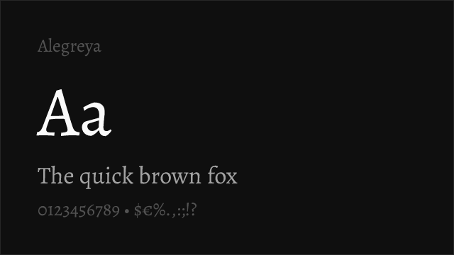
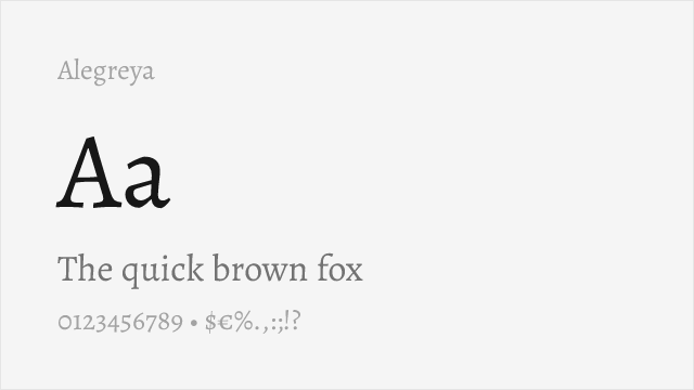
Designer cited Hoefler as direct inspiration, closest match in old-style character and book-text readability


Shares the same 16th/17th-century old-style heritage with scholarly elegance and rich OpenType features


Garamond tradition with higher contrast, similar refined character for display and editorial use
Calligraphic old-style serif with literary warmth and dynamic rhythm suited to book typography
See where Hoefler is used in the wild and swap to free alternatives live.
Install FontSwap →Performance Guide
Production performance metrics for each alternative.
How to Use Crimson Pro
Copy these code snippets to quickly add Crimson Pro to your project.
CSS code for Crimson Pro
@import url('https://fonts.googleapis.com/css2?family=Crimson+Pro:wght@100..900&display=swap');HTML code for Crimson Pro
<link rel="preconnect" href="https://fonts.googleapis.com">
<link rel="preconnect" href="https://fonts.gstatic.com" crossorigin>
<link href="https://fonts.googleapis.com/css2?family=Crimson+Pro:wght@100..900&display=swap" rel="stylesheet">
Tailwind code for Crimson Pro
// tailwind.config.js
module.exports = {
  theme: {
    extend: {
      fontFamily: {
        'crimson-pro': ['"Crimson Pro"', 'sans-serif'],
      },
    },
  },
}

// Usage in HTML:
// <p class="font-crimson-pro">Your text here</p>
Next.js code for Crimson Pro
// Using next/font (Next.js 13+)
import { Crimson_Pro } from 'next/font/google';

const crimson_pro = Crimson_Pro({
  subsets: ['latin'],
  weight: ['100', '200', '300', '400', '500', '600', '700', '800', '900'],
});

export default function Component() {
  return (
    <p className={crimson_pro.className}>
      Your text here
    </p>
  );
}

// Or using inline styles with Google Fonts link:
// <p style={{ fontFamily: '"Crimson Pro"' }}>Your text</p>
Expo and React Native code for Crimson Pro
// Install: npx expo install @expo-google-fonts/crimson-pro expo-font
import { useFonts, Crimson_Pro_400Regular } from '@expo-google-fonts/crimson-pro';

export default function App() {
  const [fontsLoaded] = useFonts({
    Crimson_Pro_400Regular,
  });

  if (!fontsLoaded) return null;

  return (
    <Text style={{ fontFamily: 'Crimson_Pro_400Regular' }}>
      Your text here
    </Text>
  );
}
Recommended Font Pairings
These free fonts pair well with Crimson Pro Hoefler for headlines, body text, or accent use.
Browse Alternatives by Context
Find Hoefler alternatives filtered by specific use case, style, or language support.
By Use Case
By Script
Frequently Asked Questions
What is the best free alternative to Hoefler?
Crimson Pro is the best free alternative to Hoefler with a FontAlternatives similarity score of 78%. It shares similar proportions and characteristics while being available under the OFL-1.1 license for both personal and commercial use at no cost.
Is there a free version of Hoefler?
There is no official free version of Hoefler. However, Crimson Pro is available under the OFL-1.1 open-source license and achieves a FontAlternatives similarity score of 78%. It includes variable weights and supports latin, latin-extended.
What Google Font looks like Hoefler?
The Google Fonts most similar to Hoefler are Crimson Pro, EB Garamond, Cormorant Garamond. Among these alternatives, Crimson Pro offers the closest match with a FontAlternatives similarity score of 78% and includes variable weights for flexible typography options.
Can I use Crimson Pro commercially?
Yes, Crimson Pro can be used commercially. It is licensed under OFL-1.1, which allows free use in websites, applications, print materials, and commercial projects without purchasing a license or paying royalties.
Is Crimson Pro similar enough to Hoefler?
Crimson Pro achieves a FontAlternatives similarity score of 78% compared to Hoefler. While not identical, it offers comparable letterforms, proportions, and visual style. Most designers find it works excellently as a substitute in web and print projects.
What are the main differences between Hoefler and its free alternatives?
Free alternatives to Hoefler may differ in subtle details like letter spacing, curve refinements, and available weights. Premium fonts typically include more OpenType features, extended language support, and optimized screen rendering. However, for most projects, these differences are negligible.
Where can I download free alternatives to Hoefler?
Download Crimson Pro directly from Google Fonts. Click the "Get Font" button on any alternative listed above to visit the official download page. Google Fonts also provides convenient embed codes for seamless web integration.