High Contrast Fonts
Typefaces with dramatic variation between thick and thin strokes, creating visual tension and elegance. A hallmark of Didone serifs, fashion typography, and editorial display type.
High-contrast typefaces feature pronounced differences between their thickest and thinnest strokes, creating a visual rhythm of alternating mass and delicacy. This dramatic variation produces some of typography's most visually striking designs, from the fashion-magazine elegance of Didot to the editorial authority of Scotch Roman faces.
Didone Origins
The high-contrast aesthetic reached its definitive form in the late 18th century through the work of two competing type dynasties: the Didots in Paris and Giambattista Bodoni in Parma. Building on the transitional forms of Baskerville, these designers pushed stroke contrast to extremes — razor-thin hairlines against heavily weighted verticals — while eliminating bracketing on serifs and imposing strict vertical stress. The result was a style later classified as "Didone" (a portmanteau of Didot and Bodoni) that represented the typographic Enlightenment: rational, precise, and architecturally rigorous. Firmin Didot's types became the face of French institutional printing, while Bodoni's Manuale Tipografico (1818) remains one of the most celebrated specimens in typographic history. Their high-contrast model dominated European typography well into the 19th century and continues to define luxury and fashion typography today.
Print vs Digital Challenges
High-contrast typefaces were born in the era of letterpress on smooth paper, where hairline strokes could be reproduced with mechanical precision. Transferring this aesthetic to digital media poses significant challenges. On screen, hairline strokes can disappear entirely at small sizes or render as distracting single-pixel lines that shimmer and shift with sub-pixel rendering. Anti-aliasing softens the dramatic contrast that defines the style. Even at larger sizes, screen rendering cannot match the crispness of a well-printed Bodoni hairline. High-resolution (Retina) displays have improved the situation substantially, making high-contrast designs viable for digital display text. For web use, choose high-contrast faces designed or optimized for screens (like Playfair Display, which deliberately thickens its hairlines for digital rendering) rather than direct digitizations of historical metal type that assume print reproduction.
Accessibility Considerations
High-contrast typefaces present specific accessibility challenges. The dramatic weight variation means that thin strokes approach the visibility threshold for readers with low vision — a hairline that reads as an elegant detail to a sighted reader may be invisible to someone with reduced visual acuity. Contrast sensitivity, which declines with age and various visual conditions, further compounds this problem. For accessible design, limit high-contrast faces to display sizes (24px and above) where hairlines remain visible, and never use them for body text in contexts that must meet WCAG accessibility standards. When high contrast is essential for brand identity, pair it with a lower-contrast text face for body content. Some contemporary type designers address this by creating "optical sizes" — high-contrast display cuts for headlines alongside lower-contrast text cuts that preserve the family's aesthetic while improving readability at small sizes.
When to Use
High-contrast typefaces are ideal for fashion editorial, luxury branding, magazine covers, formal invitations, and any display context where dramatic visual impact is the priority. They work best at large sizes (32px and above) where their full contrast range is visible and their hairlines render clearly. Always pair with a more readable text face for body content, and test carefully on target display devices to ensure hairlines survive screen rendering.
Premium High Contrast Fonts


Editorial New

Freight Display


Noe Display


Free High Contrast Fonts


Cormorant Garamond Free
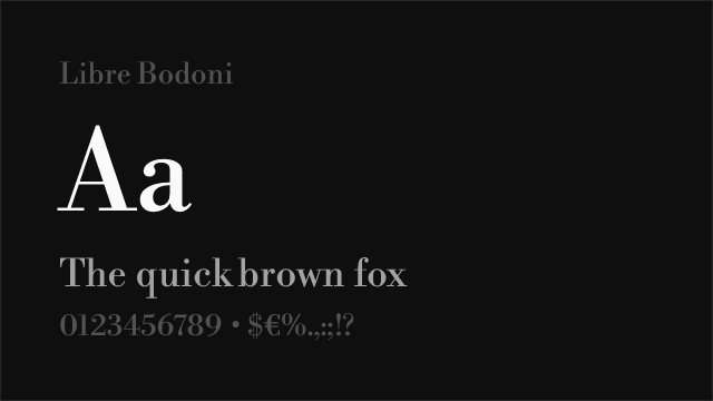
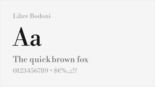
Libre Bodoni Free Variable


Montserrat Free Variable


Playfair Display Free Variable

No fonts found with this filter.