Old Style Fonts
The earliest Roman typefaces, inspired directly by Renaissance calligraphy. Old Style serifs feature diagonal stress, low stroke contrast, and bracketed serifs — warm, readable, and timeless.
Old Style typefaces — also called Garalde or Renaissance antiqua — are the oldest category of Roman type, originating in the late 15th century with the work of Venetian printers like Nicolas Jenson and Aldus Manutius. These fonts most closely preserve the character of pen-drawn letters, with proportions and stroke patterns that echo the broad-nib pen held at a natural writing angle.
Renaissance Origins
The story of Old Style type begins in Venice around 1470, when Nicolas Jenson cut a Roman typeface that translated the proportions of Italian humanist manuscript hands into metal. Jenson's design achieved remarkable balance — each letter felt both individual and part of a harmonious whole. A generation later, Aldus Manutius and his punchcutter Francesco Griffo refined these forms further, producing the model that Claude Garamond would perfect in 16th-century Paris. Garamond's types became the standard for European printing for over two centuries, and his name remains synonymous with elegant book typography. The 18th-century English printer William Caslon created the definitive British Old Style, a robust design that became the typographic default for the American colonies and was used to set the Declaration of Independence.
Cultural Associations
Old Style typefaces carry powerful cultural connotations of tradition, scholarship, and literary sophistication. They evoke the physical book, the university library, the scholarly journal. Publishers of literary fiction overwhelmingly choose Old Style designs (or their transitional descendants) because readers subconsciously associate these forms with serious, thoughtful content. Wine labels, law firms, and cultural institutions gravitate toward Old Style faces for the same reason — they communicate heritage and permanence without appearing stiff or antiquated. The diagonal stress and warm color of Old Style faces create an approachable formality that Modern serifs, with their stark contrast, cannot replicate.
Print Considerations
Old Style typefaces were designed for letterpress printing on rough, absorbent paper, and their characteristics reflect those origins. The low stroke contrast means thin strokes remain visible even when ink spreads on uncoated stock. The generous bracketing of serifs creates smooth transitions that survive imperfect reproduction. These qualities make Old Style faces forgiving in print — they perform well on a wide range of paper stocks and printing methods. For digital printing and offset on coated paper, Old Style designs may appear softer than intended; slight adjustments to size and tracking can compensate. On screen, the low contrast of Old Style faces renders more evenly than high-contrast designs, though the diagonal stress can create slight unevenness in anti-aliased rendering at small sizes.
When to Use
Old Style typefaces are the premier choice for long-form text: books, literary journals, academic publications, and any reading material where comfort over extended periods is essential. Their warm, inviting character makes them popular for publishers, universities, and cultural institutions. Garamond, Caslon, and Jenson are enduring examples that remain as functional today as they were centuries ago.
Premium Old Style Fonts


Free Old Style Fonts


Cormorant Garamond Free


Crimson Pro Free Variable


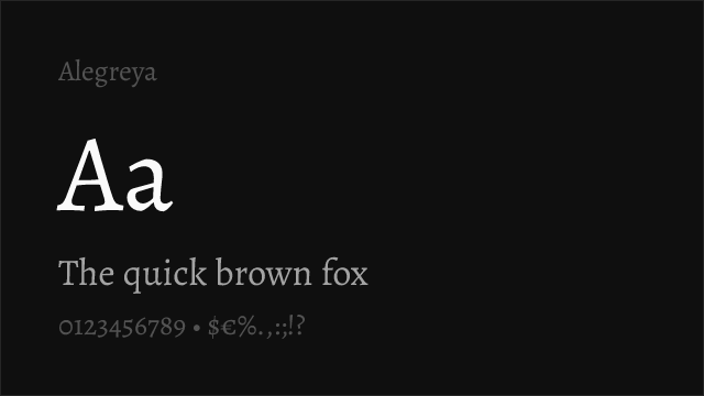
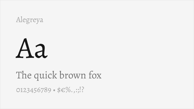
EB Garamond Free Variable
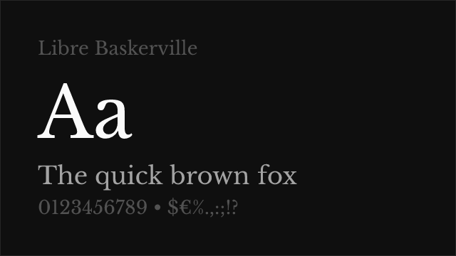

Libre Baskerville Free
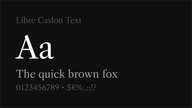

Libre Caslon Text Free


Merriweather Free

Source Serif Pro Free Variable
No fonts found with this filter.