Free Alternatives to Didot

About Didot
- Foundry
- Linotype
- Classification
- serif
- Style
- didone
Brands Using Didot
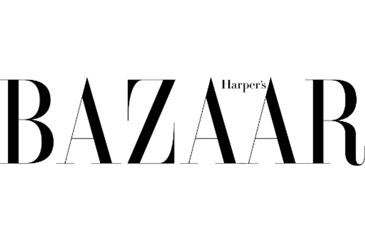
Masthead and editorial display type, a Didot identity since Brodovitch's art direction
Custom 'CBS Didot' corporate wordmark (historic; network-wide use through 2021)
High-contrast Didot-style serif wordmark introduced in the 2019 rebrand
Supporting typeface in luxury print materials
 See Didot live on these sites with FontSwap →
See Didot in the Wild
Didot is the sound of high fashion in typographic form. Named for the French printing dynasty that perfected it around 1800, its hairline thins and bold verticals have set the mastheads of magazines and the logos of luxury houses for two centuries. Where Bodoni is Italian precision, Didot is French sophistication — and because the genuinely good cuts are all commercial, expensive, and bundled with no operating system, it is one of the display serifs designers most often look to replace with a free alternative.
History and Design
The Didot family dominated French printing from the 18th into the 19th century, a typographic dynasty that shaped European publishing. François-Ambroise Didot (1730-1804) laid the foundations, but it was his son Firmin Didot (1764-1836) who cut the definitive faces that carry the name. They are marked by extreme contrast between thick and thin strokes, flat unbracketed serifs, and a strictly vertical axis — the traits that define the "Modern," or Didone, category. The word Didone is itself a portmanteau of Didot and Bodoni, the two families that arrived at the same idea on opposite sides of the Alps.
The Didots were more than punchcutters. They refined the typographic point system still used to measure type today, advanced the stereotyping techniques that industrialized printing, and published landmarks of French literature — Balzac, Hugo, and their peers first reached readers in Didot types. The style became bound up with French intellectual life.
Aesthetically, Didot is the Enlightenment in a typeface: rational, systematic, and coolly refined. Against the organic warmth of the old-style faces that came before, its mathematical contrast feels almost clinical — beautiful, precise, and a little severe, the typographic cousin of neoclassical architecture.
The version most designers license today is Linotype Didot, drawn by Adrian Frutiger in 1991. Frutiger — the mind behind Univers and the Frutiger signage face — brought his systematic sensibility to it, preserving the dramatic contrast and elegant proportions while making careful adjustments so the design would survive modern reproduction. There are other respected cuts, too, including Hoefler & Co's HTF Didot, which is worth understanding because it answers Didot's central engineering problem. Jonathan Hoefler drew HTF Didot with a range of optical masters — separate designs for different size bands — so that a version used at 96 point can carry hairlines far finer than a version used at 11 point, where those same hairlines would simply disappear. It is a modern, industrial solution to a problem the Didots themselves faced with hand-cut metal, and it explains why a single "Didot" is really a family of size-specific drawings rather than one universal shape.
Why Didot Matters
Didot's tie to fashion and luxury has only deepened with time. Harper's Bazaar has run a Didot masthead since Alexey Brodovitch's legendary art direction made it the look of American fashion publishing, and the association stuck: to this day, a high-contrast Didone at the top of a page reads instantly as fashion. Giorgio Armani and, since its 2019 rebrand, Zara have used Didot-style letterforms to signal taste and refinement, and CBS built its longtime corporate wordmark, "CBS Didot," on the style.
That is the whole point of the typeface. The delicate hairlines and strong verticals create immediate visual drama while projecting cultivated, expensive calm. Few designs say "luxury" as fluently, and none say it more economically — a single word set in Didot can carry an entire brand's aspiration.
There is a logic to why extreme contrast reads as luxury, and it is partly about difficulty. Hairlines that fine demand good paper, careful printing, or a high-resolution screen; a face that only looks right when produced with care signals, almost automatically, that care was taken. Didot's fragility is not incidental to its glamour — it is the source of it. The same thin strokes that make the typeface hard to use are what make it look expensive when used well.
Who is it for? Fashion and beauty editors, luxury and heritage brands, cultural institutions, and any designer working on elegant, large-format display type. It is a headline and masthead typeface, chosen by people who want a page to feel refined at first glance — and who have the sizes and the print or screen resolution to let those hairlines shine.
Design Characteristics
The traits that make a Didone a Didone, and Didot in particular:
- Extreme stroke contrast — the thicks are bold and the thins are true hairlines; this dramatic difference is the whole personality.
- Flat, unbracketed serifs — thin horizontal serifs meet the stems at a sharp right angle, with no supporting curve.
- Vertical stress — the axis of the round letters is bolt upright, unlike the angled stress of old-style faces like Garamond.
- High, precise finish — geometric, rational construction with an almost engineered elegance.
- Small aperture and cool tone — the forms are closed and composed rather than warm and open.
Every one of these traits is optimized for the same thing — impact at large sizes — and works against the same thing: legibility when small. That single fact drives every decision about where to use Didot and how to substitute it.
Where Didot Excels
Didot is a display typeface first and last, and at that job it is peerless:
- Fashion mastheads and editorial headlines — the register it practically invented.
- Luxury and beauty branding — perfume, cosmetics, jewellery, couture, where refinement is the message.
- Posters and large-format display — the contrast reads dramatically across a room.
- Cultural institutions — galleries, museums, and classical music programs that want elegance and gravitas.
- Formal invitations and titling — weddings, galas, and awards, where a little severity feels like occasion.
The fashion magazine is the canonical stage. A masthead is a brand's face, seen for a split second on a newsstand, and the whole job is to look effortlessly superior — which is exactly what a large Didone delivers. Brodovitch understood this at Harper's Bazaar decades ago, pairing airy layouts with crisp Didot type, and the formula has been copied so widely that "high-contrast serif at the top of the page" has become shorthand for the entire category. When a new fashion or beauty brand wants instant credibility, this is still the first move it reaches for.
The common thread is scale and refinement. Give Didot a single elegant line at a large size, on a good screen or a fine press, and nothing looks more expensive.
Where Didot Struggles
Didot's fragility is not a flaw to be fixed — it is the direct cost of its beauty.
Those hairlines are the problem. At small sizes, on low-resolution screens, or in cheap printing, the thin strokes thin out until they shimmer, break up, or vanish entirely, leaving a patchy, broken word where an elegant one should be. Didot was never meant for body text, captions, or dense interface type, and forcing it there produces exactly the failure its whole design invites.
It is also unmistakably one-note. Didot means fashion and formality so strongly that it struggles to say anything else; it cannot do casual, friendly, or rugged. Used off-register — on a hardware brand, a children's product, a budget promotion — it reads as pretension rather than polish.
And the name, as with Garamond, hides real variation. Linotype Didot, HTF Didot, and the various "Didot" freebies differ in how heavy their hairlines are and how they handle optical sizes, so two files with the same name can behave very differently at the size you actually need. Any faithful cut is also a commercial purchase, with no operating-system freebie — which is why so much "Didot" work is really done in a free Didone like Playfair Display or Bodoni Moda.
How to Choose a Free Substitute
Because every Didone lives or dies by size, choose your free stand-in by how big — and how fragile — your setting will be:
- The default free Didot → Playfair Display. The closest widely-available match, with slightly softer details that render more reliably on screen; superb for fashion and editorial headlines.
- Optical-size flexibility → Bodoni Moda. A variable Didone with size-specific cuts, so the hairlines hold up better across a range of sizes.
- Faithful Didone forms → Libre Bodoni. Extreme contrast and flat serifs in a clean, reliable package for display and posters.
- Softer, warmer high contrast → Cormorant Garamond. Elegant thins with a little more grace and less severity.
- Expressive, characterful display → Fraunces. A variable display serif with drama and personality when a strict Didone feels too cold.
- Readable body text beneath a Didot headline → EB Garamond. Not a look-alike, but the sturdy serif to carry the small copy Didot cannot.
A simple rule: for a headline or masthead, start with Playfair Display or Bodoni Moda; never set body text in any of them — pair the display Didone with a robust text face like EB Garamond instead. And whatever you pick, test it at your real size, because that is precisely where Didones separate the beautiful from the broken.
Premium Font Neighbors
Didot sits at the head of the high-contrast serif tradition, with neighbors that help you place exactly the mood you want:
- Bodoni is its Italian twin — the other founding Didone, a touch more geometric and even, drawn by Giambattista Bodoni at the same historical moment.
- Noe Display, Ogg, and Canela are the contemporary high-contrast serifs that fashion and editorial designers reach for now, each softening or sharpening the Didone idea in a different direction.
- Baskerville is the transitional step just before the Didones — high-ish contrast, but warmer and more bracketed, a gentler cousin.
- Garamond and the old-style serifs sit at the opposite end entirely, warm and low-contrast, the tradition the Didones reacted against.
Comparing them clarifies the register you are after: the pure neoclassical drama (Bodoni, Libre Bodoni), a modern fashion-serif twist (Noe, Ogg, Canela), or something warmer and more readable (Baskerville, Garamond) — with Playfair Display and Bodoni Moda covering the drama for free. The reassuring takeaway is that Didot's glamour is not proprietary. The high-contrast serif look belongs to a whole tradition, and a free Didone, used at the right size, can carry it convincingly.
FAQ
What is the best free alternative to Didot?
Playfair Display is the best free alternative, at roughly 85% similarity. Designed by Claus Eggers Sørensen, it captures Didot's Didone drama — high contrast, elegant proportions, vertical stress — with slightly softer details that render more reliably on screen, making it excellent for fashion and editorial headlines. For optical-size flexibility, Bodoni Moda is the next-best free Didone.
Can I use Playfair Display commercially?
Yes. Playfair Display is licensed under the SIL Open Font License (OFL-1.1), which permits unlimited commercial use at no cost — fashion branding, editorial, marketing, and products. Attribution is only required if you redistribute the font files themselves.
How similar is Playfair Display to Linotype Didot?
Playfair Display achieves about 85% similarity in overall character. Both feature high contrast, elegant proportions, and Didone styling. Playfair's hairlines are a touch heavier and its details slightly softer, which improves screen rendering, while Didot keeps a stricter, more severe neoclassical precision.
What are the main differences between Didot and Playfair Display?
Didot has true hairline thins and completely flat, unbracketed serifs in the purest Didone tradition. Playfair Display carries marginally heavier hairlines and a little subtle bracketing so it survives better on screen and in smaller print. Didot reads as more austere and classical; Playfair offers a fraction more warmth within the same elegant framework.
Can I use Didot for body text?
Not really. Didot and its free Didone alternatives are display faces — their extreme contrast makes them stunning at large sizes but fragile in body text, where the hairlines can disappear or break up. For running text, pair a Didone headline with a sturdy text serif such as EB Garamond, which stays readable at small sizes.
Where can I download Playfair Display for free?
Playfair Display is free from Google Fonts at fonts.google.com/specimen/Playfair+Display, including regular-through-black weights with italics, a small-caps variant, and a variable font. You can self-host it via CSS, use it through Google Fonts or Adobe Fonts, or install it for desktop use.
Is Didot on Google Fonts?
No, Didot is a premium font from Linotype and is not available on Google Fonts.
The closest Google Fonts alternative is Playfair Display with 85% similarity. Get it free on Google Fonts ↗
Free Alternatives (6)
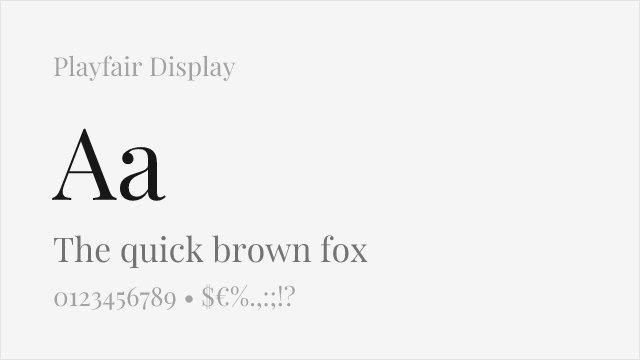
Contemporary interpretation with similar dramatic contrast for display use
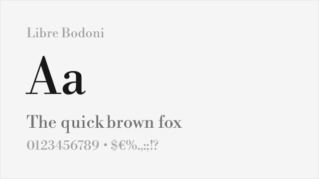
High-contrast didone with elegant proportions suitable for display
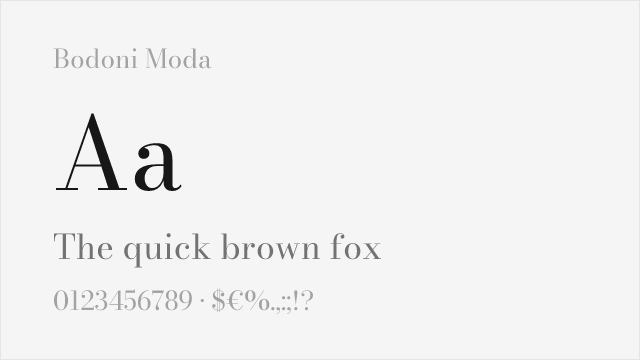
Google Fonts Bodoni revival with optical sizing and variable weight
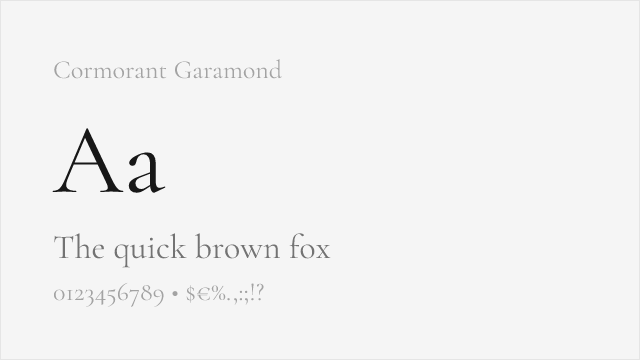
High-contrast display serif with elegant, Didot-adjacent thins
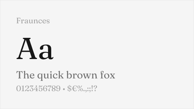
Characterful variable display serif with adjustable contrast
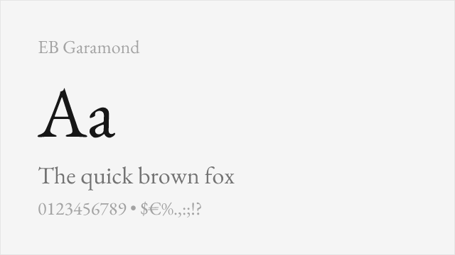
Low-contrast text serif — the readable companion for Didot's fragile display
Compare the alternatives
See how Didot compares to its top alternatives — and how those alternatives compare to each other — side by side.
See where Didot is used in the wild and swap to free alternatives live.
Install FontSwap →Replacement Summary
Source: FontAlternatives.com
Premium font: Didot
Best free alternative: Playfair Display
FontAlternatives similarity score: 85%
Replacement difficulty: Low
Best for: fashion editorials, magazine headlines, wedding stationery, luxury branding
Notable users: Harper's Bazaar, CBS, Zara
Not recommended when: Brand consistency with Harper's Bazaar requires exact letterforms
What is the best free alternative to Didot?
Playfair Display is the best free alternative to Didot with a FontAlternatives similarity score of 85%.
Playfair Display shares similar proportions, stroke characteristics, and intended use with Didot. It is available under the OFL-1.1 license, which permits both personal and commercial use at no cost.
This alternative works particularly well for: fashion editorials, magazine headlines, wedding stationery, luxury branding.
Can I safely replace Didot with Playfair Display?
Yes, Playfair Display is a high-confidence replacement for Didot. The FontAlternatives similarity score of 85% indicates strong structural compatibility.
Licensing: Playfair Display is licensed under OFL-1.1, which allows commercial use without licensing fees or royalties.
Weight coverage: Most weights have close or exact matches available.
When should I NOT replace Didot?
While Playfair Display is a strong alternative, there are situations where replacing Didot may not be appropriate:
- Strict compliance: Verify that OFL-1.1 terms meet your specific legal and compliance requirements.
Weight-Matching Guide
Map Didot weights to their closest free alternatives for accurate font substitution.
Playfair Display
| Didot | Playfair Display | Match |
|---|---|---|
| Regular | Regular (400) | close |
| Bold | Bold (700) | close |
| Black | Black (900) | close |
Libre Bodoni
| Didot | Libre Bodoni | Match |
|---|---|---|
| Regular | Regular (400) | close |
| Medium | Medium (500) | close |
| Bold | Bold (700) | close |
Bodoni Moda
| Didot | Bodoni Moda | Match |
|---|---|---|
| Regular | Regular (400) | close |
| Bold | Bold (700) | close |
| Black | Black (900) | close |
Cormorant Garamond
| Didot | Cormorant Garamond | Match |
|---|---|---|
| Regular | Regular (400) | close |
| Medium | Medium (500) | close |
| Bold | Bold (700) | close |
Fraunces
| Didot | Fraunces | Match |
|---|---|---|
| Regular | Regular (400) | close |
| Medium | Medium (500) | close |
| Bold | Bold (700) | close |
EB Garamond
| Didot | EB Garamond | Match |
|---|---|---|
| Regular | Regular (400) | substitute |
| Medium | Medium (500) | substitute |
| Bold | Bold (700) | substitute |
Performance Guide
Production performance metrics for each alternative.
How to Use Playfair Display
Copy these code snippets to quickly add Playfair Display to your project.
CSS code for Playfair Display
@import url('https://fonts.googleapis.com/css2?family=Playfair+Display:wght@100..900&display=swap');HTML code for Playfair Display
<link rel="preconnect" href="https://fonts.googleapis.com">
<link rel="preconnect" href="https://fonts.gstatic.com" crossorigin>
<link href="https://fonts.googleapis.com/css2?family=Playfair+Display:wght@100..900&display=swap" rel="stylesheet">
Tailwind code for Playfair Display
// tailwind.config.js
module.exports = {
  theme: {
    extend: {
      fontFamily: {
        'playfair-display': ['"Playfair Display"', 'sans-serif'],
      },
    },
  },
}

// Usage in HTML:
// <p class="font-playfair-display">Your text here</p>
Next.js code for Playfair Display
// Using next/font (Next.js 13+)
import { Playfair_Display } from 'next/font/google';

const playfair_display = Playfair_Display({
  subsets: ['latin'],
  weight: ['100', '200', '300', '400', '500', '600', '700', '800', '900'],
});

export default function Component() {
  return (
    <p className={playfair_display.className}>
      Your text here
    </p>
  );
}

// Or using inline styles with Google Fonts link:
// <p style={{ fontFamily: '"Playfair Display"' }}>Your text</p>
Expo and React Native code for Playfair Display
// Install: npx expo install @expo-google-fonts/playfair-display expo-font
import { useFonts, Playfair_Display_400Regular } from '@expo-google-fonts/playfair-display';

export default function App() {
  const [fontsLoaded] = useFonts({
    Playfair_Display_400Regular,
  });

  if (!fontsLoaded) return null;

  return (
    <Text style={{ fontFamily: 'Playfair_Display_400Regular' }}>
      Your text here
    </Text>
  );
}
Recommended Font Pairings
These free fonts pair well with Playfair Display Didot for headlines, body text, or accent use.
Montserrat's clean geometric forms provide readable body text that complements Didot's dramatic high-contrast display headlines
Raleway's elegant geometric proportions harmonize with Didot's sophisticated character for fashion and luxury editorial layouts
Lato's humanist warmth balances Didot's neoclassical precision, creating approachable body text beneath dramatic serif headlines
Browse Alternatives by Context
Find Didot alternatives filtered by specific use case, style, or language support.
By Use Case
By Script
Frequently Asked Questions
What is the best free alternative to Didot?
Playfair Display is the best free alternative to Didot with a FontAlternatives similarity score of 85%. It shares similar proportions and characteristics while being available under the OFL-1.1 license for both personal and commercial use at no cost.
Is there a free version of Didot?
There is no official free version of Didot. However, Playfair Display is available under the OFL-1.1 open-source license and achieves a FontAlternatives similarity score of 85%. It includes variable weights and supports latin, latin-extended.
What Google Font looks like Didot?
The Google Fonts most similar to Didot are Playfair Display, Libre Bodoni, Bodoni Moda. Among these alternatives, Playfair Display offers the closest match with a FontAlternatives similarity score of 85% and includes variable weights for flexible typography options.
Can I use Playfair Display commercially?
Yes, Playfair Display can be used commercially. It is licensed under OFL-1.1, which allows free use in websites, applications, print materials, and commercial projects without purchasing a license or paying royalties.
Is Playfair Display similar enough to Didot?
Playfair Display achieves a FontAlternatives similarity score of 85% compared to Didot. While not identical, it offers comparable letterforms, proportions, and visual style. Most designers find it works excellently as a substitute in web and print projects.
What are the main differences between Didot and its free alternatives?
Free alternatives to Didot may differ in subtle details like letter spacing, curve refinements, and available weights. Premium fonts typically include more OpenType features, extended language support, and optimized screen rendering. However, for most projects, these differences are negligible.
Where can I download free alternatives to Didot?
Download Playfair Display directly from Google Fonts. Click the "Get Font" button on any alternative listed above to visit the official download page. Google Fonts also provides convenient embed codes for seamless web integration.