Free Alternatives to Die Grotesk

About Die Grotesk
- Foundry
- Klim Type Foundry
- Classification
- sans-serif
- Variable
- Yes
- Style
- neo-grotesque
Brands Using Die Grotesk
Applied across Klim's own website and specimens as the foundry's self-application of the family
Considered identity work drawn to Klim's texture-first grotesque
Teams wanting Helvetica-level neutrality with contemporary craft
A designer's-choice grotesque for considered editorial and identity work
 See Die Grotesk live on these sites with FontSwap →
Die Grotesk is a neo-grotesk variable typeface designed by Kris Sowersby at Klim Type Foundry, released in 2025. It is Klim's first retail variable font and includes 64 styles across four optical subfamilies (A through D). Klim frames the family as a face shaped in the long shadow of Helvetica — at once homage and critique — engineered for even, perfect typographic texture rather than as a fresh digitization of any single historical source.
Klim Type Foundry is not a newcomer to the grotesque. Kris Sowersby, working out of Wellington, New Zealand, built the foundry's reputation on families like Founders Grotesk and Söhne — the latter a reinterpretation of Akzidenz-Grotesk that has become a fixture of contemporary editorial and identity design. Die Grotesk extends that catalog in a specific direction. Where Söhne looks back to the raw grotesques of the nineteenth century, Die Grotesk turns to Helvetica, the most refined and most argued-about member of the family, and asks what that face would be if it were drawn today with variable-font tooling.
Die Grotesk requires a commercial license from Klim Type Foundry. It uses per-style licensing via klim.co.nz, with desktop, web, app, and enterprise licenses available. There is no free tier, no trial version, and no Google Fonts availability. If you need a similar aesthetic without the license cost, this page covers the best open-source alternatives.
Why Die Grotesk Matters
The world does not need another Helvetica. It has Helvetica Now (Monotype, 2019), Neue Haas Grotesk (Christian Schwartz, 2011), and dozens of neo-grotesk families that trace their proportions back to Helvetica (designed 1957 as Neue Haas Grotesk). Sowersby himself has described a long oscillation between admiration for and resistance to Helvetica — comparing the dynamic to musicians who cannot escape the Beatles, or chefs who resent McDonald's. Klim frames Die Grotesk as the resolution of that tension: at once homage and critique. Its significance lies not in novelty but in methodology.
Sowersby's approach differs from other Helvetica descendants in a specific, technical way: he designed for typographic texture rather than individual glyph fidelity. Where most neo-grotesks optimize the appearance of individual characters and then adjust spacing, Die Grotesk begins with the texture of set text and works backward to the glyph level. The result is a typeface that produces unusually even color on the page, with consistent rhythm and density across paragraphs.
This matters because the most common complaint about Helvetica in professional typesetting is not its character shapes but its spacing. Helvetica's metrics were designed for metal type and hot-metal phototypesetting. Every digital Helvetica carries compromises inherited from those origins. Die Grotesk sidesteps this problem by rebuilding from the ground up, treating Helvetica as a reference point to respond to rather than a template to redraw.
This texture-first method is a Klim signature, not a one-off experiment. The foundry has long argued that a typeface is judged in paragraphs, not in isolated letters, and Die Grotesk pushes that argument to its conclusion. For a studio weighing the font, the practical question is rarely whether the letters look like Helvetica; they largely do. The real question is whether the improved evenness of set text is worth moving off a typeface that is already installed, already licensed, and already familiar to every client. Die Grotesk is Sowersby's case that the answer, for serious typesetting, is yes.
Design Characteristics
Die Grotesk sits squarely in the neo-grotesk family, but its design choices reflect Sowersby's obsession with even texture:
- Four optical variants (A through D): Each weight ships with four tracking variants, each tuned for a different size range. Variant A is optimized for small text (8-12pt) with wider tracking, while Variant D is designed for display sizes and logotypes with tighter spacing. This replaces the conventional approach of a single set of metrics adjusted by the designer.
- Variable font with optical size axis: The variable font version interpolates between these four variants automatically, adjusting tracking based on the rendered size. This is Klim's first retail variable font.
- Helvetica-derived proportions: The underlying letter shapes sit clearly within Helvetica's family, but Klim presents them as a response to Helvetica rather than a redrawing of any one historical cut. The differences are subtle but visible in characters like the uppercase R, the lowercase a, and the numeral 1.
- Alternate characters: Includes a straight-legged R (instead of Helvetica's distinctive curved leg) and round dots, allowing designers to move the typeface closer to or further from Helvetica's specific identity.
- Consistent stroke weight: Even distribution of stroke weight prevents thin strokes from disappearing at small sizes or on low-contrast screens.
- Open apertures: While maintaining Helvetica's fundamentally closed character, Die Grotesk opens apertures slightly compared to the original, improving legibility at text sizes without sacrificing the neo-grotesk aesthetic.
- Static subfamilies: For designers who prefer fixed instances, Die Grotesk ships as four complete subfamilies (A through D), each with eight weights in upright and italic.
The overall aesthetic is intentionally familiar. Die Grotesk does not try to differentiate itself through unusual design features. Its differentiation is in the quality of its typesetting — the evenness of its color, the consistency of its rhythm, and the refinement of its spacing across sizes.
None of this reads as showy on a specimen sheet. The payoff appears only when you set real copy and compare it, line for line, against a conventional Helvetica: the Die Grotesk column holds a steadier gray, with fewer tight spots and fewer loose ones. That is the entire pitch. Whether it justifies the price depends on how closely your audience actually reads, and on whether anyone in the pipeline would otherwise be hand-correcting spacing by eye.
Where Die Grotesk Excels
Die Grotesk is purpose-built for contexts where typographic texture matters more than brand differentiation:
- Editorial design: Magazines, journals, and long-form digital content where even text color across columns is critical
- Corporate identity systems: Brand guidelines that specify a neo-grotesk but need better typesetting performance than Helvetica
- Book typography: Extended reading in both print and digital formats
- Signage and wayfinding: The optical variants ensure legibility across viewing distances
- Packaging and print: The four tracking variants eliminate manual spacing adjustments for different production contexts
The common thread across these uses is repetition at text and sub-display sizes, where small inconsistencies in spacing accumulate into a visibly uneven page. A poster forgives loose tracking; a 200-page report does not. Die Grotesk earns its keep in the second case, and in any system where the same type has to behave predictably across print, screen, and signage without a specialist hand-tuning every context.
Where It Struggles
- Brand differentiation: Die Grotesk is deliberately generic. If your brand needs to be instantly recognizable through its typography alone, a more distinctive typeface is a better choice.
- Display-only projects: For headlines, posters, or display contexts where texture is irrelevant, Die Grotesk's core value proposition (even typesetting) does not apply. Cheaper or free neo-grotesks will produce identical results at large sizes.
- Budget-constrained projects: With per-style licensing via klim.co.nz, a full deployment is a meaningful investment. For projects where the difference between good and excellent typographic texture is not visible to the audience, Inter or Source Sans 3 provide 90% of the result for free.
- Licensing overhead: Klim licenses by style, format, and usage tier. A team that needs desktop, web, and app coverage across a full family can assemble a bill that requires real budgeting, and enterprise deployments need a custom quote. The cost is administrative as well as financial. Someone has to track which styles are cleared for which surface, whereas a free, open-source font carries none of that bookkeeping.
There is a subtler tradeoff built into the design itself. Neutrality here is deliberate, and neutrality is never free. A face engineered to disappear cannot also be the thing a viewer remembers. Brands that compete on a distinctive typographic voice — a wordmark that has to be recognizable as a thumbnail, a headline face with an unmistakable signature — will find Die Grotesk too well-behaved. It solves the problem of even, quiet text, which is exactly the wrong problem to solve when the goal is to be loud. That is not a flaw in the typeface. It is a reason to be honest about the brief before licensing it.
How to Choose a Free Substitute
When evaluating alternatives to Die Grotesk, prioritize these criteria:
- Typographic texture at text sizes: Set a full paragraph at 10-14px and evaluate the overall color and rhythm, not individual character shapes. Die Grotesk's differentiation is invisible at the glyph level.
- Weight coverage: Die Grotesk offers eight weights. Ensure your substitute covers at least Light through Bold for typographic hierarchy.
- Variable font support: Die Grotesk's optical sizing is its key technical feature. Inter's optical sizing axis is the closest free equivalent.
- Hinting quality: For screen-first projects, fonts with strong hinting (Inter, Source Sans 3) will produce more consistent results across devices.
- Italic quality: Die Grotesk ships true italics with all weights. Verify your substitute's italics are similarly refined.
- Neutrality: The substitute should read as invisible. If anyone notices the font, it is not neutral enough.
Once you have weighed those criteria against your project, the shortlist usually narrows fast. For screen-first product work, Inter is the default; its optical size axis is the nearest free analog to Die Grotesk's A-through-D tracking system, and its hinting holds up on low-resolution displays. For long-form reading and cross-platform documents, Source Sans 3 trades a little Swiss coolness for warmth that is easier on the eyes over pages. When the job is brand and marketing rather than dense text, DM Sans brings a rounder, more geometric tone that sits well in identity systems, while Work Sans offers a looser, American-gothic rhythm for editorial web content. Space Grotesk is the outlier: reach for it only when you actually want visible character, since its quirks run against Die Grotesk's invisibility. For accessibility-critical or civic work, Public Sans matches the institutional restraint without the license, and Libre Franklin is the pick when you want neutrality with a little editorial warmth and wider proportions. None of these reproduces the four-variant tracking system exactly, but each covers a defensible slice of what Die Grotesk does.
A practical rule mirrors the one for Helvetica itself: if you are matching an existing Die Grotesk layout, choose by behavior at your working size and by weight coverage; if you are starting fresh, choose by medium. The font's whole argument is about set text, so judge every candidate the same way Sowersby judged his own — in a paragraph, at the size it will actually be read, and not in a single enlarged glyph.
Premium Font Neighbors
If you appreciate Die Grotesk's approach, these premium typefaces occupy adjacent territory:
Cluster A: Swiss neo-grotesk precision
- Helvetica Now (Monotype) — the modernized Helvetica with optical sizing and improved spacing
- Neue Haas Grotesk (Christian Schwartz / Commercial Type) — a faithful revival of the original Haas Helvetica, a different route to the same neo-grotesk territory
- Aktiv Grotesk (Dalton Maag) — a workhorse neo-grotesk designed for extensive language support
- Akkurat (Lineto) — Swiss precision with contemporary proportions and restrained character
Cluster B: Contemporary grotesques with editorial DNA
- Söhne (Klim Type Foundry) — Sowersby's other neo-grotesk, based on Akzidenz-Grotesk rather than Helvetica
- Graphik (Commercial Type) — popular in tech and media; clean, contemporary grotesque
- GT America (Grilli Type) — bridges American gothic and European grotesk traditions
- Univers (Linotype) — Adrian Frutiger's systematic neo-grotesk, the philosophical ancestor of Die Grotesk's systematic approach
All fonts listed above are premium/commercial typefaces requiring paid licenses.
FAQ
Is Die Grotesk just another Helvetica clone?
No. Klim describes Die Grotesk as a response to Helvetica — at once homage and critique — rebuilt from the ground up with a focus on even typographic texture rather than glyph-level fidelity. The four optical tracking variants (A through D) and the variable font's optical size axis represent a fundamentally different approach to the neo-grotesk genre. Die Grotesk is what Helvetica might look like if designed today with contemporary variable font technology.
What is the best free alternative to Die Grotesk?
Inter is the closest free alternative at 82% similarity. It shares Die Grotesk's neo-grotesk foundation, tall x-height, and emphasis on screen legibility. Inter's optical sizing axis provides comparable size-specific optimization. For editorial and print contexts, Source Sans 3 is also an excellent choice at 79% similarity.
How does Die Grotesk compare to Söhne?
Both are Klim Type Foundry neo-grotesks designed by Kris Sowersby, but they respond to different reference points. Söhne reinterprets Akzidenz-Grotesk (1898), giving it a slightly rawer, more characterful tone. Die Grotesk responds to Helvetica (designed 1957), resulting in a more polished, neutral aesthetic. Söhne has more personality; Die Grotesk has more restraint. Choose Söhne for editorial projects that want character, Die Grotesk for corporate contexts that want invisible precision.
What are the four variants (A through D)?
Die Grotesk ships with four subfamilies, each with different tracking (letter spacing) optimized for different size ranges. Variant A has the widest tracking for small text (8-12pt). Variant D has the tightest tracking for display sizes and logotypes. Variants B and C cover intermediate ranges. The variable font version interpolates between these automatically using the optical size axis.
Can I use Die Grotesk for web projects?
Yes. Klim offers web font licenses for Die Grotesk. The variable font format is particularly efficient for web use, as a single file covers all weights and optical sizes. For projects that cannot justify the license cost, Inter with its optical sizing axis is the closest free web font equivalent.
Is Die Grotesk a variable font?
Yes. Die Grotesk is Klim Type Foundry's first retail variable font. It includes weight and optical size axes, allowing continuous adjustment of both weight and tracking/spacing optimization. Static instances (four subfamilies × eight weights × upright and italic) are also available for workflows that prefer fixed font files.
Why is Die Grotesk more expensive than Helvetica Now?
Pricing differs because of licensing models. Monotype (Helvetica Now) uses tiered subscription and perpetual licensing. Klim uses per-style and per-format pricing. For small projects, Die Grotesk may be less expensive than a Helvetica Now enterprise license. For large deployments, the cost comparison depends on usage scope. Both foundries offer quotes for enterprise licensing.
Who should use Die Grotesk over a free alternative?
Designers and organizations who can see (and whose audiences benefit from) the difference between good and exceptional typographic texture. If you are setting magazines, books, or corporate communications where paragraph rhythm and text color across pages are critical, Die Grotesk's optical variants offer real typographic value. If you are building a web app or dashboard where text is read in short bursts, Inter provides comparable results at no cost.
Is Die Grotesk on Google Fonts?
No, Die Grotesk is a premium font from Klim Type Foundry and is not available on Google Fonts.
The closest Google Fonts alternative is Inter with 82% similarity. Get it free on Google Fonts ↗
Free Alternatives (7)
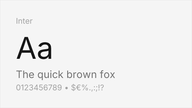
Screen-optimized variable sans with optical sizing and extensive language support

Adobe's workhorse sans with excellent hinting and variable font support
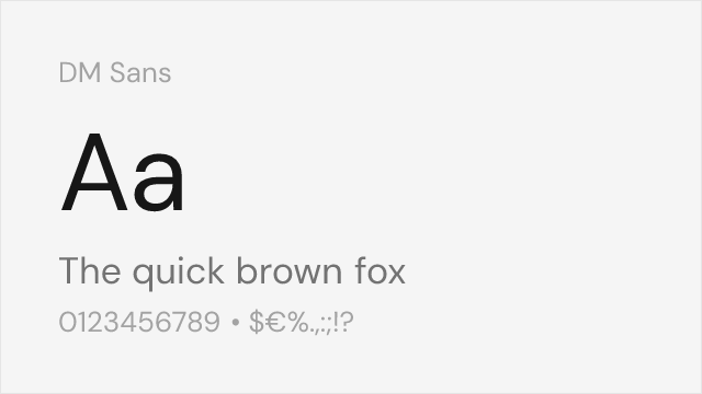
Google-commissioned geometric sans with variable support and clean character

Industrial-functional variable sans with American gothic lineage
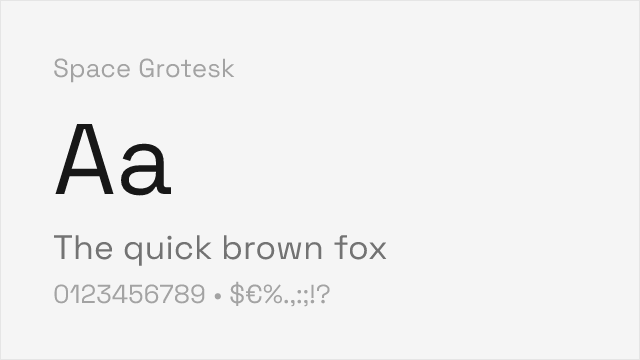
Geometric grotesk with distinctive character and variable weight axis
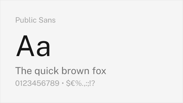
Government-grade neutrality with accessibility-first design principles
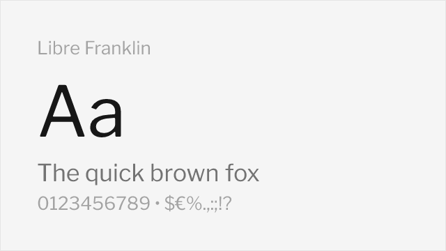
Franklin Gothic-inspired variable sans with editorial lineage
Compare the alternatives
See how Die Grotesk compares to its top alternatives — and how those alternatives compare to each other — side by side.
See where Die Grotesk is used in the wild and swap to free alternatives live.
Install FontSwap →Replacement Summary
Source: FontAlternatives.com
Premium font: Die Grotesk
Best free alternative: Inter
FontAlternatives similarity score: 82%
Replacement difficulty: Medium
Best for: web and app interfaces, editorial longform, design system prototyping, data-dense dashboards
Notable users: Klim Type Foundry, Independent design studios, Corporate identity systems
Not recommended when: Brand consistency with Klim Type Foundry requires exact letterforms
What is the best free alternative to Die Grotesk?
Inter is the best free alternative to Die Grotesk with a FontAlternatives similarity score of 82%.
Inter shares similar proportions, stroke characteristics, and intended use with Die Grotesk. It is available under the OFL-1.1 license, which permits both personal and commercial use at no cost.
This alternative works particularly well for: web and app interfaces, editorial longform, design system prototyping, data-dense dashboards.
Can I safely replace Die Grotesk with Inter?
Yes, with some considerations. Inter achieves a FontAlternatives similarity score of 82%, indicating good structural compatibility for most use cases.
Licensing: Inter is licensed under OFL-1.1, which allows commercial use without licensing fees or royalties.
Weight coverage: Most weights have close or exact matches available.
When should I NOT replace Die Grotesk?
While Inter is a strong alternative, there are situations where replacing Die Grotesk may not be appropriate:
- Optical precision requirements: Inter has measurable structural differences from Die Grotesk that may be visible in precise design work.
- Strict compliance: Verify that OFL-1.1 terms meet your specific legal and compliance requirements.
Weight-Matching Guide
Map Die Grotesk weights to their closest free alternatives for accurate font substitution.
Inter
| Die Grotesk | Inter | Match |
|---|---|---|
| Light (300) | Light (300) | close |
| Regular (400) | Regular (400) | close |
| Medium (500) | Medium (500) | close |
| Bold (700) | Bold (700) | close |
Source Sans 3
| Die Grotesk | Source Sans 3 | Match |
|---|---|---|
| Light (300) | Light (300) | close |
| Regular (400) | Regular (400) | close |
| Medium (500) | Semi Bold (600) | substitute |
| Bold (700) | Bold (700) | close |
DM Sans
| Die Grotesk | DM Sans | Match |
|---|---|---|
| Light (300) | Light (300) | close |
| Regular (400) | Regular (400) | close |
| Medium (500) | Medium (500) | close |
| Bold (700) | Bold (700) | close |
Work Sans
| Die Grotesk | Work Sans | Match |
|---|---|---|
| Light (300) | Light (300) | close |
| Regular (400) | Regular (400) | close |
| Medium (500) | Medium (500) | close |
| Bold (700) | Bold (700) | close |
Space Grotesk
| Die Grotesk | Space Grotesk | Match |
|---|---|---|
| Light (300) | Light (300) | exact |
| Regular (400) | Regular (400) | close |
| Medium (500) | Medium (500) | close |
| Bold (700) | Bold (700) | exact |
Public Sans
| Die Grotesk | Public Sans | Match |
|---|---|---|
| Light (300) | Light (300) | close |
| Regular (400) | Regular (400) | close |
| Medium (500) | Medium (500) | close |
| Bold (700) | Bold (700) | close |
Libre Franklin
| Die Grotesk | Libre Franklin | Match |
|---|---|---|
| Light (300) | Light (300) | close |
| Regular (400) | Regular (400) | close |
| Medium (500) | Medium (500) | close |
| Bold (700) | Bold (700) | close |
Performance Guide
Production performance metrics for each alternative.
How to Use Inter
Copy these code snippets to quickly add Inter to your project.
CSS code for Inter
@import url('https://fonts.googleapis.com/css2?family=Inter:wght@100..900&display=swap');HTML code for Inter
<link rel="preconnect" href="https://fonts.googleapis.com">
<link rel="preconnect" href="https://fonts.gstatic.com" crossorigin>
<link href="https://fonts.googleapis.com/css2?family=Inter:wght@100..900&display=swap" rel="stylesheet">
Tailwind code for Inter
// tailwind.config.js
module.exports = {
  theme: {
    extend: {
      fontFamily: {
        'inter': ['Inter', 'sans-serif'],
      },
    },
  },
}

// Usage in HTML:
// <p class="font-inter">Your text here</p>
Next.js code for Inter
// Using next/font (Next.js 13+)
import { Inter } from 'next/font/google';

const inter = Inter({
  subsets: ['latin'],
  weight: ['100', '200', '300', '400', '500', '600', '700', '800', '900'],
});

export default function Component() {
  return (
    <p className={inter.className}>
      Your text here
    </p>
  );
}

// Or using inline styles with Google Fonts link:
// <p style={{ fontFamily: "'Inter'" }}>Your text</p>
Expo and React Native code for Inter
// Install: npx expo install @expo-google-fonts/inter expo-font
import { useFonts, Inter_400Regular } from '@expo-google-fonts/inter';

export default function App() {
  const [fontsLoaded] = useFonts({
    Inter_400Regular,
  });

  if (!fontsLoaded) return null;

  return (
    <Text style={{ fontFamily: 'Inter_400Regular' }}>
      Your text here
    </Text>
  );
}
Recommended Font Pairings
These free fonts pair well with Inter Die Grotesk for headlines, body text, or accent use.
Source Serif Pro's transitional serif forms provide excellent contrast with Die Grotesk's clean neo-grotesk lines, creating a classic editorial pairing suitable for magazines, annual reports, and long-form digital content
JetBrains Mono's monospace clarity complements Die Grotesk's functional aesthetic for technical documentation and developer-facing interfaces where both text and code must coexist
EB Garamond's humanist warmth and old-style proportions create dramatic contrast with Die Grotesk's Swiss precision, suitable for luxury editorial and cultural institution communications
Browse Alternatives by Context
Find Die Grotesk alternatives filtered by specific use case, style, or language support.
By Script
Frequently Asked Questions
What is the best free alternative to Die Grotesk?
Inter is the best free alternative to Die Grotesk with a FontAlternatives similarity score of 82%. It shares similar proportions and characteristics while being available under the OFL-1.1 license for both personal and commercial use at no cost.
Is there a free version of Die Grotesk?
There is no official free version of Die Grotesk. However, Inter is available under the OFL-1.1 open-source license and achieves a FontAlternatives similarity score of 82%. It includes variable weights and supports latin, latin-extended.
What Google Font looks like Die Grotesk?
The Google Fonts most similar to Die Grotesk are Inter, Source Sans 3, DM Sans. Among these alternatives, Inter offers the closest match with a FontAlternatives similarity score of 82% and includes variable weights for flexible typography options.
Can I use Inter commercially?
Yes, Inter can be used commercially. It is licensed under OFL-1.1, which allows free use in websites, applications, print materials, and commercial projects without purchasing a license or paying royalties.
Is Inter similar enough to Die Grotesk?
Inter achieves a FontAlternatives similarity score of 82% compared to Die Grotesk. While not identical, it offers comparable letterforms, proportions, and visual style. Most designers find it works excellently as a substitute in web and print projects.
What are the main differences between Die Grotesk and its free alternatives?
Free alternatives to Die Grotesk may differ in subtle details like letter spacing, curve refinements, and available weights. Premium fonts typically include more OpenType features, extended language support, and optimized screen rendering. However, for most projects, these differences are negligible.
Where can I download free alternatives to Die Grotesk?
Download Inter directly from Google Fonts. Click the "Get Font" button on any alternative listed above to visit the official download page. Google Fonts also provides convenient embed codes for seamless web integration.