Free Alternatives to Söhne

About Söhne
- Foundry
- Klim Type Foundry
- Classification
- sans-serif
- Style
- neo-grotesque
Brands Using Söhne
Primary UI typeface across Dashboard, Docs, and marketing materials
Full product interface and brand identity
Marketing site and ChatGPT interface typography
Dashboard and documentation typography
Presentation software interface and brand
Söhne is a neo-grotesque sans-serif typeface designed by Kris Sowersby and released by Klim Type Foundry in 2019. Described by its creator as "the memory of Helvetica," Söhne reinterprets the mid-century Swiss grotesque tradition through a contemporary lens, stripping away nostalgic baggage while preserving the structural clarity that made Helvetica ubiquitous. It has become one of the defining typefaces of the 2020s tech industry.
Söhne requires a paid license from Klim Type Foundry. Pricing is per-project, with separate licenses for desktop, web, and app usage. There is no free tier. If your budget cannot accommodate Klim's licensing structure, this page covers the best open-source alternatives and what to evaluate when choosing one.
Why Söhne Matters
Söhne's rapid adoption by the most design-conscious tech companies of the 2020s was not accidental. When Stripe rebuilt its brand identity in 2019, it chose Söhne as its primary UI typeface, replacing a combination of system fonts and custom type. Linear, the project management tool that became the standard for engineering teams, followed. So did OpenAI for its marketing presence, Pitch for its presentation software, and dozens of well-funded startups seeking to signal design maturity.
What these companies recognized is that Söhne occupies a specific niche: it reads as Helvetica-adjacent (familiar, trustworthy, professional) while feeling distinctly modern. It avoids the retro connotations of actual Helvetica, the corporate sterility of Arial, and the ubiquitous informality of Inter. For companies building premium digital products, Söhne signals that someone with taste made the typography decisions.
The font's German weight names (Extraleicht, Leicht, Buch, Kräftig, Halbfett, Dreiviertelfett, Fett, Extrafett) are not affectation — they reference the traditional German naming conventions used by the original mid-century grotesques that inspired it.
Design Characteristics
Söhne's design choices are deliberate departures from both historical Helvetica and its contemporary competitors:
- Tall x-height with compact ascenders: Letters like
a,e,xoccupy a large portion of the body height, maximizing legibility at UI sizes (12-16px) where most of the reading happens in product interfaces - Open apertures: The
c,e,s, andahave generous counter openings that prevent letterforms from collapsing at small sizes on screen — a common failure point for tight grotesques - Flat-sided curves: Bowls and curves in letters like
b,d,p,qhave subtly flattened sides that create a more rational, geometric appearance without the sterility of a fully geometric sans - Monoline stroke weight: Minimal contrast between thick and thin strokes gives Söhne an even typographic color across paragraphs, reducing visual noise in dense UI layouts
- Ink traps at joints: Subtle ink traps where strokes meet (visible in
M,N,Wat large sizes) prevent thickening at small sizes, a detail inherited from letterpress tradition - Tabular and proportional figure sets: Both are included, essential for product interfaces that mix body copy with data tables, dashboards, and financial displays
- Horizontal terminals: Stroke endings are clean and horizontal rather than angled or ball-shaped, contributing to Söhne's calm, controlled personality
The family ships in eight weights (Extraleicht to Extrafett) with matching italics. A companion family, Söhne Breit, provides a wider-set version for display and headline use, while Söhne Mono covers programming and technical contexts.
Where Söhne Excels
Söhne is at its best in digital product interfaces, particularly:
- SaaS dashboards: The even typographic color and tabular figures handle dense information displays cleanly
- Developer tools: Its rational, precise character suits engineering-minded products where typography should be invisible
- Marketing pages for tech companies: Söhne adds premium polish to landing pages without feeling decorative
- Documentation: Clean hierarchy from Extraleicht through Extrafett supports scannable technical writing
- Dark-mode interfaces: The monoline stroke weight ensures consistent legibility across light and dark themes
Where Söhne Struggles
No typeface is universal. Söhne underperforms in certain contexts:
- Long-form editorial reading: At body sizes in continuous prose (blog posts, articles), Söhne's low contrast and tight spacing cause reader fatigue faster than a humanist alternative like Source Sans 3
- Warm or playful brands: Söhne's clinical precision reads as cold. Brands targeting families, children, or casual audiences will find it alienating
- Print at small sizes: Without the hinting advantages of fonts engineered for screen, Söhne's thin weights can appear weak in print below 9pt
- Projects requiring Cyrillic or CJK: Söhne only supports Latin scripts. Multilingual projects need a fallback strategy
How to Choose a Free Substitute
When evaluating Söhne replacements, prioritize these criteria:
- x-height and spacing rhythm: Söhne's x-height-to-cap-height ratio and letter spacing are its most recognizable features. Test your alternative at 14px and 16px in a product UI context — does it maintain the same reading rhythm?
- Weight range and distribution: Söhne's eight weights are carefully distributed for UI hierarchy. Your alternative needs at least Regular, Medium, Semi Bold, and Bold to replicate common UI patterns
- Tabular figures: If your product displays numbers in tables, dashboards, or financial contexts, verify the alternative includes tabular (fixed-width) numerals
- Variable font support: Söhne ships as static fonts only. Ironically, most of its best free alternatives offer variable font support, which is an upgrade for web performance
- Typographic personality: The critical question is whether your alternative reads as "designed with intention" or "defaulted to." Söhne's value is partly positional — it signals design taste. Inter and Geist both convey this; system fonts do not
Premium Font Neighbors
If Söhne's approach resonates but you want to explore adjacent options:
Cluster A: Rational neo-grotesques (Söhne's direct competitors)
- Calibre (Klim Type Foundry) — Sowersby's other grotesque; more geometric and condensed than Söhne
- ABC Diatype (Dinamo) — similarly clinical, with slightly wider proportions and quirky terminals
- Graphik (Commercial Type) — the pre-Söhne default for tech companies; warmer and more humanist
- Aktiv Grotesk (Dalton Maag) — Helvetica replacement engineered for digital; more corporate than Söhne
Cluster B: Contemporary tech grotesques
- Aeonik (CoType Foundry) — blends geometric and grotesque DNA; slightly softer than Söhne
- Neue Montreal (Pangram Pangram) — popular in startup branding; more expressive than Söhne
- Founders Grotesk (Klim Type Foundry) — Sowersby's earlier grotesque; tighter and more condensed
- Neufile Grotesk (Indian Type Foundry) — affordable Söhne-adjacent option with broader language support
FAQ
Is Söhne free?
No. Söhne is a premium typeface from Klim Type Foundry with per-project licensing. Desktop licenses start around $50 per style, and web licenses are priced by monthly page views. There is no free or trial version available.
What is the best free alternative to Söhne?
Inter is the closest free alternative at 90% similarity. Both share a tall x-height, open apertures, and neo-grotesque construction optimized for screen interfaces. Inter adds variable font support, broader language coverage (including Cyrillic and Greek), and optical sizing — features Söhne lacks.
Why do so many tech companies use Söhne?
Söhne occupies a specific market position: it signals design sophistication without being decorative. It reads as "Helvetica, but someone made a conscious choice," which aligns with how design-led tech companies want to present their products. The Klim Type Foundry name also carries credibility in design circles.
Can I use Söhne on the web?
Yes, with a web font license from Klim Type Foundry. Web licenses are priced by monthly page views in tiers. You receive WOFF2 files for self-hosting. Söhne is not available through any font CDN or service like Google Fonts or Adobe Fonts.
What is the difference between Söhne, Söhne Breit, and Söhne Mono?
Söhne is the standard-width family for body and UI text. Söhne Breit is a wider version designed for headlines and display use. Söhne Mono is a monospace companion for code editors, terminals, and technical interfaces. Each is licensed separately.
Does Söhne support Cyrillic or other non-Latin scripts?
No. Söhne supports Latin scripts only (Latin, Latin Extended). For projects requiring Cyrillic, Greek, Arabic, or CJK scripts, Inter (Cyrillic, Greek) or Noto Sans (nearly all scripts) are the standard open-source solutions.
Is Söhne a variable font?
No. Söhne ships as static font files in eight weights with matching italics. This means you need to load individual weight files rather than a single variable font file. Most of Söhne's free alternatives (Inter, Geist, Work Sans) are available as variable fonts, which is actually an advantage for web performance.
Who designed Söhne?
Kris Sowersby, founder of Klim Type Foundry in Wellington, New Zealand. Sowersby is one of the most respected type designers working today, also known for Founders Grotesk, Calibre, National, Domaine, and Tiempos. His work is characterized by deep historical research reinterpreted through a contemporary sensibility.
Is Söhne on Google Fonts?
No, Söhne is a premium font from Klim Type Foundry and is not available on Google Fonts.
The closest Google Fonts alternative is Inter with 90% similarity. Get it free on Google Fonts ↗
Free Alternatives (8)


Closest overall match with exceptional screen rendering and variable font support

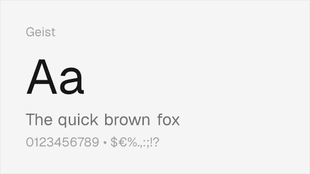
Vercel's own typeface with very similar tech-focused aesthetic


Mature editorial sans with comparable weight distribution


Geometric-leaning grotesque with clean, modern proportions


Popular neo-grotesque from Fontshare with clean character


Contemporary geometric with slightly warmer character


Adobe's workhorse sans with broad language support and strong hinting

Government-grade neutrality with accessibility-first design
See where Söhne is used in the wild and swap to free alternatives live.
Install FontSwap →Replacement Summary
Source: FontAlternatives.com
Premium font: Söhne
Best free alternative: Inter
FontAlternatives similarity score: 90%
Replacement difficulty: Low
Best for: product UI and dashboards, SaaS marketing sites, developer documentation, design system foundations
Notable users: Stripe, Linear, OpenAI
Not recommended when: Brand consistency with Stripe requires exact letterforms
What is the best free alternative to Söhne?
Inter is the best free alternative to Söhne with a FontAlternatives similarity score of 90%.
Inter shares similar proportions, stroke characteristics, and intended use with Söhne. It is available under the OFL-1.1 license, which permits both personal and commercial use at no cost.
This alternative works particularly well for: product UI and dashboards, SaaS marketing sites, developer documentation, design system foundations.
Can I safely replace Söhne with Inter?
Yes, Inter is a high-confidence replacement for Söhne. The FontAlternatives similarity score of 90% indicates strong structural compatibility.
Licensing: Inter is licensed under OFL-1.1, which allows commercial use without licensing fees or royalties.
Weight coverage: Most weights have close or exact matches available.
When should I NOT replace Söhne?
While Inter is a strong alternative, there are situations where replacing Söhne may not be appropriate:
- Brand consistency: Söhne is commonly seen in SaaS dashboards contexts where exact letterforms may be required.
- Strict compliance: Verify that OFL-1.1 terms meet your specific legal and compliance requirements.
Weight-Matching Guide
Map Söhne weights to their closest free alternatives for accurate font substitution.
Inter
| Söhne | Inter | Match |
|---|---|---|
| Extraleicht (200) | Extra Light (200) | close |
| Leicht (300) | Light (300) | exact |
| Buch (400) | Regular (400) | exact |
| Halbfett (600) | Semi Bold (600) | exact |
Geist
| Söhne | Geist | Match |
|---|---|---|
| Leicht (300) | Light (300) | close |
| Buch (400) | Regular (400) | close |
| Kräftig (500) | Medium (500) | close |
| Halbfett (600) | Semi Bold (600) | close |
Work Sans
| Söhne | Work Sans | Match |
|---|---|---|
| Leicht (300) | Light (300) | exact |
| Buch (400) | Regular (400) | exact |
| Kräftig (500) | Medium (500) | exact |
| Dreiviertelfett (700) | Bold (700) | close |
DM Sans
| Söhne | DM Sans | Match |
|---|---|---|
| Leicht (300) | Light (300) | close |
| Buch (400) | Regular (400) | close |
| Kräftig (500) | Medium (500) | close |
| Halbfett (600) | Semi Bold (600) | close |
Plus Jakarta Sans
| Söhne | Plus Jakarta Sans | Match |
|---|---|---|
| Leicht (300) | Light (300) | close |
| Buch (400) | Regular (400) | close |
| Kräftig (500) | Medium (500) | close |
| Dreiviertelfett (700) | Bold (700) | close |
Source Sans 3
| Söhne | Source Sans 3 | Match |
|---|---|---|
| Leicht (300) | Light (300) | close |
| Buch (400) | Regular (400) | close |
| Kräftig (500) | Medium (500) | substitute |
| Dreiviertelfett (700) | Bold (700) | close |
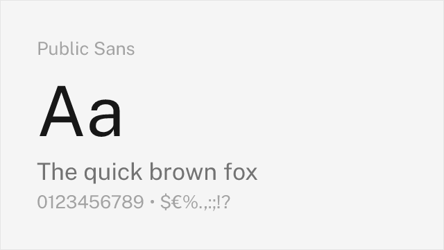
Public Sans
| Söhne | Public Sans | Match |
|---|---|---|
| Leicht (300) | Light (300) | close |
| Buch (400) | Regular (400) | close |
| Kräftig (500) | Medium (500) | close |
| Dreiviertelfett (700) | Bold (700) | close |
Performance Guide
Production performance metrics for each alternative.
How to Use Inter
Copy these code snippets to quickly add Inter to your project.
CSS code for Inter
@import url('https://fonts.googleapis.com/css2?family=Inter:wght@100..900&display=swap');HTML code for Inter
<link rel="preconnect" href="https://fonts.googleapis.com">
<link rel="preconnect" href="https://fonts.gstatic.com" crossorigin>
<link href="https://fonts.googleapis.com/css2?family=Inter:wght@100..900&display=swap" rel="stylesheet">
Tailwind code for Inter
// tailwind.config.js
module.exports = {
  theme: {
    extend: {
      fontFamily: {
        'inter': ['Inter', 'sans-serif'],
      },
    },
  },
}

// Usage in HTML:
// <p class="font-inter">Your text here</p>
Next.js code for Inter
// Using next/font (Next.js 13+)
import { Inter } from 'next/font/google';

const inter = Inter({
  subsets: ['latin'],
  weight: ['100', '200', '300', '400', '500', '600', '700', '800', '900'],
});

export default function Component() {
  return (
    <p className={inter.className}>
      Your text here
    </p>
  );
}

// Or using inline styles with Google Fonts link:
// <p style={{ fontFamily: "'Inter'" }}>Your text</p>
Expo and React Native code for Inter
// Install: npx expo install @expo-google-fonts/inter expo-font
import { useFonts, Inter_400Regular } from '@expo-google-fonts/inter';

export default function App() {
  const [fontsLoaded] = useFonts({
    Inter_400Regular,
  });

  if (!fontsLoaded) return null;

  return (
    <Text style={{ fontFamily: 'Inter_400Regular' }}>
      Your text here
    </Text>
  );
}
Recommended Font Pairings
These free fonts pair well with Inter Söhne for headlines, body text, or accent use.
Source Serif Pro's sturdy, rational serifs provide editorial contrast against Söhne's clean grotesque headlines without introducing stylistic friction — both typefaces share a disciplined, no-nonsense approach
JetBrains Mono's programming ligatures and clear glyph differentiation make it the natural monospace companion for Söhne in developer tool interfaces and technical documentation
Literata's warm, contemporary serifs balance Söhne's clinical precision for editorial layouts that need reading comfort alongside modern UI elements
Browse Alternatives by Context
Find Söhne alternatives filtered by specific use case, style, or language support.
By Script
Frequently Asked Questions
What is the best free alternative to Söhne?
Inter is the best free alternative to Söhne with a FontAlternatives similarity score of 90%. It shares similar proportions and characteristics while being available under the OFL-1.1 license for both personal and commercial use at no cost.
Is there a free version of Söhne?
There is no official free version of Söhne. However, Inter is available under the OFL-1.1 open-source license and achieves a FontAlternatives similarity score of 90%. It includes variable weights and supports latin, latin-extended.
What Google Font looks like Söhne?
The Google Fonts most similar to Söhne are Inter, Geist, Work Sans. Among these alternatives, Inter offers the closest match with a FontAlternatives similarity score of 90% and includes variable weights for flexible typography options.
Can I use Inter commercially?
Yes, Inter can be used commercially. It is licensed under OFL-1.1, which allows free use in websites, applications, print materials, and commercial projects without purchasing a license or paying royalties.
Is Inter similar enough to Söhne?
Inter achieves a FontAlternatives similarity score of 90% compared to Söhne. While not identical, it offers comparable letterforms, proportions, and visual style. Most designers find it works excellently as a substitute in web and print projects.
What are the main differences between Söhne and its free alternatives?
Free alternatives to Söhne may differ in subtle details like letter spacing, curve refinements, and available weights. Premium fonts typically include more OpenType features, extended language support, and optimized screen rendering. However, for most projects, these differences are negligible.
Where can I download free alternatives to Söhne?
Download Inter directly from Google Fonts. Click the "Get Font" button on any alternative listed above to visit the official download page. Google Fonts also provides convenient embed codes for seamless web integration.