Free Alternatives to Gotham

About Gotham
- Foundry
- Hoefler&Co
- Classification
- sans-serif
- Style
- geometric
Brands Using Gotham
Primary campaign typeface for 'Hope' and 'Change' messaging
Brand typeface used across product and marketing before the 2015 move to Circular
Event branding and promotional materials
On-screen graphics and promotional materials
 See Gotham live on these sites with FontSwap →
See Gotham in the Wild
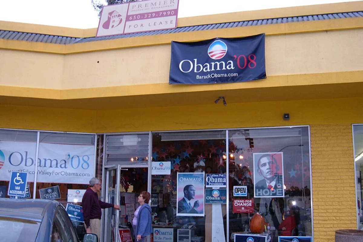
Gotham is a geometric sans-serif designed by Tobias Frere-Jones (with Jesse Ragan) and released through Hoefler & Frere-Jones in 2002. Drawn from the plainspoken lettering on mid-century New York buildings, it went on to become the typeface of American optimism — the face of a presidential campaign, a film festival, and a thousand brands that wanted to look confident and modern.
History and Design
Gotham began as a commission. Around 2000, GQ magazine asked the foundry then known as Hoefler & Frere-Jones for a geometric sans with a masculine, modern, "no-nonsense" feel; the family was drawn over the next couple of years (Frere-Jones with Jesse Ragan) and released in 2002. To build it, Frere-Jones went looking not at other typefaces but at the city itself.
He photographed the lettering on buildings, signs, and storefronts all over New York — the plain, sturdy, engineered capitals of the mid-twentieth century. The clearest single source was the Port Authority Bus Terminal, whose bold, wide, unfussy letters became the template. This was vernacular lettering: not the work of a type designer, but of sign painters and architects solving a practical problem, and Frere-Jones saw in it an honest, distinctly American character worth refining into a full typeface.
The first release was modest — four weights with italics. Its success was not. Gotham expanded into one of the most complete type systems available: Narrow, Condensed, and Extra Narrow widths for tight spaces, a Rounded version for friendlier work, and screen-optimized cuts, together spanning more than sixty fonts. That breadth is a real part of the story, because it meant a design team could build an entire identity — logo, headlines, captions, signage, app text — without ever leaving the family. Owning a whole tonal range in one coherent voice is exactly what a big brand or campaign needs, and it is the single hardest thing for a free substitute to replicate.
There is a nice irony in the commission. GQ wanted something that felt custom and exclusive, and Frere-Jones delivered it by mining the most ordinary lettering imaginable — the anonymous, functional signage that New Yorkers walk past without a glance. Gotham's sophistication is built entirely from the vernacular, which is part of why it reads as authentic rather than designed.
What sets it apart from European geometrics like Futura is temperament. Futura is mathematical and cool; Gotham is broad-shouldered and warm. Its wide proportions and even strokes feel sturdy and trustworthy rather than clinical — the difference between a theorem and a handshake.
Why Gotham Matters
Gotham was already respected among designers when politics made it famous. In 2008, Barack Obama's presidential campaign set nearly everything in Gotham, from "HOPE" to "CHANGE" to the rally signs — its design director, Scott Thomas, built the campaign's typographic system around the face. (The campaign's earlier rising-sun "O" logo was a separate commission, designed by Sol Sender's team in 2007.) The choice was deliberate: Gotham read as optimistic and forward-looking, authoritative without feeling elite, modern without feeling cold. For millions of people, that campaign was the first time a typeface felt like part of a political message.
The moment crystallized what Gotham does best. It is a typeface for institutions and brands that want to sound confident and sincere at the same time — approachable authority, in a single family.
It also changed how people talk about type. The Obama campaign is often credited with making typography a mainstream topic: commentators who had never named a font before wrote about what Gotham "said," and rival campaigns were analyzed for their type choices in turn. Few typefaces have ever carried that much cultural weight, and fewer still have done it while looking so unassuming.
There is a quieter, more literal monument, too: when the cornerstone for One World Trade Center was laid in 2004, its inscription was engraved in Gotham. A typeface pulled from New York's old buildings went back into the city's most symbolic new one.
After 2008, adoption snowballed. Film festivals, television, universities, and consumer brands reached for Gotham to borrow its blend of energy and credibility. Who is it for? Anyone who needs to look established and optimistic — campaigns, sports programs, entertainment, and brands that want a strong, sincere American voice.
Design Characteristics
Gotham's look comes down to a handful of traits:
- Geometric, with vernacular roots — built on circles and straight lines, but drawn from real signage rather than pure mathematics.
- Wide proportions — generous letter widths give it a stable, confident, broad-shouldered stance.
- Two-storey 'a' — part of what keeps it readable and grounded, unlike single-storey geometrics like Futura.
- Moderate x-height — balanced enough to work at both display and text sizes.
- Even, low-contrast strokes — a uniform weight that reads as engineered and dependable.
- A vast family — multiple widths and weights, which is what let it become a complete identity system rather than a single font.
Those wide proportions are the detail to watch when substituting: many free geometrics are narrower, so a swap that looks right in a specimen can run short or feel cramped in a real headline.
Where Gotham Excels
Gotham is a branding and display typeface first, and it is superb at it:
- Political and advocacy campaigns — sincere, confident, and legible on a sign across a crowd.
- Brand identity — a full system that can carry a logo, packaging, and environmental graphics in one voice.
- Advertising and posters — commanding in the bold weights at large sizes.
- Sports and entertainment — its energy suits athletics, film, and television graphics.
- Wordmarks and headlines — the wide, even capitals set beautifully in short, high-impact lines.
Campaign signage is the purest demonstration. A yard sign or a rally banner has to be read from a distance, in a second, by someone who is not trying — and Gotham's wide, even capitals do exactly that, projecting steadiness without shouting. The same qualities that made it work for "HOPE" make it work for a university's athletics identity or a festival's posters: it looks certain of itself, and that certainty transfers to whatever it spells.
The common thread is presence at scale. Give Gotham a headline, a sign, or a logo, and its broad, upright confidence does the work.
Where Gotham Struggles
Gotham was born for display, and that is also where its limits begin.
At small sizes and in long passages of body text, its wide proportions and moderate x-height work against it — lines run long, and the very evenness that looks confident big can feel monotonous small. Hoefler&Co drew separate screen-optimized cuts precisely because the original was not built for dense interface text.
The bigger problem now is familiarity. After the Obama campaign, Gotham became the go-to for anyone who wanted to look modern and trustworthy, to the point that it can read as a default — the typographic sound of a brand playing it safe. Designers sometimes actively avoid it for that reason.
And it is a premium typeface with no free ride: not bundled with any operating system, licensed per use, and, like Proxima Nova, expensive to run at scale on the web. For teams that love the look but not the invoice, a free geometric is often the practical answer.
Its width is a subtler catch. Gotham's generous proportions are central to its confident feel, but they eat horizontal space, which makes it awkward for long headlines, narrow columns, and responsive layouts that have to hold up on a phone. Hoefler&Co drew the Narrow and Condensed cuts for exactly this reason — a reminder that "use Gotham" often really means "use the right width of Gotham," a nuance most free substitutes cannot offer.
How to Choose a Free Substitute
Pick by what part of Gotham you actually need:
- Closest overall, full range → Montserrat. The geometric proportions, wide capitals, and nine-weight variable family make it the default free stand-in for branding and campaigns.
- Modern brand and marketing UI → Outfit. A clean, wide geometric with a complete variable family, close to Gotham's build.
- Elegant, thin display → Raleway. Beautiful in the light weights for sophisticated headlines.
- Rounder, screen-friendly → Poppins. Warmer and geometric, strong for digital work and multilingual projects.
- Interface and body text → DM Sans. Compact and even, built for screens rather than headlines.
- Friendlier logos → Montserrat Alternates. The same proportions with softer alternate letterforms.
A simple rule: for a campaign or wordmark that needs Gotham's confident capitals, start with Montserrat or Outfit; for app and body text, DM Sans will serve you better than a wide display face. As always, test your real headline at real size — Gotham's substitutes diverge most in the exact width and rhythm of the caps, which is precisely where a wordmark lives.
Premium Font Neighbors
Gotham sits among the most-used geometric and American sans-serifs, and its own family sprawls across widths:
- Gotham Narrow, Gotham Condensed, and the screen-tuned Gotham Screensmart are its own siblings — reach for these first when you need a tighter fit or better small-size rendering while staying in the family.
- Proxima Nova is the geometric-humanist contemporary that shared the 2010s web with it, more neutral and less wide.
- Avenir brings the humanist warmth Gotham hints at, in a more European register.
- Brandon Grotesque is the friendlier, softer geometric alternative for lifestyle branding.
- Circular and Futura anchor the two ends — Circular the polished modern take, Futura the strict Bauhaus original.
Comparing them clarifies what you want from Gotham: the exact width and fit (its own Narrow/Condensed), the same feel with more warmth (Avenir, Brandon Grotesque), or a different flavor of geometric confidence entirely (Circular, Futura).
It is worth noticing how tight this cluster is. Gotham, Proxima Nova, Avenir, and Circular have carried a huge share of American branding for two decades, and their similarities are why a free geometric like Montserrat can stand in so convincingly. Choose within the group by tone — Gotham for sincerity, Circular for polish, Avenir for warmth — knowing the free alternatives sit comfortably alongside all of them.
FAQ
What is the best free alternative to Gotham?
Montserrat is the best free alternative to Gotham, at roughly 88% similarity. It shares Gotham's geometric proportions, wide confident capitals, and authoritative presence, and its nine-weight variable family (under the SIL Open Font License) covers branding, headlines, and campaigns. For a modern brand-and-UI option, Outfit is the next-closest free geometric.
Can I use Montserrat commercially?
Yes. Montserrat is licensed under the SIL Open Font License (OFL-1.1), which permits unlimited commercial use at no cost — branding, advertising, websites, apps, and print. The license only asks for attribution if you redistribute the font files themselves, not when you use the font in a design.
How similar is Montserrat to Gotham?
Montserrat achieves about 88% similarity, sharing the geometric foundation, even stroke weight, and confident character. The differences are subtle — Gotham is a touch wider and more refined, drawn from New York architectural lettering, while Montserrat comes from Buenos Aires signage and is a shade more purely geometric.
What are the main differences between Gotham and Montserrat?
Gotham has slightly wider proportions, more refined optical detailing, and additional widths (Narrow, Condensed) plus screen-optimized cuts. Montserrat is a hair more geometric and offers a variable font for free. In most branding and headline uses the two are very close; the gap shows most in fine display work and in the exact width of the capitals.
Where can I download Montserrat for free?
Montserrat is free from Google Fonts at fonts.google.com/specimen/Montserrat, including a variable version spanning Thin (100) to Black (900) with matching italics. You can self-host it via CSS @font-face, use it through Google Fonts or Adobe Fonts, or download it for desktop use.
What font is Gotham similar to?
Gotham is closest to Montserrat (88%), with Outfit, Raleway, and Poppins also strong free matches. Among premium faces it neighbors Proxima Nova (a geometric-humanist contemporary), Futura (the classic geometric ancestor), and Circular (a modern geometric). All share geometric bones with different degrees of width, warmth, and polish.
Why was Gotham used for the Obama campaign?
The 2008 campaign chose Gotham because it projects optimism, sincerity, and forward motion without feeling elite or impersonal. Its roots in everyday American lettering made "HOPE" and "CHANGE" feel grounded and trustworthy, while its geometric clarity kept the message modern and clean — a combination traditional political typefaces rarely achieve.
Is Gotham on Google Fonts?
No, Gotham is a premium font from Hoefler&Co and is not available on Google Fonts.
The closest Google Fonts alternative is Montserrat with 88% similarity. Get it free on Google Fonts ↗
Free Alternatives (6)
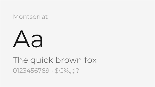
Very close geometric proportions with similar weight range and bold presence
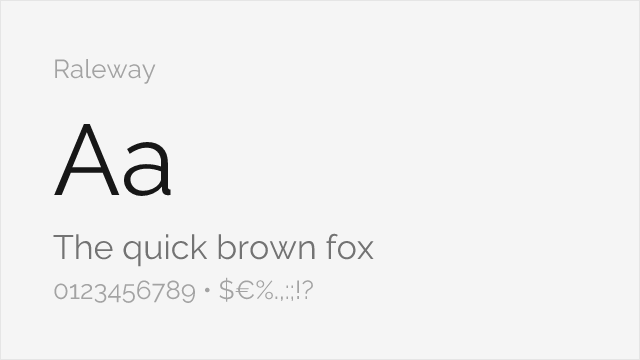
Shares geometric foundations with elegant thin weights for display use
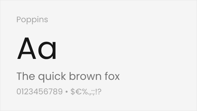
Rounded geometric forms with comparable modernist aesthetic
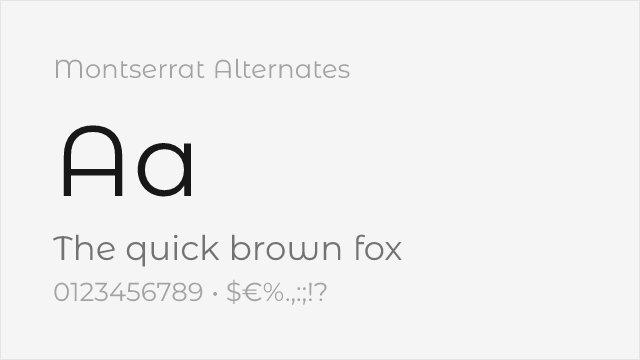
Montserrat's sister family with softer, curved alternate letterforms
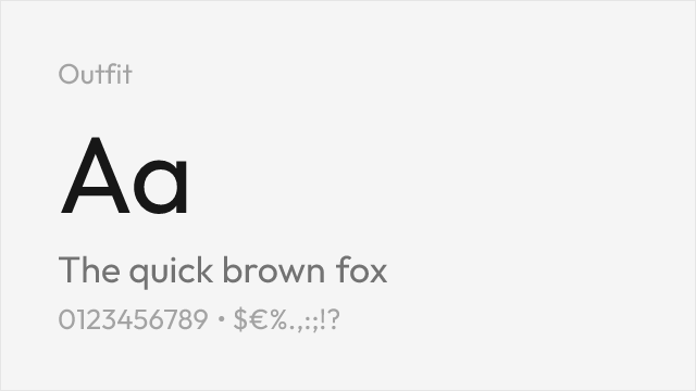
Clean geometric sans with a full variable weight range, close to Gotham's build
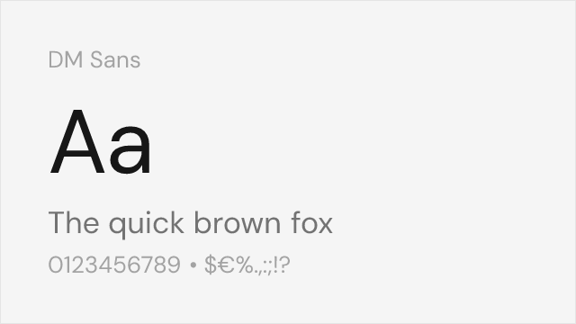
Low-contrast geometric sans tuned for screens
Compare the alternatives
See how Gotham compares to its top alternatives — and how those alternatives compare to each other — side by side.
See where Gotham is used in the wild and swap to free alternatives live.
Install FontSwap →Replacement Summary
Source: FontAlternatives.com
Premium font: Gotham
Best free alternative: Montserrat
FontAlternatives similarity score: 88%
Replacement difficulty: Low
Best for: political campaigns, brand identity, display headlines, advertising
Notable users: Obama 2008 Campaign, Spotify, Tribeca Film Festival
Not recommended when: Brand consistency with Obama 2008 Campaign requires exact letterforms
What is the best free alternative to Gotham?
Montserrat is the best free alternative to Gotham with a FontAlternatives similarity score of 88%.
Montserrat shares similar proportions, stroke characteristics, and intended use with Gotham. It is available under the OFL-1.1 license, which permits both personal and commercial use at no cost.
This alternative works particularly well for: political campaigns, brand identity, display headlines, advertising.
Can I safely replace Gotham with Montserrat?
Yes, Montserrat is a high-confidence replacement for Gotham. The FontAlternatives similarity score of 88% indicates strong structural compatibility.
Licensing: Montserrat is licensed under OFL-1.1, which allows commercial use without licensing fees or royalties.
Weight coverage: Most weights have close or exact matches available.
When should I NOT replace Gotham?
While Montserrat is a strong alternative, there are situations where replacing Gotham may not be appropriate:
- Strict compliance: Verify that OFL-1.1 terms meet your specific legal and compliance requirements.
Weight-Matching Guide
Map Gotham weights to their closest free alternatives for accurate font substitution.
Montserrat
| Gotham | Montserrat | Match |
|---|---|---|
| Thin (100) | Thin (100) | exact |
| Light (300) | Light (300) | exact |
| Book (400) | Regular (400) | close |
| Medium (500) | Medium (500) | exact |
| Bold (700) | Bold (700) | exact |
| Black (900) | Black (900) | exact |
Raleway
| Gotham | Raleway | Match |
|---|---|---|
| Light (300) | Light (300) | exact |
| Book (400) | Regular (400) | close |
| Bold (700) | Bold (700) | exact |
Poppins
| Gotham | Poppins | Match |
|---|---|---|
| Light (300) | Light (300) | exact |
| Book (400) | Regular (400) | close |
| Bold (700) | Bold (700) | exact |
Montserrat Alternates
| Gotham | Montserrat Alternates | Match |
|---|---|---|
| Book (400) | Regular (400) | close |
| Medium (500) | Medium (500) | close |
| Bold (700) | Bold (700) | exact |
Outfit
| Gotham | Outfit | Match |
|---|---|---|
| Book (400) | Regular (400) | close |
| Medium (500) | Medium (500) | close |
| Bold (700) | Bold (700) | exact |
DM Sans
| Gotham | DM Sans | Match |
|---|---|---|
| Book (400) | Regular (400) | close |
| Medium (500) | Medium (500) | close |
| Bold (700) | Bold (700) | exact |
Performance Guide
Production performance metrics for each alternative.
How to Use Montserrat
Copy these code snippets to quickly add Montserrat to your project.
CSS code for Montserrat
@import url('https://fonts.googleapis.com/css2?family=Montserrat:wght@100..900&display=swap');HTML code for Montserrat
<link rel="preconnect" href="https://fonts.googleapis.com">
<link rel="preconnect" href="https://fonts.gstatic.com" crossorigin>
<link href="https://fonts.googleapis.com/css2?family=Montserrat:wght@100..900&display=swap" rel="stylesheet">
Tailwind code for Montserrat
// tailwind.config.js
module.exports = {
  theme: {
    extend: {
      fontFamily: {
        'montserrat': ['Montserrat', 'sans-serif'],
      },
    },
  },
}

// Usage in HTML:
// <p class="font-montserrat">Your text here</p>
Next.js code for Montserrat
// Using next/font (Next.js 13+)
import { Montserrat } from 'next/font/google';

const montserrat = Montserrat({
  subsets: ['latin'],
  weight: ['100', '200', '300', '400', '500', '600', '700', '800', '900'],
});

export default function Component() {
  return (
    <p className={montserrat.className}>
      Your text here
    </p>
  );
}

// Or using inline styles with Google Fonts link:
// <p style={{ fontFamily: "'Montserrat'" }}>Your text</p>
Expo and React Native code for Montserrat
// Install: npx expo install @expo-google-fonts/montserrat expo-font
import { useFonts, Montserrat_400Regular } from '@expo-google-fonts/montserrat';

export default function App() {
  const [fontsLoaded] = useFonts({
    Montserrat_400Regular,
  });

  if (!fontsLoaded) return null;

  return (
    <Text style={{ fontFamily: 'Montserrat_400Regular' }}>
      Your text here
    </Text>
  );
}
Recommended Font Pairings
These free fonts pair well with Montserrat Gotham for headlines, body text, or accent use.
Merriweather's robust serifs ground Gotham's geometric authority for readable long-form content
Playfair's high-contrast elegance creates dramatic visual hierarchy with Gotham's bold geometric forms
Libre Baskerville's traditional serif forms provide classical balance to Gotham's modern American geometry
Browse Alternatives by Context
Find Gotham alternatives filtered by specific use case, style, or language support.
By Script
Frequently Asked Questions
What is the best free alternative to Gotham?
Montserrat is the best free alternative to Gotham with a FontAlternatives similarity score of 88%. It shares similar proportions and characteristics while being available under the OFL-1.1 license for both personal and commercial use at no cost.
Is there a free version of Gotham?
There is no official free version of Gotham. However, Montserrat is available under the OFL-1.1 open-source license and achieves a FontAlternatives similarity score of 88%. It includes variable weights and supports latin, latin-extended.
What Google Font looks like Gotham?
The Google Fonts most similar to Gotham are Montserrat, Raleway, Poppins. Among these alternatives, Montserrat offers the closest match with a FontAlternatives similarity score of 88% and includes variable weights for flexible typography options.
Can I use Montserrat commercially?
Yes, Montserrat can be used commercially. It is licensed under OFL-1.1, which allows free use in websites, applications, print materials, and commercial projects without purchasing a license or paying royalties.
Is Montserrat similar enough to Gotham?
Montserrat achieves a FontAlternatives similarity score of 88% compared to Gotham. While not identical, it offers comparable letterforms, proportions, and visual style. Most designers find it works excellently as a substitute in web and print projects.
What are the main differences between Gotham and its free alternatives?
Free alternatives to Gotham may differ in subtle details like letter spacing, curve refinements, and available weights. Premium fonts typically include more OpenType features, extended language support, and optimized screen rendering. However, for most projects, these differences are negligible.
Where can I download free alternatives to Gotham?
Download Montserrat directly from Google Fonts. Click the "Get Font" button on any alternative listed above to visit the official download page. Google Fonts also provides convenient embed codes for seamless web integration.