Expressive Fonts
Typefaces with strong visual personality that go beyond neutral communication to convey mood, emotion, or attitude. Designed to make a statement rather than blend into the background.
Expressive typefaces prioritize personality over neutrality, using distinctive letterforms, unconventional proportions, and stylistic idiosyncrasies to convey mood and attitude. Where neo-grotesque and humanist faces aim to be transparent vehicles for content, expressive designs are themselves part of the message — they communicate tone, era, and emotion through their visual character.
Sub-categories of Expression
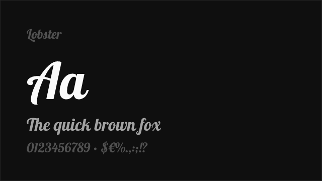
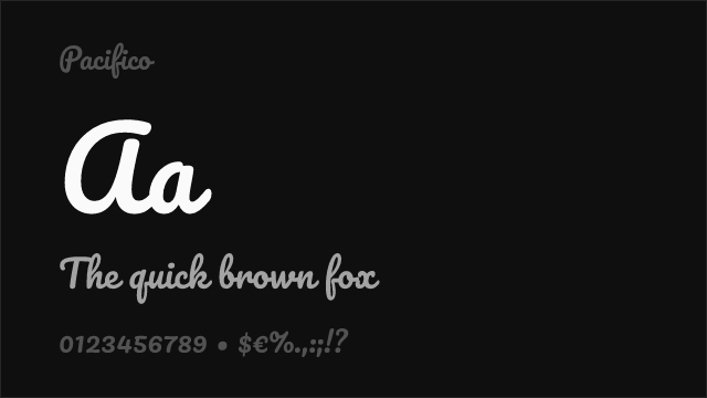
Expressive typefaces span an enormous range of approaches. Gestural designs (Zapfino, Mistral) capture the energy of handwriting or brush strokes, projecting spontaneity and human warmth. Constructivist faces (Rodchenko-inspired designs, Architype Bayer) use bold geometric forms to convey ideology and visual force. Retro-futuristic designs (Eurostile, Microgramma, Orbitron) project technological optimism through angular, space-age forms. Grunge and distressed faces (hand-damaged letterforms) reference punk aesthetics and anti-establishment attitude. Kinetic designs use variable font axes or optical illusions to suggest motion and energy. Whimsical faces (Fredoka, Baloo) use exaggerated proportions and playful details for lighthearted contexts. Understanding which sub-category your project needs prevents the common error of choosing "expressive" generically rather than targeting a specific emotional register.
Common Mistakes
The most damaging mistake with expressive type is using it for extended text. Expressive faces are designed for impact at short lengths — headlines, logos, packaging callouts, posters — not for sustained reading. Their distinctive features, which create personality in a headline, become distracting and fatiguing in a paragraph. Another frequent error is combining multiple expressive typefaces, creating visual cacophony rather than character. One expressive face per project is usually the maximum; pair it with a neutral body font that lets the display face shine. Designers also sometimes choose expressive fonts that overwhelm their content — the typeface becomes the subject rather than serving the message. The best expressive typography enhances meaning; the worst replaces it.
Cultural and Contextual Sensitivity
Expressive typefaces carry strong cultural connotations that require careful consideration. A grunge font may read as edgy to one audience and unprofessional to another. Retro-futuristic designs can feel nostalgic or dated depending on context. Script and calligraphic expressive faces carry gendered associations in many cultures. Typefaces referencing specific cultural writing traditions (East Asian brush styles, Arabic decorative scripts, Celtic lettering) should be used with awareness of their origins and appropriate contexts. The expressiveness of a typeface is not inherent — it emerges from the interaction between the design, the content, the context, and the audience's cultural framework.
When to Use
Expressive typefaces are essential for entertainment, music, events, food and beverage branding, editorial illustration, children's products, and any project where personality and emotional resonance are primary objectives. They work as display type — headlines, logos, hero text — never as body copy. Choose an expressive face that amplifies your specific message rather than applying generic "personality," and pair it with a neutral, readable companion for supporting text.
Premium Expressive Fonts


Operator Mono

PP Neue Machina


Free Expressive Fonts
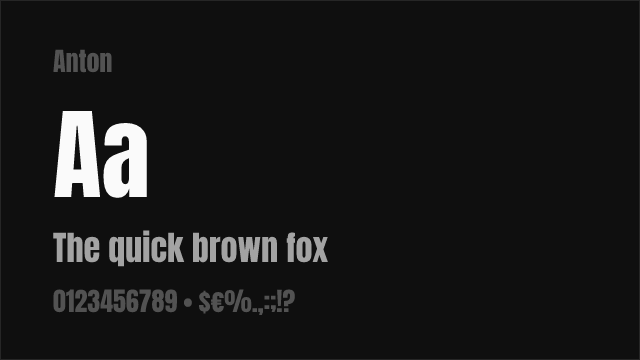
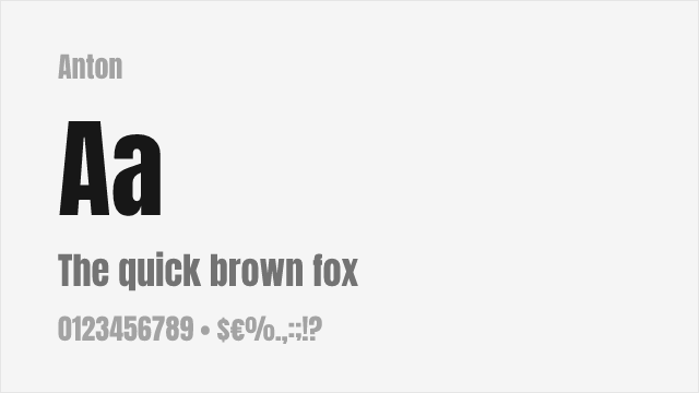


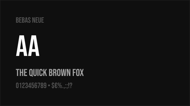
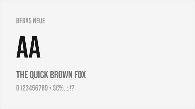
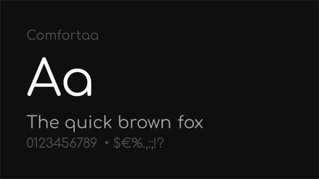
Bebas Neue Free


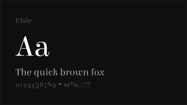
Cormorant Garamond Free


EB Garamond Free Variable


JetBrains Mono Free Variable
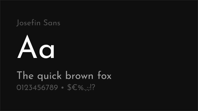

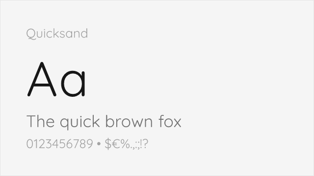
Josefin Sans Free Variable


Libre Baskerville Free


Libre Bodoni Free Variable
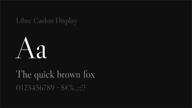

Libre Caslon Display Free


Montserrat Free Variable


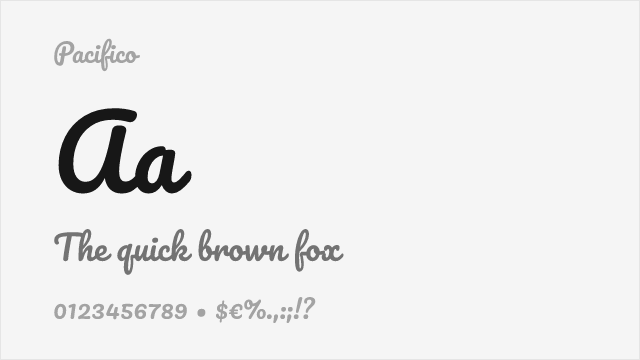


Permanent Marker Free


Playfair Display Free Variable


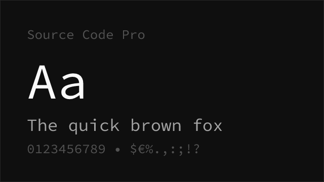
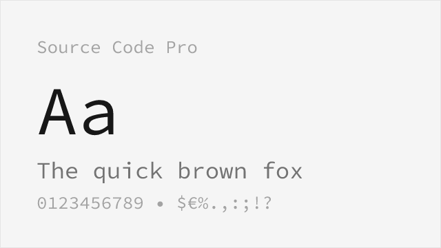
Source Code Pro Free Variable

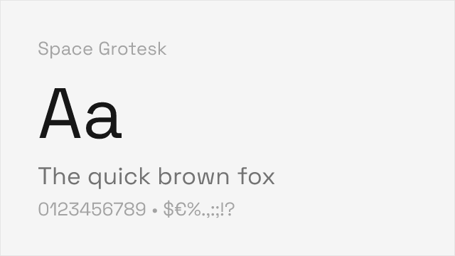
Space Grotesk Free Variable
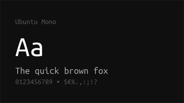
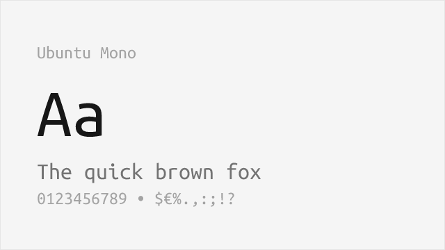
Ubuntu Mono Free

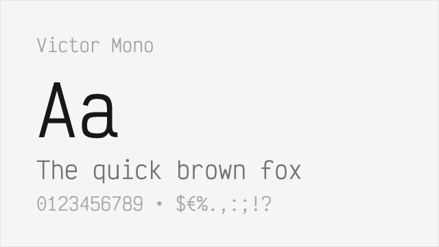
Victor Mono Free Variable


No fonts found with this filter.