Slab Serif Fonts
Typefaces with thick, block-like serifs that give letterforms a sturdy, mechanical quality. Slab serifs command attention in headlines while maintaining strong readability in text.
Slab serif typefaces — also known as Egyptian, Mechanistic, or Square Serif — first appeared in the early 19th century as attention-grabbing display faces for advertising. Their defining feature is thick, rectangular serifs that sit at right angles to the stroke, giving the letters a bold, structural quality that differs markedly from the delicate serifs of transitional and Old Style faces.
Egyptian Origins
The first slab serif appeared around 1815 in a specimen by Vincent Figgins, who called the style "Antique." The competing foundry of Robert Thorne labeled similar designs "Egyptian" — a name inspired by the Egyptomania sweeping Europe after Napoleon's campaigns along the Nile, though the typefaces have no actual connection to Egyptian writing. These early slabs were pure display faces, designed to shout from handbills and posters during the Industrial Revolution's explosion of printed advertising. The style evolved quickly: Clarendon (1845) introduced bracketed slabs for improved readability at text sizes, while later geometric slabs like Memphis (1929) and Rockwell (1934) brought the category into the 20th century with rationalized, machine-age aesthetics.
Sub-categories
Slab serifs divide into three major branches. Bracketed slabs (Clarendon, Sentinel) feature curved transitions between serif and stem, producing a softer, more readable appearance suited to body text and editorial design. Unbracketed geometric slabs (Rockwell, Lubalin Graph) attach serifs at sharp right angles with uniform stroke width, creating a bold, mechanical look ideal for headlines and branding. Humanist slabs (Chaparral, Freight Text) combine slab serif structure with Old Style proportions and calligraphic stroke variation, achieving an unusual warmth that works well for long-form reading. Some contemporary designs like Zilla Slab and Roboto Slab blur these boundaries, incorporating elements from multiple sub-categories to serve diverse digital contexts.
Pairing Advice
Slab serifs pair naturally with geometric sans-serifs — the shared emphasis on structural clarity creates visual harmony. Rockwell headlines over Futura body text, or Roboto Slab titles over Roboto Sans paragraphs, produce clean, contemporary layouts. For editorial contexts, pair a bracketed slab like Clarendon or Sentinel with a humanist sans-serif body face to balance the slab's assertiveness with reading comfort. Avoid pairing two different slabs together — the heavy horizontal emphasis compounds and overwhelms. Slab serifs also work as accent faces alongside Old Style serif body text, providing a bolder voice for pull quotes or section headers.
When to Use
Slab serif typefaces are effective for headlines, branding, editorial design, and wayfinding where a strong, confident voice is needed. They work particularly well for technology companies, construction firms, sports teams, and lifestyle brands. In recent years, slab serifs have found a home in web design for their excellent screen rendering — the thick serifs survive anti-aliasing better than thin, delicate serifs.
Premium Slab Serif Fonts


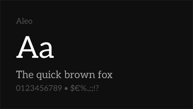
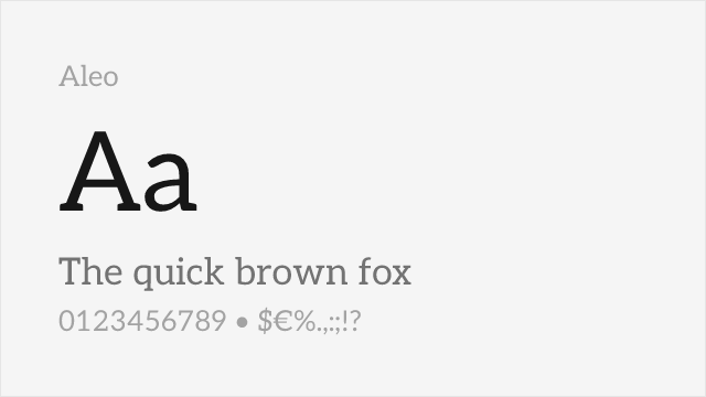
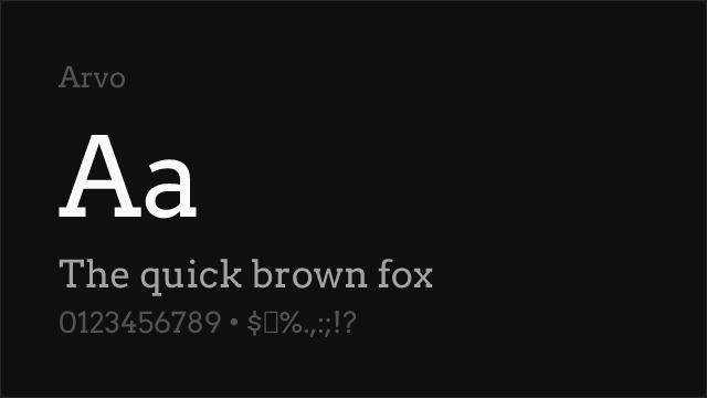
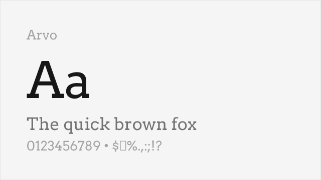
Free Slab Serif Fonts
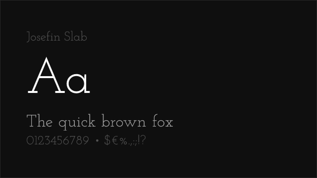
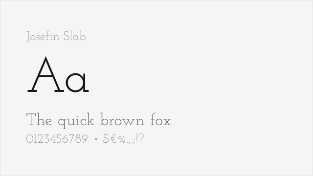
Josefin Slab Free Variable


Merriweather Free


Roboto Slab Free Variable


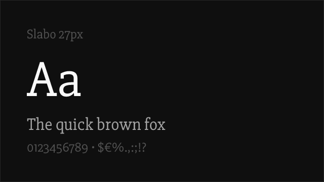
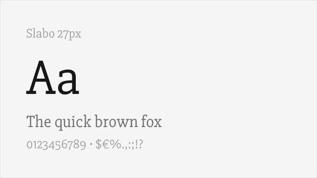
Slabo 27px Free
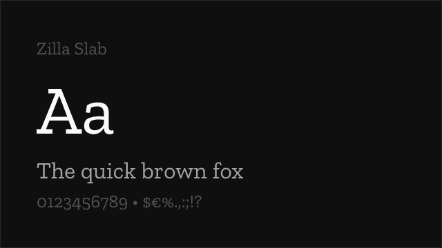

Zilla Slab Free
No fonts found with this filter.