Free Alternatives to Cooper Black

About Cooper Black
- Foundry
- Barnhart Brothers & Spindler
- Classification
- display
- Style
- ultra-bold
Brands Using Cooper Black
Its most-cited use — the 1966 album cover typography
A pop-culture resurgence after Pet Sounds cemented its warm, retro character
A staple of the current warm-nostalgic branding wave
A go-to display face for lifestyle brands seeking a warm, nostalgic voice
 See Cooper Black live on these sites with FontSwap →
Cooper Black is an extra-bold serif typeface designed by Oswald Bruce Cooper and released by Barnhart Brothers & Spindler in 1922. With its distinctive rounded serifs and ultra-heavy weight, Cooper Black became one of the most recognizable display typefaces of the 20th century.
History and Design
Oswald Cooper designed Cooper Black during the height of advertising's golden age, when bold display faces commanded attention in newspapers, posters, and shop windows. The typeface evolved from Cooper's earlier Cooper Old Style (1918), pushing the weight to extremes while maintaining warmth through rounded terminals and soft curves.
The design's genius lies in balancing extreme weight with approachability. Where other ultra-bold faces feel aggressive, Cooper Black exudes friendliness—like a firm handshake from someone you're happy to meet. The slightly condensed proportions and subtly rounded details create a typeface that's bold without being harsh.
The design came with a distinctive sales pitch. Cooper Black was famously advertised as a typeface "for far-sighted printers with near-sighted customers" — a wry acknowledgment, from the foundry's marketing, that its job was to be impossible to miss. To that end Cooper softened the outlines of the letters, rounding what other designers would have kept crisp and giving the face its slightly "muddy," low-contrast look. That softness was not a limitation of the technology but a choice, and it is precisely what separates Cooper Black from the harder, colder heavy faces of its era. The typeface also arrived with a matching italic and, later, companion designs, but it is the roman that became the icon.
Barnhart Brothers & Spindler, the Chicago foundry that issued it, marketed Cooper Black aggressively to the advertising trade, and it was an immediate commercial success — so successful that it was widely copied, and knock-off versions under other names proliferated for decades. That ubiquity, rather than any single famous use, is what first embedded Cooper Black in the visual vocabulary of American commerce.
Cultural Impact
Cooper Black transcended mere typography to become a cultural icon. Its most-cited appearance is the cover of the Beach Boys' "Pet Sounds" (1966), and after that its popularity surged again in the 1970s, when it became a staple of album art, advertising, and pop-culture graphics. Its warm, unpretentious character offered a friendly counterpoint to the cool precision of the modernism then dominating serious design, and it has been drifting in and out of fashion on that same appeal ever since.
What is remarkable is how completely the typeface's meaning depends on context. The same soft, heavy letters can read as cheerful nostalgia on a craft-beer label, as ironic retro on a band's merchandise, or as plain-spoken friendliness on a budget airline — and audiences read those signals instantly, without knowing the font's name or history. Few typefaces carry that much cultural information in their shapes, which is exactly why designers keep returning to Cooper Black whenever they want warmth and familiarity to do part of the communicating for them.
Why Cooper Black Matters
Cooper Black demonstrated that display typography could be simultaneously powerful and friendly, and that single insight has echoed through a century of type design. Before it, heavy weight tended to mean severity — the boldest faces were the most authoritative and the least warm. Cooper Black broke that link: it is as heavy as almost anything, yet it reads as genial, even a little humorous, because its weight is delivered in soft, rounded forms rather than hard, blunt ones.
That warmth is why it never really goes away. Cooper Black has been fashionable, then dated, then fashionable again in a cycle that has repeated for a hundred years, and each revival attaches it to a new mood — 1920s advertising confidence, 1970s counter-culture warmth, and today's wave of nostalgic, friendly branding. Its influence runs through the entire category of rounded, approachable bold typefaces designed since; when a contemporary brand wants to feel warm and characterful rather than slick and corporate, it is often reaching, knowingly or not, for something Cooper Black established.
Who is it for? Brands and projects that want boldness with personality — food and drink, lifestyle, hospitality, music, and anything trading on nostalgia or approachability. It is a poor fit for anything that needs to feel neutral, corporate, minimal, or contemporary-serious, where its exuberant vintage character actively works against the brief.
Design Characteristics
Cooper Black's whole identity comes from a single, unusual combination — extreme weight executed with softness — and every detail serves that paradox:
- Ultra-heavy weight: Among the boldest of any widely used serif, giving it enormous presence at display sizes.
- Rounded, soft serifs: The serifs and terminals are gently rounded rather than sharp, which is the source of its friendly, un-aggressive feel.
- Small, closed apertures: The enclosed spaces inside letters are tight, a consequence of the heavy weight, which limits it to display use.
- Blurred, organic outlines: Cooper deliberately softened the letter edges — the design famously looks a little out of focus, which adds to its warmth.
- Slightly condensed proportions: Efficient enough to work in advertising while keeping its generous, rounded character.
- Essentially a single weight: Cooper Black is one extra-bold weight (with an italic); it was never a graded family, because its whole purpose is maximum friendly heft. This is one of the clearest practical reasons to consider a variable free alternative, which can supply the lighter and heavier variations Cooper Black never offered.
Where Cooper Black Excels
Cooper Black is at its best wherever warmth and boldness need to arrive together — where a headline should feel like a smile rather than a command:
- Display headlines: Maximum impact with warmth, its defining strength.
- Packaging design: Strong shelf presence without aggression, ideal for food, drink, and lifestyle products.
- Logos and branding: Recognizable, nostalgic character that reads as friendly and established.
- Advertising and posters: Attention-grabbing with personality, especially where a retro mood is wanted.
- Music and entertainment: Its long association with album art and titling gives it instant cultural warmth.
Where Cooper Black Struggles
The flip side of such a strong personality is that Cooper Black cannot be neutral, cannot be small, and cannot be subtle — it only knows how to be loud and warm. Wherever those are the wrong qualities, or wherever they are needed at text size, it simply cannot do the job:
- Body text and small sizes: The extreme weight and tight apertures make it unreadable below headline scale; it is strictly display.
- Neutral or corporate briefs: Its strong personality is the opposite of neutral, so it fights any project that wants restraint or minimalism.
- Contemporary-serious tone: The vintage, genial character can undercut work that needs to feel cutting-edge, premium-minimal, or authoritative.
- Hierarchy: With a single weight, it cannot build graded typographic hierarchy on its own and must be paired with a separate text family.
- Overexposure: Its current popularity in nostalgic branding means it can already feel like a trend, so leaning on it risks dating a design to this exact moment.
How to Choose a Free Substitute
Cooper Black's specific look — heavy, rounded, soft-edged, warm — is genuinely hard to reproduce, because very few free fonts combine that exact weight and roundness. So decide which of its qualities you actually need.
If you want the closest soft, friendly display serif, Fraunces is the best free match by a wide margin, with a "soft" optical setting and a full weight range that reaches Cooper-like heft. If you mainly need warm heaviness and can accept squared rather than rounded serifs, the slabs — Roboto Slab and Bitter in their heavy weights, or Arvo at bold — deliver the presence with more legibility and flexibility. And if what you loved was the playful, retro character rather than the weight, Aladin and Frijole offer that spirit in lighter, more novelty forms.
The one quality none of them fully capture is Cooper Black's softly blurred, out-of-focus outline — that specific vintage texture is unique to the original. If it is essential to your design, licensing the real thing is the honest answer; otherwise, Fraunces gets you closest, and the slabs get you the heft.
A useful way to decide is to name the exact feeling you want the type to carry. If it is "friendly and soft," Fraunces with its soft optical setting is the answer. If it is "heavy and confident," a Black-weight slab like Roboto Slab or Bitter delivers that presence while remaining legible enough to use across a whole layout, not just a title. And if it is "retro and fun," the lighter, quirkier options give you the flavor without pretending to match the weight. Cooper Black tries to be all three of those at once, which is its charm and its trap — pick the one that actually matters to your project, and a free substitute will serve it better than a compromise that chases all three.
Premium Font Neighbors
If Cooper Black's warm, heavy character appeals but you want commercial options, its neighborhood is the world of friendly and vintage display serifs. Archer and Sentinel (Hoefler&Co) are the modern benchmarks of the warm slab serif, bringing approachability with contemporary polish. Clarendon, Rockwell, and Egyptienne are the classic slab serifs — heavier, more structured cousins that share Cooper Black's presence if not its roundness. For fellow bundled-era display faces often grouped with it, Impact and Bank Gothic provide very different but similarly recognizable poster typography, and ITC Avant Garde rounds out the vintage-display palette from the geometric side.
FAQ
What is the best free alternative to Cooper Black?
Fraunces is the best free alternative to Cooper Black, offering a soft serif display typeface with variable font technology. Designed by Undercase Type, Fraunces features quirky, friendly details reminiscent of Cooper Black's warmth. Its optical axis and weight range from Thin to Black provide exceptional versatility while maintaining that approachable display character.
Can I use Fraunces commercially?
Yes, Fraunces is licensed under the SIL Open Font License (OFL-1.1), permitting unlimited commercial use without fees. You can freely use it for websites, applications, print materials, logos, packaging, and products. The license permits modification and redistribution, requiring only attribution when redistributing the font files themselves.
How similar is Fraunces to Cooper Black?
Fraunces achieves approximately 78% similarity to Cooper Black in capturing the friendly, soft serif display aesthetic. While Cooper Black has bolder weights and more vintage character, Fraunces offers comparable warmth with modern refinements. Fraunces includes contemporary features like variable font axes that Cooper Black lacks.
What are the main differences between Cooper Black and Fraunces?
Cooper Black features extreme weight and distinctive 1920s vintage character with rounded serifs and condensed proportions designed for advertising. Fraunces offers a more contemporary interpretation with variable font technology, optical sizing, and a wider weight range. Cooper Black reads as nostalgic; Fraunces feels fresh yet friendly.
Where can I download Fraunces for free?
Fraunces is available for free download from Google Fonts at fonts.google.com/specimen/Fraunces. The font includes extensive weight options and two variable axes (weight and optical size). Google Fonts provides easy embedding options, CSS code snippets, and allows both web embedding and desktop installation. Roboto Slab, Bitter, Arvo, Aladin, and Frijole are all on Google Fonts too.
Why is Cooper Black so popular for vintage and nostalgic branding?
Cooper Black carries strong associations with the advertising of the 1920s and the warm, informal design of the 1960s and 70s, so it instantly signals nostalgia and approachability. Its soft, rounded, heavy forms feel friendly rather than corporate, which is exactly the mood modern lifestyle, food, and music brands reach for when they want to feel warm and characterful.
Is Cooper Black good for body text?
No. Cooper Black is a display-only typeface — its extreme weight and tight apertures make it very hard to read at small sizes. Use it for large headlines, logos, and packaging, and pair it with a clean, readable body font like Open Sans, Source Sans, or Lato for any running text.
What fonts pair well with Cooper Black?
Because Cooper Black is so loud and characterful, its best partners are calm and neutral. A clean sans-serif for body text — Open Sans, Source Sans, or Lato — lets Cooper Black own the headlines without competition. Avoid pairing it with another strong display face, which creates visual chaos rather than hierarchy.
Is Cooper Black on Google Fonts?
No, Cooper Black is a premium font from Barnhart Brothers & Spindler and is not available on Google Fonts.
The closest Google Fonts alternative is Fraunces with 78% similarity. Get it free on Google Fonts ↗
Free Alternatives (6)
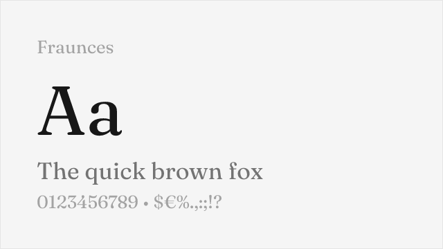
Modern variable display serif with optical sizes and soft, friendly character
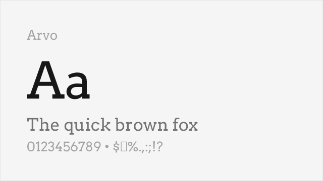
Friendly slab serif with warm character, good for softer display needs
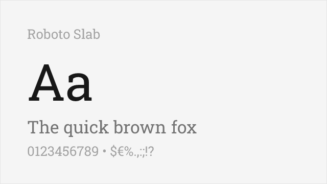
Variable slab serif whose heaviest weights approach Cooper Black's heft
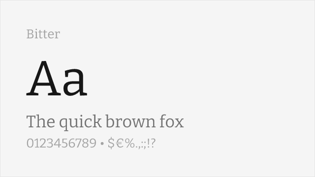
Contemporary slab serif with a warm feel and heavy weights available
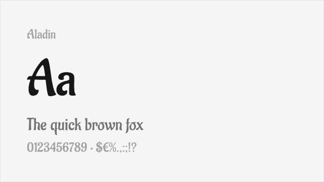
Calligraphic display with warm, approachable character for packaging and posters
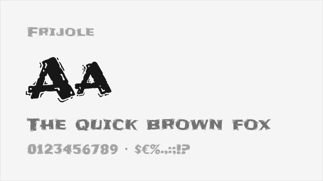
Bold textured display with playful energy for casual branding
Compare the alternatives
See how Cooper Black compares to its top alternatives — and how those alternatives compare to each other — side by side.
See where Cooper Black is used in the wild and swap to free alternatives live.
Install FontSwap →Replacement Summary
Source: FontAlternatives.com
Premium font: Cooper Black
Best free alternative: Fraunces
FontAlternatives similarity score: 78%
Replacement difficulty: Medium
Best for: brand identity, editorial headlines, packaging design, web display
Notable users: Pet Sounds (Beach Boys), 1970s album art & advertising, Craft food & drink packaging
Not recommended when: Precise optical matching is needed - Fraunces has measurable structural differences
What is the best free alternative to Cooper Black?
Fraunces is the best free alternative to Cooper Black with a FontAlternatives similarity score of 78%.
Fraunces shares similar proportions, stroke characteristics, and intended use with Cooper Black. It is available under the OFL-1.1 license, which permits both personal and commercial use at no cost.
This alternative works particularly well for: brand identity, editorial headlines, packaging design, web display.
Can I safely replace Cooper Black with Fraunces?
Yes, with some considerations. Fraunces achieves a FontAlternatives similarity score of 78%, indicating good structural compatibility for most use cases.
Licensing: Fraunces is licensed under OFL-1.1, which allows commercial use without licensing fees or royalties.
Weight coverage: Most weights have close or exact matches available.
When should I NOT replace Cooper Black?
While Fraunces is a strong alternative, there are situations where replacing Cooper Black may not be appropriate:
- Optical precision requirements: Fraunces has measurable structural differences from Cooper Black that may be visible in precise design work.
- Strict compliance: Verify that OFL-1.1 terms meet your specific legal and compliance requirements.
Weight-Matching Guide
Map Cooper Black weights to their closest free alternatives for accurate font substitution.
Fraunces
| Cooper Black | Fraunces | Match |
|---|---|---|
| Regular | Regular (400) | close |
| Black | Black (900) | close |
Arvo
| Cooper Black | Arvo | Match |
|---|---|---|
| Regular | Regular (400) | close |
| Black | Bold (700) | close |
Roboto Slab
| Cooper Black | Roboto Slab | Match |
|---|---|---|
| Black | Black (900) | close |
Bitter
| Cooper Black | Bitter | Match |
|---|---|---|
| Black | Black (900) | close |
Aladin
| Cooper Black | Aladin | Match |
|---|---|---|
| Black | Regular (400) | substitute |
Frijole
| Cooper Black | Frijole | Match |
|---|---|---|
| Black | Regular (400) | substitute |
Performance Guide
Production performance metrics for each alternative.
How to Use Fraunces
Copy these code snippets to quickly add Fraunces to your project.
CSS code for Fraunces
@import url('https://fonts.googleapis.com/css2?family=Fraunces:wght@100..900&display=swap');HTML code for Fraunces
<link rel="preconnect" href="https://fonts.googleapis.com">
<link rel="preconnect" href="https://fonts.gstatic.com" crossorigin>
<link href="https://fonts.googleapis.com/css2?family=Fraunces:wght@100..900&display=swap" rel="stylesheet">
Tailwind code for Fraunces
// tailwind.config.js
module.exports = {
  theme: {
    extend: {
      fontFamily: {
        'fraunces': ['Fraunces', 'sans-serif'],
      },
    },
  },
}

// Usage in HTML:
// <p class="font-fraunces">Your text here</p>
Next.js code for Fraunces
// Using next/font (Next.js 13+)
import { Fraunces } from 'next/font/google';

const fraunces = Fraunces({
  subsets: ['latin'],
  weight: ['100', '200', '300', '400', '500', '600', '700', '800', '900'],
});

export default function Component() {
  return (
    <p className={fraunces.className}>
      Your text here
    </p>
  );
}

// Or using inline styles with Google Fonts link:
// <p style={{ fontFamily: "'Fraunces'" }}>Your text</p>
Expo and React Native code for Fraunces
// Install: npx expo install @expo-google-fonts/fraunces expo-font
import { useFonts, Fraunces_400Regular } from '@expo-google-fonts/fraunces';

export default function App() {
  const [fontsLoaded] = useFonts({
    Fraunces_400Regular,
  });

  if (!fontsLoaded) return null;

  return (
    <Text style={{ fontFamily: 'Fraunces_400Regular' }}>
      Your text here
    </Text>
  );
}
Recommended Font Pairings
These free fonts pair well with Fraunces Cooper Black for headlines, body text, or accent use.
Open Sans's neutral clarity pairs naturally with Cooper Black's bold warmth, providing readable body text beneath attention-grabbing headlines
Source Sans Pro's clean professionalism tempers Cooper Black's exuberance, creating balanced layouts for branding and editorial use
Lato's humanist warmth complements Cooper Black's friendly character while maintaining legibility in supporting text
Browse Alternatives by Context
Find Cooper Black alternatives filtered by specific use case, style, or language support.
By Style
By Script
Frequently Asked Questions
What is the best free alternative to Cooper Black?
Fraunces is the best free alternative to Cooper Black with a FontAlternatives similarity score of 78%. It shares similar proportions and characteristics while being available under the OFL-1.1 license for both personal and commercial use at no cost.
Is there a free version of Cooper Black?
There is no official free version of Cooper Black. However, Fraunces is available under the OFL-1.1 open-source license and achieves a FontAlternatives similarity score of 78%. It includes variable weights and supports latin, latin-extended.
What Google Font looks like Cooper Black?
The Google Fonts most similar to Cooper Black are Fraunces, Arvo, Roboto Slab. Among these alternatives, Fraunces offers the closest match with a FontAlternatives similarity score of 78% and includes variable weights for flexible typography options.
Can I use Fraunces commercially?
Yes, Fraunces can be used commercially. It is licensed under OFL-1.1, which allows free use in websites, applications, print materials, and commercial projects without purchasing a license or paying royalties.
Is Fraunces similar enough to Cooper Black?
Fraunces achieves a FontAlternatives similarity score of 78% compared to Cooper Black. While not identical, it offers comparable letterforms, proportions, and visual style. Most designers find it works excellently as a substitute in web and print projects.
What are the main differences between Cooper Black and its free alternatives?
Free alternatives to Cooper Black may differ in subtle details like letter spacing, curve refinements, and available weights. Premium fonts typically include more OpenType features, extended language support, and optimized screen rendering. However, for most projects, these differences are negligible.
Where can I download free alternatives to Cooper Black?
Download Fraunces directly from Google Fonts. Click the "Get Font" button on any alternative listed above to visit the official download page. Google Fonts also provides convenient embed codes for seamless web integration.