Humanist Fonts
Typefaces influenced by Renaissance calligraphy and human handwriting, featuring organic stroke variation, open apertures, and warm proportions. Humanist fonts balance readability with personality.
Humanist typefaces trace their lineage to the handwritten letterforms of Renaissance scribes. Whether applied to sans-serifs (like Gill Sans or Frutiger) or serifs (like Jenson or Centaur), the humanist approach preserves the organic rhythms and subtle stroke modulation of pen-drawn letters, creating fonts that feel warm and approachable.
Calligraphic Roots
The humanist tradition originates with Nicolas Jenson's Roman type of 1470, which translated the proportions and stroke logic of Italian humanist manuscripts into metal type. Jenson preserved the diagonal stress and organic weight variation of the broad-nib pen, establishing a model that endured for centuries. In the 20th century, Edward Johnston's London Underground typeface (1916) and Eric Gill's Gill Sans (1928) applied these calligraphic principles to the sans-serif form, proving that typefaces could be modern and mechanical while retaining human warmth. Adrian Frutiger continued this lineage with his namesake Frutiger (1976), designed for airport wayfinding at Charles de Gaulle, where readability at distance demanded the clarity that humanist construction naturally provides.
Accessibility Advantages
Humanist typefaces consistently outperform geometric and neo-grotesque designs in legibility research. Their open apertures make letters like 'c', 'e', and 's' easier to distinguish, while natural width variation between characters helps readers differentiate letterforms. The British Dyslexia Association recommends sans-serif fonts with humanist characteristics for people with dyslexia, and several accessibility guidelines cite humanist designs as best practice for body text. Frutiger, Verdana, and their descendants were explicitly designed with legibility as the primary objective — Verdana's wide proportions and generous x-height were engineered specifically for low-resolution screens.
Digital vs Print Considerations
Humanist typefaces generally perform well across both media, but their stroke variation creates specific challenges on screen. At very small pixel sizes, the thin strokes in humanist designs may disappear or render unevenly without careful hinting. Print reproduction is more forgiving — the natural contrast and organic rhythm translate well to paper, where humanist serifs like Minion and Arno are preferred for long-form reading. For digital work, modern humanist sans-serifs like Source Sans Pro and Inter incorporate optical adjustments specifically for screen rendering, maintaining the humanist warmth while ensuring consistent display across devices and resolutions.
Famous Examples
Gill Sans became the face of British public life after its adoption by the London and North Eastern Railway, and later by the BBC and Penguin Books. Frutiger transformed airport wayfinding globally and spawned dozens of derivatives. Optima, Hermann Zapf's 1958 masterwork, occupies a unique position between sans-serif and serif — its gently swelling strokes suggest calligraphic origins without any actual serifs. Among free alternatives, Source Sans Pro (Adobe's first open-source typeface) and Inter carry the humanist legacy forward, with Inter becoming one of the most widely used interface fonts in contemporary web design.
When to Use
Humanist typefaces are excellent for body text, educational materials, healthcare communications, and government publications where readability and accessibility are priorities. Their warmth makes them suitable for brands that want to appear friendly and trustworthy without being casual. Humanist sans-serifs are particularly popular for web and mobile interfaces where clarity at small sizes is essential.
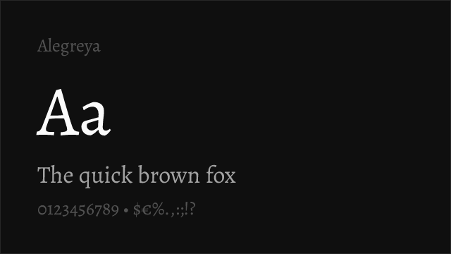
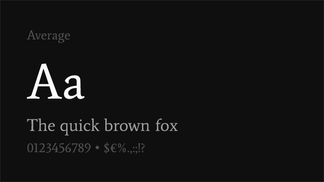
Premium Humanist Fonts


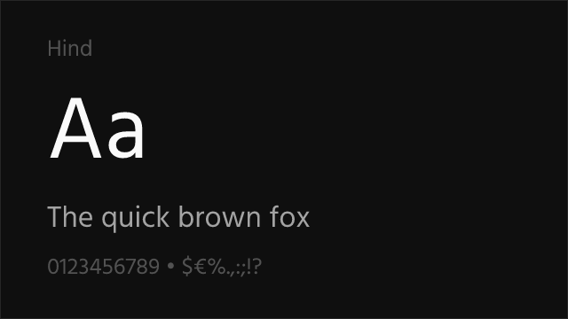
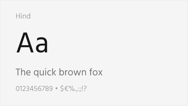
Free Humanist Fonts


Cormorant Garamond Free


Crimson Pro Free Variable


DejaVu Sans Free


EB Garamond Free Variable


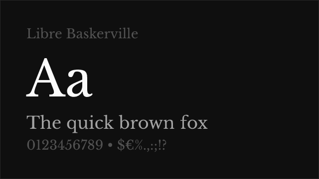

Libre Baskerville Free


Libre Franklin Free Variable


Merriweather Free

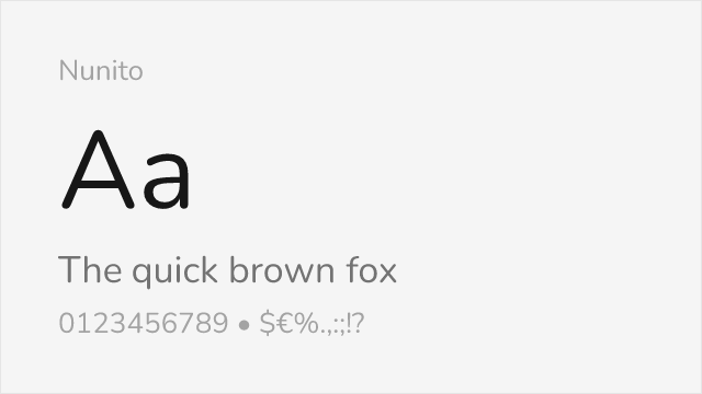

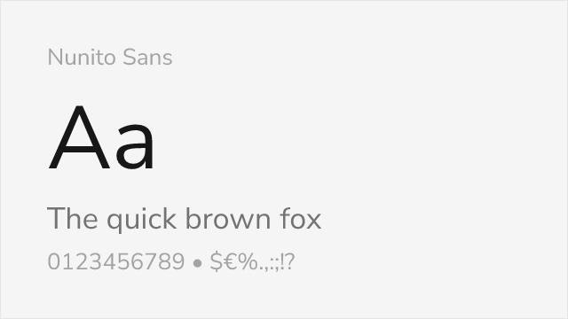
Nunito Sans Free Variable


Source Sans Pro Free Variable


Source Serif Pro Free Variable


URW Gothic Free


No fonts found with this filter.