Condensed Fonts
Narrow typefaces that fit more text per line without reducing point size. Condensed fonts are essential for headlines, data tables, navigation, and space-constrained layouts.
Condensed typefaces are narrower versions of standard-width designs, engineered to pack more characters per line while maintaining legibility. They are not simply horizontally scaled — well-designed condensed fonts involve careful redrawing of every letterform to ensure optical balance, consistent stroke weight, and comfortable reading rhythm at the reduced width.
Design Principles
The art of condensing a typeface lies in knowing what to compress and what to protect. Vertical strokes in condensed fonts must be thinned slightly to prevent them from appearing disproportionately heavy compared to horizontals — a problem immediately visible when standard fonts are mechanically squished. Counters (the enclosed spaces in letters like 'o', 'e', 'a') need enough area to remain legible; overly compressed counters fill in at small sizes or in poor printing conditions. Well-designed condensed families offer multiple width grades (condensed, narrow, compressed, ultra-condensed), each redrawn rather than interpolated, with letter spacing recalibrated at every width. The best condensed designs maintain their parent typeface's personality despite radical proportion changes — Univers Condensed still reads as Univers, not as a distorted impostor.
Digital Rendering Challenges
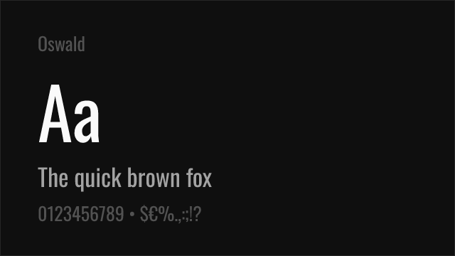
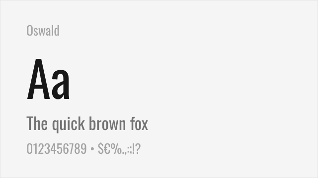
Condensed fonts present specific rendering challenges on screen. Their narrow proportions mean vertical strokes often fall between pixel boundaries, causing uneven rendering at small sizes. Sub-pixel rendering and variable font technology have improved the situation, but condensed text below 14px can still appear blurry or inconsistent across browsers. For web use, choose condensed fonts with built-in screen optimization (like Barlow Condensed or Oswald, both designed with digital rendering in mind) rather than condensed cuts of print-first families. Variable-width fonts allow designers to dial in the exact condensation ratio that renders cleanly at their target pixel size, avoiding the all-or-nothing choice between fixed width grades.
Common Mistakes
The most damaging mistake is using CSS transform: scaleX() or design tool scaling to fake condensed type. Mechanically squished text produces uneven stroke weights — verticals become too thin, horizontals too thick — and distorted curves that look amateurish. Always use a properly designed condensed font family. Other common errors include setting condensed type with insufficient line height (the narrow proportions need more vertical breathing room), using condensed fonts for body text longer than a few lines, and failing to increase letter-spacing slightly when setting condensed type in all-caps, which can create an impenetrable wall of verticals.
When to Use
Condensed typefaces are indispensable for newspaper headlines, magazine layouts, packaging, and any design where space is limited. They work well for data-dense tables, navigation menus, and sidebar content. Condensed fonts are a staple of news design and sports graphics, where they allow for bold, impactful headlines within tight column widths. Avoid using condensed fonts for body text — their narrow proportions create fatigue over extended reading.
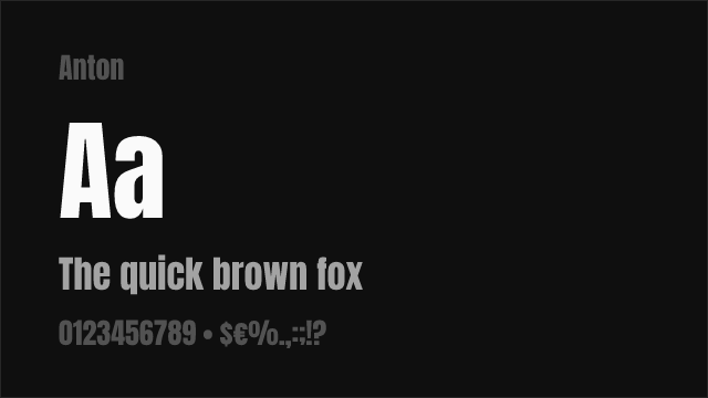
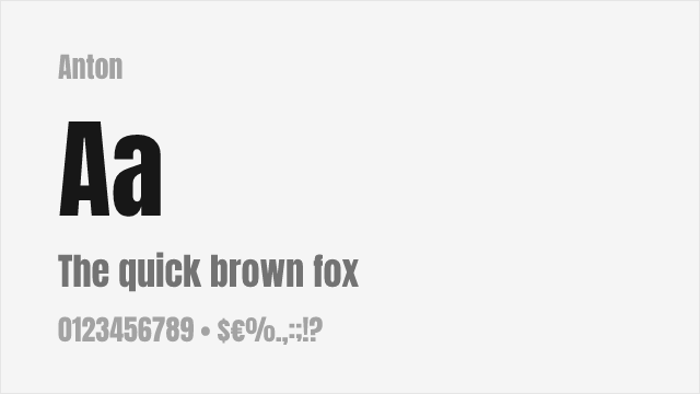
Premium Condensed Fonts


Free Condensed Fonts


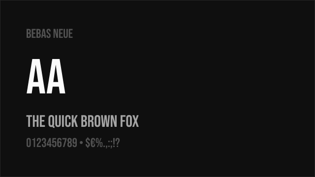
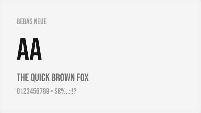
Bebas Neue Free


DejaVu Sans Free
Familjen Grotesk Free Variable


Fjalla One Free


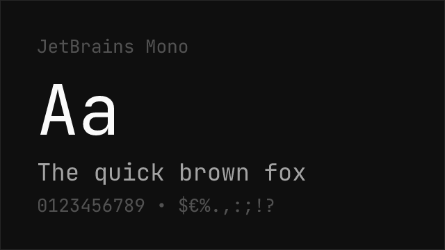

JetBrains Mono Free Variable


Libre Franklin Free Variable


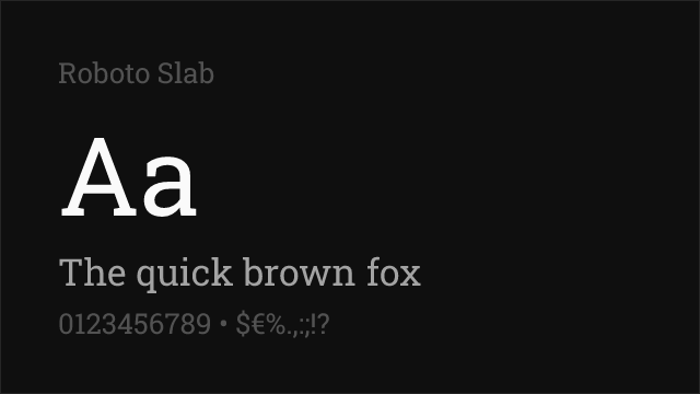
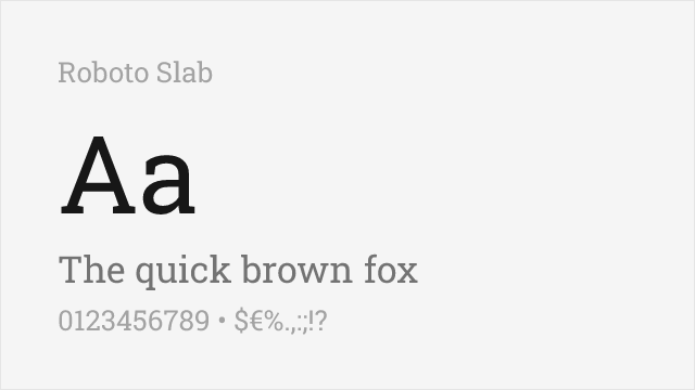
Roboto Slab Free Variable


Source Sans Pro Free Variable


Zilla Slab Free
No fonts found with this filter.