Best Fonts for Headlines
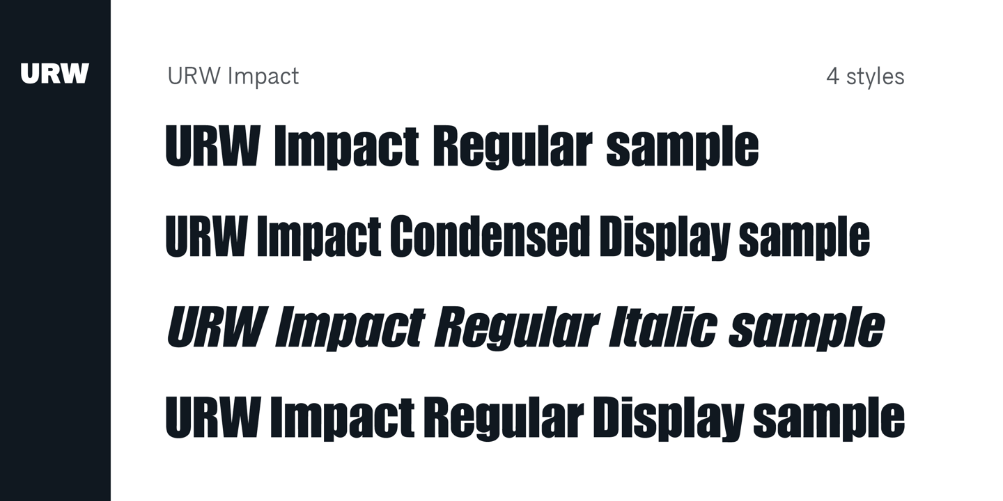
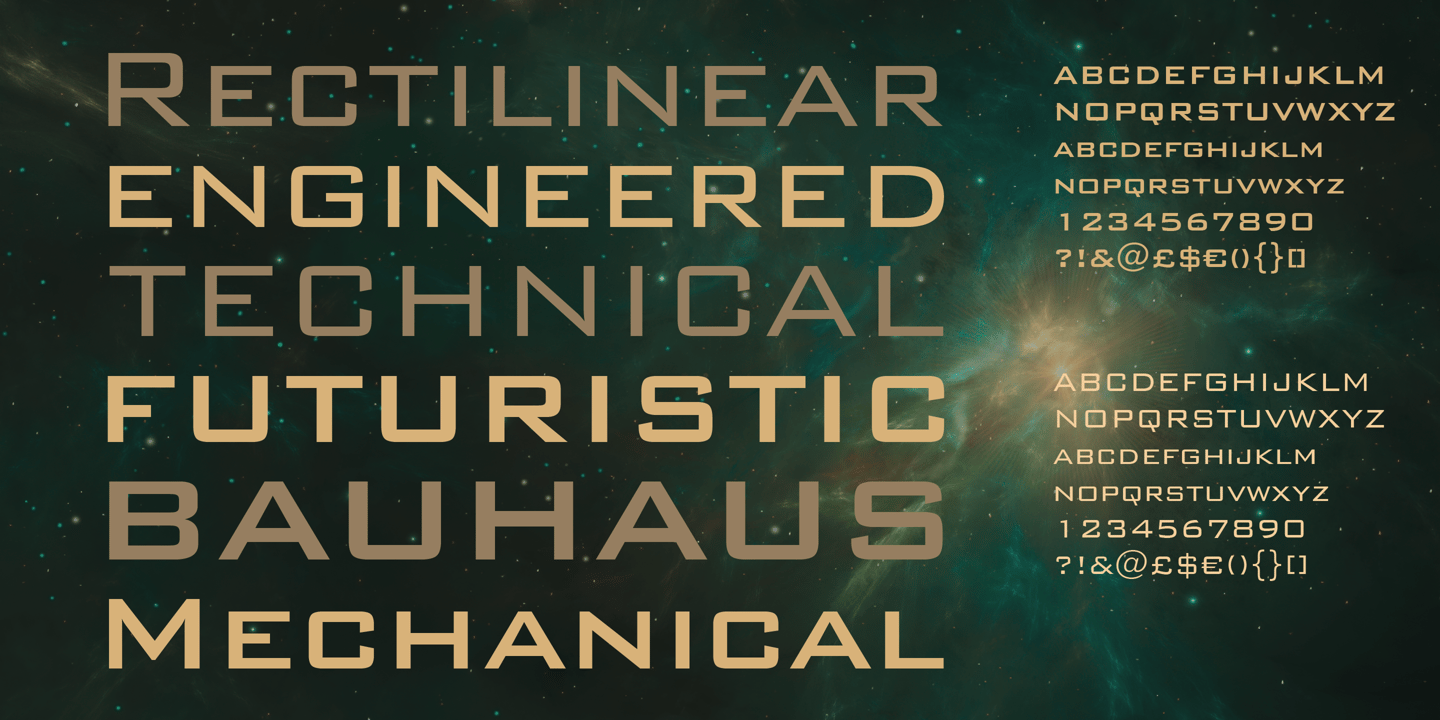
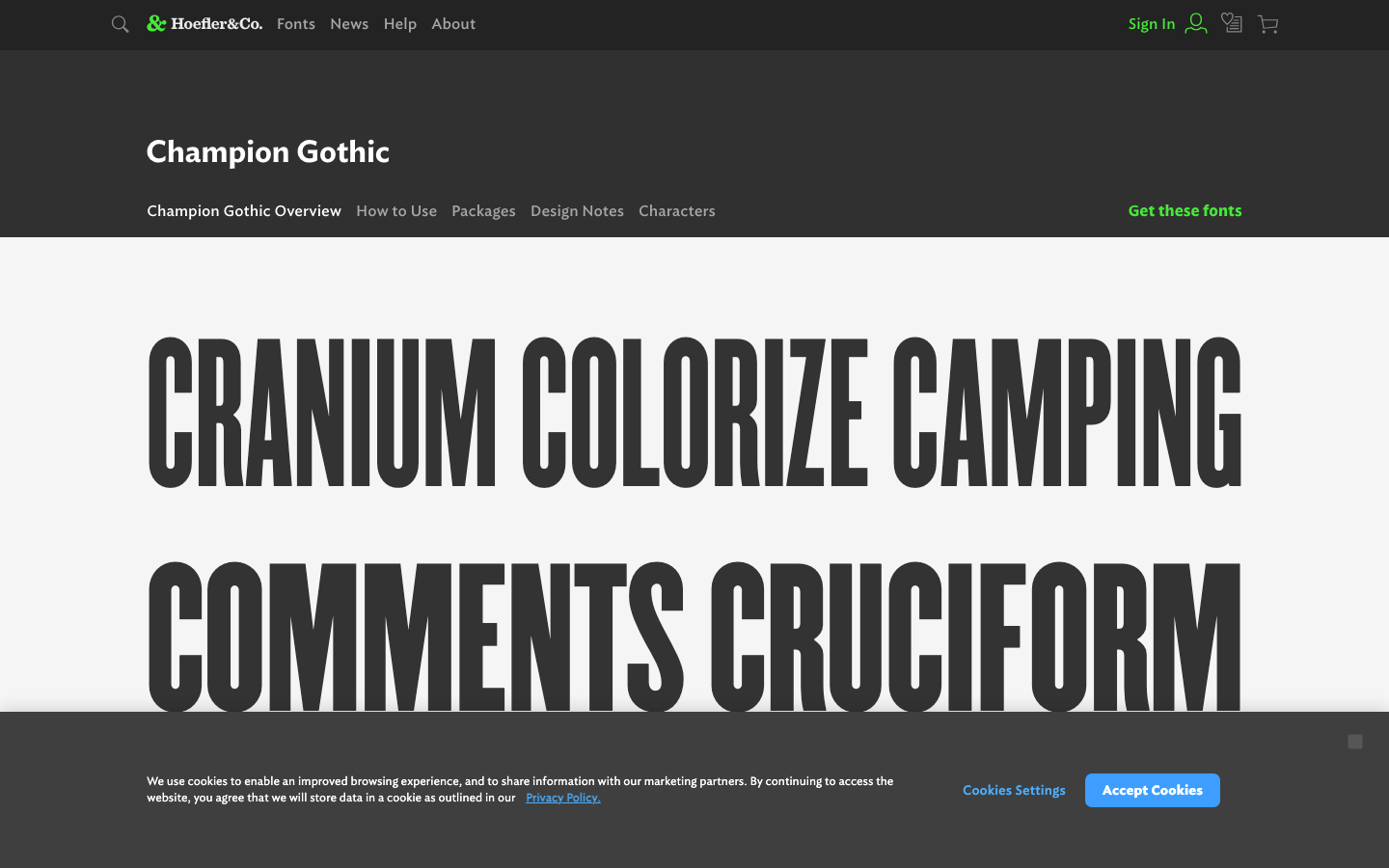
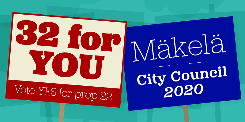
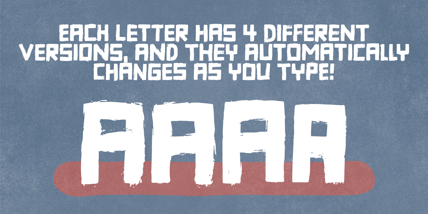
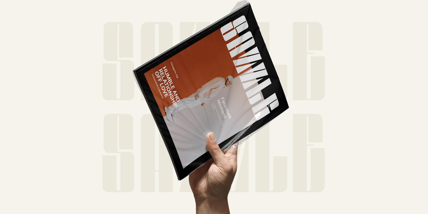
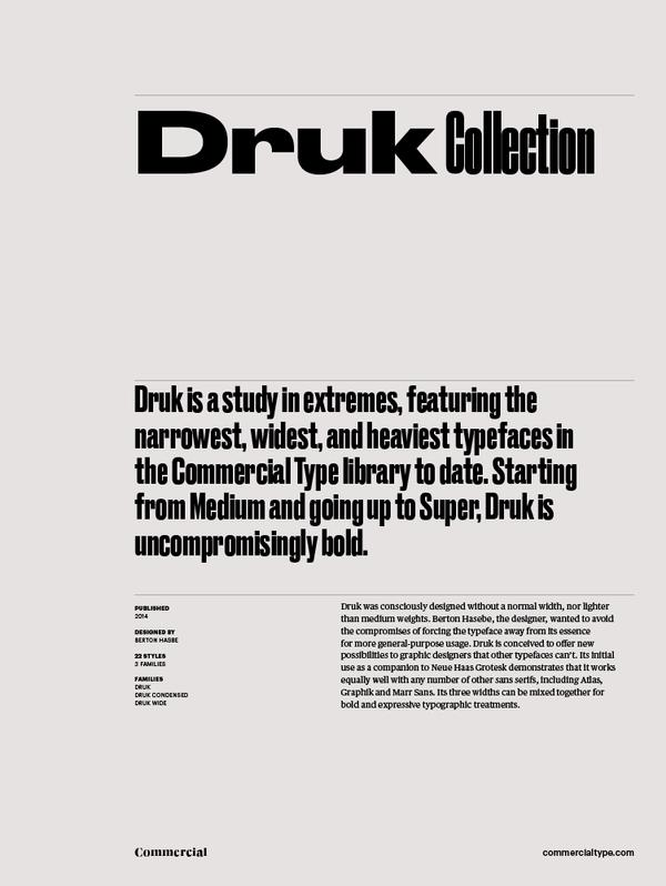
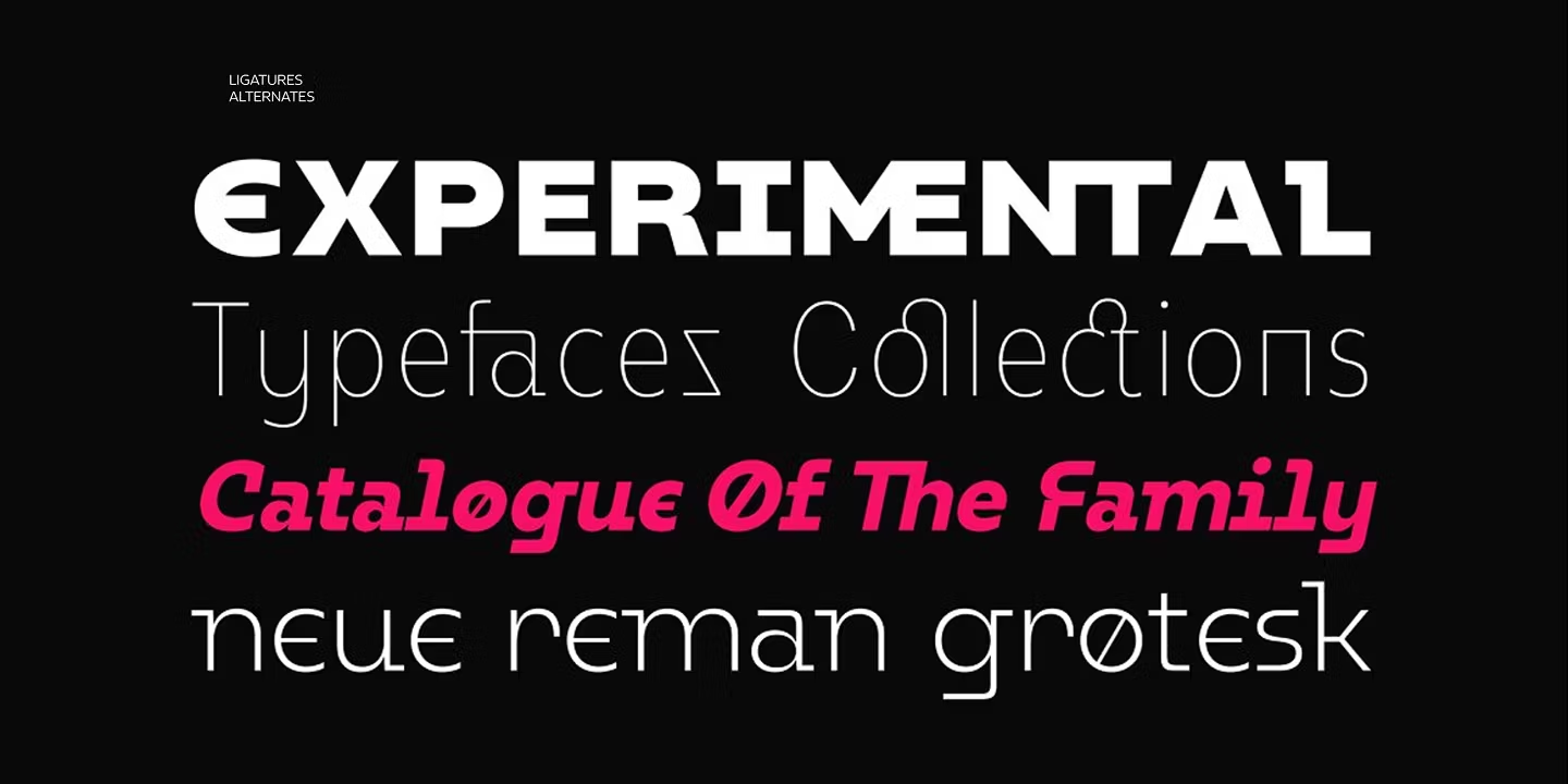
Typography designed specifically for titles, headers, and attention-grabbing text. Headline fonts feature strong visual presence, dramatic weight, and distinctive character at large sizes.
Free Fonts for Headlines
Open-source fonts perfect for headlines projects.
Premium Headlines Fonts You Can Replace
Popular premium fonts for headlines with free open-source alternatives.
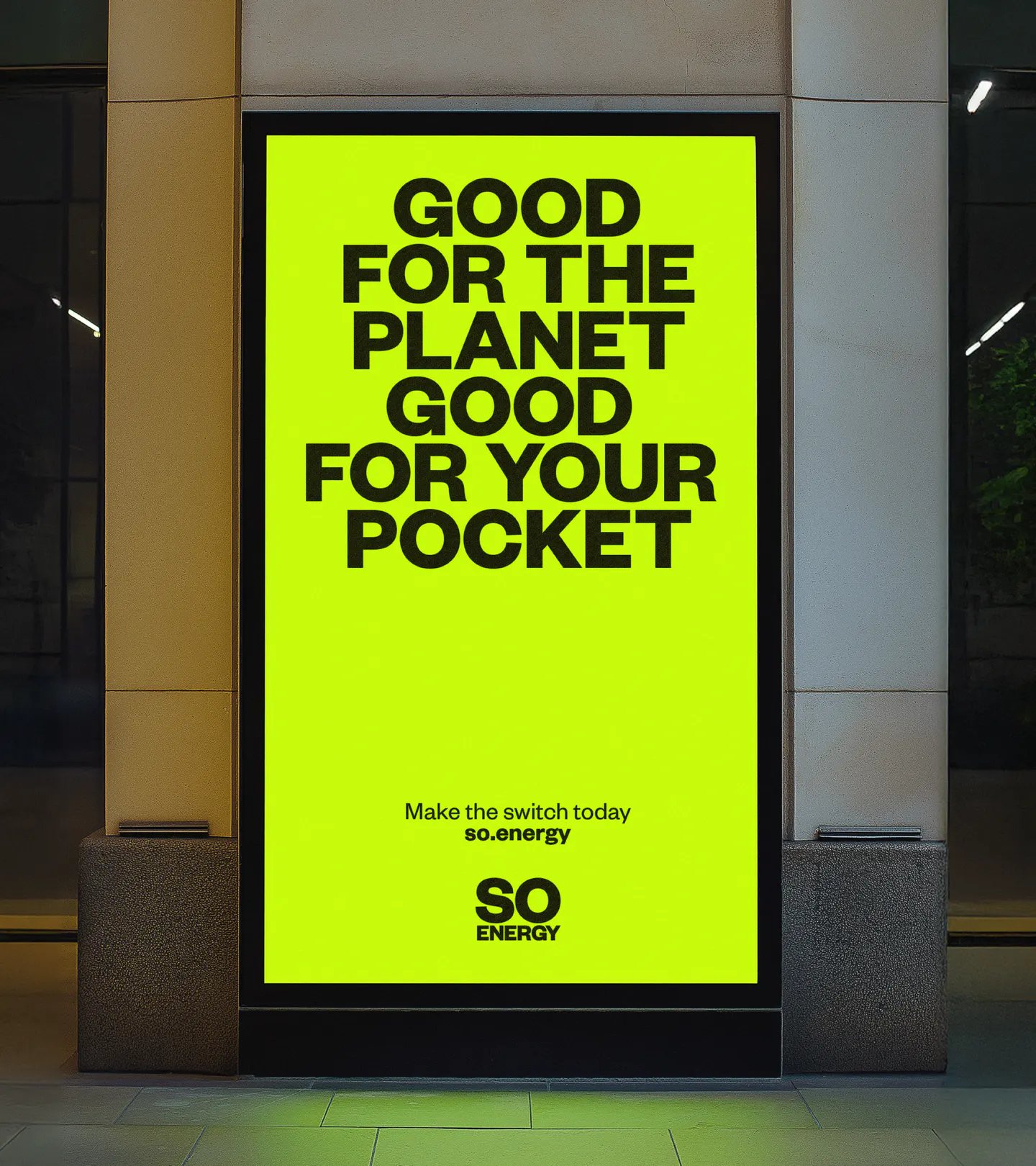
Founders Grotesk
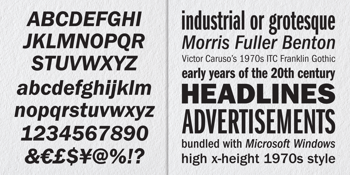
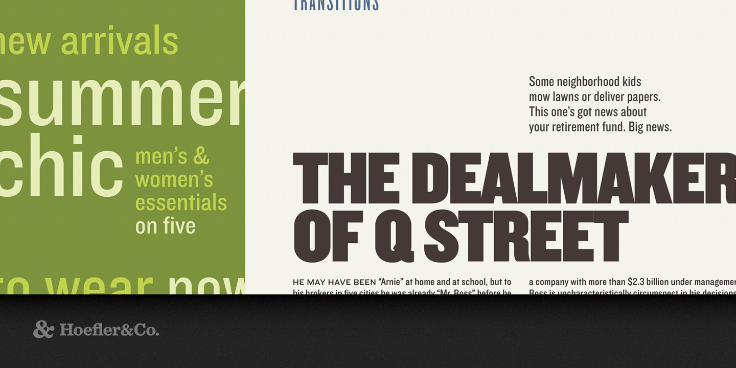
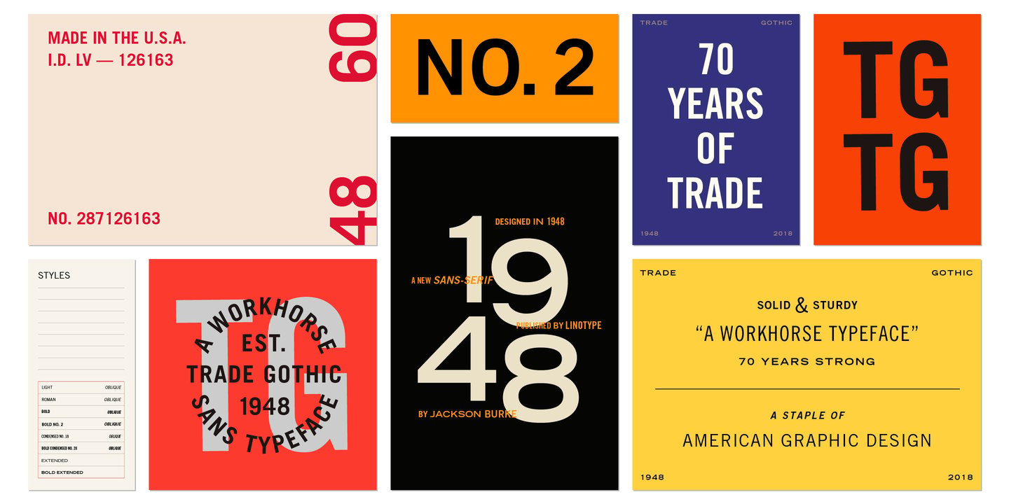
Franklin Gothic
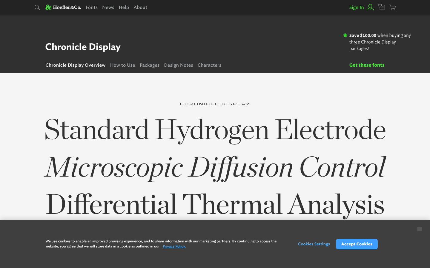
Chronicle Display
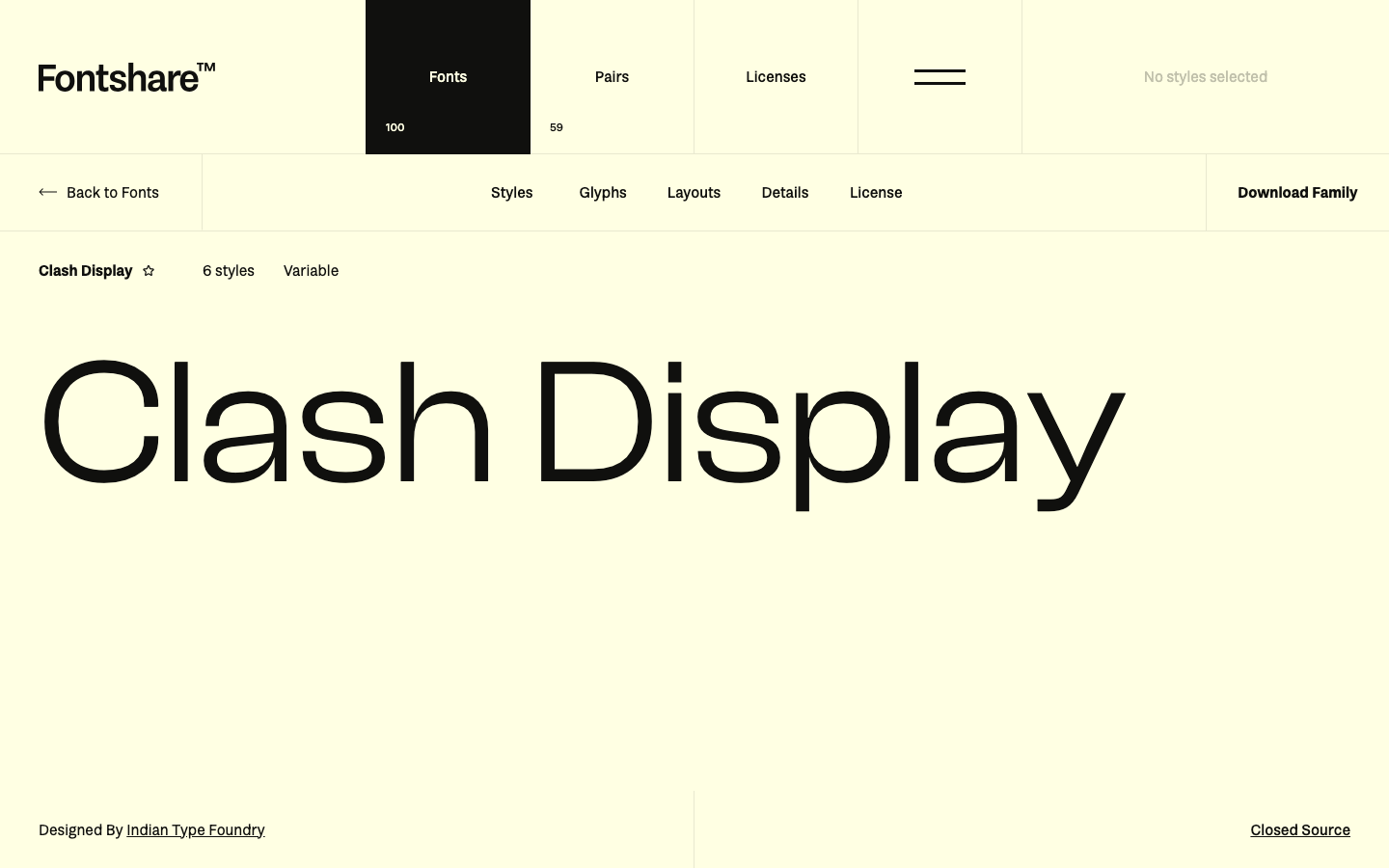
Clash Display
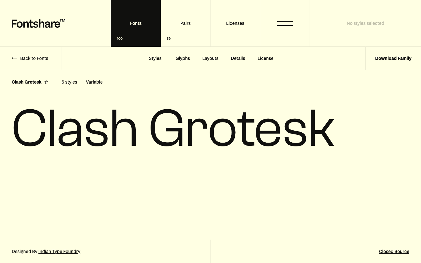
Clash Grotesk
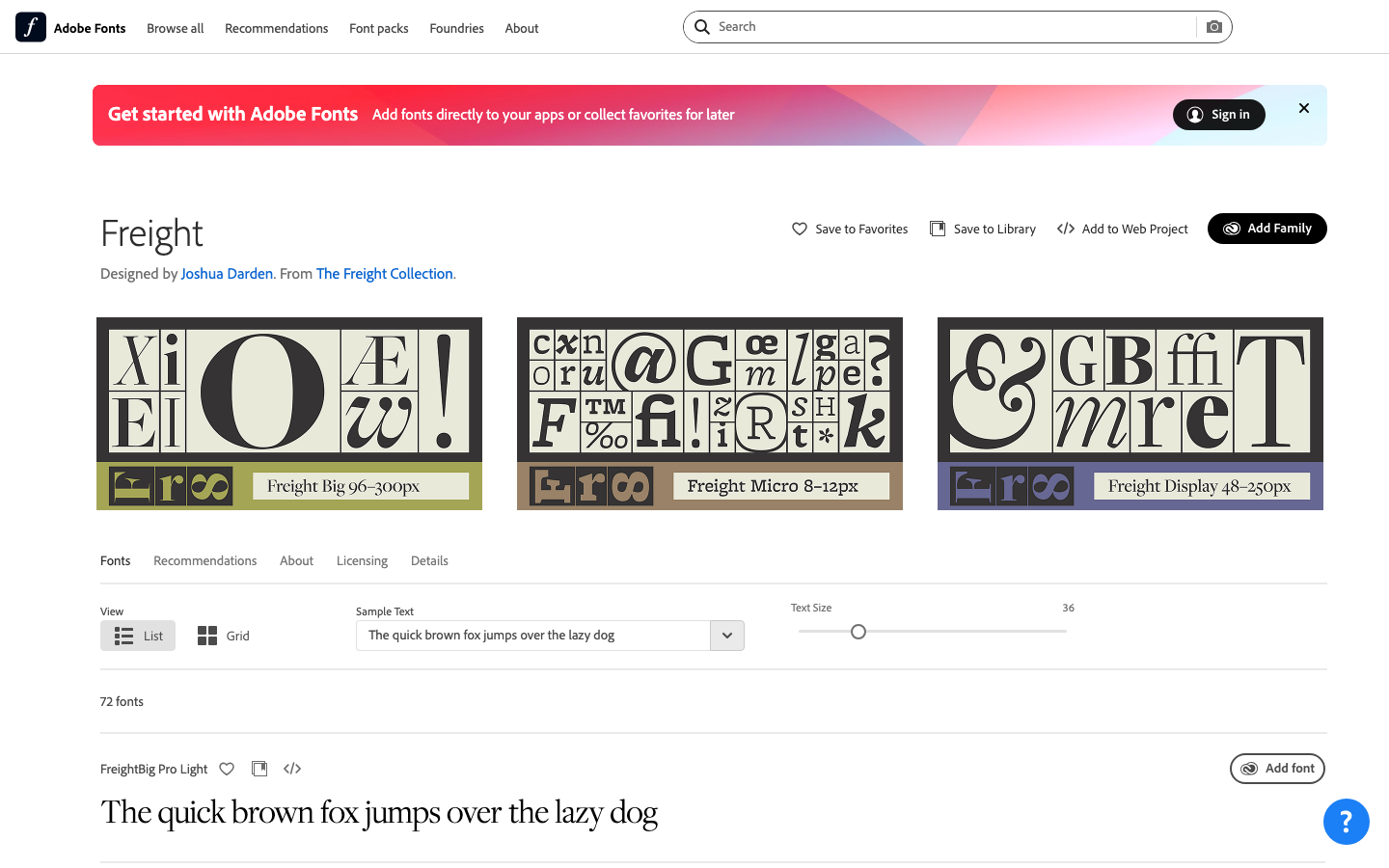
Freight Display
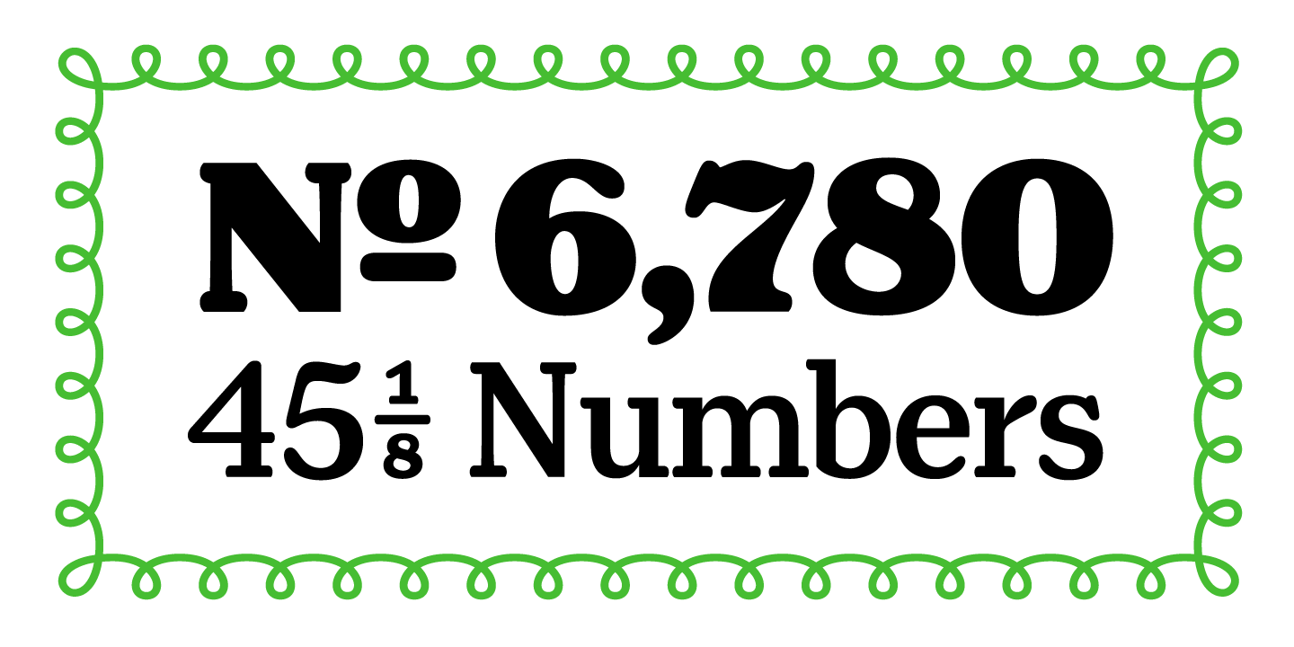
Henriette Compressed
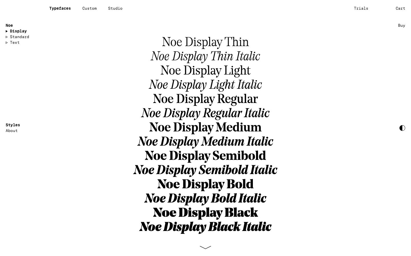
Noe Display
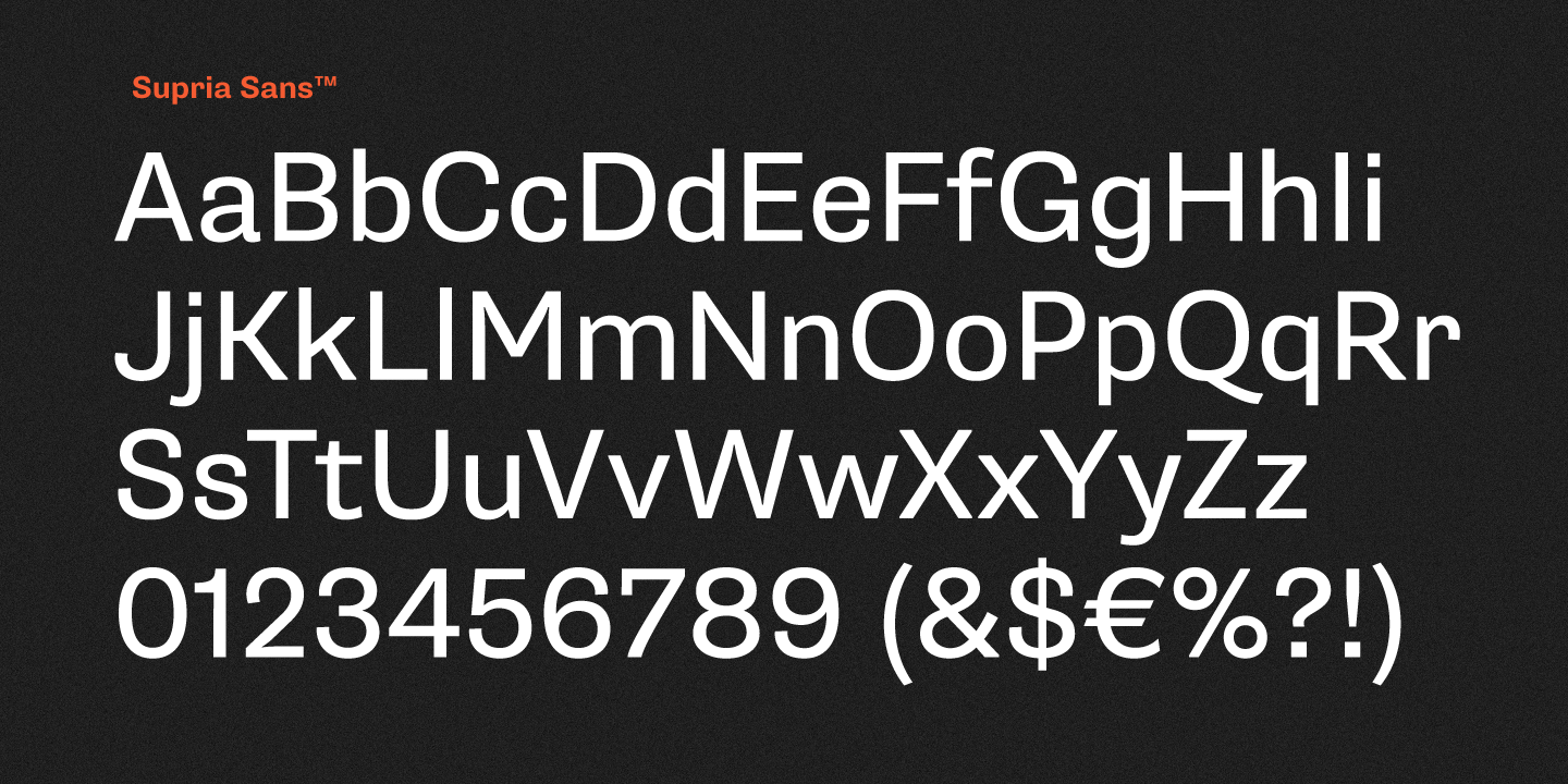
Supria Sans
Frequently Asked Questions
What makes a font good for headlines?
Headline fonts need visual impact at large sizes. Look for distinctive letterforms, bold weights, and tight tracking that creates solid text blocks. They can be more expressive than body fonts—condensed, extra-bold, or stylized. The best headline fonts are instantly recognizable and create visual hierarchy.
How do I pair headline and body fonts?
Create contrast through weight, style, or classification. Pair a bold geometric sans headline with a readable serif body, or a dramatic serif headline with clean sans body text. Avoid pairing fonts that are too similar—the contrast should be clear. Many font families include both headline and text weights.
What free fonts work well for headlines?
Oswald delivers bold, condensed impact. Playfair Display offers editorial elegance. Bebas Neue provides all-caps power. For modern headlines, try Poppins Bold or Montserrat Black. Sora and Space Grotesk offer contemporary geometric alternatives with strong headline weights.
Headlines Alternatives by Font
Browse headlines alternatives for specific premium fonts.
