Bold Fonts
Heavy-weight typefaces designed for maximum visual impact, featuring thick strokes and commanding presence. Essential for headlines, calls to action, and attention-grabbing design.
Bold typefaces are designed for impact. Their heavy strokes command attention, establish hierarchy, and anchor visual compositions. While "bold" often refers to a weight within a type family, bold as a typographic trait describes faces that are inherently heavy — designed from the ground up for density and presence rather than derived by thickening a regular-weight design.
Optical Compensation in Bold Design
Designing a bold typeface is not simply a matter of making strokes thicker. As weight increases, several optical problems emerge that require careful correction. Counters (the interior spaces of letters like 'a', 'e', 'o') shrink and can close entirely at extreme weights, destroying legibility. Intersections where strokes meet become dark spots — the junction of 'M' or 'W', the shoulder of 'n' and 'h' — requiring careful thinning through ink traps or stroke adjustments. Letter spacing must increase as weight grows; bold text set with the same tracking as regular text appears cramped and illegible. Skilled type designers also adjust proportions: very bold faces often have slightly wider letterforms than their lighter siblings to maintain adequate counter space. These optical compensations are why a well-designed Bold weight always looks better than a synthetically bolded Regular.
Accessibility and Readability
Bold type serves critical accessibility functions. For users with low vision, bold text provides the higher contrast ratio needed for comfortable reading. WCAG guidelines emphasize sufficient contrast between text and background — bold type inherently increases the text's visual weight, improving perceived contrast even when color contrast remains constant. Bold is also essential for creating hierarchy that screen readers can parse: semantic use of bold (via or heading tags) provides structural information that assistive technology conveys to users. However, overuse of bold undermines these benefits — when everything is bold, nothing stands out, and the accessibility advantage of hierarchical emphasis disappears.
Digital Rendering Considerations
Bold fonts present specific rendering challenges on screen. At small pixel sizes, the thick strokes of bold type can overflow their allocated pixel grid, causing letters to merge or appear as undifferentiated blobs. Subpixel rendering helps, but very bold weights below about 14px often perform poorly on standard-resolution displays. High-DPI (Retina) screens have largely resolved this problem, but designers building for diverse device ecosystems must still test bold type at their target sizes. Web font rendering also varies by operating system: macOS tends to render bold type more heavily than Windows, meaning a font that appears pleasantly bold on macOS may look excessively thick on Windows. Variable fonts offer a solution: designers can specify slightly different weight values for different platforms using CSS media queries.
When to Use
Bold typefaces are essential for headlines, pull quotes, calls to action, navigation elements, and any text that must grab attention or establish hierarchy. Use bold weight strategically to guide the reader's eye through a composition. Avoid setting full paragraphs in bold — the density creates reading fatigue and eliminates the hierarchical contrast that makes bold effective. For extended bold text needs, consider a semi-bold or medium weight that provides emphasis without overwhelming density.
Premium Bold Fonts


Clash Display

Clash Grotesk

Cooper Black


Franklin Gothic


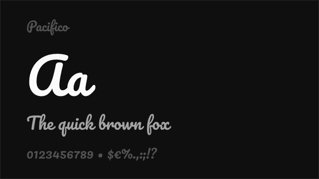
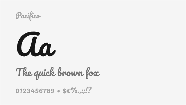
Free Bold Fonts
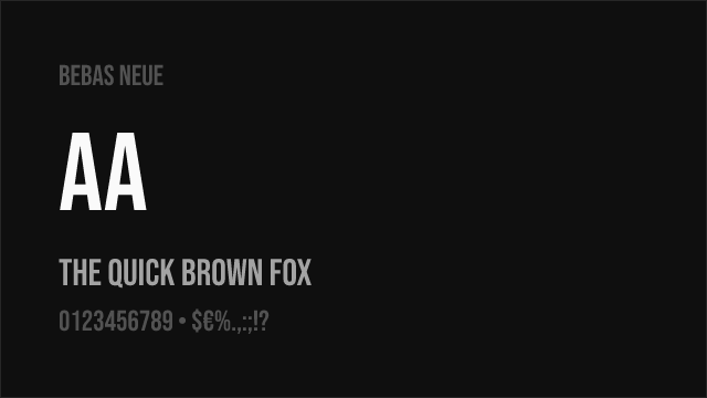
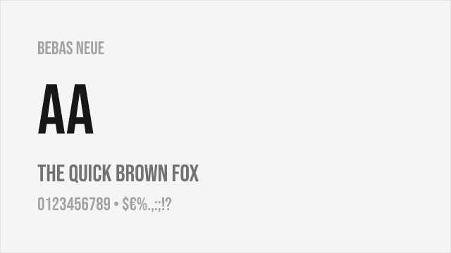
Bebas Neue Free


Crimson Pro Free Variable


EB Garamond Free Variable


Fjalla One Free


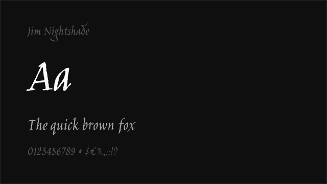
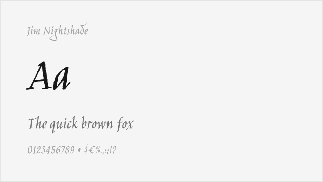
Jim Nightshade Free


Libre Bodoni Free Variable
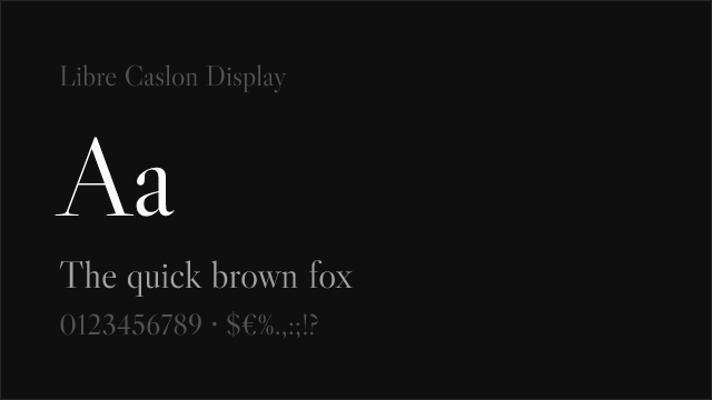

Libre Caslon Display Free


Libre Franklin Free Variable


MedievalSharp Free


Merriweather Free
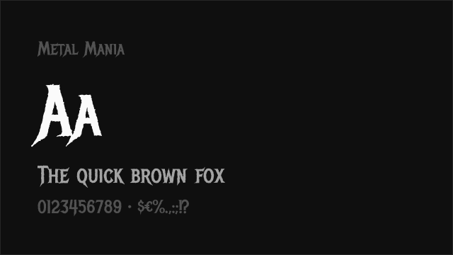
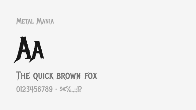
Metal Mania Free


Montserrat Free Variable


New Rocker Free


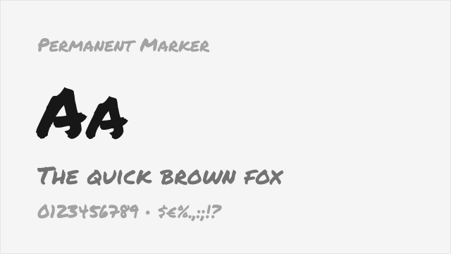
Permanent Marker Free
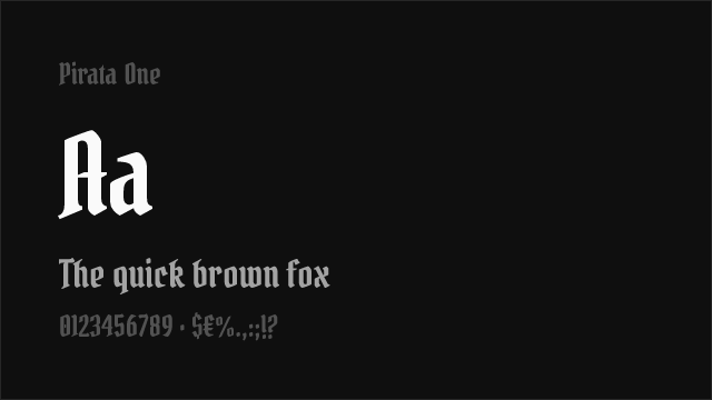
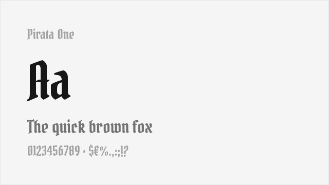
Pirata One Free


Playfair Display Free Variable


Roboto Slab Free Variable

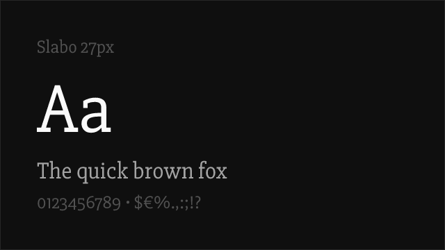

Slabo 27px Free


Source Sans Pro Free Variable


Source Serif Pro Free Variable


Space Grotesk Free Variable
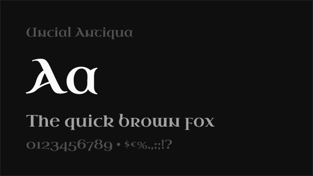
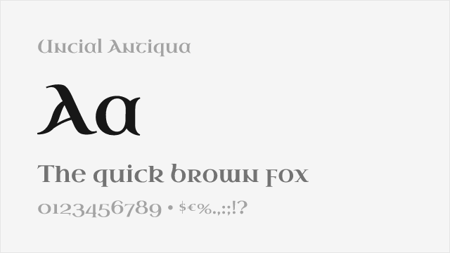
Uncial Antiqua Free


UnifrakturCook Free
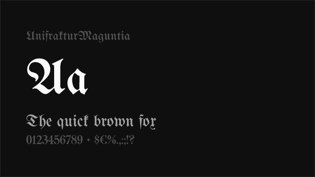
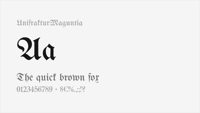
UnifrakturMaguntia Free


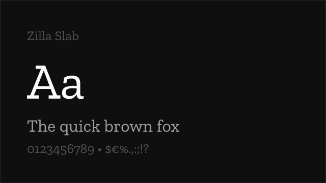

Zilla Slab Free
No fonts found with this filter.