Decorative Fonts
Ornamental typefaces designed for visual impact over readability, featuring elaborate details, unusual forms, and striking embellishments. Built for short bursts of display text.
Decorative typefaces exist at the far end of the typographic spectrum, where visual impact takes absolute priority over reading ease. Their ornate details, unusual construction, and striking embellishments are designed to capture attention, establish mood, and create memorable visual impressions — all within the span of a few words or a single headline.
The Overuse Problem
Decorative fonts are the most frequently misused category in typography. Their visual intensity, which creates impact at headline scale, becomes overwhelming and illegible when applied to body text, navigation, or extended passages. The fundamental rule is restraint: decorative type works when it is the exception, not the norm. A decorative headline gains its power from contrast with surrounding neutral type — without that contrast, the decoration becomes noise. Amateur designers are particularly prone to using decorative fonts throughout a layout, producing designs that are visually exhausting and functionally unreadable. Professional practice limits decorative type to a single application per composition — a title, a logo, a pull quote — supported by clean, readable type everywhere else.
Pairing Strategies
Pairing decorative fonts requires establishing clear hierarchy through contrast. The decorative face handles the attention-grabbing role; its partner handles everything else. For serif decorative faces, pair with a clean sans-serif body font — the classification difference creates natural separation. For sans-serif decorative faces (those with unusual proportions or embellishments), pair with a traditional serif for body text. The key principle is that the body font should be as neutral as possible: Source Sans Pro, Inter, Georgia, or similar workhorses that recede behind content. Never pair two decorative fonts together — the visual competition produces chaos. When a decorative font has a companion family (some foundries release matched sets), use it, as the designer has already solved the pairing problem.
Cultural and Historical Context
Decorative typefaces often reference specific cultural moments, artistic movements, or visual traditions. Art Nouveau faces carry associations of organic elegance and the early 1900s. Victorian display type evokes industrial-era advertising. Psychedelic lettering references 1960s counterculture. Western saloon fonts invoke the American frontier. Each decorative style carries its own cultural baggage — associations that can enhance a design when deployed thoughtfully or undermine it when used carelessly. The most effective decorative type use connects the font's visual heritage to the content's thematic context, creating a resonance between form and meaning that neither element achieves alone.
When to Use
Decorative typefaces are appropriate for book covers, movie posters, album art, event invitations, themed restaurant menus, holiday cards, packaging accents, and any context where a few words need to create maximum visual and emotional impact. Keep their use brief — no more than a headline or title — and support them with readable, neutral companion type. Test decorative fonts at their intended size; many lose their detailed charm when scaled down.
Premium Decorative Fonts


Chronicle Display

Clash Display

Clash Grotesk

Cloister Black


Freight Display


Miller Display


Noe Display


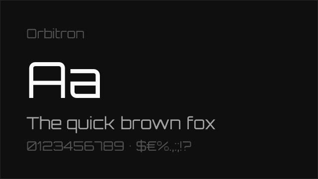
PP Neue Machina


Supria Sans


Wilhelm Klingspor Gotisch


Free Decorative Fonts
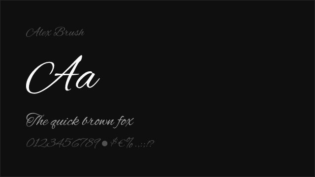
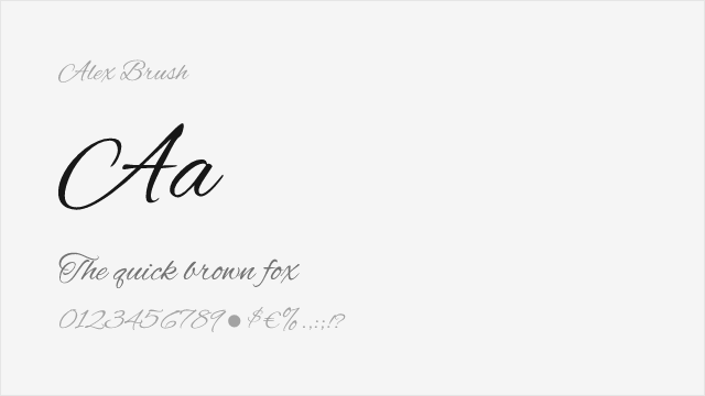
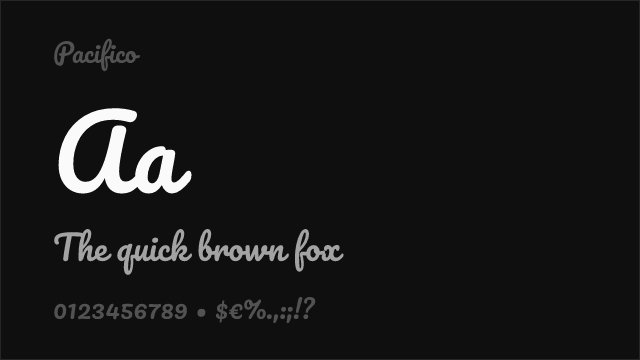
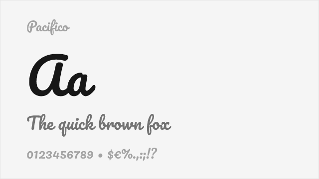
Alex Brush Free


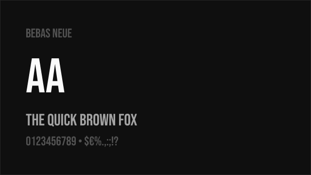
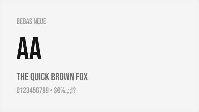
Bebas Neue Free


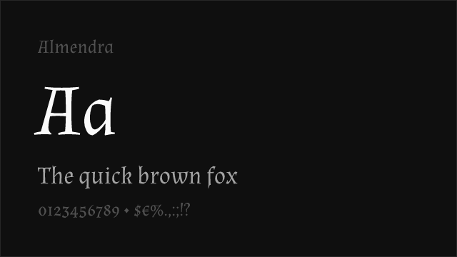
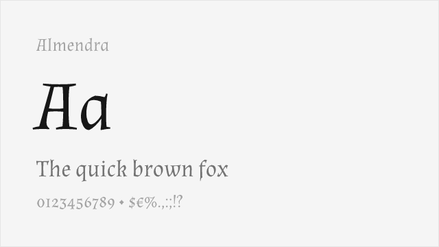
Cormorant Garamond Free
Dancing Script Free Variable


EB Garamond Free Variable


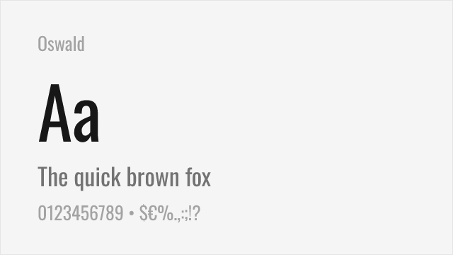
Fjalla One Free


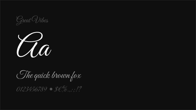
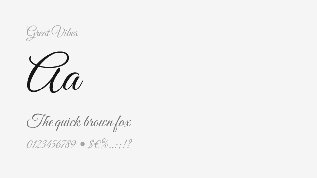
Great Vibes Free
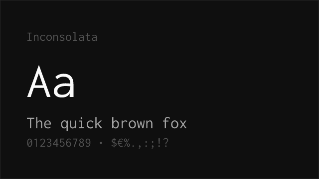
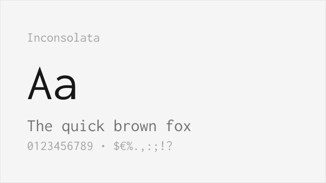
Inconsolata Free Variable


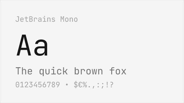
JetBrains Mono Free Variable
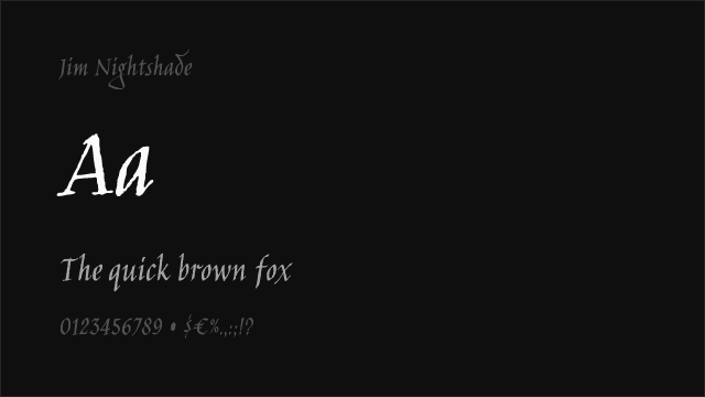
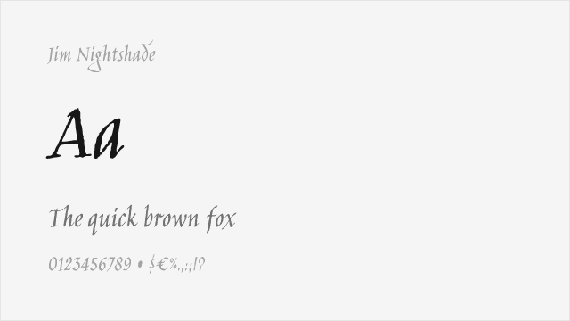
Jim Nightshade Free
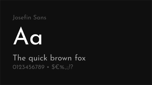

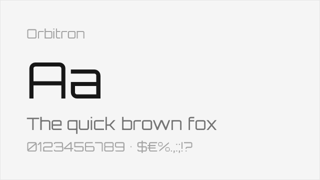
Josefin Sans Free Variable


Libre Baskerville Free


Libre Bodoni Free Variable
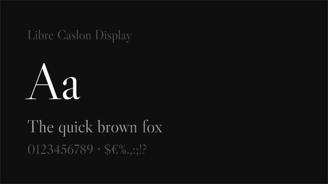

Libre Caslon Display Free


Libre Franklin Free Variable


MedievalSharp Free


Merriweather Free
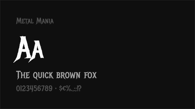
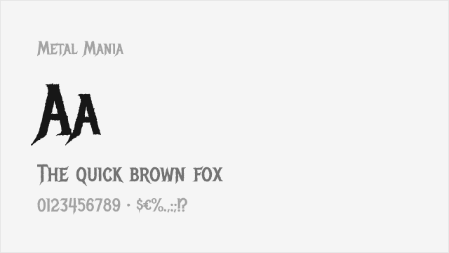
Metal Mania Free


Montserrat Free Variable


New Rocker Free


Permanent Marker Free
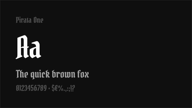
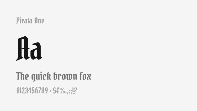
Pirata One Free


Playfair Display Free Variable


Source Code Pro Free Variable


Source Sans Pro Free Variable


Source Serif Pro Free Variable


Space Grotesk Free Variable
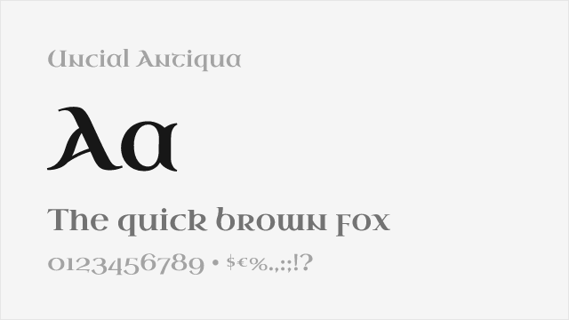
Uncial Antiqua Free


UnifrakturCook Free
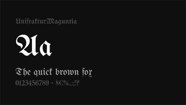
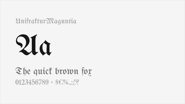
UnifrakturMaguntia Free


No fonts found with this filter.