Headline Fonts
Typefaces designed and optimized for use at large display sizes, featuring tighter spacing, sharper details, and bolder presence than their text counterparts. Built to grab attention.
Headline typefaces are optimized for large-size display, where they must command attention, establish hierarchy, and create visual impact within the first moments of viewer engagement. Unlike text fonts designed for the sustained rhythm of reading, headline fonts prioritize immediate presence — bold weight, tight fit, and distinctive character that reads powerfully at 24px and above.
Optical Sizing Principles
The distinction between headline and text type is rooted in a centuries-old understanding of optical sizing. Metal type founders cut different masters for different sizes: a 72-point capital 'A' was not simply a scaled-up version of a 12-point 'A'. The large-size version had finer serifs, tighter spacing, greater stroke contrast, and more delicate details, because these features are visible at headline sizes but would disappear or clutter at text sizes. Modern "Display" or "Headline" cuts preserve this logic. They feature tighter letter-spacing (because large type has visible gaps between letters), higher stroke contrast (because the contrast range is visible), sharper details and terminals (because subtlety reads at scale), and often slightly narrower proportions (because wide letters at large sizes consume excessive space). Variable fonts with an optical size axis (opsz) automate this adjustment, making these refinements continuous rather than binary.
Pairing with Body Text
The headline-body pair is the most fundamental typographic relationship. Effective pairings create clear hierarchy through contrast — a bold, high-impact headline draws the eye, then a comfortable text face sustains reading. The classic approach pairs a sans-serif headline with a serif body (Montserrat Bold over Source Serif Pro), leveraging classification contrast for natural hierarchy. The reverse works equally well: a dramatic serif headline (Playfair Display) over a clean sans-serif body (Inter). When using fonts from the same family, the headline weight should be dramatically different from the body weight — Regular body with ExtraBold headlines, not Regular body with SemiBold headlines. The weight jump must be decisive enough that the hierarchy is immediately obvious, not gradually inferred.
Common Mistakes
Setting headline fonts too small undermines their design intent. Display and headline cuts are optimized for large sizes and often look clumsy or overly tight below 24px. Another common mistake is using too much tracking (letter-spacing) on headline type. While body text benefits from generous spacing, headline fonts are designed with tighter fit — adding tracking defeats their engineered density and weakens their visual impact. Designers also frequently choose headline fonts that compete with rather than complement their content — the headline typeface should enhance the message, not overwhelm it. Finally, avoid using more than one headline font per project. Multiple display faces fighting for attention create confusion rather than hierarchy; use weight and size variation within a single headline family instead.
When to Use
Headline typefaces are essential for page titles, hero sections, article headers, advertising headlines, poster text, and any content that must capture attention at first glance. Choose headline-specific cuts or display weights when available — they are engineered for the job in ways that text weights at large sizes are not. Pair with readable, comfortable body fonts and maintain consistent headline treatment throughout a project to build visual coherence.
Premium Headline Fonts


Chronicle Display

Clash Display

Clash Grotesk

Cloister Black


Freight Display


Miller Display


Noe Display


PP Neue Machina


Supria Sans


Wilhelm Klingspor Gotisch


Free Headline Fonts
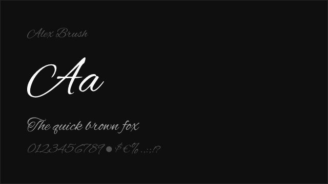
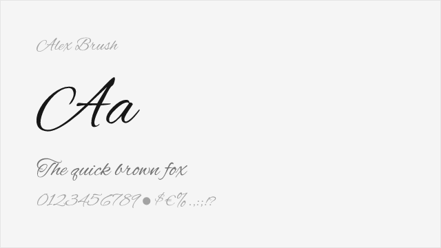
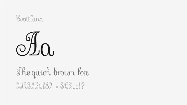
Alex Brush Free
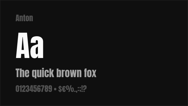
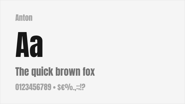


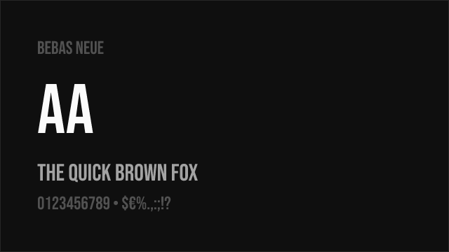
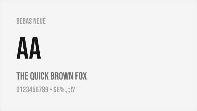
Bebas Neue Free


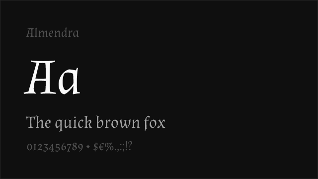
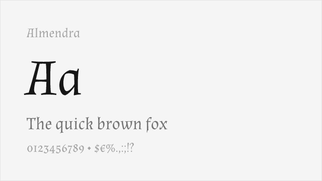
Cormorant Garamond Free
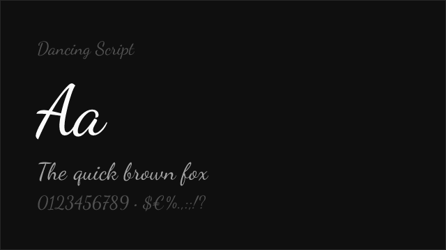
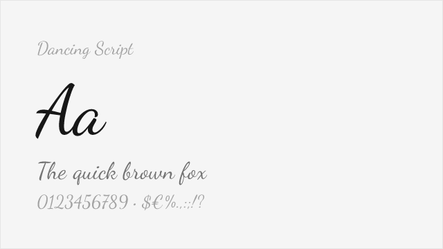
Dancing Script Free Variable


EB Garamond Free Variable


Fjalla One Free


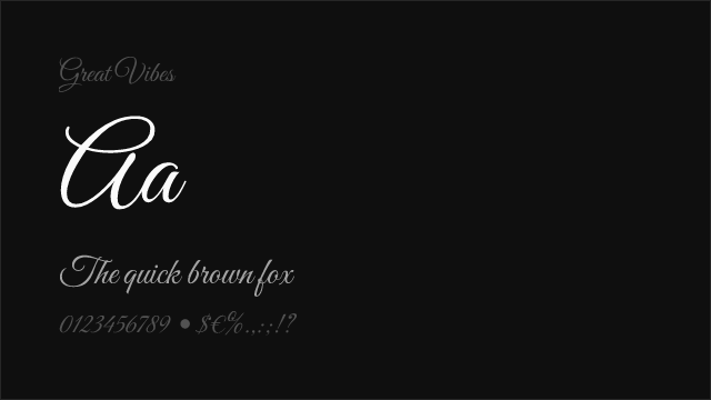
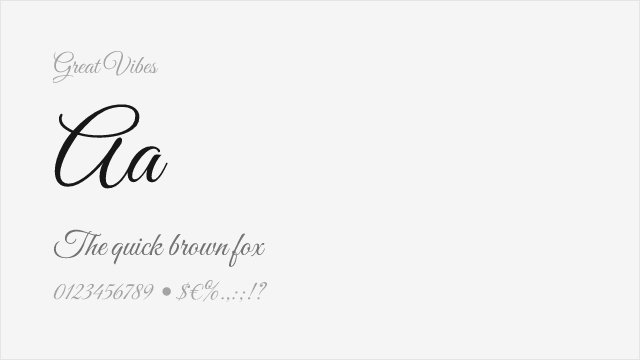
Great Vibes Free
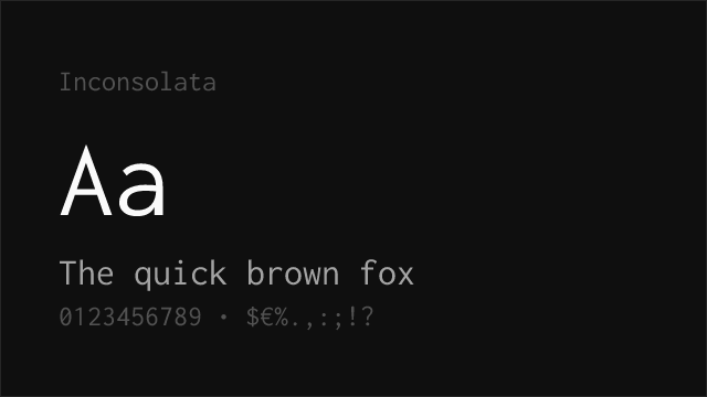
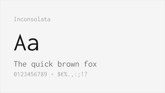
Inconsolata Free Variable


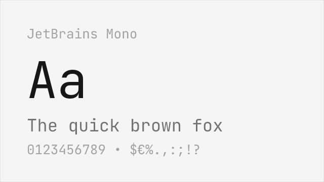
JetBrains Mono Free Variable
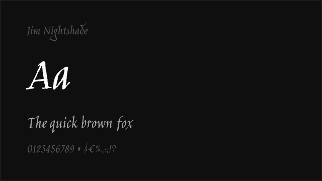
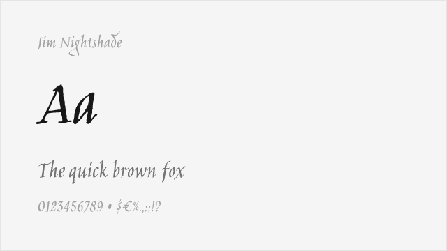
Jim Nightshade Free
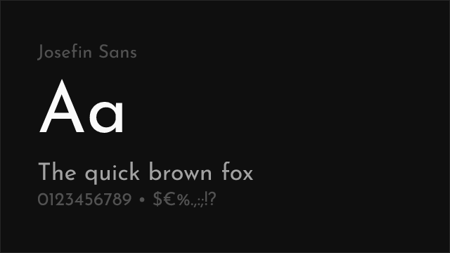

Josefin Sans Free Variable


Libre Baskerville Free


Libre Bodoni Free Variable
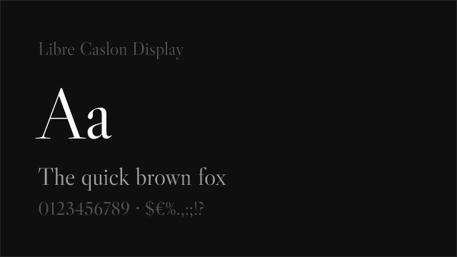

Libre Caslon Display Free


Libre Franklin Free Variable


MedievalSharp Free


Merriweather Free
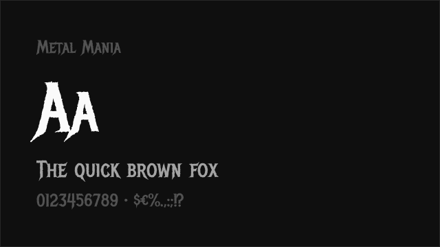
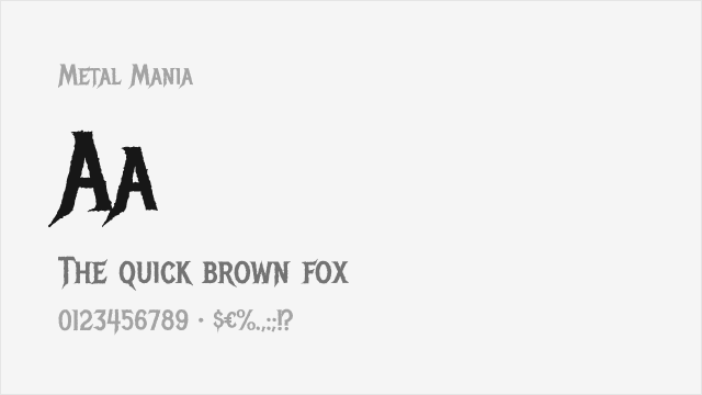
Metal Mania Free


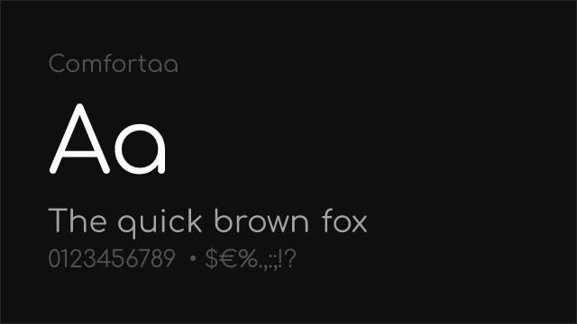
Montserrat Free Variable


New Rocker Free


Permanent Marker Free
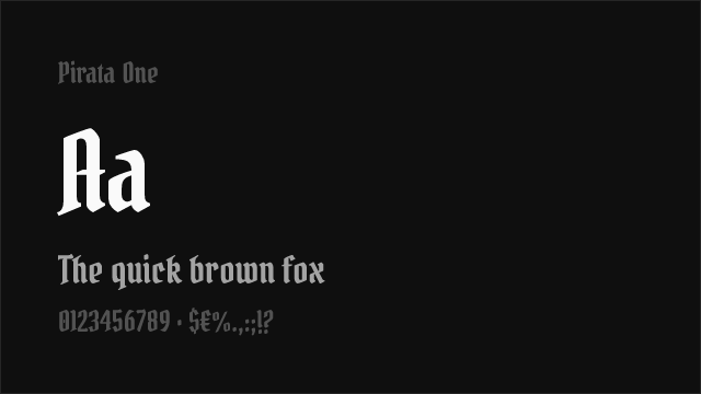
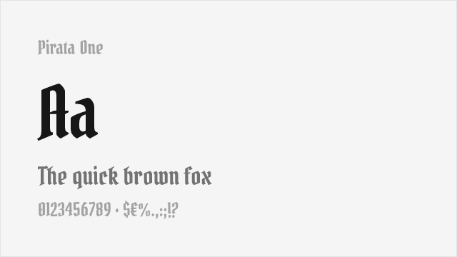
Pirata One Free


Playfair Display Free Variable


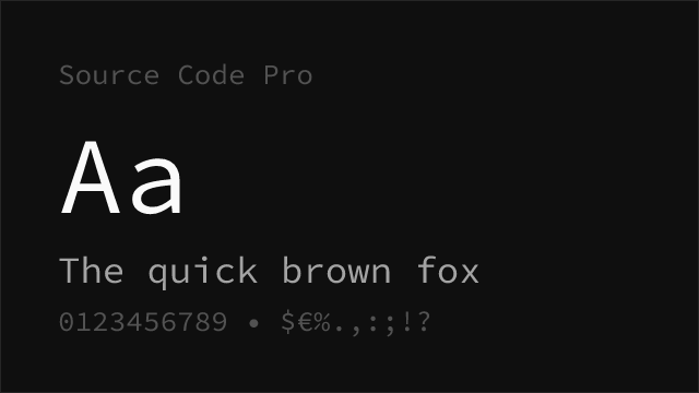
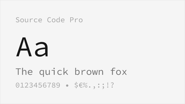
Source Code Pro Free Variable


Source Sans Pro Free Variable


Source Serif Pro Free Variable


Space Grotesk Free Variable
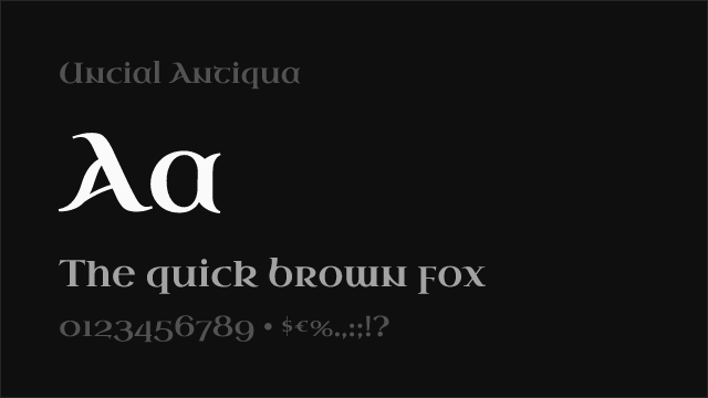
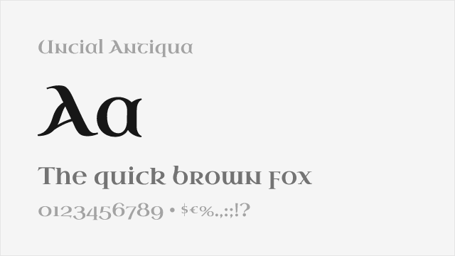
Uncial Antiqua Free


UnifrakturCook Free
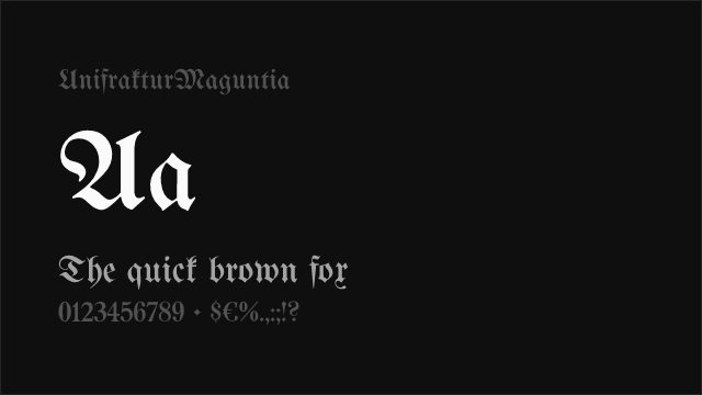
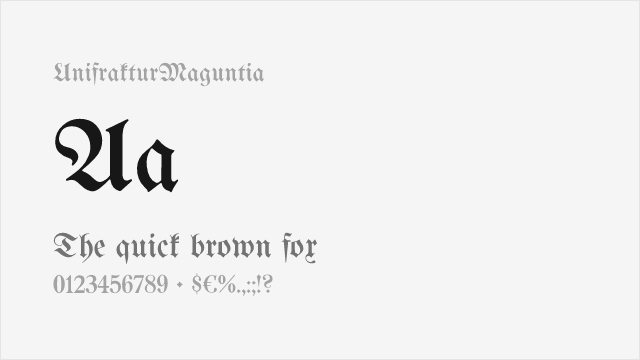
UnifrakturMaguntia Free


No fonts found with this filter.