Best Fonts for Wayfinding
Typography for navigation systems, directional signage, and environmental graphics. Wayfinding fonts must ensure instant recognition and maximum legibility in motion and at distance.
Free Fonts for Wayfinding
Open-source fonts perfect for wayfinding projects.
Premium Wayfinding Fonts You Can Replace
Popular premium fonts for wayfinding with free open-source alternatives.
Frequently Asked Questions
What makes a font good for wayfinding?
Wayfinding fonts prioritize instant recognition. They need large x-heights, open counters, and clear character differentiation—especially for similar shapes like C/G/O and I/L/1. Sans-serifs dominate because serifs disappear at distance. Testing at actual viewing distances and angles is essential before finalizing.
Why was Frutiger designed for airport wayfinding?
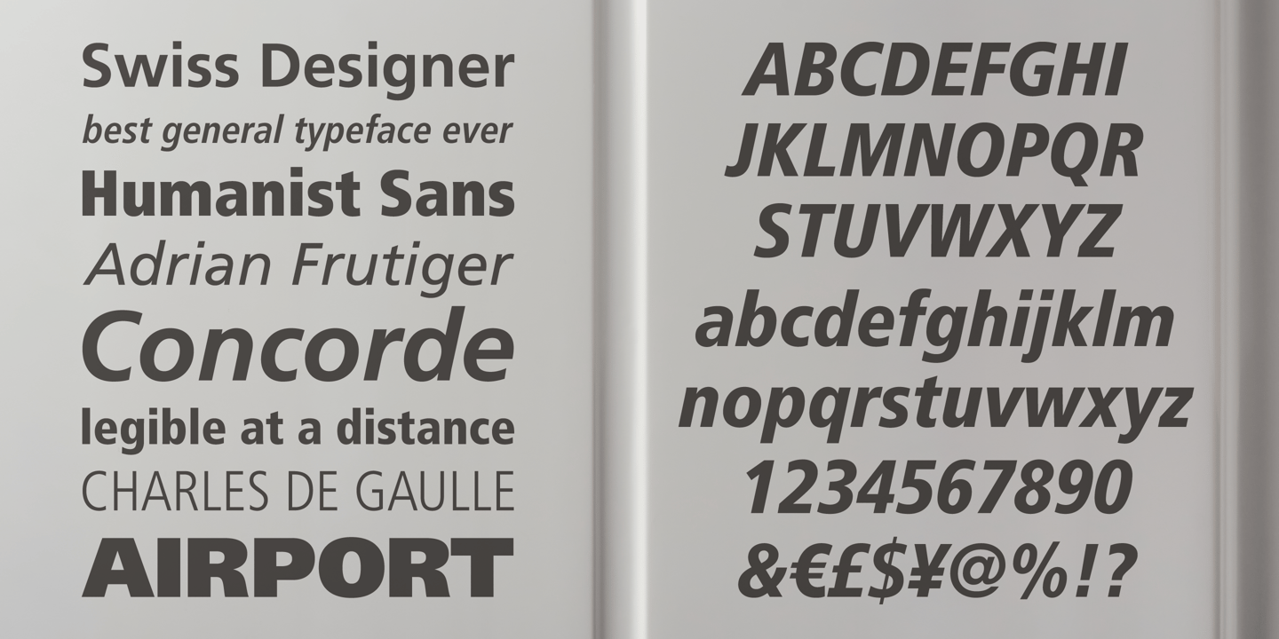
Adrian Frutiger designed his namesake font for Charles de Gaulle Airport in 1975. Its humanist construction, large x-height, and open apertures maximize legibility at distance and in peripheral vision—crucial when travelers navigate while walking. It remains the benchmark for wayfinding typography.
What free fonts work well for wayfinding?
Overpass was designed for highway signage and translates well to general wayfinding. Hind offers similar clarity. Source Sans Pro provides Frutiger-like qualities. For a more contemporary option, Inter works at various sizes. Test extensively at actual viewing distances before implementation.
Wayfinding Alternatives by Font
Browse wayfinding alternatives for specific premium fonts.
