Elegant Fonts
Typefaces that convey sophistication, refinement, and luxury through graceful proportions, delicate details, and poised letterforms. The typographic equivalent of fine craftsmanship.
Elegant typefaces communicate sophistication through restraint rather than ornamentation. Their power lies in precise proportions, graceful stroke modulation, and refined details that reward close inspection. Elegance in typography is not about decoration — it is about the confidence that comes from flawless execution and tasteful simplicity.
Cultural Associations
Typographic elegance is culturally constructed and context-dependent. In Western design, elegance is most commonly associated with high-contrast serif faces (Didot, Bodoni) that reference 18th-century French and Italian printing traditions — the era of Enlightenment rationalism and aristocratic refinement. These associations have been reinforced by a century of fashion magazine mastheads and luxury brand identities that consistently employ Didone-style typefaces. In a broader context, elegance can also be expressed through refined sans-serifs (Optima, Cormorant), where the sophistication comes from subtle stroke variation and classical proportions rather than dramatic contrast. Japanese typography associates elegance with Mincho typefaces (the serif equivalent) that echo brush calligraphy, while Arabic typographic elegance is often expressed through the flowing, deeply proportioned Naskh and Thuluth styles.
The Luxury Context
Luxury brands rely on typography as a primary signal of exclusivity and quality. The dominant approach is what might be called "confident minimalism" — elegant typefaces set large, with generous white space and restrained color palettes. Didone serifs like Didot dominate fashion (Vogue, Harper's Bazaar, Giorgio Armani), while refined geometric sans-serifs serve modern luxury (Cartier's use of custom type, Celine's Futura-based wordmark). The key principle is that luxury typography should appear effortless — the refinement is in what has been removed, not what has been added. Elegant type in luxury contexts typically uses light weights, generous tracking, and uppercase settings to create an airy, confident presence that communicates exclusivity without shouting.
Design Principles
Achieving elegance in type selection requires attention to several technical qualities. Look for consistent, refined stroke terminals — the way a letter's strokes begin and end reveals a designer's care. Proportions should be generous but not loose; slightly narrow proportions often read as more elegant than wide ones. Contrast (the ratio of thick to thin strokes) is a primary tool: moderate contrast suggests understated elegance, while high contrast projects dramatic sophistication. Kerning must be impeccable — poorly spaced type cannot be elegant regardless of the typeface's quality. Weight selection matters too: light and regular weights appear more elegant than bold, though a well-designed bold can achieve commanding elegance through sheer quality of form.
When to Use
Elegant typefaces are appropriate for luxury branding, fashion editorial, fine dining, hospitality, jewelry, high-end real estate, and cultural institutions like galleries and opera houses. They work best at display sizes where their refined details are visible. Pair elegant typefaces with ample white space and restrained design elements — visual clutter undermines elegance regardless of the typeface. For digital luxury brands, ensure the elegant font renders well on screen; many Didone-style faces lose their delicate hairlines on low-resolution displays.
Premium Elegant Fonts


Atlas Typewriter


Basis Grotesque


Chronicle Display


Editorial New


Freight Display


Miller Display


Noe Display


Supria Sans


Wilhelm Klingspor Gotisch

Free Elegant Fonts
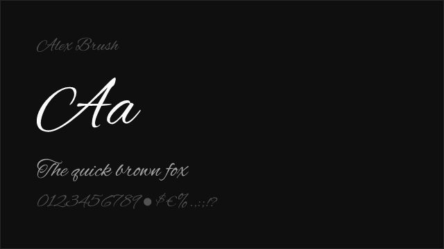
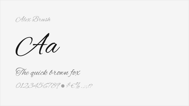
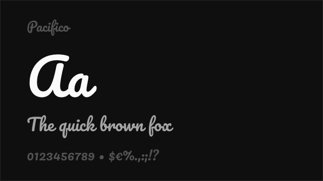
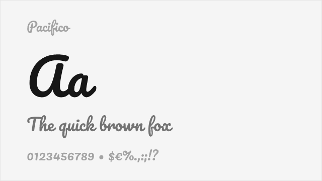
Alex Brush Free


Baskervville Free


Cormorant Garamond Free


Crimson Pro Free Variable
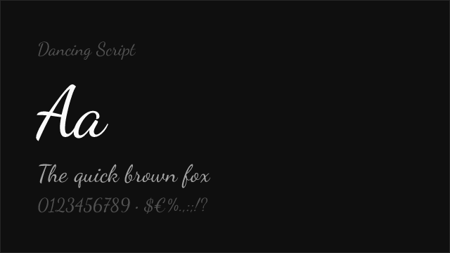
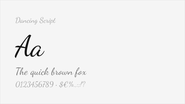
Dancing Script Free Variable


EB Garamond Free Variable

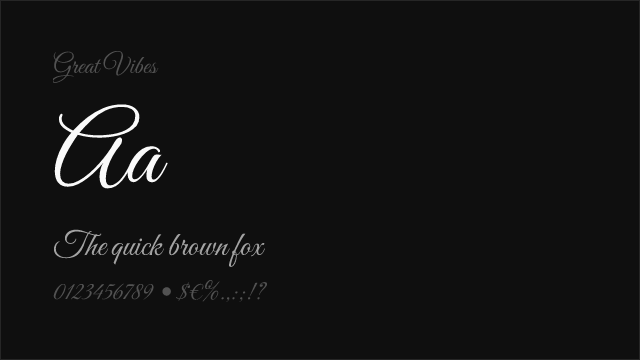
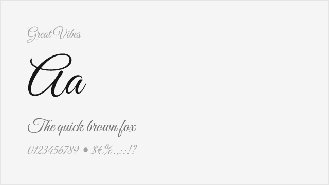
Great Vibes Free


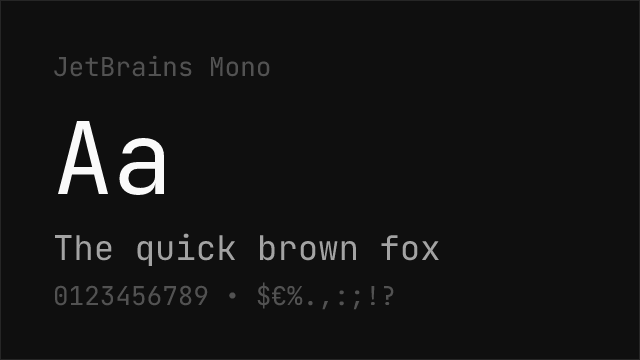

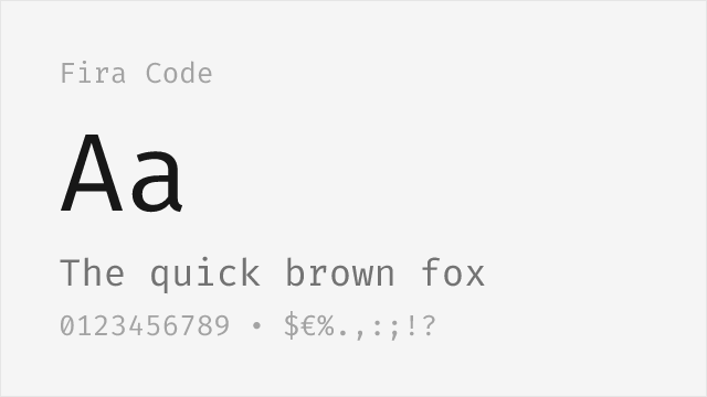
JetBrains Mono Free Variable
Jim Nightshade Free

Josefin Sans Free Variable


Libre Baskerville Free

Libre Bodoni Free Variable
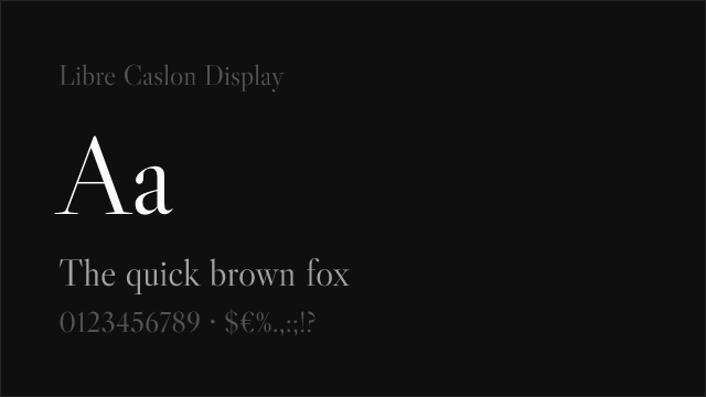

Libre Caslon Display Free


MedievalSharp Free


Merriweather Free
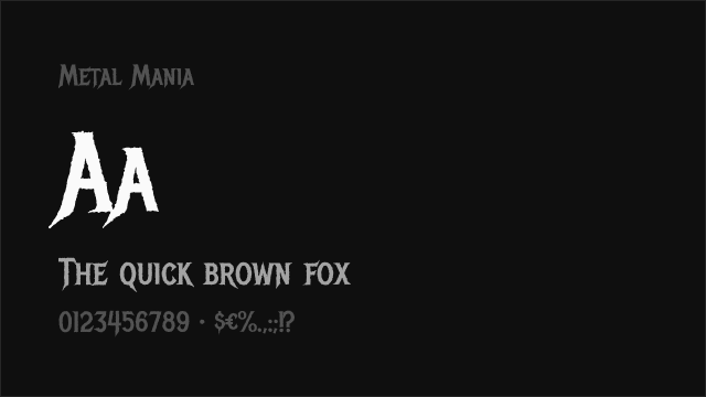
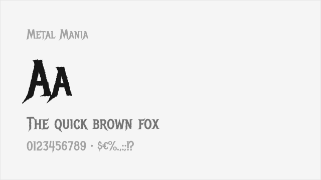
Metal Mania Free


Montserrat Free Variable


New Rocker Free


Nunito Sans Free Variable


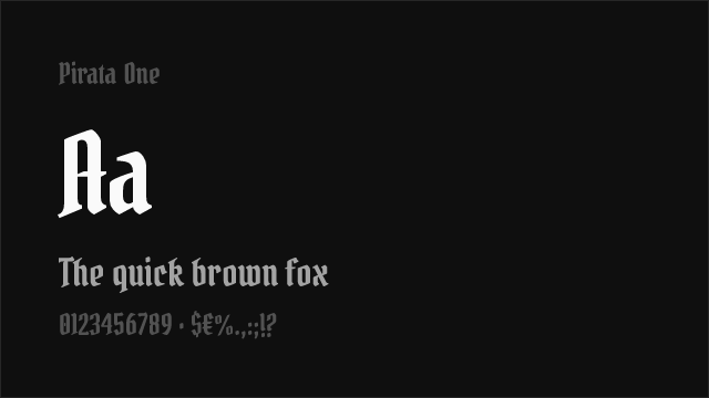
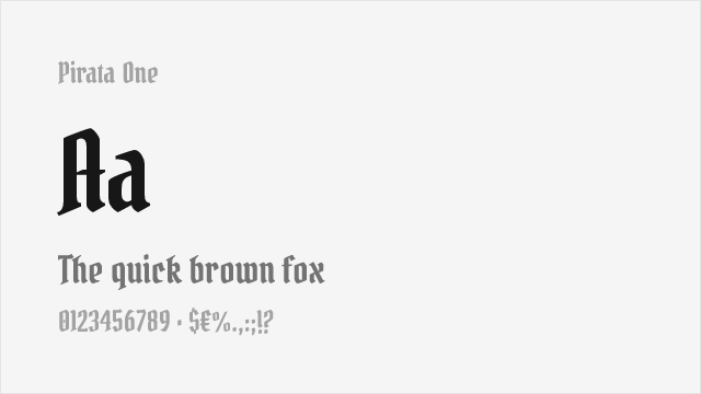
Pirata One Free


Playfair Display Free Variable


Source Sans Pro Free Variable


Source Serif Pro Free Variable
Uncial Antiqua Free


UnifrakturCook Free
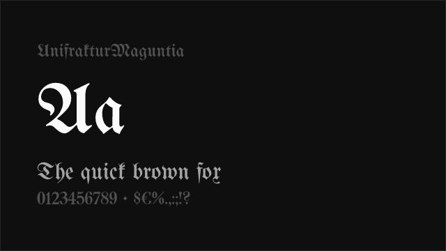
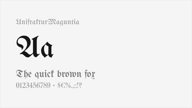
UnifrakturMaguntia Free

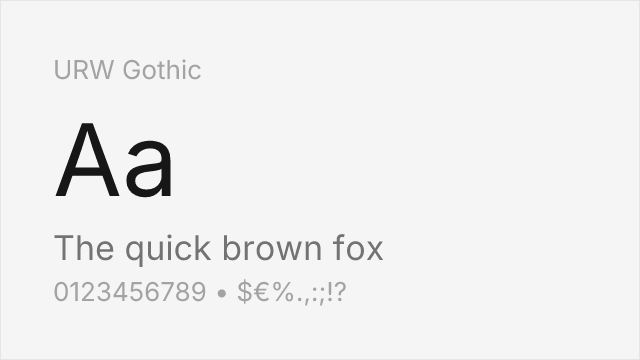
URW Gothic Free


Zilla Slab Free
No fonts found with this filter.