Geometric Fonts
Typefaces built from perfect circles, consistent stroke widths, and mathematical proportions. Geometric fonts project modernity, precision, and clean minimalism — ideal for tech, architecture, and contemporary branding.
Geometric typefaces are constructed from basic geometric shapes — circles, squares, and triangles — rather than the organic forms of handwriting. Pioneered by designs like Futura (1927) and Avant Garde Gothic (1970), the geometric approach strips letterforms down to their most essential shapes, producing fonts that feel engineered rather than written.
Historical Origins
The geometric sans-serif emerged from the Bauhaus movement in 1920s Germany, where designers sought to unify art, craft, and technology through rational form. Paul Renner's Futura (1927) became the movement's typographic flagship, applying strict geometric construction to every glyph. The Bauhaus school at Weimar and Dessau championed the idea that functional beauty arose from pure geometry — an ethos Futura embodied in its near-perfect circular 'o' and triangular 'A'. Herbert Bayer's Universal alphabet (1925) pushed the concept further, proposing single-case letterforms built entirely from arcs and straight lines. Though Universal never achieved widespread use, its influence shaped decades of geometric type design.
Sub-categories
Geometric sans-serifs divide into two distinct branches. Hard geometric designs like Futura and Century Gothic adhere strictly to circular forms, uniform stroke width, and sharp junctions. They project precision and formality, but can feel cold at text sizes. Soft geometric designs like Avenir, Nunito, and Poppins introduce subtle optical adjustments — slightly squared curves, gentle stroke tapering, and open apertures — that preserve the geometric aesthetic while improving warmth and legibility. A third category, geometric grotesques (Circular, Gotham), blends geometric construction with grotesque proportions, achieving a contemporary warmth that dominates startup and tech branding.
Common Mistakes
The most frequent error is using hard geometric fonts for body text without testing readability. Pure geometric construction produces letters with identical rhythm that the eye struggles to differentiate over long passages — the word shapes become monotonous. Futura in particular has a famously narrow lowercase 'a' and tall ascenders that can create uneven color in paragraphs. Another common mistake is setting geometric fonts too tightly; their mathematically consistent forms need slightly more generous tracking than humanist alternatives to breathe. Finally, avoid pairing two geometric fonts together — the similarity creates visual confusion rather than hierarchy.
Pairing Advice
Geometric sans-serifs pair effectively with serif faces that provide contrasting texture. A geometric headline font like Montserrat works well with a transitional body serif like Georgia or Libre Baskerville. For all-sans pairings, combine geometric headlines with humanist body text (e.g., Futura headings with Source Sans body) to balance precision with warmth. Avoid pairing geometric with neo-grotesque — both are too neutral and similar to create meaningful contrast.
When to Use
Geometric typefaces excel in technology branding, architectural signage, fashion, and any context that benefits from a clean, modern aesthetic. They pair well with minimalist layouts and generous whitespace. Use them for headlines, logos, and short display text where their precision creates impact. For body text, choose geometric fonts with slightly humanist touches to maintain readability over longer passages.
Premium Geometric Fonts


Gotham Screenwise


Object Sans


Free Geometric Fonts


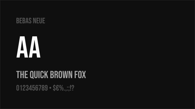
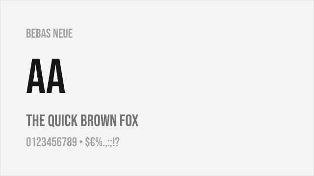
Bebas Neue Free


IBM Plex Sans Free


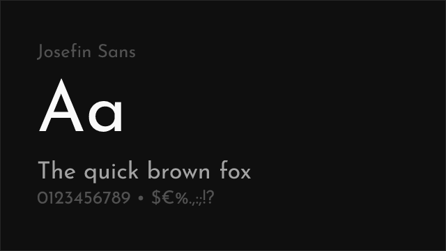

Josefin Sans Free Variable
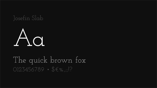
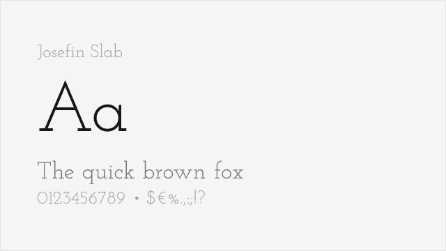
Josefin Slab Free Variable


Montserrat Free Variable


Nunito Sans Free Variable


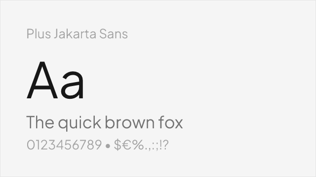
Plus Jakarta Sans Free Variable


Roboto Slab Free Variable


Space Grotesk Free Variable


No fonts found with this filter.