Minimal Fonts
Typefaces stripped to their essential forms, removing all unnecessary detail to achieve maximum clarity and visual quietness. The typographic expression of "less is more."
Minimal typefaces pursue an aesthetic of reduction — stripping letterforms to their essential components while eliminating ornament, contrast variation, and stylistic embellishment. The result is type that communicates through pure form: clean, quiet, and focused on content rather than personality.
Design Principles
Minimal type design follows a philosophy of purposeful restraint. Every design element must justify its presence; anything that does not improve legibility or structural clarity is removed. This manifests in consistent stroke widths (or very low contrast), geometric or rational construction, simplified terminals (often blunt-cut), and restrained curves. The challenge is that excessive reduction can produce letterforms that are too similar to each other, reducing legibility — the 'a', 'o', and 'e' in an overly simplified font may share uncomfortably similar silhouettes. Successful minimal typefaces maintain sufficient character differentiation through subtle size and proportion variations that preserve recognition without adding visible complexity. The optical corrections must be present but invisible, which paradoxically requires more design skill than ornamental approaches.
The Swiss Revival
Minimal typography has deep roots in the Swiss International Typographic Style of the 1950s, and contemporary minimal type design represents a revival and reinterpretation of those principles. The original Swiss Style prescribed Helvetica or Univers on mathematical grids with ample white space, creating layouts that were radically spare by mid-century standards. Today's minimal renaissance — visible in brand redesigns from Google, Airbnb, Spotify, and countless tech companies — extends this logic with new technical capabilities. Variable fonts allow minimal typefaces to offer continuous weight adjustment. Improved screen rendering makes light, minimal faces viable on digital displays. And the aesthetic minimalism of contemporary UI design (flat design, material design, design systems) creates a natural context for minimal typography. However, critics note that this convergence has produced visual homogeneity, with many brands now typographically indistinguishable.
Pairing Approaches
Minimal typefaces pair most effectively with other minimal elements — clean photography, geometric layouts, ample white space. Within a type system, combine a minimal sans-serif with a minimal serif to create hierarchy through classification contrast rather than personality contrast: Inter headlines over Source Serif Pro body, for example. Avoid pairing minimal type with ornamental or decorative elements, which creates a distracting clash of design philosophies. When additional typographic emphasis is needed within a minimal system, rely on weight variation, size contrast, and spatial arrangement rather than introducing a stylistically different typeface. Monospace faces can complement minimal sans-serifs in technical contexts, sharing the same reductive aesthetic while providing visual differentiation for code or metadata.
When to Use
Minimal typefaces excel in user interfaces, design systems, technology products, architectural graphics, gallery exhibitions, and any context where visual quietness allows content to take center stage. They work well across both print and digital media, particularly in high-resolution contexts where their subtlety is preserved. Ensure that your minimal type choice maintains sufficient personality to differentiate your brand — minimalism should clarify, not homogenize.
Premium Minimal Fonts


Atlas Grotesk


Berkeley Mono


Commit Mono


Gotham Screenwise


Instrument Sans


Free Minimal Fonts


EB Garamond Free Variable
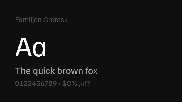
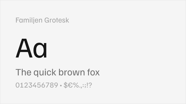
Familjen Grotesk Free Variable


Geist Mono Free Variable


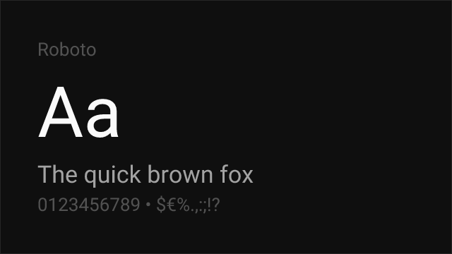
IBM Plex Sans Free


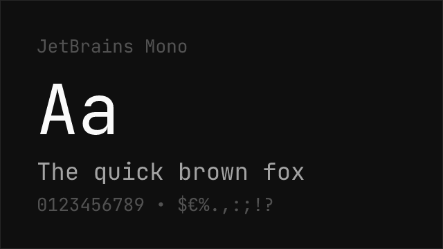

JetBrains Mono Free Variable
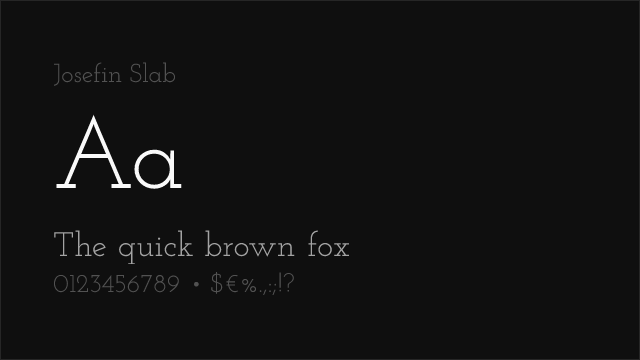
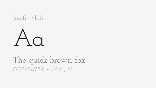
Josefin Slab Free Variable


Libre Franklin Free Variable


Merriweather Free


Montserrat Free Variable


Nunito Sans Free Variable


Playfair Display Free Variable


Plus Jakarta Sans Free Variable


Public Sans Free Variable


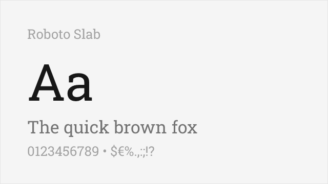
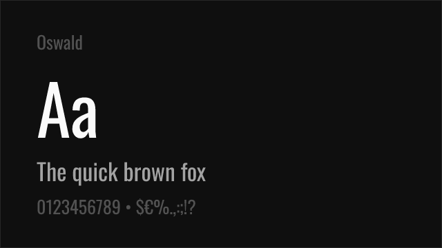
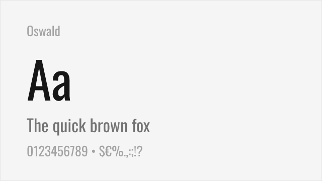
Roboto Slab Free Variable


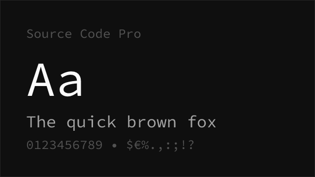
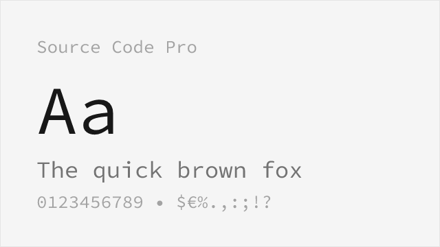
Source Code Pro Free Variable


Source Sans 3 Free Variable


Source Sans Pro Free Variable


Source Serif Pro Free Variable


Space Grotesk Free Variable


No fonts found with this filter.