Neo-Grotesque Fonts
The refined descendants of 19th-century grotesques, featuring uniform strokes, closed apertures, and a neutral personality. Neo-grotesque fonts like Helvetica define modern corporate and UI typography.
Neo-grotesque typefaces emerged in the 1950s as refined versions of the earlier grotesque sans-serifs. Designs like Helvetica (1957) and Univers (1957) stripped away the quirky irregularities of their predecessors to achieve a neutral, almost invisible quality that made them the default choice for corporate identity and international communication.
The Swiss Style Revolution
The neo-grotesque movement is inseparable from the International Typographic Style (Swiss Style) that flourished in Basel and Zurich during the 1950s. Max Miedinger designed Neue Haas Grotesk — later renamed Helvetica — at the Haas type foundry in 1957, aiming for a typeface that would be perfectly neutral: legible, professional, and devoid of personality. The same year, Adrian Frutiger released Univers at Deberny & Peignot, introducing a systematic numbering scheme for weights and widths that made it the first truly rationalized type family. These two faces embodied the Swiss designers' conviction that typography should organize information with mathematical clarity, free from decorative excess.
Cultural Impact
Helvetica became the most ubiquitous typeface in the world, appearing on subway signage (New York MTA), corporate logos (American Airlines, BMW, Lufthansa), government documents, and tax forms. Its neutrality made it simultaneously everywhere and invisible — the typographic equivalent of white paint. This dominance provoked cultural backlash: the postmodernist designers of the 1990s deliberately rejected Helvetica's uniformity in favor of expressive, deconstructed typography. Gary Hustwit's 2007 documentary "Helvetica" explored this tension, revealing how deeply a typeface could embed itself in visual culture and how strongly designers could feel about a seemingly neutral design.
Sub-categories
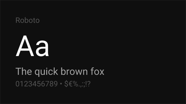
Neo-grotesques divide along a spectrum of neutrality. Classical neo-grotesques (Helvetica, Univers, Akzidenz-Grotesk) maintain tight apertures, horizontal terminals, and minimal variation between glyphs. Contemporary neo-grotesques (Aktiv Grotesk, Roc Grotesk) introduce subtle personality — slightly open apertures, gentle ink traps, or distinctive alternate characters — while preserving the core neutrality. UI-optimized neo-grotesques (SF Pro, Roboto) are engineered specifically for screen interfaces, with optical adjustments for rendering at specific pixel sizes and metrics tuned for component-based design systems.
Modern Trends
The past decade has seen a neo-grotesque renaissance driven by the technology industry. Apple's San Francisco, Google's Roboto, and countless SaaS companies have adopted neo-grotesque designs as their interface typefaces. However, the trend is evolving: contemporary designers increasingly favor neo-grotesques with subtle humanist inflections (Inter, IBM Plex Sans) that retain neutral professionalism while adding enough warmth to avoid the clinical coldness of pure Helvetica. The "corporate same-ness" critique — that every tech company now uses a near-identical geometric or neo-grotesque sans — is pushing some brands toward more distinctive type choices.
When to Use
Neo-grotesque typefaces are the backbone of corporate identity, user interfaces, wayfinding systems, and any context where the type should communicate clearly without drawing attention to itself. They are the safe, professional choice for business communications, annual reports, and government documents. Their neutrality makes them ideal for multilingual applications where consistent character across scripts is important.
Premium Neo-Grotesque Fonts


Atlas Grotesk

Basis Grotesque


Clash Grotesk


Founders Grotesk


Instrument Sans


PP Radio Grotesk


Free Neo-Grotesque Fonts


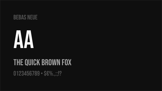
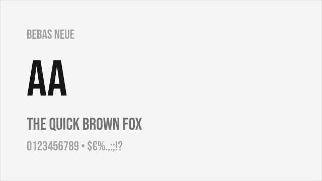
Bebas Neue Free


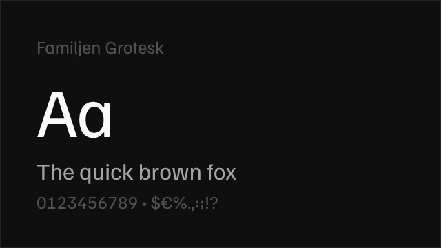

Familjen Grotesk Free Variable


IBM Plex Sans Free


Libre Franklin Free Variable


Plus Jakarta Sans Free Variable


Public Sans Free Variable


Source Sans 3 Free Variable


Source Sans Pro Free Variable


Space Grotesk Free Variable


No fonts found with this filter.